출처 : https://www.youtube.com/watch?v=j-JxASock0Q&t=3s
import styled from "styled-components";
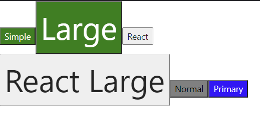
const SimpleButton = styled.button`
color: white;
background-color: green;
`;
const LargeButton = styled(SimpleButton)`
font-size: 50px; //SimpleButton 스타일 + font 적용
`;
const ReactButton = (props) => {
// console.log("React Button props", props); -> {children: 'React'}
// console.log("props.className", props.className); -> 'sc-dkrFOg hFSatG(알아서 생성)'
return <button className={props.className}>{props.children}</button>;
};
const ReactLargeButton = styled(ReactButton)`
font-size: 50px;
`;
const PrimaryButton = styled.button`
//primary가 있는 경우 white, 아니면 black
color: ${(props) => (
console.log("props.primary", props.primary), //true
props.primary ? "white" : "black"
)};
background-color: ${(props) => (props.primary ? "blue" : "gray")};
}};
`;
const App = () => {
return (
<div>
<SimpleButton>Simple</SimpleButton>
<LargeButton>Large</LargeButton>
<ReactButton>React</ReactButton>
<ReactLargeButton>React Large</ReactLargeButton>
<PrimaryButton>Normal</PrimaryButton>
<PrimaryButton primary>Primary</PrimaryButton>
</div>
)
}
export default App;
개발 블로그, 티스토리(https://ba-gotocode131.tistory.com/)로 갈아탐