
동기
오늘은 2020.12.23 ~ 2020.12.31 동안 학교에서 진행한 SW활용프로그램에 관하여 포스팅을 진행하려고 한다. 3학년 2학기를 마치고 파이썬을 활용한 프로젝트를 구상 하던 도중, 마침 학교에서 파이썬을 활용한 데이터 시각화 프로젝트 특강을 진행한다는 게시물을 보았다. 나는 정말 좋은 기회라 생각하고 지원하였다.
이번 특강은 파이썬의 기초 문법을 배우고 활용능력을 향상시킨 후 matplotlib 라이브러리를 활용하여 데이터를 시각화 하는 커리큘럼으로 진행되었다. 총 6회차 수업으로 진행되었고, 1회차부터 4회차까지는 파이썬의 기본 문법을 배우고, 5, 6회차동안에는 기온 데이터 분석 등 여러가지 예제를 수행해보고 개인 프로젝트를 진행하였다.
기본문법
사실 파이썬의 기본 문법에 대해서는 미리 공부해놨던 터라 문법 수업이 어렵진 않았지만, 딕셔너리와 리스트에 대해서는 기본 개념이 부족했다는 것을 깨달았다. 특히, 슬라이싱에 대해 헷갈리는 부분이 있었고,
# <리스트 복습>

a = [1, 2, 3, 4, 5, 6, 7, 8, 9]

print(a)
print(a[0]) # indexing 인덱싱 -> 인덱스로 값을 추출, 인덱스는 반드시 0부터 시작
print(a[1])
# slicing 슬라이싱 -> 인덱스 시작과 종료를 기준으로 값을 추출.
print(a[0:2])
print(a[1:3])
print(a[:4])
print(a[2:]) # index 2번부터 끝까지 출력
print(a[-1]) # 맨 마지막 인덱스

print(a[-2:-5]) # 오른쪽값에서 왼쪽값을 뺀 갯수만큼 출력하기 때문에 음수가 나오면 안된다.
print(a[-2:])
print(len(a))
print(len(a)//2) # 인덱스 중간값 계산
이러한 예제들을 풀면서 기본 개념을 확실히 하였다.
더 나아가서,
def dictionary():
    dicA = ["love", "청출어람", "chance"]
    dicB = ["사랑", "제자나 후배가 스승이나 선배보다 나음을 말함", "기회"]
    while True:
        a = int(input("1. 단어입력, 2. 단어 검색, 3. 종료 >>> "))
        if (a == 1):
            b = input("기억할 단어 : ")
                if (b == "love"):
                    print('[',b,']',"의 의미 : ", dicB[0])
                elif (b == "청출어람"):
                    print('[',b,']',"의 의미 : ", dicB[1])
                else:
                    print('[',b,']',"의 의미 : ", dicB[2])
        elif (a == 2):
            b = input("검색할 단어 : ")
                if (b == "love"):
                    print("검색할 단어 : ", dicB[0])
                elif (b == "청출어람"):
                    print("검색할 단어 : ", dicB[1])
                else:
                    print("검색할 단어 : ", dicB[2])
        else :
            break

dictionary()
이러한 조건문과 리스트를 활용한 예제들도 풀어보았다.
import math
import time
count1 = 0
n = int(input("1보다 큰 정수 입력 : "))
start1 = time.time()
for i in range(2, n, 1):
    if n % i == 0 :
        count1 = 1
        break
end1 = time.time()
if count1 == 0 :
    print("소수입니다")
else :
    print("소수가 아닙니다")
count2 = 0
start2 = time.time()
for i in range(2, n//2, 1):
    if n % i == 0 :
        count2 = 1
        break
end2 = time.time()
if count2 == 0 :
    print("소수입니다")
else :
    print("소수가 아닙니다")
count3 = 0
start3 = time.time()
for i in range(2, int(math.sqrt(n))+1, 1):
    if n % i == 0 :
        count3 = 1
        break
end3 = time.time()
if count3 == 0 :
    print("소수입니다")
else :
    print("소수가 아닙니다")
print("초급코드 : ", end1 - start1)
print("중급코드 : ", end2 - start2)
print("고급코드 : ", end3 - start3)
위와 같이 math, time등등 파이썬의 라이브러리를 활용하여 소수를 판단하는 예제도 풀어보았다. 파이썬은 사용할때마다 느끼는 점이지만 라이브러리가 많아 코드 길이를 많이 줄일 수 있어 좋은 것 같다.
시각화 예제
4회차 수업부터는 공공데이터 포털(www.data.go.kr)에서 각종 csv데이터들을 다운받아 파이썬을 활용해 시각화 하는 작업을 진행하였다.
import csv, matplotlib.pyplot as plt
f = open('seoul1.csv')
data = csv.reader(f)
header = next(data)
print(header)
max_temp = -999
max_date = ''
result1 = []
result2 = []
month = ''
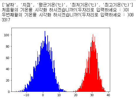
n1 = input("처음월의 기온을 시각화 하시겠습니까?(두자리로 입력하세요 : )")
n2 = input("두번째월의 기온을 시각화 하시겠습니까?(두자리로 입력하세요 : )")
for row in data:
month = row[0].split('-')[1] #변수로 공공데이터 값을 처리
if row[-1] != '' :
if month == n1:
result1.append(float(row[-1]))
if month == n2:
result2.append(float(row[-1]))
f.close()
print(len(result))
#print(result)
plt.hist(result1, color = 'blue', bins = 100)
plt.hist(result2, color = 'red', bins = 100)
plt.show()
#print('서울 가장 더웠던 날은 %s이고 %d도 입니다.' %(max_date, max_temp))실행결과
서울시 기온데이터를 이용하여 두 개의 월을 입력 받아 해당 월의 기온 분포를 확인해 본 모습이다.
여러가지 데이터들을 시각화 해보면서 maplotlib라이브러리를 활용하여 데이터를 한눈에 볼 수 있는 것이 신기했고, 빨리 내 프로젝트를 진행하고 싶었다.
나의 프로젝트
다음은 나의 프로젝트 계획안이다.
PPT 템플릿 출처 : https://minheeblog.tistory.com/
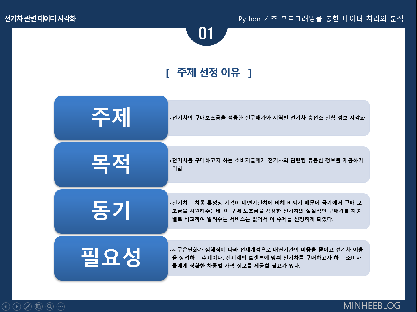
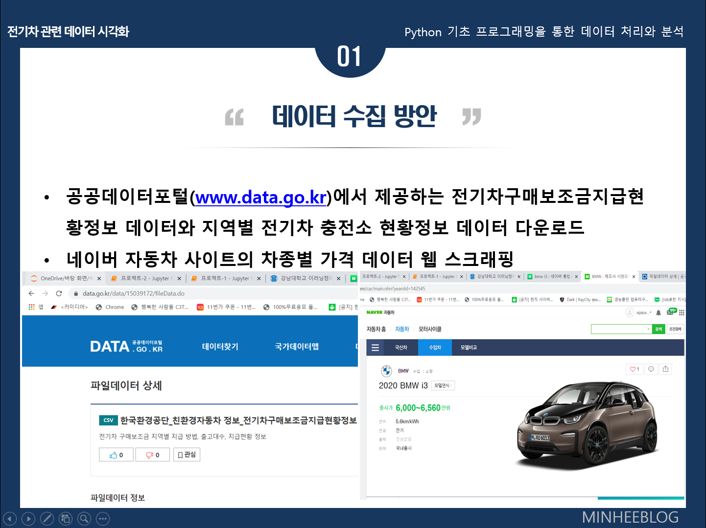
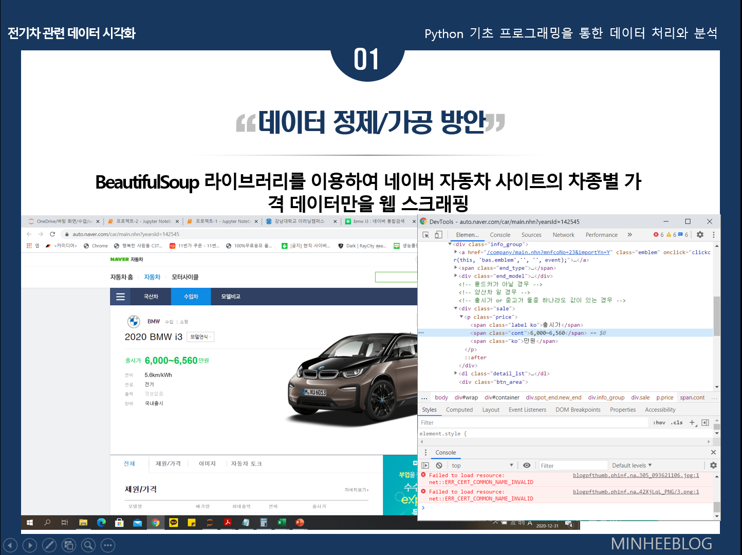

공공데이터포털의 전기차 구매보조금 관련 데이터와 네이버자동차 사이트의 자동차 가격정보를 스크래핑하여 전기차의 실구매가를 시각화하고, 도시별 전기차 충전소 현황을 시각화하였다.
차량 제조사에서 제공하는 전기차의 가격에서 각 도시별 구매보조금을 적용한 차종별 실구매가를 비교해 보고 싶어서 이 주제를 정하게 되었다.
다음은 프로젝트 코드와 실행결과 이다.
import requests, csv, matplotlib.pyplot as plt, numpy as np
from bs4 import BeautifulSoup
from IPython.display import Image

f1 = open('전기차구매보조금현황-정제(가격만).csv')
f2 = open('전기차구매보조금현황-정제(출고대수).csv')
f3 = open('지역별충전소현황.csv')
data1 = csv.reader(f1)
data2 = csv.reader(f2)
data3 = csv.reader(f3)

#가장 적합한 차량 찾기

headers = {'User-Agent' : 'Mozilla/5.0 (Windows NT 10.0; Win64; x64)AppleWebKit/537.36 (KHTML, like Gecko) Chrome/73.0.3683.86 Safari/537.36'}

i3 = requests.get('https://auto.naver.com/car/main.nhn?yearsId=142545',headers=headers)
i3 = BeautifulSoup(i3.text, 'html.parser')
i3 = i3.select_one('#container > div.spot_end.new_end > div.info_group > div.sale > p > span.cont')
i3 = i3.text
i3 = i3.split('~')[0]

model3 = requests.get('https://auto.naver.com/car/main.nhn?yearsId=132213',headers=headers)
model3 = BeautifulSoup(model3.text, 'html.parser')
model3 = model3.select_one('#container > div.spot_end.new_end > div.info_group > div.sale > p > span.cont')
model3 = model3.text
model3 = model3.split('~')[0]

ds3 = requests.get('https://auto.naver.com/car/main.nhn?yearsId=141063',headers=headers)
ds3 = BeautifulSoup(ds3.text, 'html.parser')
ds3 = ds3.select_one('#container > div.spot_end.new_end > div.info_group > div.sale > p > span.cont')
ds3 = ds3.text
ds3 = ds3.split('~')[0]

niro = requests.get('https://auto.naver.com/car/main.nhn?yearsId=125863',headers=headers)
niro = BeautifulSoup(niro.text, 'html.parser')
niro = niro.select_one('#container > div.spot_end.new_end > div.info_group > div.sale > p > span.cont')
niro = niro.text
niro = niro.split('~')[0]

kona = requests.get('https://auto.naver.com/car/main.nhn?yearsId=136029',headers=headers)
kona = BeautifulSoup(kona.text, 'html.parser')
kona = kona.select_one('#container > div.spot_end.new_end > div.info_group > div.sale > p > span.cont')
kona = kona.text
kona = kona.split('~')[0]

Bolt = requests.get('https://auto.naver.com/car/main.nhn?yearsId=139703',headers=headers)
Bolt = BeautifulSoup(Bolt.text, 'html.parser')
Bolt = Bolt.select_one('#container > div.spot_end.new_end > div.info_group > div.sale > p > span.cont')
Bolt = Bolt.text
Bolt = Bolt.split('~')[0]

e_3008 = requests.get('https://auto.naver.com/car/main.nhn?yearsId=140487&importYn=Y',headers=headers)
e_3008 = BeautifulSoup(e_3008.text, 'html.parser')
e_3008 = e_3008.select_one('#container > div.spot_end.new_end > div.info_group > div.sale > p > span.cont')
e_3008 = e_3008.text
e_3008 = e_3008.split('~')[0]

leaf = requests.get('https://auto.naver.com/car/main.nhn?yearsId=129671&importYn=Y',headers=headers)
leaf = BeautifulSoup(leaf.text, 'html.parser')
leaf = leaf.select_one('#container > div.spot_end.new_end > div.info_group > div.sale > p > span.cont')
leaf = leaf.text
leaf = leaf.split('~')[0]

soul = requests.get('https://auto.naver.com/car/main.nhn?yearsId=138101',headers=headers)
soul = BeautifulSoup(soul.text, 'html.parser')
soul = soul.select_one('#container > div.spot_end.new_end > div.info_group > div.sale > p > span.cont')
soul = soul.text
soul = soul.split('~')[0]

ionic = requests.get('https://auto.naver.com/car/main.nhn?yearsId=130499',headers=headers)
ionic = BeautifulSoup(ionic.text, 'html.parser')
ionic = ionic.select_one('#container > div.spot_end.new_end > div.info_group > div.sale > p > span.cont')
ionic = ionic.text
ionic = ionic.split('~')[0]

e_208 = requests.get('https://auto.naver.com/car/main.nhn?yearsId=140435',headers=headers)
e_208 = BeautifulSoup(e_208.text, 'html.parser')
e_208 = e_208.select_one('#container > div.spot_end.new_end > div.info_group > div.sale > p > span.cont')
e_208 = e_208.text
e_208 = e_208.split('~')[0]

zoe = requests.get('https://auto.naver.com/car/main.nhn?yearsId=140649&importYn=Y',headers=headers)
zoe = BeautifulSoup(zoe.text, 'html.parser')
zoe = zoe.select_one('#container > div.spot_end.new_end > div.info_group > div.sale > p > span.cont')
zoe = zoe.text
zoe = zoe.split('~')[0]

sm3 = requests.get('https://auto.naver.com/car/main.nhn?yearsId=129477',headers=headers)
sm3 = BeautifulSoup(sm3.text, 'html.parser')
sm3 = sm3.select_one('#container > div.spot_end.new_end > div.info_group > div.sale > p > span.cont')
sm3 = sm3.text
sm3 = sm3.split('~')[0]

region = input("지역(도,시)을 입력하세요 : ").split()  #ex)서울 서울특별시, 경기 부천시, 강원 평창군
region1 = region[0]
region2 = region[1]
mymoney = int(input("예산을 입력하세요 : (만원)"))


price = []
price1 = []
subsidy = []
result = []
yesan = []
name = ['BMW i3', 'TESLA model3', 'CITROEN ds3', 'KIA niro', 'HYUNDAI kona', 'CHEVY Bolt', 'PEUGEOT e_3008', 'NISSAN leaf', 'KIA soul', 'HYUNDAI ionic', 'PEUGEOT e_208', 'RENAULT zoe', 'SAMSUNG sm3']
price.extend([i3, model3, ds3, niro, kona, Bolt, e_3008, leaf, soul, ionic, e_208, zoe, sm3])
for index in price:
    index = index.replace(',', '')
    price1.append(index)
price1 = list(map(int, price1))

for row in data1:
    if (region[0] in row[1]) | (region[1] in row[1]):
        subsidy = int(row[2])

for index in price1:
    result.append(index-subsidy)

for index in result:
    s = (mymoney-index)**2
    yesan.append(s)

index = yesan.index(min(yesan))
mycar = name[index]
result = result[index]
print("가장 적합한 차량은 %s 입니다." % mycar)
print("가격 : %d만원" % result)

#차종별 가격

plt.rcParams["figure.figsize"] = (23,10)
plt.rc('font', family='Malgun Gothic')
plt.xticks(rotation = 45, size=20)
plt.yticks(size=20)
plt.xlabel('차종', fontsize=20, color='b')
plt.ylabel('가격(만원)', fontsize=20, color='b')
plt.bar(name, result, width=0.5)
plt.show()

#지역별 연도별 충전소 현황

for row in data3:
    if (region[0] in row[0]) | (region[1] in row[0]):
        result = np.array(row[1:6], dtype=int)
    if '지역' in row[0]:
        year = np.array(row[1:6], dtype=int)

print("2020년도 %s 지역 충전소 개수(2020.10.14기준) : %d개" % (region1, result[4]))
plt.style.use('ggplot')
plt.title(region1 + " 지역 충전소 설치현황", size=25)
plt.rcParams["figure.figsize"] = (18,7)
plt.rc('font', family='Malgun Gothic', size=30)
plt.rc('xtick', labelsize=20)
plt.rc('ytick', labelsize=20)
plt.xlabel('연도', fontsize=20, color='b')
plt.ylabel('충전소', fontsize=20, color='b')
plt.plot(year, result, color='r', linewidth=2, label= region1)
plt.legend()
plt.show()

#지역별 전기차 출고대수
region = []
result = []
for row in data2:
    if '경기' in row[0]:
        for i in row[1:2]:
            region.append(i)
        for j in row[2:]:
            result.append(int(j))

plt.title("경기도 지역별 전기차 출고대수", size=20)
plt.rcParams["figure.figsize"] = (23,29)
plt.rc('font', family='Malgun Gothic')
plt.xlabel('출고대수', fontsize=15, color='b')
plt.ylabel('도시', fontsize=15, color='b')
plt.xticks(size=12)
plt.yticks(size=12)
plt.barh(region, result)
plt.show()
Image("./차량사진/%s.jpg" % mycar)
실행결과
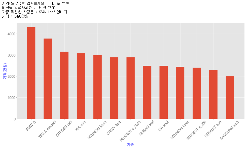
bar(막대)그래프를 이용하여 전기차 구매 보조금을 적용한 차종별 가격을 나타내었다. 지역과 예산을 입력하면 해당 지역의 구매 보조금을 적용하여 예산과 가격이 가장 가까운 전기차를 추천해주도록 하였다.
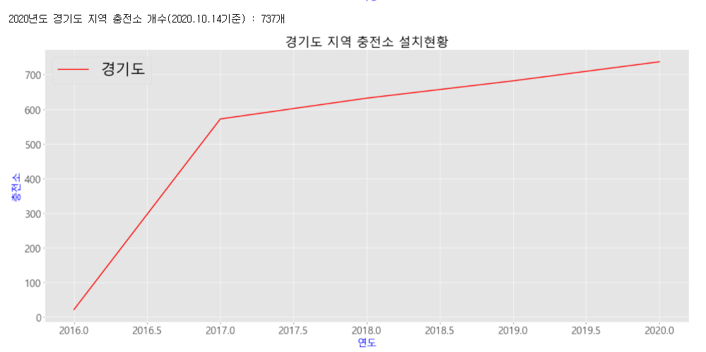
plot(선)그래프를 이용하여 입력한 지역(시/도)의 연도별 충전소 현황을 나타내었다.
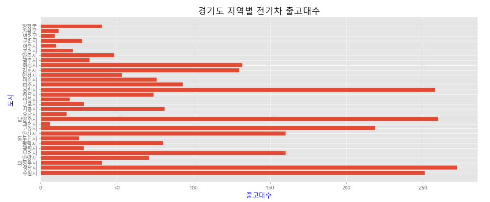
barh(수평 막대)그래프를 이용하여 경기도 지역의 시별 전기차의 출고대수를 시각화하였다.
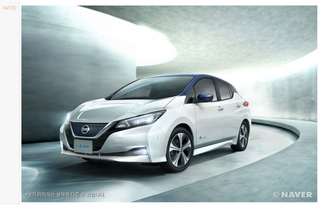
Image라이브러리와 문자열 포맷팅을 이용하여 위에서 추천받은 차종별 이미지를 띄웠다.
다음은 boxplot 그래프를 이용해본 결과이다.
import csv, matplotlib.pyplot as plt
f = open('전기차구매보조금현황-정제(가격만).csv')
data = csv.reader(f)
next(data)
#구매보조금 가격분포
result = []
hi = []
for row in data:
if row[2] != '':
result.append(int(row[2]))
mx = max(result)
print("가장 높은 보조금 : %d" % mx)
for row in data:
if mx in row[2]:
for i in row[1:]:
print(i)
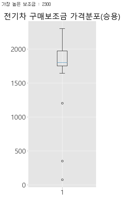
plt.title("전기차 구매보조금 가격분포(승용)", size=25)
plt.rcParams["figure.figsize"] = (4,10)
plt.boxplot(result)
plt.show()실행결과
전기차 구매보조금은 1600~2700만원대에 가장 많이 분포되어 있는 것을 알 수 있었다.
import csv, matplotlib.pyplot as plt, numpy as np
f = open('지역별충전소현황(합계미포함).csv')
data = csv.reader(f)
next(data)
#연도별 가장 높은 충전기 대수
year_16 = []
year_17 = []
year_18 = []
year_19 = []
year_20 = []
for row in data:
    if row[1] != '':
        year_16.append(int(row[1]))
    if row[2] != '':
        year_17.append(int(row[2]))
    if row[3] != '':
        year_18.append(int(row[3]))
    if row[4] != '':
        year_19.append(int(row[4]))
    if row[5] != '':
        year_20.append(int(row[5]))
mx = [max(year_16), max(year_17), max(year_18), max(year_19), max(year_20)]
print("2016년 최대값 : %d" % mx[0])
print("2017년 최대값 : %d" % mx[1])
print("2018년 최대값 : %d" % mx[2])
print("2019년 최대값 : %d" % mx[3])
print("2020년 최대값 : %d" % mx[4])

plt.title("연도별 충전소 설치 현황", size=25)
plt.rcParams["figure.figsize"] = (11,8)
plt.boxplot([year_16, year_17, year_18, year_19, year_20])
plt.xticks([1, 2, 3, 4, 5], ['2016', '2017', '2018', '2019', '2020'])
plt.show()
실행결과
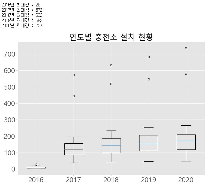
boxplot그래프는 최대값 혹은 최소값을 확인할 때 주로 사용한다.
전기차 충전소가 매년 증가하는 추세인것을 알 수 있다.
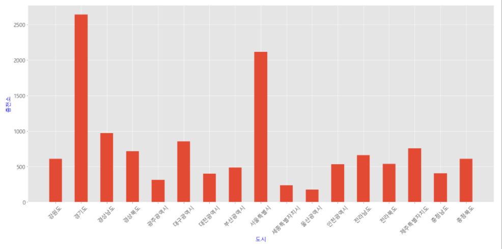
다음은 충전소 현황을 살펴본 결과이다.
import csv, matplotlib.pyplot as plt
f = open('지역별충전소현황.csv')
data = csv.reader(f)
next(data)
#지역별 충전소 현황
region = []
result = []
for row in data:
    if (row[0]) != '':
        result.append(int(row[6]))
        for i in row[0:1]:
            region.append(i)

plt.rcParams["figure.figsize"] = (23,10)
plt.xticks(rotation = 45, size=15)
plt.yticks(size=15)
plt.xlabel('도시', fontsize=15, color='b')
plt.ylabel('충전소', fontsize=15, color='b')
plt.bar(region[0:-1], result[0:-1], width=0.5)
plt.show()
실행결과
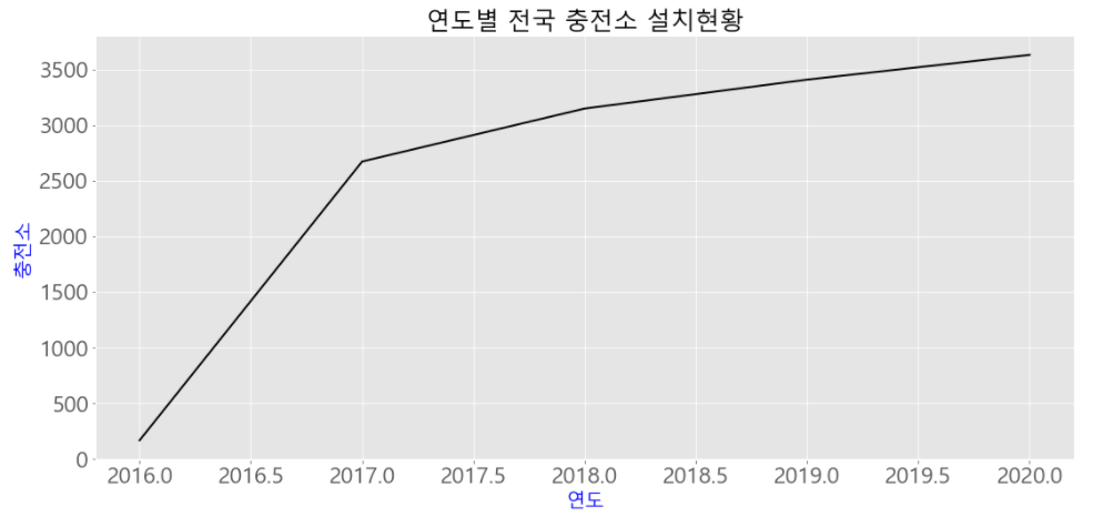
import csv, matplotlib.pyplot as plt, numpy as np
f = open('지역별충전소현황.csv')
data = csv.reader(f)

#연도별 충전소 현황
for row in data:
    if '연도별 합계' in row[0]:
        result = np.array(row[1:6], dtype=int)
    if '지역' in row[0]:
        year = np.array(row[1:6], dtype=int)

plt.style.use('ggplot')
plt.title("연도별 전국 충전소 설치현황", size=25)
plt.rcParams["figure.figsize"] = (18,7)
plt.rc('font', family='Malgun Gothic', size=20)
plt.rc('xtick', labelsize=23)
plt.rc('ytick', labelsize=23)
plt.xlabel('연도', fontsize=20, color='b')
plt.ylabel('충전소', fontsize=20, color='b')
plt.plot(year, result, color='black', linewidth=2)
plt.show()
실행결과
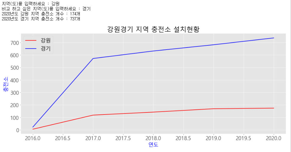
import csv, matplotlib.pyplot as plt, numpy as np
f = open('지역별충전소현황.csv')
data = csv.reader(f)

#도(시)별 연도별 충전소 현황

region = input("지역(도)을 입력하세요 : ")
compare = input("비교 하고 싶은 지역(도)을 입력하세요 : ")
for row in data:
    if region in row[0]:
        result = np.array(row[1:6], dtype=int)
    if compare in row[0]:
        result1 = np.array(row[1:6], dtype=int)
    if '지역' in row[0]:
        year = np.array(row[1:6], dtype=int)

print("2020년도 %s 지역 충전소 개수 : %d개" % (region, result[4]))
print("2020년도 %s 지역 충전소 개수 : %d개" % (compare, result1[4]))
plt.style.use('ggplot')
plt.title(region + compare + " 지역 충전소 설치현황", size=25)
plt.rcParams["figure.figsize"] = (18,6)
plt.rc('font', family='Malgun Gothic', size=20)
plt.rc('xtick', labelsize=20)
plt.rc('ytick', labelsize=20)
plt.xlabel('연도', fontsize=20, color='b')
plt.ylabel('충전소', fontsize=20, color='b')
plt.plot(year, result, color='r', linewidth=2, label= region)
plt.plot(year, result1, color='b', linewidth=2, label= compare)
plt.legend()
plt.show()
실행결과
소감
파이썬을 이용하여 새로운 프로젝트를 해보고 싶었는데 이번 기회를 통하여 재미있고 유익한 경험을 하였다. 파이썬의 기초를 더 탄탄하게 다질 수 있었고, matplotlib이라는 라이브러리를 통하여 엄청난 양의 데이터를 한눈에 확인할 수 있다는 점이 재미있고 신기했다. 이번에 수집한 전기차 관련 데이터는 양이 많지 않아 극적인 결과는 확인하지 못해서 다음에는 훨씬 많은 양의 데이터를 시각화 해 볼 예정이다.