
선형 분류 모델을 이용한 실습 1
데이터 셋 설명
비행 경험 만족도 데이터

1. 문제 정의
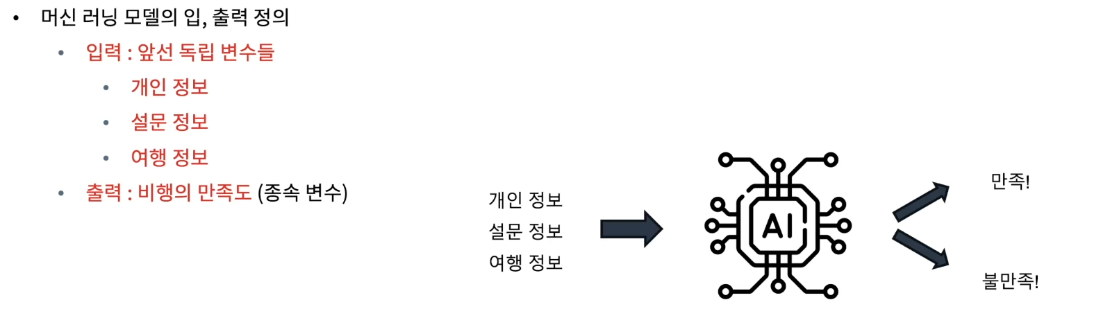
- 풀어야 하는 문제
• 주어진 탑승객의 개인 및 여행 경험 정보를 바탕으로 전반적인 비행의 만족도를 예측
1.데이터 로드
import pandas as pd

# 데이터 경로 지정 및 읽어오기
data_path = '/content/Invistico_Airline.csv'
airplane = pd.read_csv(data_path)

# 데이터 꼴 확인
airplane.head()
2.EDA
# 기본 정보
print('#'*20, '기본 정보', '#'*20)
airplane.info() # info() 안에서 자동으로 print를 진행

# 기초 통계량
summary_statistics = airplane.describe(include='all')
print('#'*20, '기초 통계량', '#'*20)
print(summary_statistics)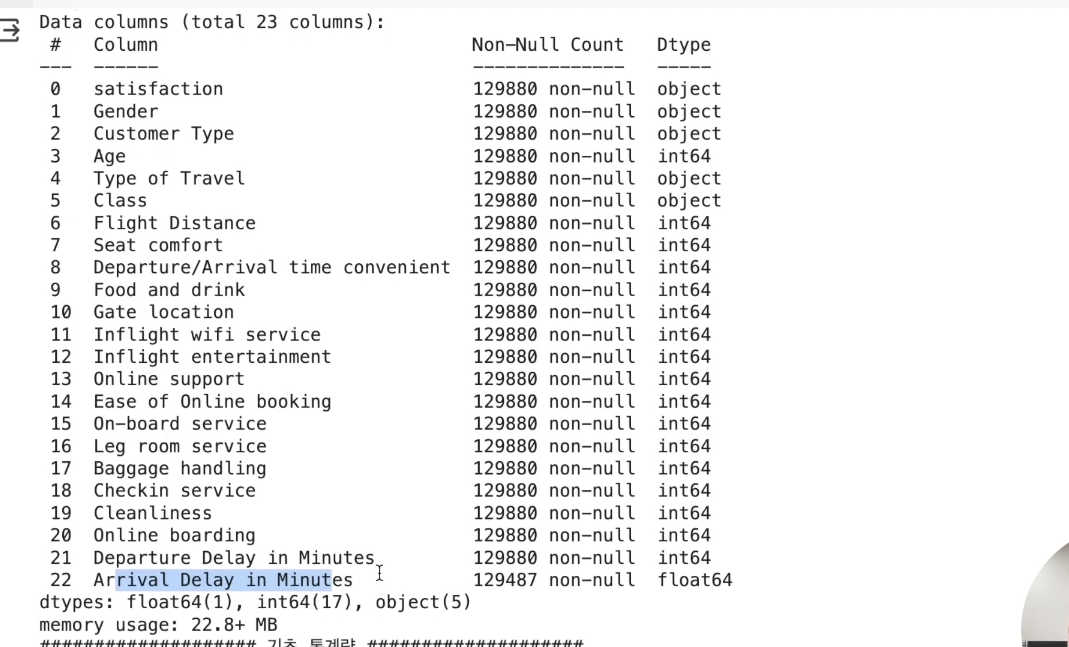
전체 데이터셋 크기
• 총 129,880개의 개별 데이터
• 총 23개 특성
- 데이터 타입
- 수치형 (Numerical)
- 서수형 (Ordinal)
- 순서나 등급을 나타냄
- 설문 조사, 학점, 통증 수준 등
- 범주형 (Categorical)
• 누락 : Arrival Delay in Minutes
시각화
시각화를 진행할 때에 수치형, 서수형, 범주형으로 각 카테고리를 나눠보자
## 데이터 자료형에 따른 column 구분

y_column = ['satisfaction']
numeric_columns = ['Age', 'Flight Distance',
                   'Departure Delay in Minutes', 'Arrival Delay in Minutes']
ordinal_columns = ['Seat comfort', 'Departure/Arrival time convenient',
                   'Food and drink', 'Gate location',
                   'Inflight wifi service', 'Inflight entertainment',
                   'Online support', 'Ease of Online booking',
                   'On-board service', 'Leg room service',
                   'Baggage handling', 'Checkin service',
                   'Cleanliness', 'Online boarding']
category_columns = ['Gender', 'Customer Type',
                    'Type of Travel', 'Class']
시각화 ‒ 수치형 데이터
• 전체 데이터의 분포 확인
• 만족도 결과에 따른 분포 확인
# 전체 데이터 분포 확인

numeric_data = airplane[numeric_columns]

import matplotlib.pyplot as plt
plt.figure(figsize=(14, 10))

np.random.seed(seed)
for idx, numeric in enumerate(numeric_columns) :
    col = (np.random.random(), np.random.random(), np.random.random())

    plt.subplot(2, 2, idx+1)
    plt.hist(numeric_data[numeric], bins=30, color=col, edgecolor='black')
    plt.title(f'{numeric} Distribution')
    plt.xlabel(numeric)
    plt.ylabel('Frequency')

plt.tight_layout()
plt.show()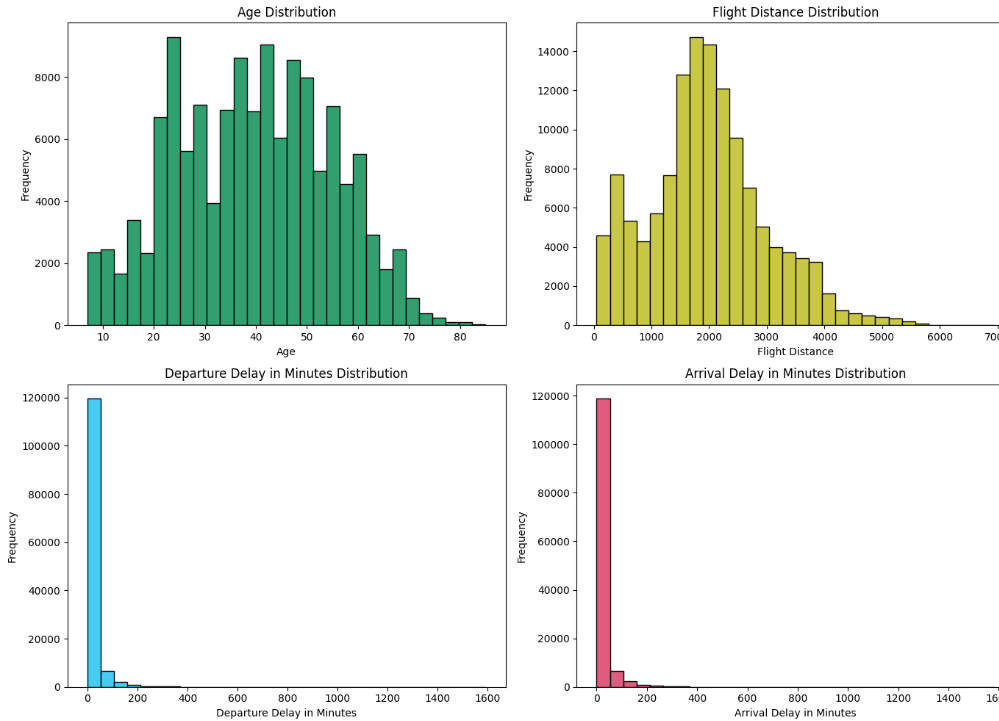
출발 및 도착 지연 시간에는 outlier가 보임(1600시간은 뭐임…)
하지만 이 결과가 만족도에 영향을 줄 수 있음을 고려
- 컬럼별 만족도가 어떻게 나눠지는지 보자.
# 클래스 별 시각화
satisfied = airplane[airplane['satisfaction'] == 'satisfied']
dissatisfied = airplane[airplane['satisfaction'] == 'dissatisfied']

plt.figure(figsize=(15, 15))

for idx, column in enumerate(numeric_columns):
    plt.subplot(len(numeric_columns), 2, 2*idx + 1)
    plt.hist(satisfied[column], color='blue', label='Satisfied', bins=30, edgecolor='black')
    plt.title(f'Satisfied - {column}')

    plt.subplot(len(numeric_columns), 2, 2*idx + 2)
    plt.hist(dissatisfied[column], color='red', label='Dissatisfied', bins=30, edgecolor='black')
    plt.title(f'Dissatisfied - {column}')

plt.tight_layout()
plt.show()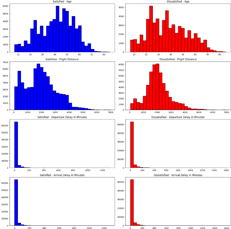
아웃라이어 ‒ 수치형 데이터
아웃라이어도 확인해보자
plt.figure(figsize=(8, 8))

np.random.seed(seed)
for idx, numeric in enumerate(numeric_columns) :

    plt.subplot(2, 2, idx+1)
    plt.boxplot(numeric_data[numeric].dropna(), labels=[numeric])

plt.tight_layout()
plt.show()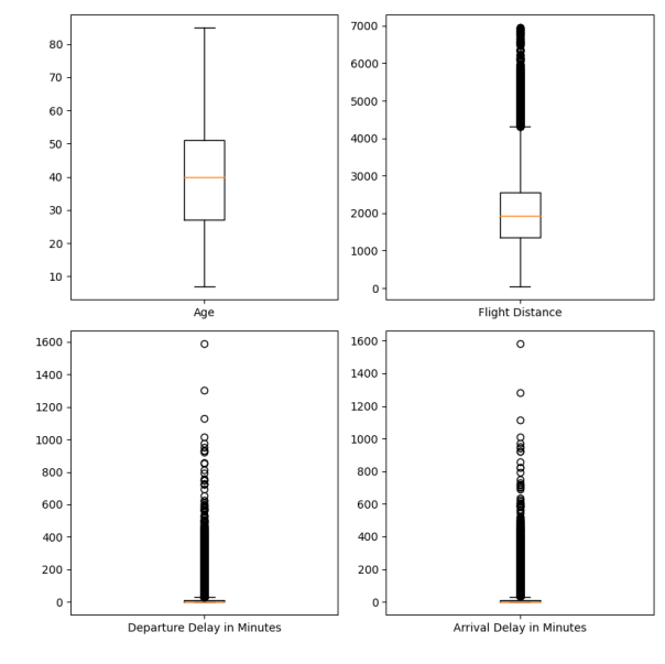
Age
• 전체 모형이 정규 분포 모양
• 균일한 분포이며 아웃라이어는 안보임
Flight Distance
• 비교적 균일, 약간의 아웃라이어
• 하지만 충분히 있을 수 있는 정도
Delay time
• 극단적인 값이 존재
상관관계 ‒ 수치형 데이터
correlation_matrix = numeric_data.corr()

# 상관관계 메트릭스 시각화
plt.figure(figsize=(5, 5))

plt.matshow(correlation_matrix, fignum=1)
plt.colorbar()
plt.xticks(range(len(correlation_matrix.columns)), correlation_matrix.columns, rotation=90)
plt.yticks(range(len(correlation_matrix.columns)), correlation_matrix.columns)

for (i, j), val in np.ndenumerate(correlation_matrix):
    plt.text(j, i, '{:0.2f}'.format(val), ha='center', va='center', color='black')

plt.show()

# 상관관계 값 프린트
print('#'*20, '상관관계 값 확인', '#'*20)
print(correlation_matrix)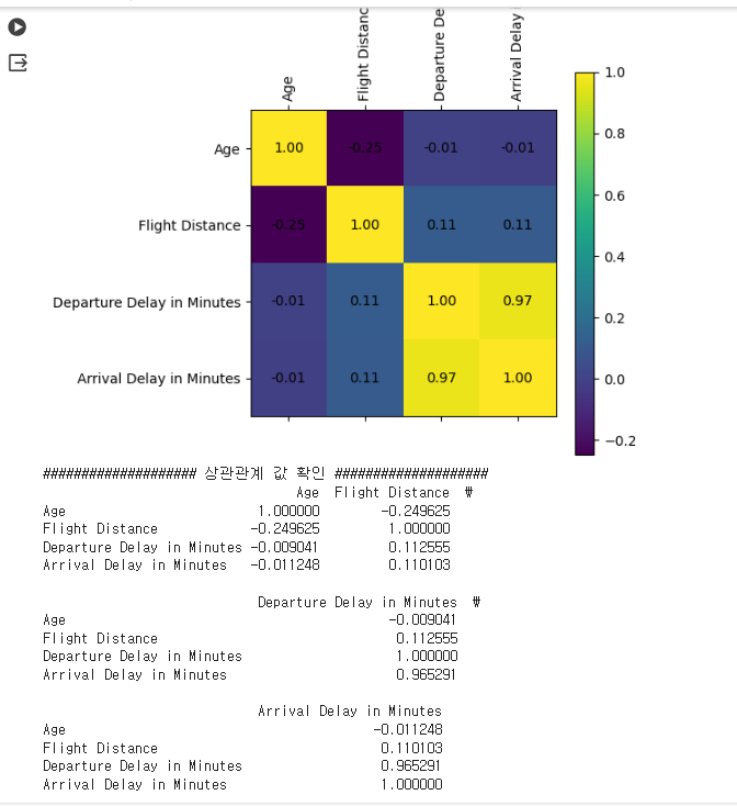
- 출발 시간이 늦으면 도착 시간도 늦음
• 두 변수 사이에 매우 큰 상관관계 예상
• 선형 모델에는 부정적 영향을 미칠 수 있음을 인지
시각화 ‒ 서수형 데이터
# 전체 데이터 분포 확인
ordinal_data = airplane[ordinal_columns]

import matplotlib.pyplot as plt
plt.figure(figsize=(10, 15))

np.random.seed(seed)
for idx, ordinal in enumerate(ordinal_data) :
    col = (np.random.random(), np.random.random(), np.random.random())

    plt.subplot(7, 2, idx+1)
    plt.hist(ordinal_data[ordinal], bins=30, color=col, edgecolor='black')
    plt.title(f'{ordinal} Distribution')
    plt.xlabel(ordinal)
    plt.ylabel('Frequency')

plt.tight_layout()
plt.show()
-
0~5점에 해당하는 설문 평가 데이터의 시각화
-
극단적으로 답변이 치우진 문항은 없어 보임
-
따라서 모델 개발 입장에서
- 특별히 주의할 변수는 보이지 않음
- 대신 각 변수 마다 보이는 분포는 상이함
- 상위점에 몰림 현상
- 중간 점수에 몰림 현상
-
서비스 개선의 입장에서
- 잘 하고 있는 것과
- 개선이 필요한 부분 (Food & Drink, Seat Comfort 등)
만족도 결과에 따른 변수를 시각화 해보자.
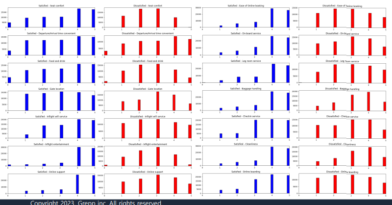
- 만족 / 불만족에 따른 분포 차이가 존재하는 경우(seat comfort, food and drink 등)도 있고
그렇지 않은 경우(depart/arrival time comfort)도 존재 - 종속 변수의 결과로 나누어 확인할 경우,
분포의 차이가 보이는 변수의 경우 분석에 큰 영향을 미칠 가능성 있음
상관관계 - 서수형 데이터
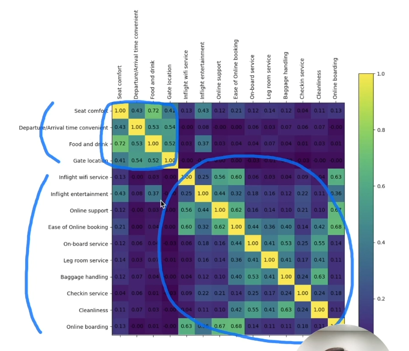
특정 문항 사이에 높은 상관관계가 보임
• 하지만 다른 변수를 대체할 만큼 상관 관계 값이 크지는 않아보임
시각화 - 범주형 데이터
- 전체 데이터에 대해 특정 범주의 빈도수를 확인
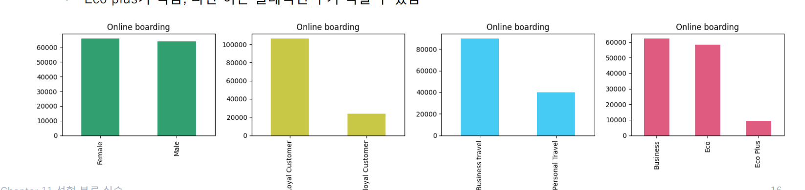
• 성별 : 응답 승객에서 성별 비율은 큰 차이가 없음
• 설문을 포함한 만족도 조사에 있어 응답자 차이가 보임
• VIP / 일반 고객에서도 차이가 보임
• 비지니스 고객이 더 응답을 많이 했고
• Eco plus가 적음, 다만 이는 절대적인 수가 적을 수 있음
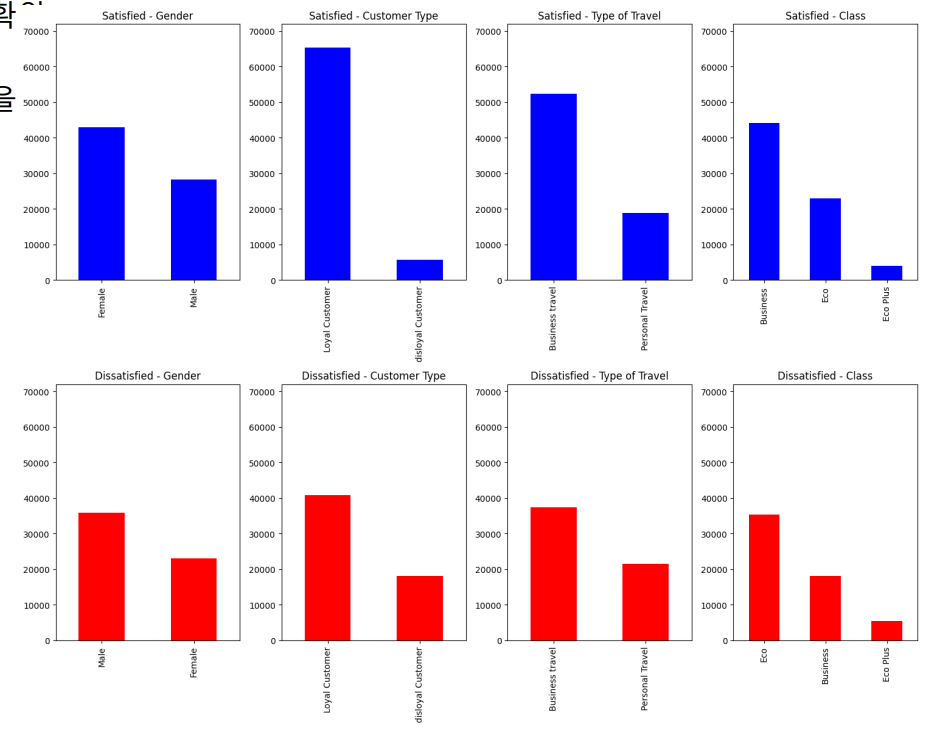
- 만족과 불만족 데이터 사이의 범주형 데이터 분포 확
- 이 분포의 차이가 강한 범주일수록 분석에 큰 영향을 미칠 수 있음
3. 데이터 전처리
제외 데이터 판단 및 제거
누락 데이터를 포함한 부분은 제거
또한, EDA 과정에서 판단한 제외 데이터를 제거
이번 실습에서는 delay 시간을 기준으로 clipping 진행
결과적으로 129,149 데이터를 사용
airplane_cleaned = airplane.dropna() # na값 제거
time_limit = 300 # 지연 시간 5시간 이상은 제거
airplane_cleaned = airplane_cleaned[(airplane_cleaned['Arrival Delay in Minutes'] < time_limit) &
                                    (airplane_cleaned['Departure Delay in Minutes'] < time_limit)]

airplane_cleaned.info()
카테고리형 변수 인코딩
-
선형 회귀 실습 과정과 비슷 (문자열을 숫자 0과 1로 변경!)
-
타겟하는 범주형 데이터로는
- (종속변수) ʻ만족도ʼ
- (독립변수) ʻ성별ʼ, ʻ고객 유형ʼ, ʻ여행 유형ʼ, ʻ클래스ʼ
-
이 과정에서 좌석 등급으로 인해 1개의 변수가 추가됨
airplane_cate_encoded = pd.get_dummies(airplane_cleaned[category_columns], drop_first=True)
airplane_target_encoded = pd.get_dummies(airplane_cleaned[y_column], drop_first=True)

airplane_combined = pd.concat([airplane_target_encoded,
                               airplane_cleaned[numeric_columns + ordinal_columns],
                               airplane_cate_encoded],
                              axis=1)
airplane_combined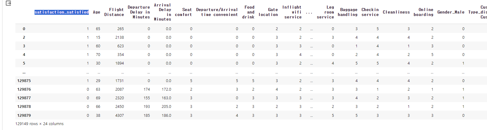
여기서 만족하냐 안하냐를 나타내는 satisfaction_satisfied 컬럼이 종속변수가 되고 나머지가 독립변수가 된다.
상관관계가 큰 컬럼만 사용
컬럼이 많기 때문에 상관관계를 통해 중요한 것만 확인하여 컬럼을 제거해주자.
# 모든 변수 간 상관관계를 계산
correlation_matrix_combined = airplane_combined.corr()

plt.figure(figsize=(20, 20))

plt.matshow(correlation_matrix_combined, fignum=1)
plt.colorbar()
plt.xticks(range(len(correlation_matrix_combined.columns)), correlation_matrix_combined.columns, rotation=90)
plt.yticks(range(len(correlation_matrix_combined.columns)), correlation_matrix_combined.columns)

for (i, j), val in np.ndenumerate(correlation_matrix_combined):
    plt.text(j, i, '{:0.2f}'.format(val), ha='center', va='center', color='black')

plt.show()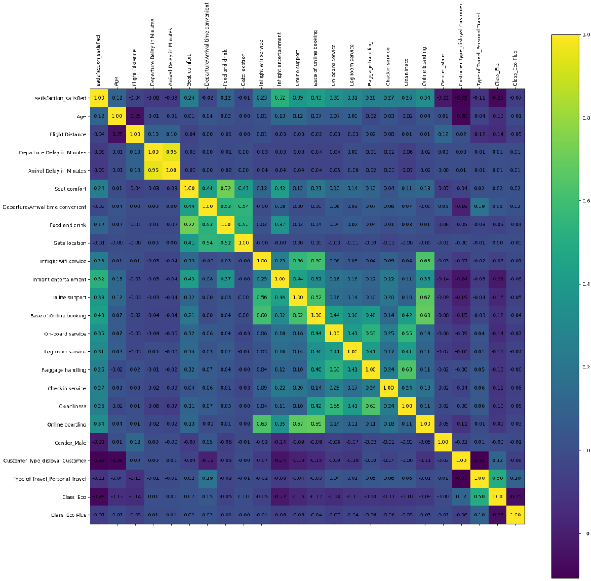
여기서 어두운 것들은 영향이 없다고 볼 수 있다.
# 목표로 하는 target column과 가장 상관관계가 큰 15개를 선택!
select_num = 15
target_correlations = correlation_matrix_combined[airplane_target_encoded.columns[0]].abs().sort_values(ascending=False)
top_features_with_target = target_correlations[1:select_num+1].index.tolist()#0번은 자기자신이기 때문에 제외
top_features_with_target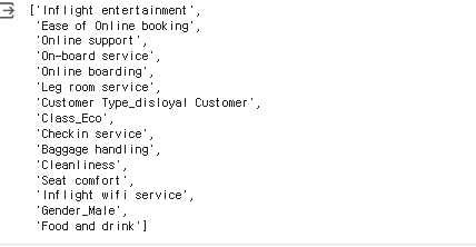
23개 변수 중 15개 변수만 취해서 학습 진행
• → 종속 변수와 여러 독립 변수 사이의 상관관계를 활용
• 상위 15개 변수를 취함
이제 여기서 나온 컬럼들로 다시 데이터 프레임을 만들어 준다.
data = airplane_combined[target_correlations[:select_num+1].index.tolist()]
data.info()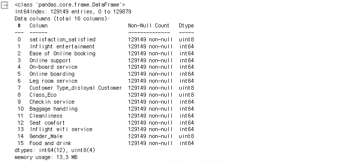
이후 각 컬럼들에 대해서 다시 한번 수치형, 서수형, 범주형으로 각 카테고리를 나눠준다.
# 추출된 특징 이름
# 수치형 데이터는 추출 x
y_column = ['satisfaction_satisfied']
ordinal_columns = ['Inflight entertainment', 'Ease of Online booking',
                   'Online support', 'On-board service',
                   'Online boarding', 'Leg room service',
                   'Checkin service', 'Baggage handling',
                   'Cleanliness', 'Seat comfort',
                   'Inflight wifi service', 'Food and drink']
category_columns = ['Customer Type_disloyal Customer', 'Class_Eco',
                    'Gender_Male']
이제 다음 글에서 학습을 진행하도록 하겠다.
