
Layout
ReactNative에는 display:block,display:inline-block등의 속성이 없다.
모든 요소가 display:flex이며 flex-direction:column이 기본값이다.
import { SafeAreaView, View } from 'react-native';

export default function App() {
  return (
    <SafeAreaView style={{flex:1, backgroundColor:'tomato'}}></SafeAreaView>
  );
}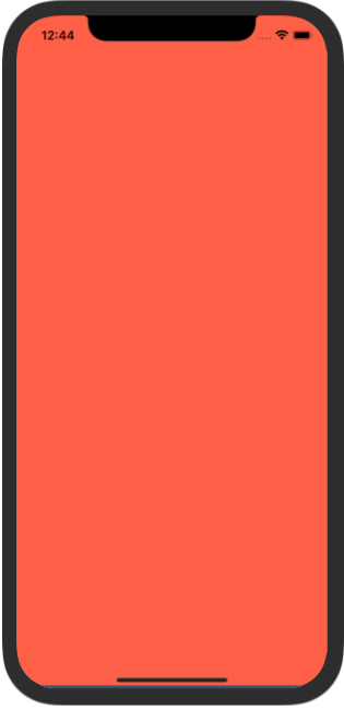
flex:1은 부모요소에 대한 해당 요소의 비율을 뜻하며, 이때 Rn에서 body의 height 크기는 기기의 세로 크기와 같고 하나의 자식요소(=SafeAreaView)만 존재하기 때문에 꽉 채워진 layout이 나타나는 것이다.
반응형 레이아웃
요즘 모바일기기는 다양하다. 다양한 기기만큼 다양한 화면 크기가 존재하기 때문에 기기마다 레이아웃을 따로 설정하는건 시간 낭비이다. 때문에 앱을 개발할땐 15px, 1rem등의 절대값의 사이즈값 사용을 자제한다.
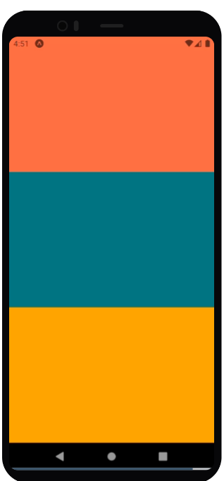
import { SafeAreaView, View } from 'react-native';

export default function App() {
  return (
    <SafeAreaView style={{flex:1}}>
      <View style={{flex:1, backgroundColor:"tomato"}}></View>
      <View style={{flex:1, backgroundColor:"teal"}}></View>
      <View style={{flex:1, backgroundColor:"orange"}}></View>
    </SafeAreaView>
  );
}
아까 flex:1은 비율을 뜻한다고 말했다.
즉 위 코드는 부모요소를 기준으로 1:1:1의 비율로 layout을 구성하는 코드이다.
퍼센트로 나타내면 33.333..%, 33.333..% , 33.333..%와 같다.
1:5:2
flexbox
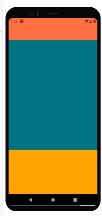
import { SafeAreaView, View } from 'react-native';

export default function App() {
  return (
    <SafeAreaView style={{flex:1}}>
      <View style={{flex:1, backgroundColor:"tomato"}}></View>
      <View style={{flex:5, backgroundColor:"teal"}}></View>
      <View style={{flex:2, backgroundColor:"orange"}}></View>
    </SafeAreaView>
  );
}
percentage
import { SafeAreaView, View } from 'react-native';

export default function App() {
  return (
    <SafeAreaView style={{height:"100%"}}>
      <View style={{height:"12.5%", backgroundColor:"tomato"}}></View>
      <View style={{flex:"62.5%", backgroundColor:"teal"}}></View>
      <View style={{flex:"25%", backgroundColor:"orange"}}></View>
    </SafeAreaView>
  );
}
이런식으로 기기 사이즈가 다르더라도 비율에 따라 레이아웃을 구성하므로
비슷한 레이아웃 구성이 나타나게 될 것이며 사용자경험의 차이가 크지 않게 할 수 있다.
가로모드
만약 기기가 가로모드라면 어떻게 될까?
결론부터 말하면 비율은 바뀐 가로 세로가 새로운 width, height가 되어 재배치 된다.
요즘 앱들은 특수한 경우아니면 가로모드를 못하게 막아두지만. (ex: 배민, 네이버앱 )
넷플릭스앱처럼 가로모드가 꼭 필요한 경우 이것까지 생각해서 만들어주어야 한다.
Styles
직접 넣기
<View style={{flex:1, backgroundColor:"tomato"}}></View>StyleSheet사용
 <View style={styles.container}></View>

const styles = StyleSheet.create({
  container:{
    flex:1,
    backgroundColor:"tomato",
  },
});
StyleSheet를 사용하지 않고 그냥 js object로 직접 작성해서 넣어도 무방하나, 쓰는 이유는 자동완성을 지원해주기 때문이다.
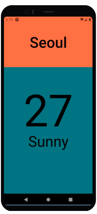
import { SafeAreaView, StyleSheet, Text, View } from 'react-native';

export default function App() {
  return (
    <SafeAreaView style={styles.container}>
      <View style={styles.city}>
        <Text style={styles.cityName}>Seoul</Text>
      </View>
      <View style={styles.weather}>
        <View style={styles.day}>
          <Text style={styles.temp}>27</Text>
          <Text style={styles.description}>Sunny</Text>
        </View>
      </View>
    </SafeAreaView>
  );
}

const styles = StyleSheet.create({
  container:{
    flex:1,
    backgroundColor:"tomato",
  },
  city:{
    flex:1.2,
    justifyContent:"center",
    alignItems:"center"
  },
  cityName:{
    fontSize:60,
    fontWeight:"500",
  },
  weather:{
    flex:3
  },
  day:{
    flex:1,
    backgroundColor:"teal",
    alignItems:"center"
  },
  temp:{
    marginTop:50,
    fontSize:178,
  },
  description:{
    marginTop:-30,
    fontSize:60
  }
})
Styled-Components
Install
# with npm
npm install --save styled-components
# with yarn
yarn add styled-components
TS 환경세팅
# with npm

## Web(for React)
npm install --save-dev @types/styled-components

## React Native
npm install --save-dev @types/styled-components @types/styled-components-react-native

# with yarn

## Web(for React)
yarn add --dev @types/styled-components

## React Native
yarn add --dev @types/styled-components @types/styled-components-react-native
Babel Plugin 설정
# with npm
npm install --save-dev babel-plugin-styled-components

# with yarn
yarn add --dev babel-plugin-styled-components
루트 디렉토리에 있는 babel config에 plugin을 추가해주면 완료된다.
module.exports = function(api) {
  api.cache(true);
  return {
    presets: ['babel-preset-expo'],
    plugins: [
      [
        "babel-plugin-styled-components",
        {
          "ssr": false
        }
      ]
    ],
  };
};
사용하기
import React from "react";
import styled from "styled-components/native";

const StyledComponents = ({cityName} :{cityName?:string})=>{
    return (
        <City>
            <CityName>{cityName || "None"}</CityName>
        </City>);
}

export default React.memo(StyledComponents);

interface citynameProps{
    readonly fontSize?:number;
}

const City = styled.View`
    flex:1.2;
    justify-content: center;
    align-items: center;
`;

const CityName = styled.Text<citynameProps>`
    font-size:${props=>props.fontSize || 50};
    font-weight:500;
`
자동완성을 적용하고 싶다면
vscode-styled-componentsextension을 추가해주자.