styled-components 부분
Circle.tsx
import styled from 'styled-components';
interface StyledCircleProps {
backgroundColor: string;
borderColor: string;
}
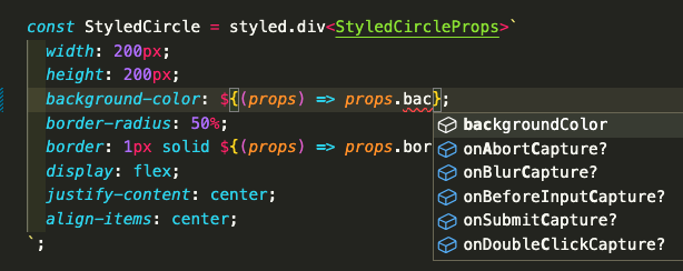
const StyledCircle = styled.div<StyledCircleProps>`
width: 200px;
height: 200px;
background-color: ${(props) => props.backgroundColor};
border-radius: 50%;
border: 1px solid ${(props) => props.borderColor};
display: flex;
justify-content: center;
align-items: center;
`;StyledCircleProps 라는 인터페이스를 정의하여 styled.div에 명시해 주었다.
아래와 같이 자동완성이 지원되는걸 확인할 수 있다.
컴포넌트 정의 부분
Circle.tsx
interface CircleProps {
  backgroundColor: string;
  borderColor?: string; //optional key (string or undefined)
  text?: string;
}

const Circle = ({
  backgroundColor,
  borderColor,
  text = 'default text' }: CircleProps) => {
  return (
    <StyledCircle
      backgroundColor={backgroundColor}
      borderColor={borderColor ?? backgroundColor}>
      {text}
    </StyledCircle>
  );
};
export default Circle;
CircleProps 인터페이스를 정의하여 Circle props 부분에 명시해 주었다. 세미클론 앞부분에 ?를 붙여주면 optional key라는 것이 명시된다.
App.tsx
import Circle from './Circle';

function App() {
  return (
    <div>
      <Circle
        backgroundColor="tomato"
        borderColor="black"
        text="hello"/>
      <Circle backgroundColor="teal"/>
      <Circle backgroundColor="yellow"/>
    </div>
  );
}

export default App;
첫 번째 Circle 컴포넌트에만 borderColor와 text가 prop으로 전달되었고, 나머지 Circle들은 default 값이 적용되었다. borderColor와 text가optional key로 명시되어 오류 없이 렌더링되었다.
출처

꾸준하게 기록하는 습관을 가지자