
1. EDA
- EDA(Exploratory Data Analysis, 탐색적 데이터 분석
🔍 EDA(Exploratory Data Analysis, 탐색적 데이터 분석)는 벨연구소의 수학자 ‘존 튜키’가 개발한 데이터분석 과정에 대한 개념으로, 데이터를 분석하고 결과를 내는 과정에 있어서 지속적으로 해당 데이터에 대한 ‘탐색과 이해’를 기본으로 가져야 한다는 것을 의미한다.
2. 데이터 뽑기, 데이터 전처리, 데이터 시각화
import numpy as np
import pandas as pd
from pandas import Series

df = pd.DataFrame({
    '학번' : ['123456','345678','125690'],
    '성명' : ['홍길동','김영희','박철수'],
    '학년' : [1,2,3]
})
df = df.set_index('학번')
df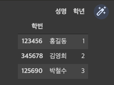
print(df.shape)
print(df.ndim)
df['성명']
df.iloc[0,0]
>>>>
(3, 2)
2
홍길동


s = pd.Series(data = [20,30,40], index = df.index)
df['학점']
df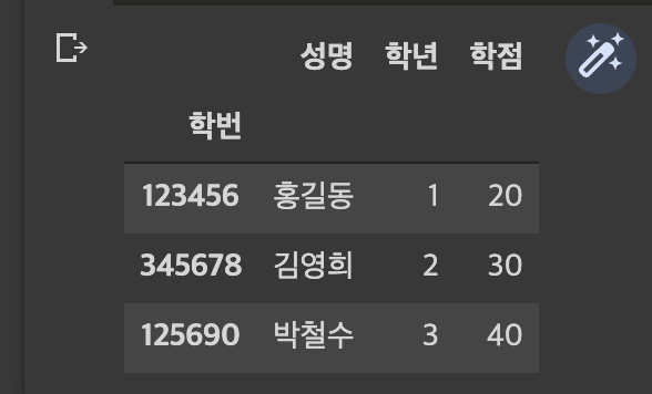
s = pd.Series(data = ['아이유','4',99], index = df.columns, name='098765')
df = df.append(s)
df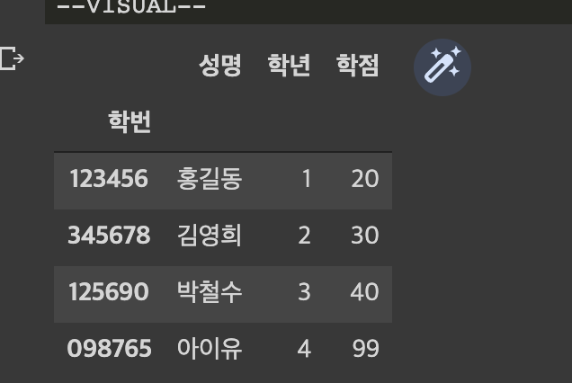
df.loc['098765','학점'] = 96
df.iloc[3,2] = 97
df.drop("학점",axis = 1), df.drop("123456",axis = 0)
df.rename(columns= {'성명':'이름'}, inplace = True)
df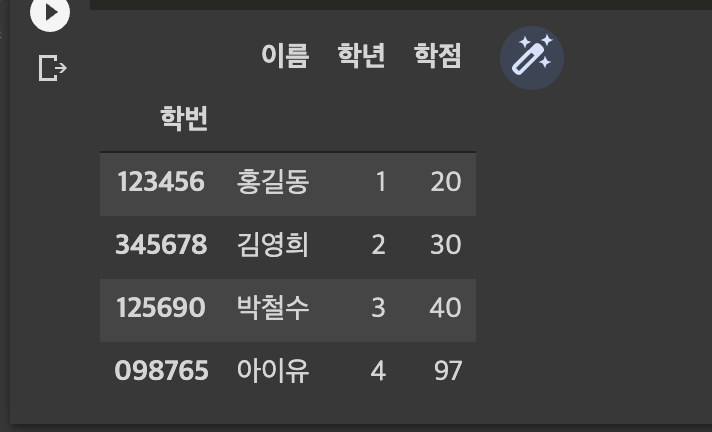
실습 !
1. 데이터 가져오기, 데이터 전처리, 데이터 시각화
import seaborn as sns
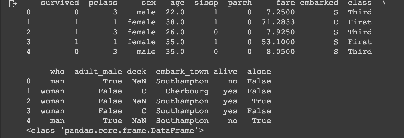
titanic = sns.load_dataset('titanic')
print(titanic.head())
print(type(titanic))
# 파일 읽어오기
# 데이터 건수와 데이터 컬럼(필드) 수 확인하기
import pandas as pd
print('--------------------start------------------------')
print('컬럼(필드):',df.columns)
print('--------------------------------------------')
print('데이터 프레임 형태:',df.shape)
print('--------------------------------------------')
print('컬럼,데이터 값의 개수:',df.info())
print('--------------------------------------------')
print('컬럼 별 데이터 개수:',df.nunique())
print('--------------------------------------------')
print('특정 컬럼 데이터 값, 개수:', df.value_counts())
print('--------------------------------------------')
print('컬럼 별 데이터 타입 : ', df.dtypes)
print('--------------------------------------------')
print('---------------------finish-----------------------')
>>>>
--------------------start------------------------
컬럼(필드): Index(['survived', 'pclass', 'sex', 'age', 'sibsp', 'parch', 'fare',
       'embarked', 'class', 'who', 'adult_male', 'deck', 'embark_town',
       'alive', 'alone'],
      dtype='object')
--------------------------------------------
데이터 프레임 형태: (891, 15)
--------------------------------------------
<class 'pandas.core.frame.DataFrame'>
RangeIndex: 891 entries, 0 to 890
Data columns (total 15 columns):
 #   Column       Non-Null Count  Dtype
---  ------       --------------  -----
 0   survived     891 non-null    int64
 1   pclass       891 non-null    int64
 2   sex          891 non-null    object
 3   age          714 non-null    float64
 4   sibsp        891 non-null    int64
 5   parch        891 non-null    int64
 6   fare         891 non-null    float64
 7   embarked     889 non-null    object
 8   class        891 non-null    category
 9   who          891 non-null    object
 10  adult_male   891 non-null    bool
 11  deck         203 non-null    category
 12  embark_town  889 non-null    object
 13  alive        891 non-null    object
 14  alone        891 non-null    bool
dtypes: bool(2), category(2), float64(2), int64(4), object(5)
memory usage: 80.7+ KB
컬럼,데이터 값의 개수: None
--------------------------------------------
컬럼 별 데이터 개수: survived         2
pclass           3
sex              2
age             88
sibsp            7
parch            7
fare           248
embarked         3
class            3
who              3
adult_male       2
deck             7
embark_town      3
alive            2
alone            2
dtype: int64
--------------------------------------------
특정 컬럼 데이터 값, 개수: survived  pclass  sex     age   sibsp  parch  fare      embarked  class  who    adult_male  deck  embark_town  alive  alone
1         1       female  24.0  0      0      69.3000   C         First  woman  False       B     Cherbourg    yes    True     2
                          58.0  0      0      26.5500   S         First  woman  False       C     Southampton  yes    True     1
                          49.0  0      0      25.9292   S         First  woman  False       D     Southampton  yes    True     1
                                1      0      76.7292   C         First  woman  False       D     Cherbourg    yes    False    1
                          50.0  0      1      247.5208  C         First  woman  False       B     Cherbourg    yes    False    1
                                                                                                                              ..
                          16.0  0      0      86.5000   S         First  woman  False       B     Southampton  yes    True     1
                                       1      39.4000   S         First  woman  False       D     Southampton  yes    False    1
                                              57.9792   C         First  woman  False       B     Cherbourg    yes    False    1
                          17.0  1      0      57.0000   S         First  woman  False       B     Southampton  yes    False    1
          3       male    32.0  0      0      8.0500    S         Third  man    True        E     Southampton  yes    True     1
Length: 181, dtype: int64
--------------------------------------------
컬럼 별 데이터 타입 :  survived          int64
pclass            int64
sex              object
age             float64
sibsp             int64
parch             int64
fare            float64
embarked         object
class          category
who              object
adult_male         bool
deck           category
embark_town      object
alive            object
alone              bool
dtype: object
--------------------------------------------
---------------------finish-----------------------

# 3. 수치형 데이터 컬럼(필드)의 열의 개수, 평균, 표준편차, 최소값, 최대값, 4분위수의 요약 통계량 확인하기
print('컬럼,데이터 값의 개수:',df.info())
df.nunique()
df['survived'].value_counts()
df.describe()
# 수치형 데이터의 특정 비율에 따른 요약 통계량 확인하기
df.describe(percentiles=[.30,.75,.95,.99])

>>>>
<class 'pandas.core.frame.DataFrame'>
RangeIndex: 891 entries, 0 to 890
Data columns (total 15 columns):
 #   Column       Non-Null Count  Dtype
---  ------       --------------  -----
 0   survived     891 non-null    int64
 1   pclass       891 non-null    int64
 2   sex          891 non-null    object
 3   age          714 non-null    float64
 4   sibsp        891 non-null    int64
 5   parch        891 non-null    int64
 6   fare         891 non-null    float64
 7   embarked     889 non-null    object
 8   class        891 non-null    category
 9   who          891 non-null    object
 10  adult_male   891 non-null    bool
 11  deck         203 non-null    category
 12  embark_town  889 non-null    object
 13  alive        891 non-null    object
 14  alone        891 non-null    bool
dtypes: bool(2), category(2), float64(2), int64(4), object(5)
memory usage: 80.7+ KB
컬럼,데이터 값의 개수: None
survived	pclass	age	sibsp	parch	fare
count	891.000000	891.000000	714.000000	891.000000	891.000000	891.000000
mean	0.383838	2.308642	29.699118	0.523008	0.381594	32.204208
std	0.486592	0.836071	14.526497	1.102743	0.806057	49.693429
min	0.000000	1.000000	0.420000	0.000000	0.000000	0.000000
30%	0.000000	2.000000	22.000000	0.000000	0.000000	8.050000
50%	0.000000	3.000000	28.000000	0.000000	0.000000	14.454200
75%	1.000000	3.000000	38.000000	1.000000	0.000000	31.000000
95%	1.000000	3.000000	56.000000	3.000000	2.000000	112.079150
99%	1.000000	3.000000	65.870000	5.000000	4.000000	249.006220
max	1.000000	3.000000	80.000000	8.000000	6.000000	512.329200

# 범주형 데이터 컬럼(필드)의 열의 개수, Unique한 값 등의 요약
df.describe(include=['object'])

>>>>

sex	embarked	who	embark_town	alive
count	891	889	891	889	891
unique	2	3	3	3	2
top	male	S	man	Southampton	no
freq	577	644	537	644	549

# 결측치가 있는지 확인하기
df.isnull().sum()

>>>>
survived         0
pclass           0
sex              0
age            177
sibsp            0
parch            0
fare             0
embarked         2
class            0
who              0
adult_male       0
deck           688
embark_town      2
alive            0
alone            0
dtype: int64

# Embarked 필드의 데이터 확인하기
df['embarked']
>>>>
0      S
1      C
2      S
3      S
4      S
      ..
886    S
887    S
888    S
889    C
890    Q
Name: embarked, Length: 891, dtype: object

# 각 클래스('Pclass)별 탑승객 분포 확인하기
df['pclass'].value_counts()
>>>>
3    491
1    216
2    184
Name: pclass, dtype: int64

# 생존 인원수 확인하기(survived 0 : 사망, 1 : 생존)
# print(df.groupby('survived').count())
res = df.groupby('pclass').count()

>>>>

# 각 클래스('Pclass) 별 생존 인원수 확인하기
df[df['survived']==1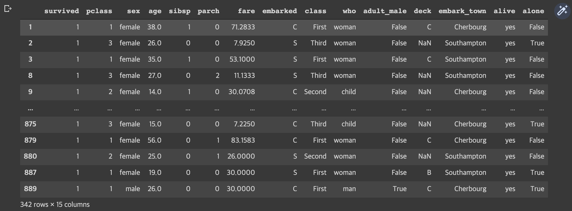
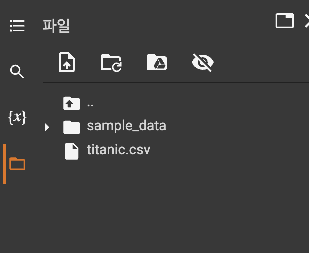
df.to_csv("titanic.csv",index = False)
!ls
print('\n')
!cat titanic.cs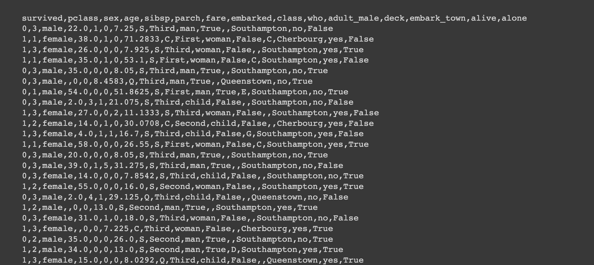
# 1. Feature 간의 상관관계 확인하기 : heatmap 참고
import matplotlib.pyplot as plt
plt.subplots(figsize=(8,6))
sns.heatmap(titanic.corr(), annot=True, linewidths=2)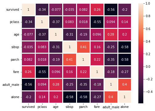
import matplotlib.pyplot as plt
# 2. 선착장(embarked)의 데이터 분포 확인하기 : piechart 참고
df['embarked'].value_counts().plot.pie(autopct = '%.2f %%')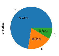
#3. 탑승 클래스('Pclass')별 + 성별('Sex') 생존여부('Survived') 데이터 분포  : barplot 참고
# 1. 막대그래프

# 스타일 테마 설정 (5가지: darkgrid, whitegrid, dark, white, ticks)
sns.set_style('whitegrid')

# 그래프 객체 생성 (figure에 3개의 서브 플롯을 생성)
fig = plt.figure(figsize=(15, 5))
ax1 = fig.add_subplot(2, 2, 1)
ax2 = fig.add_subplot(2, 2, 2)
ax3 = fig.add_subplot(2, 2, 3)
ax4 = fig.add_subplot(2, 2, 4)

# x축, y축에 변수 할당
sns.barplot(x='sex', y='survived', data=titanic, ax=ax1)
sns.barplot(y='sex', x='survived', data=titanic, ax=ax2)

# x축, y축에 변수 할당하고 hue 옵션 추가
sns.barplot(x='sex', y='survived', hue='class', data=titanic, ax=ax3)

# x축, y축에 변수 할당하고 hue 옵션을 추가하여 누적 출력
sns.barplot(x='sex', y='survived', hue='class', dodge=False, data=titanic, ax=ax4)

# 차트 제목 표시
ax1.set_title('vertical')
ax2.set_title('horizontal')
ax3.set_title('multiple')
ax4.set_title('stacked')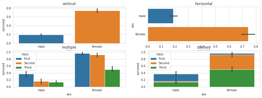
#4. 탑승 클래스('Pclass')별 + 성별('Sex') 생존여부('Survived') 데이터 분포  : catplot 참고
sns.catplot(x="age",y='class', hue='survived', data=titanic)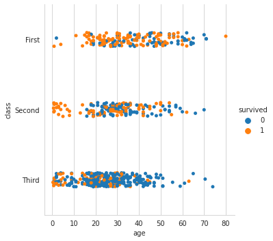
# 5. 나이('Age')를 8개 구간으로 나누고, 생존여부('Survived') 데이터 분포 확인하기 : histplot
sns.histplot(data = df, x = 'age', hue = 'survived', bins = 8, binwidth = 3)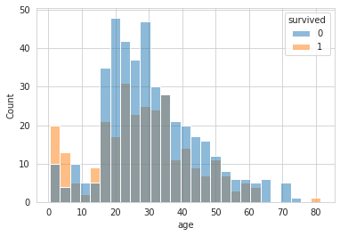
# 탑승 클래스('Pclass')별 + 성별('Sex') 생존여부('Survived') 데이터 분포: boxplot
sns.boxplot(x='pclass', y='sex', hue='survived', data=titanic)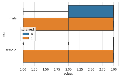
# 7. 탑승 클래스('Pclass')별 + 나이('Age') 생존여부('Survived') 데이터 분포 : violinplo
sns.violinplot(x='class', y='age', hue='survived', data=titanic, split=True);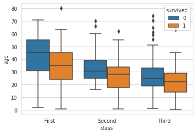
# 8. 탑승 클래스('Pclass')별 + 성별('Sex') 생존여부('Survived') 데이터 분포 : violinplot
sns.violinplot(x='pclass', y='sex', hue='survived', data=titanic, split=True);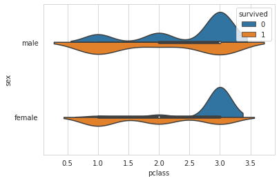
# 9 . 가족수(Family_size)와 혼자 탑승여부(Alone)에 따른 생존여부 확인하기 : factorplot 사용
titanic['Family_Size']=0
titanic['Family_Size']=titanic['parch']+titanic['sibsp']
titanic['Alone']=0
titanic.loc[titanic.Family_Size==0,'Alone']=1

sns.factorplot('Family_Size','survived',data=titanic)
sns.factorplot('Alone','survived',data=titanic)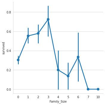
2. 네이버 기사 워드 클라우드
- word cloud library 설치
!pip install wordcloud
- 필요한 것 임포트 하기 !!
import requests
import pandas as pd
import matplotlib.pyplot as plt

from bs4 import BeautifulSoup
from wordcloud import WordCloud, STOPWORDS
# 코랩에서 한글 표기를 위한 Font 설치
!apt-get update -qq
!apt-get install fonts-nanum* -qq date='20220726'
# 네이버 랭킹 뉴스 (해당일자)
news_url = 'https://news.naver.com/main/ranking/popularDay.nhn?date={}'.format(date)
# HTTP, HTTPS 웹 사이트에 요청하기 위해 자주 사용되는 모듈
# Crawling 과정에서 requests모듈을 이용해 웹 사이트의 소스코드를 가져온 다음 파싱
headers = {'User-Agent' : 'Mozilla/5.0 (Windows NT 10.0; Win64; x64) AppleWebKit/537.36 (KHTML, like Gecko) Chrome/89.0.4389.90 Safari/537.36'}
req = requests.get(news_url, headers = headers)
# html 구문으로 분석
soup = BeautifulSoup(req.text, 'html.parser')
news_titles = soup.select('.rankingnews_box > ul > li > div > a')
crowling_title = []
for i in range(len(news_titles)):
crowling_title.append(news_titles[i].text)
print(i+1, news_titles[i].text) # 기사 제목 리스트 저장하기- 특수 문자 변환
filtered_title = "".join(crowling_title)

# 특수 문자 변환
specialChar = '...!@#$%^&()_{}[]\|;:''""<>?/=\n,…·'

for i in range(len(specialChar)):
  filtered_title = filtered_title.replace(specialChar[i], ' ')

filtered_title- 워드 클라우드 실시
# 워드클라우드 시각화

#font = '/usr/share/fonts/truetype/nanum/NanumGothicEco.ttf'
font = '/usr/share/fonts/truetype/nanum/NanumGothic.ttf'

wc = WordCloud(font_path=font,
		background_color="white",
		width=1000,
		height=1000,
		max_words=100,
		max_font_size=300)

wc = wc.generate(filtered_title)

plt.figure(figsize=(10,10))
plt.imshow(wc, interpolation='bilinear')
plt.axis('off')
plt.show()
- 불용어 처리
# 불용어 처리

stopword = set(STOPWORDS)
stopword.add('발암')
stopword.add('여교사')

wc = WordCloud(font_path=font,
    stopwords = stopword,
		background_color="white",
		width=1000,
		height=1000,
		max_words=100,
		max_font_size=300)

wc = wc.generate(filtered_title)

plt.figure(figsize=(10,10))
plt.imshow(wc, interpolation='bilinear')
plt.axis('off')
plt.show()

자습서 같은 공부 블로그 만들기!