📒 HTML
<!DOCTYPE html>
<html lang="en">
<head>
<meta charset="UTF-8">
<meta http-equiv="X-UA-Compatible" content="IE=edge">
<meta name="viewport" content="width=device-width, initial-scale=1.0">
<title>Document</title>
<link rel="stylesheet" href="css/style.css">
</head>
<body>
<div id="container">
<header>
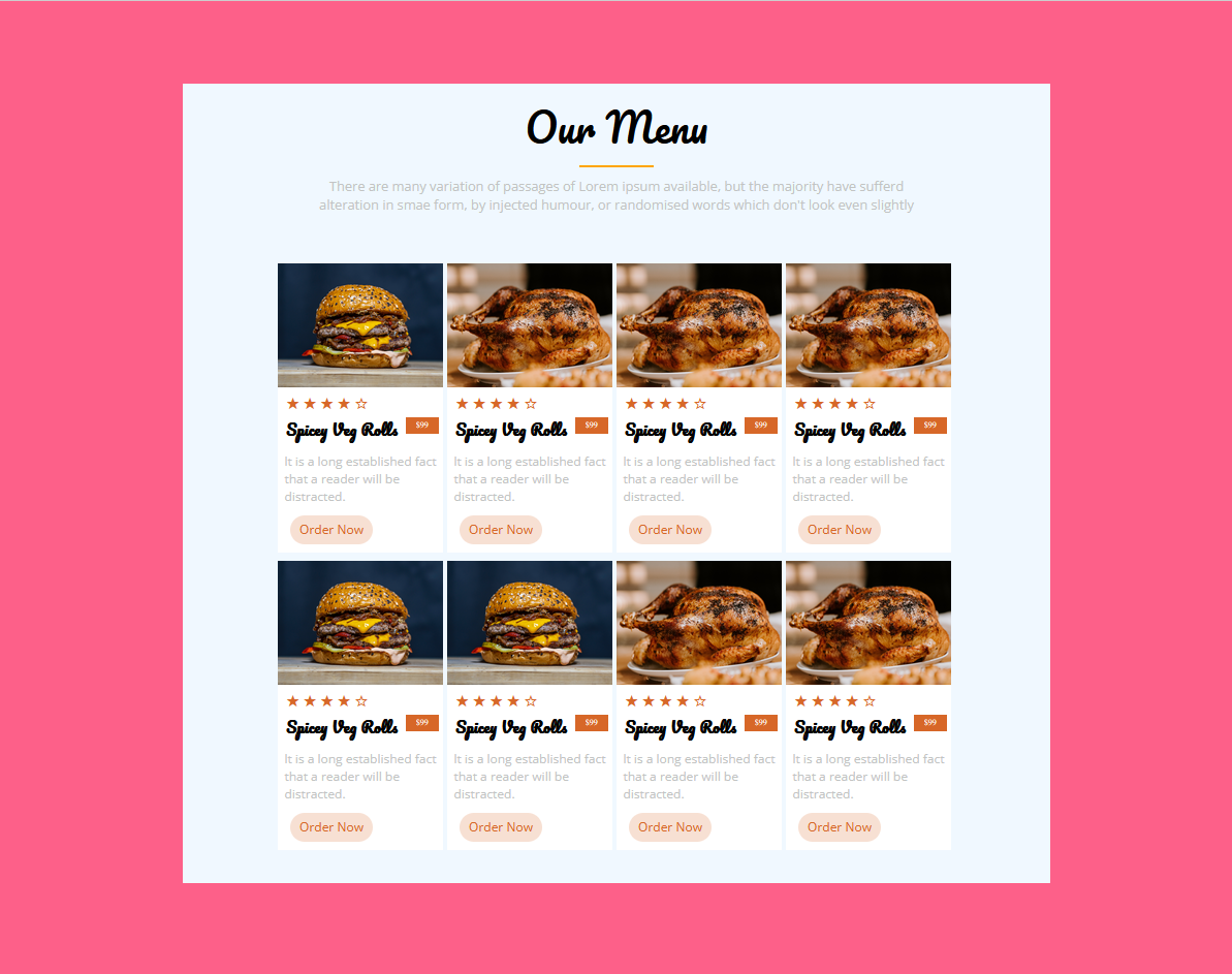
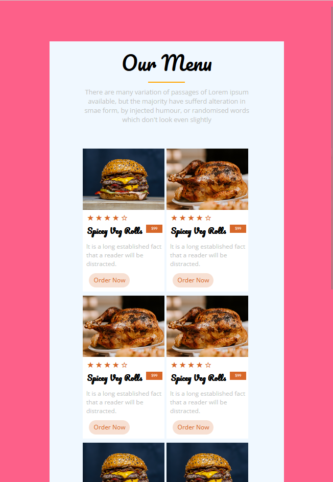
<p>Our Menu</p>
<div class="line"></div>
<aside>There are many variation of passages of Lorem ipsum available, but the majority have sufferd alteration in smae form, by injected humour, or randomised words which don't look even slightly</aside>
</header>
<main>
<section>
<div class="box">
<img src="images/hamburger.jpg" class="pic">
<p class="star">★★★★☆</p>
<h1> Spicey Veg Rolls</h1>
<div class="money">$99</div>
<p class="text">lt is a long established fact that a reader will be distracted.</p>
<input type="button" value="Order Now" class="button">
</div>
<div class="box">
<img src="images/chicken.jpg" class="pic">
<p class="star">★★★★☆</p>
<h1> Spicey Veg Rolls</h1>
<div class="money">$99</div>
<p class="text">lt is a long established fact that a reader will be distracted.</p>
<input type="button" value="Order Now" class="button">
</div>
<div class="box">
<img src="images/chicken.jpg" class="pic">
<p class="star">★★★★☆</p>
<h1> Spicey Veg Rolls</h1>
<div class="money">$99</div>
<p class="text">lt is a long established fact that a reader will be distracted.</p>
<input type="button" value="Order Now" class="button">
</div>
<div class="box">
<img src="images/chicken.jpg" class="pic">
<p class="star">★★★★☆</p>
<h1> Spicey Veg Rolls</h1>
<div class="money">$99</div>
<p class="text">lt is a long established fact that a reader will be distracted.</p>
<input type="button" value="Order Now" class="button">
</div>
<div class="box">
<img src="images/hamburger.jpg" class="pic">
<p class="star">★★★★☆</p>
<h1> Spicey Veg Rolls</h1>
<div class="money">$99</div>
<p class="text">lt is a long established fact that a reader will be distracted.</p>
<input type="button" value="Order Now" class="button">
</div>
<div class="box">
<img src="images/hamburger.jpg" class="pic">
<p class="star">★★★★☆</p>
<h1> Spicey Veg Rolls</h1>
<div class="money">$99</div>
<p class="text">lt is a long established fact that a reader will be distracted.</p>
<input type="button" value="Order Now" class="button">
</div>
<div class="box">
<img src="images/chicken.jpg" class="pic">
<p class="star">★★★★☆</p>
<h1> Spicey Veg Rolls</h1>
<div class="money">$99</div>
<p class="text">lt is a long established fact that a reader will be distracted.</p>
<input type="button" value="Order Now" class="button">
</div>
<div class="box">
<img src="images/chicken.jpg" class="pic">
<p class="star">★★★★☆</p>
<h1> Spicey Veg Rolls</h1>
<div class="money">$99</div>
<p class="text">lt is a long established fact that a reader will be distracted.</p>
<input type="button" value="Order Now" class="button">
</div>
</section>
</main>
</container>
</body>
</html>📒 CSS
@import url('https://fonts.googleapis.com/css2?family=Open+Sans:wght@300;400&family=Pacifico&display=swap');

* {
  margin: 0; padding: 0;
}

body {
  background-color: #FD6089;
}

#container {
  margin: 100px auto;
  width: 70vw;
  background-color: aliceblue;
}

  header > p {
    position: relative;
    top: 10px;
    font-size: 300%;
    text-align: center;
    font-family: 'Pacifico';
  }

  header > .line {
    margin: 15px auto 2px;
    width: 90px;
    height: 2px;
    background-color: orange;
  }

aside {
  position: relative;
  top: 10px;
  width: 50vw;
  text-align: center;
  margin: 0 auto;
  color: #C2C4C3;
  font-family: 'Open Sans';
}

section {
  display: flex;
  flex-flow: row wrap;
  justify-content: center;
  align-items: center;
  margin: 70px;
  padding-bottom: 30px;
}

.box {
  float: left;
  width: 200px;
  height: 350px;
  background-color: white;
  margin: 0px 5px 10px 0px;
}

  .box > .star {
    font-size: 20px;
    letter-spacing: 4px; /* 자간 */
    color: #D76728;
    margin-left: 10px;
  }

  .box > h1 {
    font-size: 110%;
    float: left;
    margin: 5px 10px;
    font-family: 'Pacifico';

  }
  .box > .money {
    float: left;
    width: 40px; height: 20px;
    background-color: #D76728;
    color: white;
    text-align: center;
    line-height: 2.0em;
    font-size: x-small;
    margin: 5px 5px 0px 0px;
  }
  .box > .text {
    position: relative;
    left: 8px; top: 8px;
    float: left;
    clear: both;
    font-size: 15px;
    color: #C2C4C3;
    font-family: 'Open Sans';
  }

  .box > .button {
    position: relative;
    top: 20px; left: 15px;
    width: 100px;
    height: 35px;
    border-radius: 2em;
    background-color: #F7E0D3;
    border: none;
    color: #D76728;
    font-size: 15px;
    font-family: 'Open Sans';
  }

  .box > .pic {
    width: 200px;
    height: 150px;
  }
📒 배운 점
✏️ 여러 개를 똑같이 사용할 때는 id 보다 class를 사용하자.
✏️ vw, vh 를 사용하자.
vh = viewport height
vw = viewport width
현재 실행중인 스크린 크기에 맞춰 상대적 크기를 반환
%와 다른 점은?
- vh 와 vw 는 열려있는 화면 전체의 상대길이이기 때문에 스크롤바를 포함한 길이를 반환
- 반면에 % 는 창이 중심이 아닌, %를 쓰고 있는 요소의 부모 요소의 길이에 맞게 반환
- 100%는 자신의 부모 요소의 width가 기준, 100vw는 브라우저 창의 width가 기준
- 만약 화면 넓이가 1920px이고 부모가 200px이면 100vw=1920px 100%=200px
비전공자 Java, JavaScript, Html, Css, C++ 공부중