transition
-
transition-property
-
transition-duration
.box {
  width: 100px;
  height: 100px;
  background: tomato;
  margin: 50px;
  transition: width 1s, background 1s;
  // transition-property : width, background;
  // transition-duration: 1s
}

.box:hover {
  width: 300px;
  background: dodgerblue;
}
transition은 바뀌기 전 상태에서 값을 정의해 준다.
transition은 모든 상태값을 같이 정의 할 수 있다.
property 는 바뀐 값의 키 값을 가지고
duration은 그 상태의 시간 (초) 를 나타낸다.
- transition-timing-funtion
기본 적인 값은
- ease 빠르게-느리게
- linear 일정하게
- ease-in 느리게-빠르게
- ease-out 빠르게-느리게
- ease-in-out 느리게-빠르게-느리게
- steps(n) n 값 만큼 멈춰서 진행
- transition-delay
2D 속성
transform
-
transform: rotate(45deg);
-
transform: translate(100px, 30px); //x축 , y축
=== position: relative, left: 100px, top: 30px 하면 같다. 하지만 position은 위치를 여기에 둬라가 끝이지만 translate는 거기까지 가는 과정을 성정 할 수있다.
.box {
  width: 100px;
  height: 100px;
  background: tomato;
  /* margin: 100px; */
  display: flex;
  justify-content: center;
  font-size: 30px;
  transition: 1s;
}

.box:hover {
  transform: translate(30px, 30px);
}
-
transform: scale(1.5)
hover를 이용하여 물체 확대
-
transform: skewX or Y(45deg) / skew (x축, y축)
X 또는 Y축으로 비트는 것이다. 두개다 같이 비트는 방식도 있다.
3D 속성
transform
- transform: perspective(500px) rotateX(45deg);
perspective(~px) 물체에 대해서 원근법을 사용해서 멀리서 보겠다는 의미,
이로 인해서 rotateX 축에 물체를 확인 할 수 있다.
값을 적당히 주어야 한다.
선언은 항상 맨 앞에
여기다 transition: 1s 를 주면 자연스럽게 움직인다.
transform-origin
- transform-origin
요소 변환의 기준점을 설정 ( 물체 회전 할 때에, 어디를 기준으로 할지 설정)
transform-origin: bottom right / bottom ...
기준 정하기 100%, 100% 하면 오른쪽 밑에 를 기준으로 설정한다.
- transform-style
3D 변환 요소의 자식 요소도 3D 변환을 사용할지 설정,
자식에 자식의 요소로 계속 내려갈 때에 속해서 명시 해줘야지 자식요서에서 변환이 잘 이루어 집니다.
기본적으로는transform-style이flat하게 되있기 때문이다.preserve-3d바꿔줘야 한다.
- perespective
하위 요소를 관찰하는 원근 거리를 설정
하위 요소가 많을 때에는 맨위에서 perspective를 설정하고
하나에서만 필요할 때에는 transform: perspective()를 이용해서 설정한다.
- perspective-origin
원근 거리의 기준점을 설정
perspective-origin: (50% 50%) 중앙을 보고 있다.
(0 50%) 왼쪽에서 보고 있다.
(0 120%) 왼쪽밑 밖에서 보고 있다.
- backface-visibility
3D 변환으로 회전된 요소의 뒷 부분 볼수 있다.
값 : visible ( 뒷면 숨기지 않음 )
hidden ( 뒷면 숨김 )
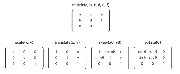
matrix(a,b,c,d,e,f)
요소의 2차원 변환 효과를 지정 , scale(), skew(), translate(), rotate()를 지정
카드 뒤집기
// HTML

<div class="cards">

  <div class="card">
    <div class="face face-front">
      <img src="https://st.depositphotos.com/1035350/2205/i/950/depositphotos_22054389-stock-photo-south-korean-flag.jpg" alt="korea">
    </div>
    <div class="face face-back">
      <img src="https://www.pngfind.com/pngs/m/638-6386507_10-years-of-experience-react-native-logo-svg.png" alt="react">
    </div>
  </div>
<!--  2222  -->
   <div class="card">
    <div class="face face-front">
      <img src="https://st.depositphotos.com/1035350/2205/i/950/depositphotos_22054389-stock-photo-south-korean-flag.jpg" alt="korea">
    </div>
    <div class="face face-back">
      <img src="https://www.pngfind.com/pngs/m/638-6386507_10-years-of-experience-react-native-logo-svg.png" alt="react">
    </div>
  </div>


</div>

//CSS

.cards {
  padding: 20px;
}

.card {
  width: 150px;
  height: 220px;
  margin-right: 15px;
  position: relative;
  float:left;
  perspective: 600px;
}

.card .face {
  width: 150px;
  height: 220px;
  border: 1px solid lightgray;
  border-radius: 10px;
  display: flex;
  justify-content: center;
  align-items: center;
  transition: 1s;
  position:absolute;
  backface-visibility: hidden;
  background-color: white;
}

.card .face-front {
  background-img: url("https://heropy.blog/css/images/pattern.png")
  transform: rotateY(0deg);
}

.card:hover .face-front {
  transform: rotateY(-180deg);
}

.card .face-back {
  transform: rotateY(180deg);
}

.card:hover .face-back{
  transform: rotateY(0deg);
}

.card .face-front img {
  width: 90px;
  filter: grayscale();
  opacity: 0.7;
}

.card .face-back img {
  width: 120px;
}