flex box 의 기본
flex는 강하다. 그래서children과 대화하지 않는다.flex로 box를 움직이고 싶다면 그들의 부모, 즉flexbox container를 만들어야 한다.flexbox container를 통해 box들을 배치해야 하는 것이다.
css
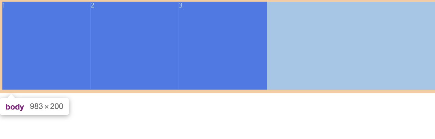
body {
  display: flex;
}

.box {
  background: blue;
  width:200px;
  height:200px;
  color:white;
}
과감하게 body 에 display: flex를 주었다. 아이들은 전보다 다소 온순해졌다.
당연한 얘기지만
container(parent)는 언제나 바로 상위 태그에 존재해야 한다. 조부모는 안 된다. 오직 부모여야 한다.
justify-content 와 align-item
display: flex를 당한 flex children는 수평축을 중심으로 나란히 선다. 이 수평축의 있는 flex children의 위치를 바꾸고 싶다면 justify-content 를 사용하면 된다.
justify-content: center
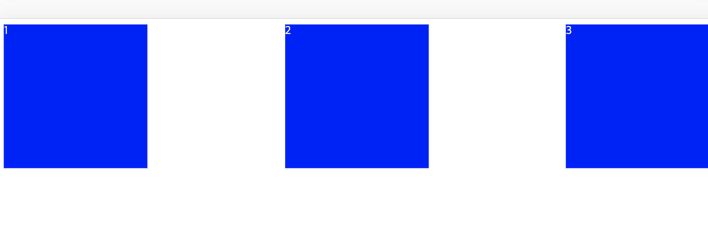
애매할 때 자주 사용하는 justify-content: space-bewteen
main axis 와 cross axis
flex direction의 기본은 row다. row일 때의 main axis는 가로고 반대로 cross axis 는 세로다.
align item은 flex direction이 row일 때, cross axis 방향으로 item을 옮긴다.
.wrapper {
  display: flex;
  justify-content: space-around
  align-items: center
}
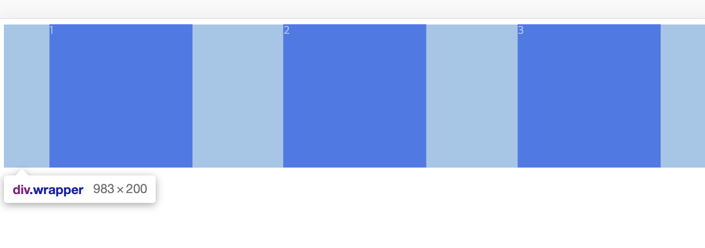
.wrapper 라는 container 를 추가하고 align-items: center 투여했다. 하지만 아무 반응이 없다. 그 이유는 .wrapper 의 height가 box의 height와 같기 때문이다.
.wrapper {
  height: 100vh;
  display: flex;
  justify-content: space-around
  align-items: center
}
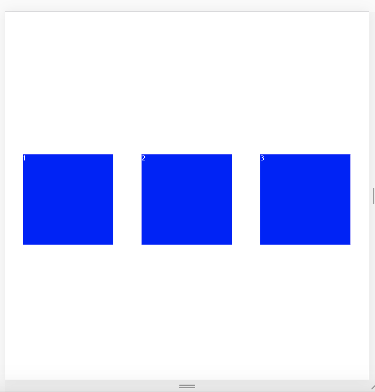
화끈하게 height: 100vh을 주었더니 화면 가운데로 이동했다. 생각보다 말을 잘 듣는다.