align-self
css
.father {
  display: flex;
  justify-content:space-around;
  height: 100vh;
}
.child {
  background: blue;
  width:200px;
  height:200px;
  color:white;
}

.child:nth-child(2) {
align-self: center;
}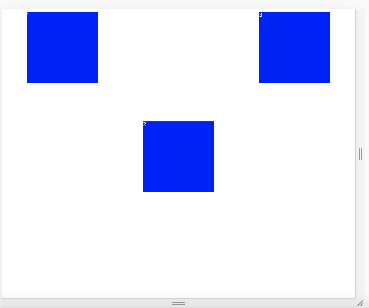
child 에게 직접 입력했더니 2번째 box만 이동했다.
여태까지 parent에 property를 주어 child를 움직였다. 하지만
align-self는 child에게 직접 property를 주어 개별적으로 배치한다.
child에게 직접 property를 주기 위해서는 parent의 높이를 먼저 설정해야 한다.
wrap
이번엔 box를 3개 더 추가했다.
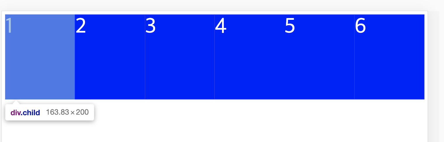
무언가 이상하다. 분명 height와 width 를 200px로 지정했는데 width 가 163px이다.
이유는
flex box는 item들이 모두 같은 줄에 있게 만든다.width가 바뀌더라도 한 줄에 채워 넣는 것이다.
.father {
  display: flex;
  justify-content:space-around;
  height: 100vh;
  flex-wrap: wrap;
}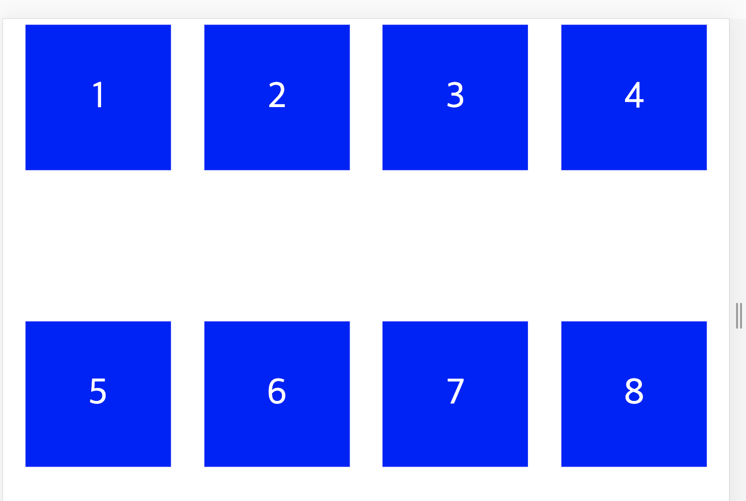
child에 flex, align-items, justify-content를 주어 숫자들이 가운데 오게 한 후 parent에 flex-wrap: wrap 을 먹였다. flex-wrap: wrap은 child의 크기를 유지하라는 명령이다.
align-content
1번부터 4번 box와 4번부터 8번 박스 사이에 있는 빈 공안을 align-content 라고 부른다. justify-content 와 비슷한데 line의 영역에 관한 property다.
.father {
  display: flex;
  justify-content:space-around;
  height: 100vh;
  align-content: flex-start;
  flex-wrap: wrap;
}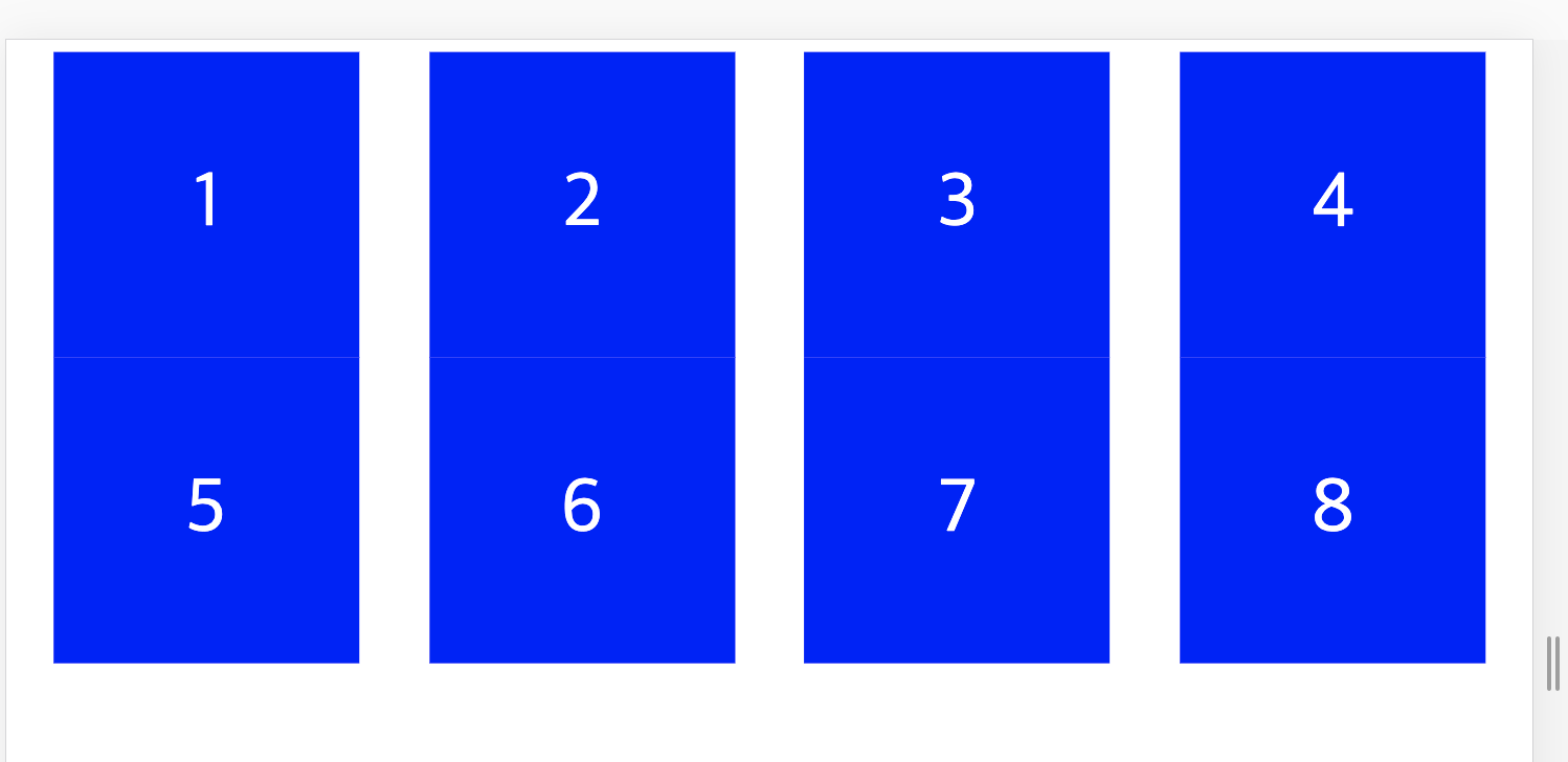
align-content: flex-start를 parent에게 드리니 가운데 빈 공간이 사라졌다. 매우 놀라운 일이다.

프론트엔드 개발