.grid {

display: grid;
grid-template-columns: 100px 100px 100px 100px;
grid-template-rows:200px 200px 200px 200px;

}
다짜고짜 grid와 함께 시작하는 아침이다. 위 100x200 grid는 css 함수로 표현 가능하다.
.grid {

display: grid;
grid-template-columns: repeat(4, 100px);
grid-template-rows: repeat(4, 200px);
}
grid-template-area
정말 직관적인 방법이다. 원하는 레이아웃을 적어내는대로 grid가 완성된다.
.grid {
display: grid;
grid-template-columns: repeat(4, 100px);
grid-template-rows: repeat(4, 50px);
grid-template-areas:
"header header header header"
"content content content nav"
"content content content nav"
"footer footer footer footer";
}
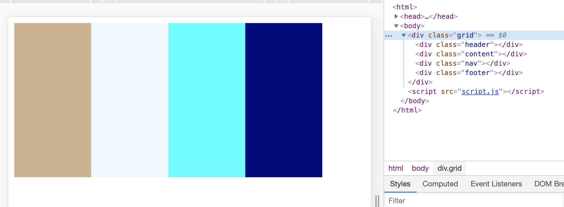
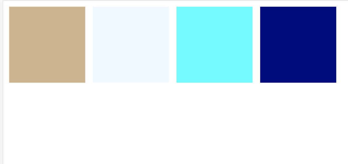
.header {
background-color: tan;
grid-area: header;
}
.content {
background-color: aliceblue;
grid-area:content;
}
.nav {
background-color: aqua;
grid-area:nav;
}
.footer {
background-color: navy;
grid-area:footer;
}
짜잔
column, row
그렇다면 이제 area 를 사용하지 않고 column과 row만으로 표현하는 방법을 알아야 한다.
.grid {

display: grid;
grid-gap: 10px;
grid-template-columns: repeat(4, 100px);
grid-template-rows: repeat(4, 100px);

}
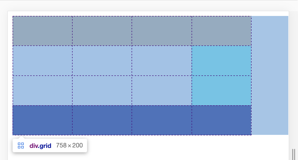
100x100 박스가 16개 들어가는 grid를 만들고 child를 손보면 된다.
.header {
background-color: tan;
grid-column-start: 1;
grid-column-end: 2;
}
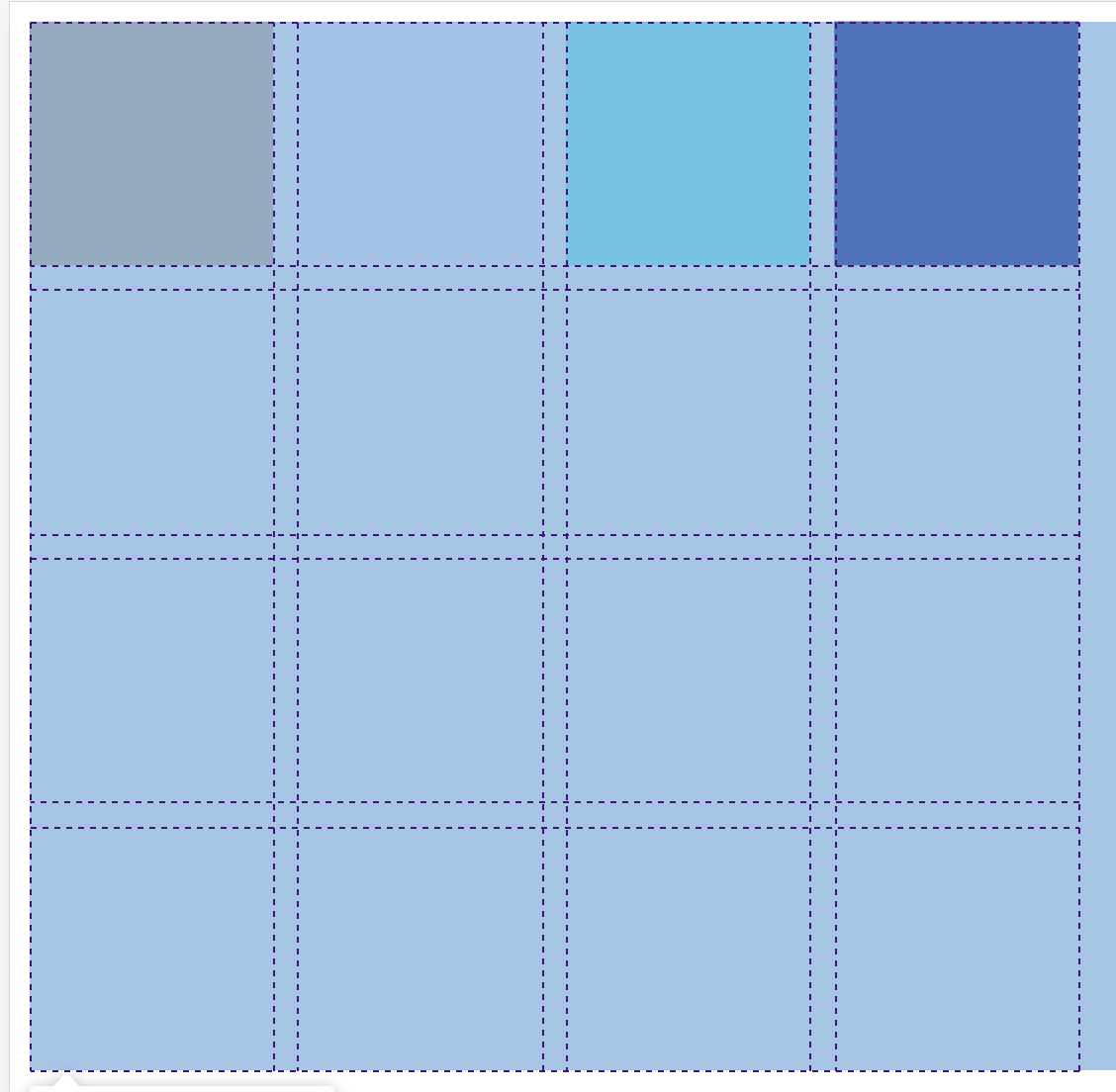
grid-column-start 와 grid-column-end를 지정했는데 아무 일도 발생하지 않았다. 그 이유는 property에서 말하는 column은 box가 아니라 box와 box 사이 빈 공간이기 때문이다.

.header {
background-color: tan;
grid-column-start: 1;
grid-column-end: 3;
}
3으로 end를 변경하니까 box 두 개가 하나가 되었다. 위 방법으로 area를 표현하자면
.header {
background-color: tan;
grid-column-start: 1;
grid-column-end: 5;
}

.content {
background-color: aliceblue;
grid-column-start: 1;
grid-column-end: 4;
grid-row-start : 2;
grid-row-end: 4;
}

.nav {
background-color: aqua;
grid-row-start : 2;
grid-row-end: 4;
}
.footer {
background-color: navy;
grid-column-start: 1;
grid-column-end: 5;

}
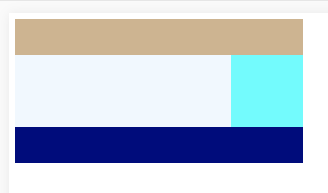
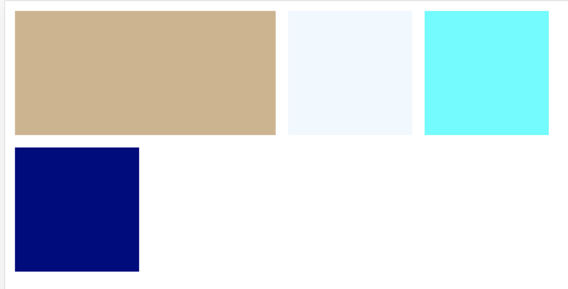
짜잔 완성이다. 하지만 더 간단한 방법이 있다. 위 area를 더 쉽게 표현해보자.
.header {
background-color: tan;
grid-column : 1 / 5;
}

.content {
background-color: aliceblue;
grid-column: 1 / 5;
grid-row: 2 / 4
}

.nav {
background-color: aqua;
grid-row: 2 / 4
}

.footer {
background-color: navy;
grid-column : 1 / 5

}
grid-column : 1 / 5 이란 문법은 column의 시작과 끝을 정해주는 것이다. 예를들어 수십개의 column 작업한다고 했을 때 box와 box를 다 세어야 한다. 시작과 끝을 정해주는 것보다 얼마나 큰지를 얘기해주는 것이 더 효율적이라는 것이다! 예를들어 grid-column : 1 / 5 대신 grid-column : 1 / -1 는 첫 번째부터 끝까지라는 뜻이다.
grid-column : 1 / 5에 숫자를 적는 것 대신 span을 사용할 수도 있다. span은 얼마나 많은 cell(여기에서는 박스)를 가질 것인지 정해준다.
.header {
background-color: tan;
grid-column : span 4;
}
span을 사용할 때 시작점 정하는 것을 잊으면 안 된다