
사진 넣기
 <div class="photo-container" style="--direction:normal;">
    <div class="photo-wrapper">
        <img class="a"/>
        <img class="b"/>
        <img class="a"/>
        <img class="b"/>
    </div>
</div>- 필자는 2장을 할것이라 2장을 이어서 2번 넣었다.
css적용하기
@keyframes slide {
	0% { transform: translateX(0); }
	25% { transform: translateX(-25%); }
    50% { transform: translateX(-25%); }
    75% { transform: translateX(-50%); }
    100% { transform: translateX(-50%); }
}
.photo-container {
	width: 56px;
	height: 56px;
	bottom: 98px;
	right: 20px;
	position: fixed;
	border-radius: 50%;
	overflow: hidden;
	background-color: #C7EAFF;
	box-shadow: 2px 2px 12px 0px rgba(0, 0, 0, 0.2);
	z-index: 2;
}
.photo-wrapper {
	display: flex;
    width: calc(100% * 4);
    height: 100%;
    animation: 3s linear infinite 2s slide;
}
.photo-wrapper img {
    width: 25%;
    height: 100%;
    object-fit: cover;
}
.photo-wrapper img.a {
    content: url(./images/example1.png);
}
.photo-wrapper img.b {
    content: url(./images/example2.jpg);
}-
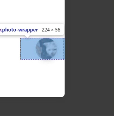
photo-wrapper에 적용된 animation 디테일
-
2장의 사진이 이동하면서 끊어지지 않아야 하기 때문에
0, 25, 50, 75, 100 으로 끊어서 translateX값을 적절히 주도록 한다. -
slide애니메이션이 적용되는 모습

기록남기기