본 내용은 엘리스 SW 4기에서 학습한 내용을 정리한 것입니다.
📌 웹사이트의 움직임-transform, transition, animation
애니메이션을 구현하는 4가지 방법
1. CSS - Transition
2. CSS - Keyframe Animation
3. Javascript - Web Animation API
4. Javascript - requestAnimationFrame
1. Transform
웹사이트 특정 영역에서 object각도 틀거나 크기 조정, 위치 변경할 때 사용
- rotate(45deg) : 입력한 각도만큼 회전, 음수도 입력 가능
- 평면적 회전
- scale(width, height) : 매개변수로 숫자를 넣음, 숫자는 비율 의미
- scale(2,3)→ width를 2배, height를 3배 확대
- 축소시키기 위해서는 소수점 이용
- 특정 object의 크기를 비율로 키우거나 축소
- skew(x축, y축) : 입체적으로 각도를 비틀 때 사용
- skew(10deg, 20deg)
- x축, y축을 기준으로 입력한 긱도만큼 비틂
- translate(x축, y축) : 선택한 오브젝트의 좌표 변경
- 선택한 오브젝트를 몇만큼 옮기겠다.
- prefix접두사
-
css3의 최신 언어이기때문에 하위버전에선 사용 불가.
-
transform으로 단독으로 입력하면 익스플로러에서 사용 불가
-
각 버전에 맞게 접두사를 붙임
.transition {
  -webkit-transform: translate(100px, 200px); /* 크롬, 사파리 */
  -moz-transform: translate(100px, 200px);    /* 파이어폭스 */
  -ms-transform: translate(100px, 200px);     /* 익스플로러 9.0 */
  -o-transform: translate(100px, 200px);      /* 오페라 */

}
-
transform-origin
transform 속성과 함께 사용되는 속성, 회전 중심을 지정, rotate(), skew() 등의 회전, 변형 속성을 사용하기 전에 기준점 지정
- transform-origin : 0 % 0 % → 왼쪽 상단 모서리에 위치
- transform-origin : 100 % 100 %; → 오른쪽 하단 모서리에 위치
- transform-origin : 0 100 → 왼쪽 하단 모서리에 위치
- transform-origin : 50 50 → 중간, default값
속성 중복 시
.transform {
  width: 100px;
  height: 100px;
  background-color: aquamarine;
  margin: 200px 0 0 200px;
  transform: rotate(45deg);
  transform: scale(0.5, 2);
  transform: translate(100px, 200px);
  transform: skew(10deg, 20deg);
}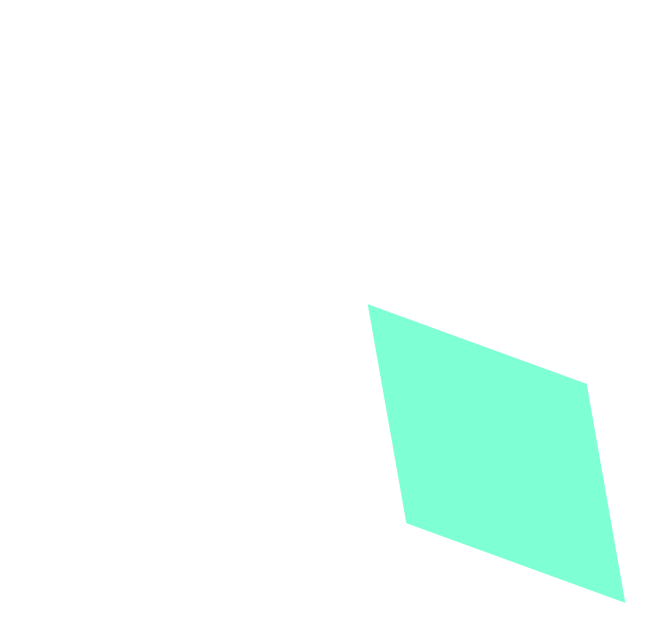
transform을 여러개 기입하면 겹쳐지게 되어 맨 마지막 속성만 적용이 된다.
일반 width, transform width지정
- 일반 width
/* 일반 width지정 */
.box {
	width: 200px;
}
- transform width
그 안에 있는 내용이 있을 경우 영향을 끼치게 됨
=> 레이아웃에 영향을 끼침 => 텍스트가 그려진 후 비율로 변화할 때 텍스트에 영향을 미치게 됨
/* transform width지정 */
.box {
	width: 100px;
    transform: scale(2,1);
}
transform 사용하는 이유
- width 사용 시 레이아웃을 계산 단계에서 적용된다.
- transform으로 사용 시 레이아웃을 계산 후 적용된다.
transform 쓴 후 레이어 겹치게 되는 문제
- position, z-index를 사용해서 해결
직접 구현하기 전까지는 레이아웃에 영향을 미치는 지 안 미치는 지 정확히 알 수 없다.
Transform으로 어떻게 지지고 볶든 해도 그 다음 오는 엘리먼트의 위치는 고정이다
transform 서순
- transform 속성을 한 줄에 다 쓸 때 실행 순서
마지막에 쓰여진 것부터 실행시킨다. 뒤부터 앞으로 사용된다.
2. Transition
변화하는 과정을 보여주고 싶을 때 사용
- property : 효과를 적용하고자 하는 css 속성
transition-property: width;→ width값이 변화하는 과정을 사용자에게 보여주겠다.- 여러개일 때 각각 작성 가능, 쉼표로 순서대로 구분
- duration : 효과가 나타나는데 걸리는 시간, ~초 동안(while) 효과 발동
transition-duration: 2s;→ 바뀌는데 어느정도의 소요시간을 설정할 것인지, 2초의 시간을 적용
- timing-function : 효과의 속도
- 변화하는 데 속도값에 영향, 빨라졌다가 일정하게, 일정했다가 빨라지게, 느려졌다가 일정하게….etc
transition-timing-function: linear;→ linear은 ‘일정하게’라는 의미
- delay: 특정 조건 하에서 효과 발동, ~초 후에(after) 효과 발동
- ex) 마우스 올렸을 때 바뀌었으면 좋겠다, 근데 바로 바뀌는 게 아니라 약간의 delay를 주고 싶다.
transition-delay: 1s;→ 1s는 ‘1초 후’라는 의미
- 가상 선택자: hover
- css에서 미리 만들어 놓은 클래스
- ‘마우스를 올렸을 때 라는 조건
선택자:hover { width: 300px; }: 마우스를 올렸을 때 width값을 바꾼다.
- Transition 종합
-
마우스를 올리면 1초 후에 width값이 300px로, 2초 동안, 속도 일정하게 변하는 애니메이션 효과 발동
.transition: width 2s linear 1s; .transition:hover { width: 300px; } -
1줄에 다 쓸 수 있지만, 항상 먼저 나오는 숫자가 duration이고 그 다음에 나오는 숫자가 delay. (숫자가 하나인 경우 ⇒ duration)
-
마우스를 올리면 1초 후에 width값이 300px로, 2초 동안 속도 일정하게 변하는 애니메이션 효과 발동
-
3. Animation
조건에 상관없이 어떤 이벤트를 적용하고 싶을 때 사용
ex) 웹사이트 들어가자마자 사진이 돌아간다던가
.animation {
	animation-name: changeWidth;
	animation-duration: 3s;
	animation-timing-function: linear;
	animation-delay: 1s;
	animation-iteration-count: 6;
	animation-direction: alternate;
}

/* keyframs 옆에는 애니메이션 이름을 작성
위에는 조건, 아래는 실제 변화되는 결과값을 입력.
300픽셀에서 600픽셀로 변화
*/
@keyframes changeWidth{
	from { width: 300px ;}
	to { width: 600px; }
}- name: 애니메이션에 대한 이름, 임의로 작성 가능
- duration: 애니메션이 동작하는데 소요되는 시간, while
- timing-function: 속도 성격 규정, 애니메이션이 작동하는 방식(부드럽게, 끊기게)
- delay: 몇 초 후에 애니메이션 동작?
- iteration-count: 애니메이션 반복 횟수, 몇 회 반복 효과를 적용할 것인지?,
무한: infinite - direction: 애니메이션 진행 방향
- alternate : from → to → from, 반복 효과
- normal: from → to, from → to, 시작 → 끝
- reverse: to → from, to → from, 끝 → 시작
- play-state: 애니메이션 재생/정지
- runnig: 기본값으로 애니메이션 실행
- paused: 애니메이션 동작을 일시 정지
@keyframes
% 속성 : 애니메이션의 실행 중간 속성
- 애니메이션 from(0%) to(100%)라고 생각했을 때 애니메이션의 실행 중간상태
- ex) 10% → 애니메이션의 실행 중 10%
- 0~100%까지 걸리는 시간이 duration 시간과 같다
- transition을 사용하면 from-to만 속성을 지정할 수 있다. animation은 그 사이사이에 속성을 지정 가능하다.
4. 애니메이션 응용
Transform & Animation 결합
.box1 {
	animation: rotation 1500ms linear infinite alternate;
}

@keyframes rotation{
	from { transform: rotate(-10deg); }
	to { transform: rotate(10deg); }
}- 한 줄로 작성 가능, 순서는 상관 없으나, 숫자 순서는 첫번째 숫자는 duration, 두번째 숫자는 delay라는 점은 기억
- 1000ms → 1s(1초)
애니메이션도 prefix를 달 수 있다.
.box1 {
  animation: rotation 3s linear 1s 6 alternate;
}
@-webkit-keyframes rotation {
  from {
    -webkit-transform: rotate(-10deg);
  }
  to {
    -webkit-transform: rotate(10deg);
  }
}- 애니메이션에 prefix를 달려면 그 하위 keyframes에 모든 곳에도 동일한 prefix를 달아야한다.
- 각각의 따로 prefix를 다는 작업이 필요하다. → 코드 분량이 늘어남
5. 예제
메뉴 영역 애니메이션
- 메뉴버튼 마우스 올렸을 때 글자색 변함
#intro nav ul li a{
	transition: color 1s;
}

#intro nav ul li a: hover {
	color: #917f7f;
}
본문 영역 애니메이션
- 본문 영역 마우스 올렸을 때 배경색 달라지고 이미지 커지는 효과
/* 배경색 변경 효과 */
#main article.one{
	transition: background-color 1s;
}

#main article.one{
	background-color: #8683bd;
}

/* 이미지 크기 확대 효과 */
#main article img {
	transition: all 1s;
}

#main article img: hover{
	transform: scale(1.1);
}- transition 속성에 all → img에 적용되어있는 모든 속성값들에 영향을 주겠다. (ex. width, height, …)
- transform으로 이미지의 크기를 원래 크기보다 1.1비율정도로 키우겠다.
margin: 0 auto; → x축으로 중앙정렬
.container {
  width: 960px;
  margin: 0 auto;
}- 공간에 대한 명확한 크기를 가지고 있는 블록요소에서 사용이 가능함.
- 상하는 0으로 하고, 좌우를 자동으로 맞춰라
(심화) 애니메이션 중첩
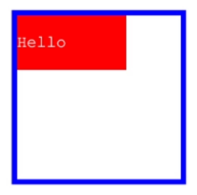
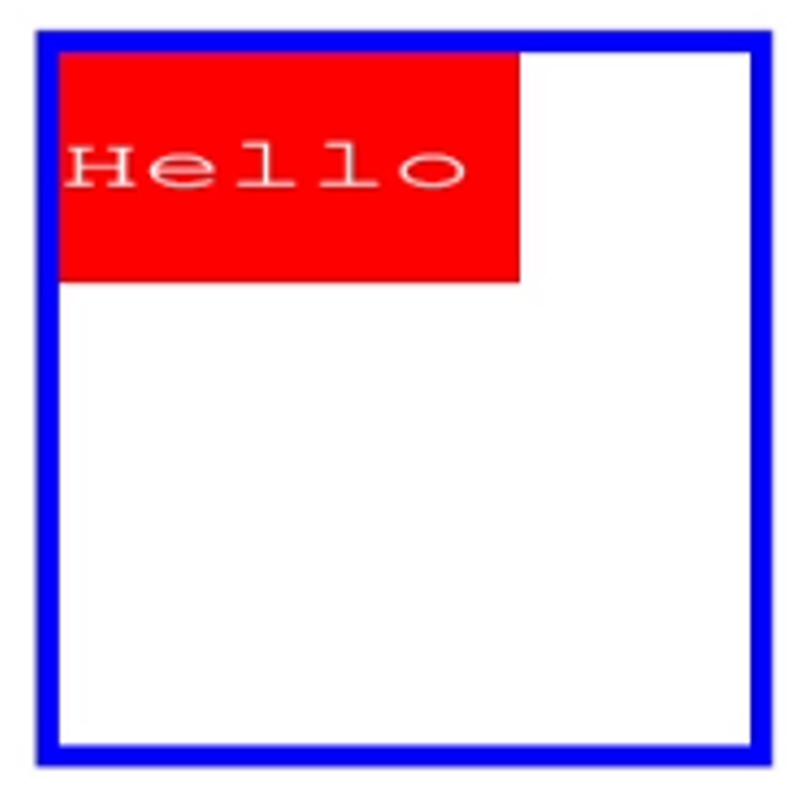
🧐 사각형이 떨리면서 움직이게 하고 싶다
=> div태그를 부모, 자식으로 나누고, 부모의 div태그에 shake애니메이션을 지정하고, 자식의 div태그에 움직이는 애니메이션을 넣으면 됨
<style>
      div.container {
        width: 100px;
        height: 100px;
        animation-name: shake;
        animation-duration: 400ms;
        animation-iteration-count: infinite;
      }

      div.container div {
        width: 100%;
        height: 100%;
        background-color: #333;
        animation: move, color;
        animation-duration: 5s, 1s;
        animation-timing-function: ease-out, ease-in-out;
        animation-delay: 300ms, 100ms;
        animation-play-state: running;
        animation-direction: normal;
        animation-iteration-count: infinite;
      }

      @keyframes move {
        from,to { transform: translate(0, 0); }
        10% { transform: translate(30px, 80px) rotate(45deg); }
        30% { transform: translate(200px, 0px); }
        50% {
          transform: translate(100px, 50px) rotate(140deg) scale(1.3, 1.3);
          color: red;
        }
        60% { transform: translate(200px, 200px); }
        80% {
          transform-origin: 0 100%;
          transform: translate(0px, 200px) scale(2, 2);
        }
      }
      @keyframes color {
        from, to { background-color: #333; }
        50% { background-color: blue; }
        70% { background-color: yellow; }
        90% { background-color: crimson; }
      }
      @keyframes shake {
        from, to { transform: scale(1, 1); }
        33% { transform: scale(1.4, 1.4); }
        66% { transform: scale(0.8, 0.8); }
      }
</style>
...
<body>
  <div class="container">
    <div>Hello</div>
  </div>
</body>
📌 모바일에 대응하는 웹사이트-미디어쿼리
1. media-query
.media {
	width: 500px;
	height: 500px;
	background-color: red;
}

@media (min-width: 320px) and (max-width: 800px) {
	width: 300px;
	height: 300px;
	background-color: yellow;
}- min-width와 max-width로 브라우저 가로폭 설정
- 브라우저의 가로폭이 최소 320px, 최대 800px이 되었을 경우, 중괄호 안의 css 속성으로 대체하겠다는 의미
2. 미디어쿼리 주의사항
viewport
viewport라는 meta태그에 속성값을 반드시 기입 > head태그 안 쪽에 기입
<meta name="viewport" content="width=device-width", initial-scale=1.0">- 미디어쿼리가 제대로 작동하지 않는 문제가 발생할 수 있으므로 viewport로 너비와 배율을 설정해야 모바일 디바이스에서 의도한 화면을 볼 수 있음
- viewport
- 다양한 디지털 기기의 화면상에 표시되는 영역을 의미.
- 너비와 배율을 설정할 때 사용하는 메타 태그의 속성 중 하나
- content
- width=device-width → viewport의 가로폭 = 디바이스의 가로폭
- initial-scale=1.0 → 비율은 항상 1.0, 화면의 초기 비율은 항상 1.0으로 유지시키겠다라는 의미
CSS 속성 상속
.media {
	width: 500px;
	height: 500px;
	background-color: yellow;
}
@media (min-width: 320px) and (max-width: 800px) {
	.media {
		width: 300px;
		height: 300px;
		background-color: none;
	}
}- 미디어쿼리 외부 영역에 있는 CSS 속성을 상속받음
- 만약 상속을 받지 않고자 하면 속성값으로 none입력
3. 미디어쿼리 적용하기
- header → 로고 100%, 메뉴 100%
- main → 각각의 영역들 100%, y축 배치
- footer → 좌우배치 → center y축배치
@media (min-width: 320px) and (max-width: 1000px) {
  .container {
    width: 640px;
  }

  #intro {
    width: 100%;
  }

  #intro h1 {
    width: 100%;
    height: 160px;
  }

  #intro h1 a {
    text-align: center;
    padding: 22px 0 0 0;
  }

  #intro nav {
    width: 100%;
  }

  #main article {
    width: 100%;
    height: 420px;
  }
  #footer {
    padding: 30px 0;
  }
  #footer .copyright,
  #footer .address {
    width: 100%;
  }
  #footer .copyright p,
  #footer .address p {
    text-align: center;
    padding: 0;
  }
  #footer .address p {
    padding-top: 20px;
  }
}
4. SCSS 믹스인 미디어쿼리 사용시
이것은 내가 프로젝트하면서 믹스인 사용할 때 썼던 것임. 엘리스에서는 scss 안 배움
- 변수 작성 파일들 앞에는 언더바 _를 붙임
- 언더바를 붙여 작성해야 파일단위로 분리되어 컴파일X
- 변수만 따로 저장해놓을 파일이기에 별도의 css파일로 컴파일될 필요 없음
- 성능 및 관리상의 이득
- import 해올 때 언더바, 확장자 제외해도 정상 동작
- _common.scss
- max-width에서는 -1px를 해줘야 해당 너비에서 정상 동작한다.
/*반응형 화면 크기 변수*/
$breakpoint-mobile: 335px;
$breakpoint-tablet: 758px;
$breakpoint-desktop: 1024px;

@mixin mobile {
  @media (min-width: #{$breakpoint-mobile}) and (max-width: #{$breakpoint-tablet - 1px}) {
    @content;
  }
}

@mixin tablet {
  @media (min-width: #{$breakpoint-tablet}) and (max-width: #{$breakpoint-desktop - 1px}) {
    @content;
  }
}

@mixin desktop {
  @media (min-width: #{$breakpoint-desktop}) {
    @content;
  }
}- 믹스인 사용할 파일.scss
@import "**_common.scss**";

@include mobile {
  .img-card {
    width: 100px;
  }
}

@include tablet {
  .img-card {
    width: 200px;
  }
}

@include desktop {
  .img-card {
    width: 300px;
  }
}