DEMO

네이버 결제, 은행 앱 비밀번호 창 등등 모바일에서 password design 을 custom 하여 많이 사용하는 것 같다.
네이버에서 상품을 결제할 때, 아래와 같은 화면이 나타나고, 숫자를 입력할 때마다 동그라미 안에 color 색상이 변경되어진다. 아래와 같은 화면을 react를 이용하여 나만의 방법으로 만들어보았다.
네이버에서는 직접 모바일 숫자 키패드를 커스터마이징하여 구현하였는데, 나는 숫자 키패드는 일반적인 input 키패드를 사용할 것이다. 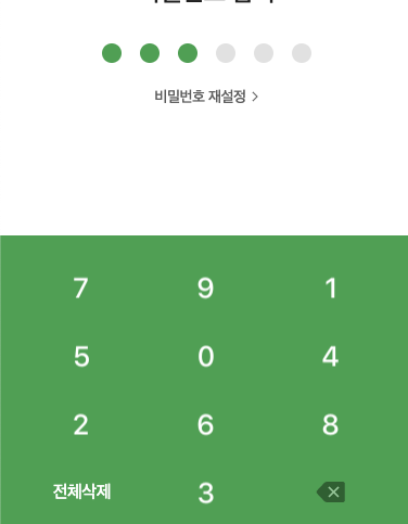
JSX
구현된 함수들은 Class 함수를 만들어서 import를 해오는 방법으로 작성하였다.
import React, { useState, useEffect, useRef } from 'react';
import { StyledPassword } from '../styles/password'
import PasswordPresentor from './password-presentor';

export default function Password() {
  // 함수들은 Class 를 외부에서 생성하여 import를 하여 사용하였다.
  const passwordPresentor = new PasswordPresentor(); // 인스턴스 생성

  const inputRef = useRef([]); // value들을 담을 ref 배열

  // input value
  const [state, setState] = useState({
    value1: '',
    value2: '',
    value3: '',
    value4: '',
    value5: '',
    value6: '',
  });

  // input onChange
  const handleInputChange = (e) => {
    passwordPresentor.handleInputChange(e, state, setState);
  };

  // value 입력 시, 다음 Index로 focus 이동
  const handleNextFocus = () => {
    passwordPresentor.handleNextFocus(inputRef);
  };

  // value 삭제
  const handleDeleteEvent = (e) => {
    passwordPresentor.handleDeleteEvent(e, inputRef, state, setState);
  };

  // 랜덤한 value 클릭 시, 비어있는 index에 focus 지정
  const emptyIndexFocus = () => {
    passwordPresentor.emptyIndexFocus(inputRef);
  };

  // value 값 존재 시에, 색상 변경
  const valueColorActive = (checkState) => {
    return checkState ? 'input-on-active' : undefined;
  };

  useEffect(() => {
    inputRef.current[0].focus(); // 마운트 > 첫 번째 value에 focus
    handleNextFocus(); // 각각의 value에 값을 입력 시, 다음 value 로 focus 이동
  }, [state]); // dependency 에 state 를 넣음으로써, state의 값이 변경될 때마다 리렌더링

  return (
    <StyledPassword>
      <div className="masking-input">
        <label className={valueColorActive(state.value1)}>
          <input
            type="number"
            value={state.value1}
            name="value1"
            pattern="\d*"
            inputMode="numeric"
            ref={(el) => (inputRef.current[0] = el)}
            onClick={emptyIndexFocus}
            onChange={handleInputChange}
            onKeyDown={handleDeleteEvent}
          />
        </label>
        <label className={valueColorActive(state.value2)}>
          <input
            type="number"
            value={state.value2}
            name="value2"
            pattern="\d*"
            inputMode="numeric"
            ref={(el) => (inputRef.current[1] = el)}
            onClick={emptyIndexFocus}
            onChange={handleInputChange}
            onKeyDown={handleDeleteEvent}
          />
        </label>
        <label className={valueColorActive(state.value3)}>
          <input
            type="number"
            value={state.value3}
            name="value3"
            pattern="\d*"
            inputMode="numeric"
            ref={(el) => (inputRef.current[2] = el)}
            onClick={emptyIndexFocus}
            onChange={handleInputChange}
            onKeyDown={handleDeleteEvent}
          />
        </label>
        <label className={valueColorActive(state.value4)}>
          <input
            type="number"
            value={state.value4}
            name="value4"
            pattern="\d*"
            inputMode="numeric"
            ref={(el) => (inputRef.current[3] = el)}
            onClick={emptyIndexFocus}
            onChange={handleInputChange}
            onKeyDown={handleDeleteEvent}
          />
        </label>
        <label className={valueColorActive(state.value5)}>
          <input
            type="number"
            value={state.value5}
            name="value5"
            pattern="\d*"
            inputMode="numeric"
            ref={(el) => (inputRef.current[4] = el)}
            onClick={emptyIndexFocus}
            onChange={handleInputChange}
            onKeyDown={handleDeleteEvent}
          />
        </label>
        <label className={valueColorActive(state.value6)}>
          <input
            type="number"
            value={state.value6}
            name="value6"
            pattern="\d*"
            inputMode="numeric"
            ref={(el) => (inputRef.current[5] = el)}
            onClick={emptyIndexFocus}
            onChange={handleInputChange}
            onKeyDown={handleDeleteEvent}
          />
        </label>
      </div>
    </StyledPassword>
  )
}
- input의 type을 number로 지정을 해둠으로써, 모바일에서 사용 시 자동으로 숫자 키패드가 올라온다.
- input 6개를 만들어 길게 나열하는 방법은 중복 코드이므로, 하나의 컴포넌트로 만들어서 중복을 제거 할 예정이다.
Class 생성, password-presentor.js
export default class PasswordPresentor {

  // input onChange
  handleInputChange(e, state, update) {
    const name = e.target.name;
    const value = e.target.value.trim();
    const modifiedValue = value.substring(0, 1); // input maxlength: 1 지정

    update({
      ...state,
      [name]: modifiedValue,
    });
  }

  // value 입력 시, 다음 Index로 focus 이동
  handleNextFocus(ref) {
    for (let i = 0; i < ref.current.length - 1; i++) {
      if (ref.current[i].value) {
        ref.current[i + 1].focus();
      }
    }
  }

  // value 삭제
  handleDeleteEvent(e, ref, state, update) {
    const name = e.target.name;

    if (e.keyCode === 8) {
      const CURRENT_INDEX = name.slice(-1) - 1;

      ref.current[CURRENT_INDEX].value = ''; // value값 초기화

      update({
        ...state,
        [name]: '',
      });

      if (CURRENT_INDEX === 0) return; // index가 0 일 때는 이전의 value로 이동하면 안 된다.

      // 이전의 value로 이동
      setTimeout(() => {
        ref.current[CURRENT_INDEX - 1].focus();
      });
    }
  }

  // 랜덤한 value 클릭 시, 비어있는 index에 focus 지정
  emptyIndexFocus(ref) {
    for (let i = 0; i < ref.current.length - 1; i++) {
      if (ref.current[i].value === '') {
        ref.current[i].focus();
        break;
      }
    }
  }
}
Styled-Components
import styled from "styled-components";

export const StyledPassword = styled.div`
  display: flex;
  justify-content: center;
  align-items: center;
  min-width: 200px;
  margin-top: 50px;

  label {
    width: 40px;
    height: 40px;
    border-radius: 50%;
    background-color: gray;

    /* 인증번호 입력 시 기본 색상 */
    &.input-on-active {
      background-color: blue;
    }
  }

  input {
    width: 20px;
    opacity: 0;
  }
`;
꾸준히 새로운 것을 알아가는 것을 좋아합니다.