범용성을 가지는 체크박스를 구현한 내용을 공유하고자 한다.
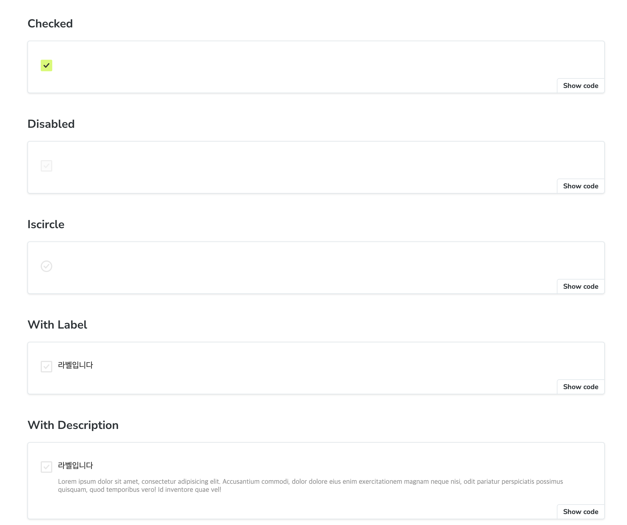
작업 결과물
Checkbox.tsx
import { HTMLProps, ReactNode, SVGProps, useId } from 'react';
import cns from 'classnames';

import * as S from './Checkbox.styles';

// v 아이콘
const CheckIcon = (props: SVGProps<SVGSVGElement>) => (
  <svg width={10} height={8} fill="none" xmlns="http://www.w3.org/2000/svg" {...props}>
    <path
      d="M9.664.253a1 1 0 0 1 .083 1.411l-5.333 6a1 1 0 0 1-1.495 0l-2.666-3a1 1 0 1 1 1.494-1.328l1.92 2.159L8.253.335A1 1 0 0 1 9.664.254Z"
      fill="currentColor"
    />
  </svg>
);

interface CheckboxProps extends Omit<HTMLProps<HTMLInputElement>, 'label'> {
  /** label 내용 */
  label?: ReactNode;
  /** check UI 위치 */
  checkPosition?: 'left' | 'right';
  /** checkbox 설명문 */
  description?: ReactNode;
  /** check UI 모양을 원형 활성화 */
  isCircle?: boolean;
}

export function Checkbox({
  //
  label,
  checkPosition = 'left',
  isCircle,
  description,
  ...rest
}: CheckboxProps) {
  const checkBoxId = useId();

  function _Checkbox() {
    return (
      <S.Checkbox
        className={cns({
          circle: isCircle,
        })}
      >
        <input //
          id={checkBoxId}
          type="checkbox"
          data-checkbox-control
          {...rest}
        />
        <span data-checkbox-icon>
          <CheckIcon />
        </span>
      </S.Checkbox>
    );
  }

  const isRight = checkPosition === 'right';
  return (
    <S.CheckboxWrapper>
      {checkPosition === 'left' && <_Checkbox />}
      <S.LabelWrapper>
        {label && (
          <label htmlFor={checkBoxId} className={`${isRight ? 'reverse' : ''}`}>
            {label}
          </label>
        )}
        {description && <p className={`${isRight ? 'reverse' : ''}`}>{description}</p>}
      </S.LabelWrapper>
      {checkPosition === 'right' && <_Checkbox />}
    </S.CheckboxWrapper>
  );
}
타입 정의
interface CheckboxProps extends Omit<HTMLProps<HTMLInputElement>, 'label'> {
  /** label 내용 */
  label?: ReactNode;
  /** check UI 위치 */
  checkPosition?: 'left' | 'right';
  /** checkbox 설명문 */
  description?: ReactNode;
  /** check UI 모양을 원형 활성화 */
  isCircle?: boolean;
}- 기존 HTMLInput 요소의 속성과 필자가 정의한 속성을 이용해야하기 때문에 위와 같이 타입을 정의했고, 기존 HTMLInput 요소 중에 label 을 다른 의미로 사용하기 때문에 Omit 으로 제거했다.
CheckIcon 구현
const CheckIcon = (props: SVGProps<SVGSVGElement>) => (
  <svg width={10} height={8} fill="none" xmlns="http://www.w3.org/2000/svg" {...props}>
    <path
      d="M9.664.253a1 1 0 0 1 .083 1.411l-5.333 6a1 1 0 0 1-1.495 0l-2.666-3a1 1 0 1 1 1.494-1.328l1.92 2.159L8.253.335A1 1 0 0 1 9.664.254Z"
      fill="currentColor"
    />
  </svg>
);
우선 기본적으로 제공하는 UI 를 사용하지 않기 때문에 check 를 표시하는 v UI 를 컴포넌트로 추출하였다.
CheckUI 구현
function _Checkbox() {
    return (
      <S.Checkbox
        className={cns({
          circle: isCircle,
        })}
      >
        <input //
          id={checkBoxId}
          type="checkbox"
          data-checkbox-control
          {...rest}
        />
        <span data-checkbox-icon>
          <CheckIcon />
        </span>
      </S.Checkbox>
    );
  }
export const Checkbox = styled.span`
position: relative;
z-index: 0;
display: inline-flex;
width: 24px;
height: 24px;
&.circle {
[data-checkbox-icon] {
border-radius: 9999px;
}
}
[data-checkbox-icon] {
position: absolute;
display: inline-flex;
align-items: center;
justify-content: center;
color: ${theme.color.gray300};
background-color: ${theme.color.white};
border: 2px solid ${theme.color.gray300};
border-radius: 2px;
inset: 2px;
}
[data-checkbox-control] {
// 기존 checkbox UI 숨기기
position: absolute;
z-index: 1;
width: 100%;
height: 100%;
opacity: 0;
inset: 0;
&:checked + [data-checkbox-icon] {
color: ${theme.color.black};
background-color: ${theme.color.primary};
border-color: ${theme.color.primary};
}
&:disabled + [data-checkbox-icon] {
color: ${theme.color.gray200};
background-color: ${theme.color.gray0};
border-color: ${theme.color.gray200};
}
}
`;- circle 인 경우 원 모양을 구현하기 위해 circle css 를 정의하였다.
- 기본적으로 제공하는 html checkbox UI 를 사용하지 않기 때문에
data-checkbox-control과data-checkbox-icon을 속성으로 정의하고 scss 에서 해당 값을 이용해서 스타일링 하였다.
그리고 각 속성에 따른 스타일링 하였다.
실제 Checkbox 구현
// ...
const isRight = checkPosition === 'right';
return (
  <S.CheckboxWrapper>
    {checkPosition === 'left' && <_Checkbox />}
    <S.LabelWrapper>
      {label && (
        <label htmlFor={checkBoxId} className={`${isRight ? 'reverse' : ''}`}>
          {label}
        </label>
      )}
      {description && <p className={`${isRight ? 'reverse' : ''}`}>{description}</p>}
    </S.LabelWrapper>
    {checkPosition === 'right' && <_Checkbox />}
  </S.CheckboxWrapper>
);- checkPosition 값에 따라 해당 UI 위치가 달라지기 때문에 그에 맞춰 렌더링하도록 정의하였다.
또한 그에 맞춰서 렌더링되도록 스타일링 되도록 하였다. - label 이 있는 경우 label 을 클릭하면 자동으로 check 되게하기 위해 react 의 useId 를 이용하여 랜덤한 것을 사용했고 htmlFor 값으로 연결하였다.
