Circle 기반 Progress 를 구현했는데 해당 과정을 공유하고자 한다. SVG 를 이용해서 구현했기에 이번 기회에 svg 에 대해 좀 더 알아보는 계기가 되었다.
그리고 progress UI 를 infinte 로 순회하면 로딩 UI 가 되기 때문에 해당 기능을 적용했다.
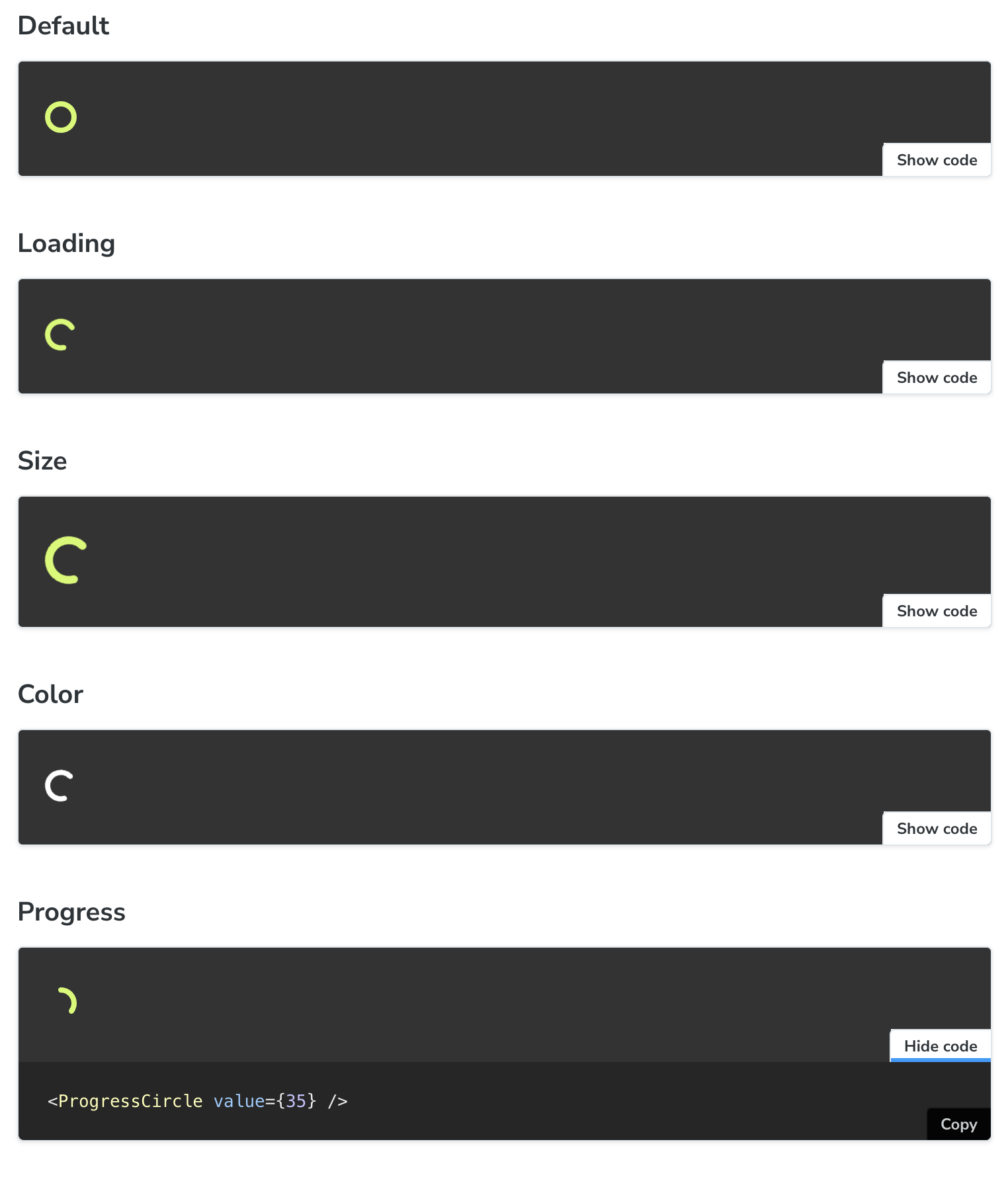
작업 결과물
사전 지식 (SVG)
<S.CircleSVG
      role="progressbar"
      fill="none"
      xmlns="http://www.w3.org/2000/svg"
      viewBox={`0 0 12 12`}
      width={size}
      height={size}
    >
      <circle
        cx="50%"
        cy="50%"
        r={RADIUS}
        stroke="currentColor"
        strokeWidth="2"
        strokeLinecap="round"
        strokeDasharray={CIRCUMFERENCE}
        strokeDashoffset={strokeDashoffset}
      />
    </S.CircleSVG>
);cx는 circle 의 x 위치 (50% 로 원형의 중심)cy는 circle 의 y 위치 (50% 로 원형의 중심)viewBox는 SVG 요소의 크기를 정의r은 반지름stroke는 원형의 선의 색상strokeWidth는 원형의 선의 두께strokeLinecap은 속서의 선의 가장자리를 처리하는 속- butt : 선 끝으로 딱 자름, round
- round : 선 끝을 둥글게 처리
- square 은 선 끝을 네모로 한번 더 묶음 처리
strokeDasharray은 점선을 표시하는 속성으로 홀수 번째는 선의 길이, 짝수번은 공백의 길이를 지정strokeDasharray={CIRCUMFERENCE}는 원형의 둘레를 전달함으로서 동일한 길이의 점선을 지정
strokeDashoffset: 점선을 어디서부터 보여줄지 지정함!
Progress Circle 구현기
// ProgressCircle.tsx

import { CSSProperties, useMemo } from 'react';
import cns from 'classnames';

import * as S from './ProgressCircle.styles';
import { theme } from '@/styles/theme.ts';

interface ProgressCircleProps {
  /** 해당 컴포넌트로 loading 으로 표현하고 싶은 경우*/
  isLoading?: boolean;
  /** 컴포넌트 색상 지정 */
  color?: string;
  /** 컴포넌트 size 지정 */
  size?: number;
  /** progress 진척도 (값) */
  value?: number;
}

export function ProgressCircle({
  isLoading = false,
  color = theme.color.primary,
  size = 24,
  value,
}: ProgressCircleProps) {
  const MIN = 0;
  const MAX = 100;
  const RADIUS = 5;
  const CIRCUMFERENCE = 2 * Math.PI * RADIUS;
  const strokeDashoffset = useMemo(() => {
    if (value === undefined) return;
    const progress = value / 100;
    return CIRCUMFERENCE * (1 - progress);
  }, [CIRCUMFERENCE, value]);

  return (
    <S.CircleSVG
      role="progressbar"
      fill="none"
      xmlns="http://www.w3.org/2000/svg"
      viewBox={`0 0 12 12`}
      width={size}
      height={size}
      aria-valuenow={value}
      aria-valuemin={MIN}
      aria-valuemax={MAX}
      className={cns({
        loading: isLoading,
      })}
      style={{ '--progress-color': color } as CSSProperties}
    >
      <circle
        cx="50%"
        cy="50%"
        r={RADIUS}
        stroke="currentColor"
        strokeWidth="2"
        strokeLinecap="round"
        strokeDasharray={CIRCUMFERENCE} // 원의 둘레만큼 가득 차게해서 전체 원을 나타내게함.
        strokeDashoffset={strokeDashoffset} // strokeDashOffset 값으로 시작위치를 다르게 함으로서 진척도를 나타낼 수 있음
      />
    </S.CircleSVG>
  );
}
// ProgressCircle.styles.tsx

import styled from '@emotion/styled';

export const CircleSVG = styled.svg`
  color: var(--progress-color);
  transform: rotate(-90deg); // 0도 부터 처리하려고 만든거 같음

  circle {
    // stroke-dashoffset 에 cubic-bezier 로 일정하게 애니메이션 되는 것이 아닌 가속효과로 애니메이션 설정
    transition: stroke-dashoffset 0.1s cubic-bezier(0.4, 0, 0.2, 1);
  }

  &.loading {
    animation: progress 2s linear infinite;

    circle {
      transition: none;
      animation: circle 6s linear infinite;
      stroke-dasharray: 30;
    }
  }

  // 수행하면서 같은 위치에서만 도게 하는 것이 아닌 조금씩 움직이도록 설정
  @keyframes progress {
    0% {
      transform: rotate(0deg);
    }

    100% {
      transform: rotate(360deg);
    }
  }

  @keyframes circle {
    0%,
    100% {
      stroke-dashoffset: 150;
    }

    50% {
      stroke-dashoffset: 0;
    }

    50.1% {
      stroke-dashoffset: 300;
    }
  }
`;
- 우선 color, size 는 스타일을 지정하는 요소이다. 그에 맞춰서 스타일링하였다.
여기서 좀 더 중점적으로 이야기하고 싶은 것은 Loading UI를 어떻게 표현할지, Progress UI 를 어떻게 처리했는지 좀 더 이야기하고자 한다.
로딩 UI 를 어떻게 구현해야할까?
import styled from '@emotion/styled';

import { theme } from '@/styles/theme.ts';

export const ProgressCircleWrapper = styled.div``;

export const CircleSVG = styled.svg`
  color: ${theme.color.primary};
  transform: rotate(-90deg); // 0도 부터 처리하려고 만든거 같음

  circle {
    transition: stroke-dashoffset 0.1s cubic-bezier(0.4, 0, 0.2, 1);
    animation: circle 6s linear infinite;
  }

  @keyframes circle {
    0%,
    100% {
      stroke-dashoffset: 150;
    }

    50% {
      stroke-dashoffset: 0;
    }

    50.1% {
      stroke-dashoffset: 300;
    }
  }
`;
transform: rotate(-90deg);으로 기존 circle svg UI 가 3시 위치부터 시작하여rotate(-90deg);하여 12시 방향부터 시작하도록 했다.circle애니메이션으로stroke-dashoffset으로 시작위치를 변경하여 계속 순회하는 UI 를 구현했다.- 0~100% 는 완벽히 그려지지 않도록 150 으로 설정
- 50% 프레임은 선이 완전히 그려지도록 0 으로 설정
- 1% 는 또다시 선이 완전히 그려지지 않도록 300으로 설정
이렇게 시작위치를 변경하여 계속 순회하도록 변경했다.
좀 더 나아가면 해당 UI 는 동일한 위치에서 계속 순회하는 UI 이기 때문에 순회하면서 시작 위치를 조금씩 변경하기 위해 해당 UI 를 구현하였다. (loading 인 경우에만)
왜냐하면 현재 rotate(-90deg) 로 12시 방향부터 시작하게 했는데 해당 애니메이션으로 rotate 를 변경시켜서 항상 똑같은 시작 위치를 변형하도록 했다.
  // 수행하면서 같은 위치에서만 도게 하는 것이 아닌 조금씩 움직이도록 설정
  @keyframes progress {
    0% {
      transform: rotate(0deg);
    }

    100% {
      transform: rotate(360deg);
    }
  }
Progress UI 구현 내용
export function ProgressCircle({
  isLoading = false,
  color = theme.color.primary,
  size = 24,
  value,
}: ProgressCircleProps) {
  const MIN = 0;
  const MAX = 100;
  const RADIUS = 5;
  const CIRCUMFERENCE = 2 * Math.PI * RADIUS;
  const strokeDashoffset = useMemo(() => {
    if (value === undefined) return;
    const progress = value / 100;
    return CIRCUMFERENCE * (1 - progress);
  }, [CIRCUMFERENCE, value]);

  return (
    <S.CircleSVG
      role="progressbar"
      fill="none"
      xmlns="http://www.w3.org/2000/svg"
      viewBox={`0 0 12 12`}
      width={size}
      height={size}
      aria-valuenow={value}
      aria-valuemin={MIN}
      aria-valuemax={MAX}
      className={cns({
        loading: isLoading,
      })}
      style={{ '--progress-color': color } as CSSProperties}
    >
      <circle
        cx="50%"
        cy="50%"
        r={RADIUS}
        stroke="currentColor"
        strokeWidth="2"
        strokeLinecap="round"
        strokeDasharray={CIRCUMFERENCE} // 원의 둘레만큼 가득 차게해서 전체 원을 나타내게함.
        strokeDashoffset={strokeDashoffset} // strokeDashOffset 값으로 시작위치를 다르게 함으로서 진척도를 나타낼 수 있음
      />
    </S.CircleSVG>
  );
}- 해당 부분에서 보면 MIN, MAX 로 0, 100 으로 최소, 최대 값을 구현했다.
- 반지름 값으로 5로 지정했다.
- 원의 둘레 (
CIRCUMFERENCE) 를 구하는 공식2 * PI * R로 원의 둘레를 구했다.- strokeDasharray 에 원의 둘레만큼 지정해서 원의 전체를 가득차게 했다.
- svg circle 의 시작 위치 (
strokeDashoffset) 를 value 에 따라 다르게 계산해서 해당 값을 통해 진척도를 나타냈다.const strokeDashoffset = useMemo(() => { if (value === undefined) return; const progress = value / 100; return CIRCUMFERENCE * (1 - progress); }, [CIRCUMFERENCE, value]);- 진행 상태를 나타내는 circle 요소의 원둘레 길이에서 원하는 만큼의 퍼센트 값을 빼는 방식으로
stroke-dashoffset에 변화를 주어 진척도를 조절했다.- 초기에는 stroke-dashoffset 과 stroke-dashaaray 값에 원 둘레만큼 들어가 있기 때문에 진행 상태가 보이지 않는 상태이다
- stroke-dashoffste 값을 조금씩 감소시키면 진행 상태 circle 이 보이는 구조이다.
예를 들어 30% 를 나타내고 싶다면 전체 원둘레(2 * PI * R) 에서2 * PI * R * 0.3을 뺀 값을 지정하는 방식으로2 * PI * R * (1 - percent)로 진척도를 계산했다.
value / 100로 진척도를 퍼센트로 계산하고CIRCUMFERENCE * (1 - progress);로 원의 둘레로 진척도를 계산한다.
- 진행 상태를 나타내는 circle 요소의 원둘레 길이에서 원하는 만큼의 퍼센트 값을 빼는 방식으로

공유 감사합니다!