
📖 학습주제
파이썬으로 웹데이터 크롤하고 분석하기 (5)
시각화
이제까지 데이터 스크래핑을 통해 데이터를 추출하는 것을 실습했다. 그러나 결과들을 보면 텍스트, 리스트 등으로 얻을 수 있었다. 이렇게 얻은 데이터들이 유의미하다고는 아직 말할 수 없다. 좀 더 가공을 거쳐 인사이트를 얻기 편하게 만들어야한다. 시각화는 이러한 정보들을 요약해서 한 눈에 보여 줄 수 있다.
Seaborn
matplotlib을 기반으로 하는 시각화 라이브러리
import seaborn as sns꺾은선 그래프(Line Plot)
두 변수의 값에 따른 추이를 선으로 이은 그래프로 .lineplot()를 이용해 구현 가능하다.
# 값 x=[1, 3, 2, 4]
# 값 y=[0.7,0.2,0.1,0.05]

sns.lineplot(x=[1, 3, 2, 4], y=[4, 3, 2, 1])
막대 그래프(Bar Plot)
범주형 데이터의 "값"과 그 값의 크기를 직사각형으로 나타낸 그림으로 .barplot()를 이용해 구현 가능하다.
# 범주 x=[1,2,3,4]
# 값 y=[0.7,0.2,0.1,0.05]

sns.barplot(x=[1,2,3,4],y=[0.7,0.2,0.1,0.05])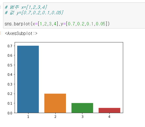
Plot의 속성
seaborn은 파이썬의 시각화 라이브러리 matplotlib을 기반으로 만들어졌기 때문에 matplotlib.pyplot의 속성을 변경해서 그래프에 다양한 요소를 변경/추가할 수 있다.
import matplotlib.pyplot as pltplt.title(): 그래프에 제목을 추가
sns.barplot(x=[1,2,3,4],y=[0.7,0.2,0.1,0.05])
plt.title('Bar Plot')

plt.show() #그래프를 보여줌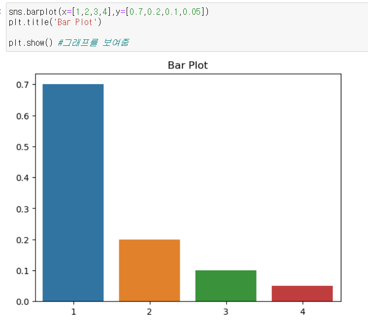
plt.xlabel: x축에 설명 추가plt.ylabel: y축에 설명 추가
sns.barplot(x=[1,2,3,4],y=[0.7,0.2,0.1,0.05])
plt.xlabel('x')
plt.ylabel('y')

plt.show()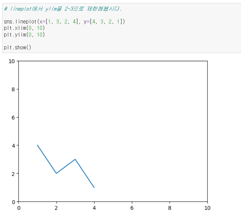
plt.xlim(): 그래프의 x축의 범위 를 지정plt.ylim(): 그래프의 y축의 범위 를 지정
sns.lineplot(x=[1, 3, 2, 4], y=[4, 3, 2, 1])
plt.xlim(0, 10)
plt.ylim(0, 10)

plt.show()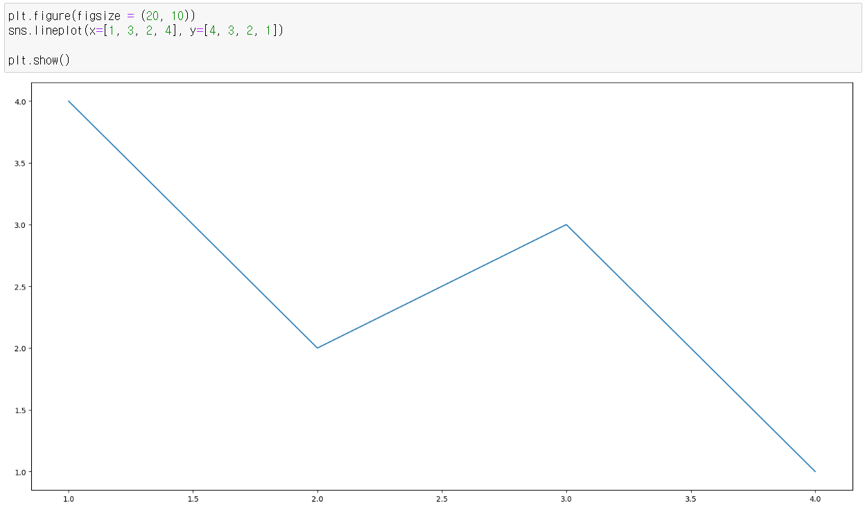
plt.figure(figsize = (x, y)): 그래프의 크기 를 지정, 그래프를 그리기 전에 먼저 실행함
plt.figure(figsize = (20, 10))
sns.lineplot(x=[1, 3, 2, 4], y=[4, 3, 2, 1])

plt.show()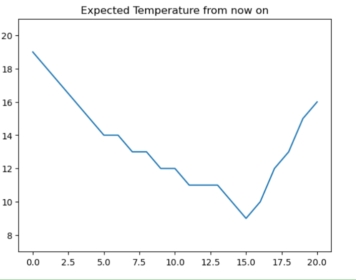
https://seaborn.pydata.org/examples/index.html
위의 사이트에서 더 더양한 그래프들을 볼 수 있다.
실습
기상청 날씨 스크래핑하기
https://www.weather.go.kr/w/weather/forecast/short-term.do
from selenium import webdriver
from selenium.webdriver import ActionChains
from webdriver_manager.chrome import ChromeDriverManager
from selenium.webdriver.chrome.service import Service
from selenium.webdriver.common.by import By
import seaborn as sns
import matplotlib.pyplot as plt

driver = webdriver.Chrome(service=Service(ChromeDriverManager().install()))
driver.get('https://www.weather.go.kr/w/weather/forecast/short-term.do')

driver.implicitly_wait(1) # 데이터가 로딩될 때까지 기다림

# my-chart id가 있어 그쪽으로 접근해 데이터를 추출한다.
temps = driver.find_element(By.ID, "my-tchart").text

# 가져온 온도 데이터에서 계행 및 ℃ 제거
temps = list(map(int,temps.replace('℃','').split('\n')))

plt.ylim(min(temps)-2,max(temps)+2)
plt.title('Expected Temperature from now on')

sns.lineplot(x = [i for i in range(len(temps))], y = temps)

plt.show()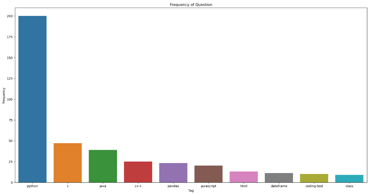
질문 태그의 빈도 확인
from bs4 import BeautifulSoup
from collections import Counter
import requests
import time
import seaborn as sns
import matplotlib.pyplot as plt

freq = {} # 빈도를 저장할 딕셔너리

# 반복문과 페이지네이션을 이용해 10페이지까지 데이터를 추출
for i in range(1, 11):
    res = requests.get('https://hashcode.co.kr/?page={}'.format(i))
    soup = BeautifulSoup(res.text, 'html')

    ul_tags = soup.find_all('ul', 'question-tags')

    for ul in ul_tags:
        li_tags = ul.find_all('li')

        # 가져온 데이터의 공백을 제거하고 딕셔너리에 추가
        for li in li_tags:
            tag = li.text.strip()

            if tag not in freq:
                freq[tag] = 1

            else:
                freq[tag] += 1
    time.sleep(0.5)

counter = Counter(freq)
counter.most_common(10) #가장 많은거 순서대로 뽑아줌

x = [elem[0] for elem in counter.most_common(10)]
y = [elem[1] for elem in counter.most_common(10)]

plt.figure(figsize = (20, 10))
plt.title('Frequency of Question')
plt.xlabel('Tag')
plt.ylabel('Frequency')

sns.barplot(x,y)

plt.show()
Word Cloud
자주 등장하는 텍스트를 중요도나 인기도를 고려해 표현한 것
wordcloud: 파이썬의 텍스트 클라우드 라이브러리. 이를 기반으로 텍스트 구름을 그릴 수 있다.konlpy: 한국어 형태소 분석기 라이브러리로, 주어진 문장에서 명사 등을 뽑아 내는 데에 사용할 수 있다.
한국어로 워드 클라우드를 만드는 절차는 다음과 같다.
KoNLPy라이브러리로 한국어 문장을 전처리Counter를 이용해 빈도수 측정WordCloud를 이용해 시각화

.