styled-components란? tagged template literals을 이용하여 css,scss 같은 별도의 파일 없이 바로 스타일이 된 컴포넌트를 만들게 해주는 라이브러리이다. 이러한 기술을 CSS in JS 라고 한다.
tagged template literal은 지금 당장 그렇게 필요한 내용이 아니기 때문에 추후에 살펴 보기로 하겠다.
설치
npm install --save styled-components공식문서 참조 사항
It's highly recommended (but not required) to also use the Babel plugin. It offers many benefits like more legible class names, server-side rendering compatibility, smaller bundles, and more.
사용법
기본적인 사용방법
기본적인 사용방법은 아래와 같다. 컴포넌트를 만들고 바로 스타일링.
import React from 'react';
import styled from 'styled-components';

const 컴포넌트명 = styled.html태그`
	css 스타일링
`
그럼 실제로 styled-components를 이용해서 컴포넌트를 만들어보자.
import React from 'react';
import styled from 'styled-components';

const Circle = styled.div`
	width: 5rem;
	height: 5rem;
	background: red;
	border-radius: 50%;
`;

function App() {
	return (
		<div>
			<Circle />
		</div>
	);
}

export default App;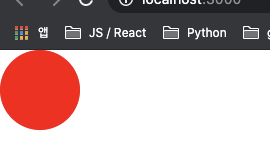
여기서 더 나아가 컴포넌트에 props로 전달한 값을 이용할 수 있다.
템플릿 리터럴 기반이기 때문에 보간 표현식을 사용해서 props를 불러올 수 있다.
import React from 'react';
import styled from 'styled-components';

const Circle = styled.div`
	width: 5rem;
	height: 5rem;
	background: ${(props) => props.color};
	border-radius: 50%;
`;

function App() {
	return (
		<div>
			<Circle color="black" />
			<Circle color="blue" />
		</div>
	);
}

export default App;
만약 보간 표현식 안에서 또 tagged template literal를 사용해 css를 적용하고 싶다면 다음과 같이 사용할 수 있다. styled-components에서 {css}를 불러오고 보간 표현식 내부에서 css``으로 다시 css를 설정할 수 있다.
import React from 'react';
import styled, { css } from 'styled-components';

const Circle = styled.div`
	width: 5rem;
	height: 5rem;
	background: ${(props) => props.color};
	border-radius: 50%;
	${(props) =>
		props.large &&
		css`
			width: 10rem;
			height: 10rem;
		`}
`;

function App() {
	return (
		<div>
			<Circle color="black" large />
			<Circle color="blue" />
		</div>
	);
}

export default App;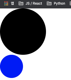
styled-components를 사용할 때 자동 완성 기능이 필요하다면 vscode 기준 vscode-styled-components extension을 설치해주면 된다.
또한 polished 모듈을 사용해 Sass 스타일의 함수나 mixin 등을 사용할 수 있다.
styled-components의 ThemeProvider를 이용해 구성 요소 트리에서 그 아래에 있는 요소에 테마를 삽입할 수도 있다.
App.js
import React from 'react';
import styled, { css, ThemeProvider } from 'styled-components';
import Button from './components/Button';

const AppBlock = styled.div`
	width: 512px;
	margin: 4rem auto 0;
	border: 1px solid black;
	padding: 1rem;
`;

const palette = {
	blue: '#228be6',
	gray: '#496057',
	pink: '#f06595',
};

function App() {
	return (
		<ThemeProvider theme={{ palette }}>
			<AppBlock>
				<Button>Button</Button>
				<Button color="gray">Button</Button>
				<Button color="pink">Button</Button>
			</AppBlock>
		</ThemeProvider>
	);
}

export default App;
Button.jsx
import React from 'react';
import styled, { css } from 'styled-components';
import { darken, lighten } from 'polished';

const colorStyles = css`
	${({ theme: { palette }, color }) => {
		const selected = palette[color];
		return css`
			background: ${selected};
			&:hover {
				background: ${lighten(0.1, selected)};
			}
			&:active {
				background: ${darken(0.1, selected)};
			}
		`;
	}}
`;

const StyledButton = styled.button`
	display: inline-flex;
	outline: none;
	border: none;
	border-radius: 4px;
	color: #fff;
	font-weight: bold;
	cursor: pointer;
	padding-left: 1rem;
	padding-right: 1rem;

	height: 2.25rem;
	font-size: 1rem;

	${colorStyles}

	& + & {
		margin-left: 1rem;
	}
`;

const Button = ({ children, color, ...rest }) => {
	return (
		<>
			<StyledButton color={color} {...rest}>
				{children}
			</StyledButton>
		</>
	);
};

Button.defaultProps = {
	color: 'blue',
};

export default Button;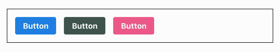
https://styled-components.com/docs
https://github.com/styled-components/polished