1. 화면 해상도 확인
2. 기기별 해상도 모음 사이트기기별 해상도 모음 사이트
http://iosres.com/
https://material.io/devices/
https://screensiz.es/phone
3. CSS 그리드 속성 사용
https://caniuse.com/?search=flex
https://caniuse.com/css-grid
4. 반응형 분기점 (4개)
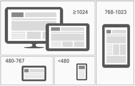
/* PC , 테블릿 가로 (해상도 768px ~ 1023px)*/
@media all and (min-width:768px) and (max-width:1023px) { /*스타일입력*/}

/* 테블릿 세로 (해상도 768px ~ 1023px)*/
@media all and (min-width:768px) and (max-width:1023px) { /*스타일입력*/}

/* 모바일 가로, 테블릿 세로 (해상도 480px ~ 767px)*/
@media all and (min-width:480px) and (max-width:767px) { /*스타일입력*/}

/* 모바일 가로, 테블릿 세로 (해상도 ~ 479px)*/
@media all and (max-width:479px) { /*스타일입력*/}

공부기록