1. 도넛 차트
다음과 같이 해당 id(카테고리)값과 전체 count수를 활용하여 비율을 계산해 도넛차트로 구현하는 작업을 진행하고자 한다.
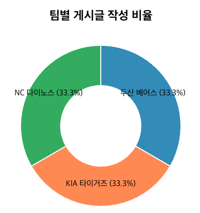
사용할 데이터
[
    {
        "id": "doosan",
        "totalCount": "1"
    },
    {
        "id": "kia",
        "totalCount": "1"
    },
    {
        "id": "nc",
        "totalCount": "1"
    }
]
전체 코드
백엔드에서 API를 호출해 데이터를 받아와, 도넛 차트에 사용할 비율 데이터로 가공한다.
또한 차트에 레이블 표시에 설정할 객체 (위 코드에서는teamNameMap)를 활용한다.
<template>
  <div class="chart-container">
    <h2>팀별 게시글 작성 비율</h2>
    <div ref="chartRef"></div>
    <p v-if="loading">데이터를 불러오는 중...</p>
    <p v-if="error" class="error">{{ error }}</p>
  </div>
</template>

<script setup>
import { ref, onMounted } from 'vue';
import * as d3 from 'd3';
import axiosInstance from '@/util/axiosInstance';

const chartRef = ref(null);
const loading = ref(true);
const error = ref(null);


const teamNameMap = {
    "lg": "LG 트윈스", "doosan": "두산 베어스", "hanwha": "한화 이글스",
    "nc": "NC 다이노스", "ssg": "SSG 랜더스", "lotte": "롯데 자이언츠",
    "kia": "KIA 타이거즈", "kt": "KT 위즈", "kiwoom": "키움 히어로즈",
    "samsung": "삼성 라이온즈"
  };


// 차트 설정값
const width = 400;
const height = 400;
const margin = 40;
const radius = Math.min(width, height) / 2 - margin;

const drawChart = (data) => {
  // 1. 기본 SVG 세팅
  const svg = d3.select(chartRef.value)
    .append("svg")
    .attr("width", width)
    .attr("height", height)
    .append("g")
    .attr("transform", `translate(${width / 2}, ${height / 2})`);

  // 2. 색상 스케일 설정
  const color = d3.scaleOrdinal()
    .domain(data.map(d => d.id))
    .range(d3.schemeCategory10);

  // 3. 파이 데이터 계산 (도넛 형태를 위해 padAngle 추가)
  const pie = d3.pie()
    .value(d => d.totalCount)
    .sort(null);

  const data_ready = pie(data);

  const arc = d3.arc()
    .innerRadius(radius * 0.5) // 도넛 구멍 크기
    .outerRadius(radius);

  // 5. 도넛 조각 그리기
  svg.selectAll('path')
    .data(data_ready)
    .join('path')
    .attr('d', arc)
    .attr('fill', d => color(d.data.id))
    .attr("stroke", "white")
    .style("stroke-width", "2px")
    .style("opacity", 0.8);

  // 6. 텍스트 라벨 추가 (팀명 및 비율 %)
  const total = d3.sum(data, d => d.totalCount);

  svg.selectAll('text')
    .data(data_ready)
    .join('text')
    .text(d => {
      const percentage = ((d.data.totalCount / total) * 100).toFixed(1);
      return `${teamNameMap[d.data.id]} (${percentage}%)`;
    })
    .attr("transform", d => `translate(${arc.centroid(d)})`)
    .style("text-anchor", "middle")
    .style("font-size", "16px")
    .style("fill", "#000");
};

const fetchData = async () => {
  try {
    const response = await axiosInstance.get('/posts/count-post-by-team');
    drawChart(response.data);
    console.log(response.data); //위에서 언급한 데이터

  } catch (err) {
    error.value = "데이터를 가져오는데 실패했습니다.";
    console.error(err);
  } finally {
    loading.value = false;
  }
};

onMounted(() => {
  fetchData();
});
</script>

<style scoped>
.chart-container {
  display: flex;
  flex-direction: column;
  align-items: center;
}
.error {
  color: red;
}
</style>
1) 기본 SVG 세팅
append() : svg 태그 생성
attr() : 속성 설정
- 속성 : width / height / transform 등 css 속성과 유사함
2) 색상 스케일 설정
scaleOrdinal() : 항목(카테고리)를 색상으로 매핑하는 함수
schemeCategory10 : D3에서 주로 사용하는 색상 팔레트(리스트)
3) 데이터를 파이 차트 데이터로 변경
pie()
4) 각 데이터의 호(arc)의 각도 계산
const arc = d3.arc().innerRadius(radius * 0.5).outerRadius(radius);
2. 막대차트
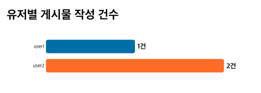
사용할 데이터
[
    {
        "id": "user1",
        "totalCount": "1"
    },
    {
        "id": "user2",
        "totalCount": "2"
    }
]<template>
<div class="chart-container">
<h2 class="title">유저별 게시물 작성 건수</h2>
<div v-if="loading">로딩 중...</div>
<div v-else-if="error">{{ error }}</div>
<svg ref="svgRef"></svg>
</div>
</template>
<script setup>
import { ref, onMounted } from 'vue';
import * as d3 from 'd3';
import axiosInstance from '@/util/axiosInstance';
const svgRef = ref(null);
const loading = ref(true);
const error = ref(null);
const fetchData = async () => {
try {
loading.value = true;
const response = await axiosInstance.get('/posts/count-post-by-nickname');
renderChart(response.data);
} catch (err) {
error.value = "데이터를 가져오는데 실패했습니다.";
console.error(err);
} finally {
loading.value = false;
}
};
onMounted(() => {
fetchData();
});
const renderChart = (data) => {
if (!data || data.length === 0) return;
// 1. 설정 및 차트 크기 정의
const margin = { top: 20, right: 60, bottom: 20, left: 80 };
const width = 500 - margin.left - margin.right;
const height = data.length * 45;
// 기존 내용 초기화 (재렌더링 시 중복 방지)
const svgElement = d3.select(svgRef.value);
svgElement.selectAll("*").remove();
const svg = svgElement
.attr('width', width + margin.left + margin.right)
.attr('height', height + margin.top + margin.bottom)
.append('g')
.attr('transform', `translate(${margin.left},${margin.top})`);
// 2. 스케일 설정
const x = d3.scaleLinear()
.domain([0, d3.max(data, d => d.totalCount) || 10]) // 데이터 없을 시 대비
.range([0, width]);
const y = d3.scaleBand()
.domain(data.map(d => d.id))
.range([0, height])
.padding(0.3);
// 3. 축(Axis) 추가
svg.append('g')
.call(d3.axisLeft(y).tickSize(0))
.select('.domain').remove();
const colorScale = d3.scaleOrdinal(d3.schemeCategory10);
// 4. 막대(Bar) 생성
svg.selectAll('rect')
.data(data)
.join('rect')
.attr('y', d => y(d.id))
.attr('x', 0)
.attr('height', y.bandwidth())
.attr('fill', (d, i) => colorScale(i))
.attr('rx', 4)
.attr('width', 0) // 초기 애니메이션용
.transition()
.duration(1200)
.ease(d3.easeExpOut)
.attr('width', d => x(d.totalCount));
// 5. 텍스트 라벨 추가
svg.selectAll('.label')
.data(data)
.join('text')
.attr('class', 'label')
.attr('y', d => y(d.id) + y.bandwidth() / 2 + 5)
.attr('x', 0)
.style('font-size', '14px')
.style('font-weight', 'bold')
.style('fill', '#000')
.text(d => `${d.totalCount}건`)
.transition()
.duration(1200)
.ease(d3.easeExpOut)
.attr('x', d => x(d.totalCount) + 5);
};
</script>

프론트엔드 개발자