Hist, overlapping
import random
import numpy
from matplotlib import pyplot


def drawHist(datas, label):
   bins = numpy.linspace(-10, 10, 40)
   n, bins, patches = pyplot.hist(datas, bins, alpha=0.5, label=label, rwidth=0.9)
   max_area_cnt = max(n)
   print(max_area_cnt)


x = [random.gauss(3,1) for _ in range(400)]
y = [random.gauss(4,2) for _ in range(400)]
z = [random.gauss(0,2) for _ in range(300)]


drawHist(x, 'x')
drawHist(y, 'y')
drawHist(z, 'z')

pyplot.legend(loc='upper right')
pyplot.show()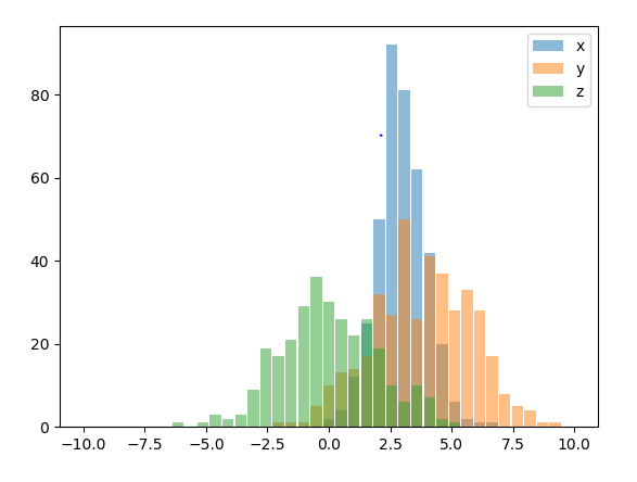
// Todo n, bins, pathches 정리하기
Hist, Side by side
어떤 경우에 사용? 마드리드하고 부산의 온도를 비교할려고 해, 겹치는것 보다 1월에 몇도 2월에 몇도 각각 비교하는게 눈에 보기 좋음
import numpy as np
import matplotlib.pyplot as plt
plt.style.use('seaborn-deep')

x = np.random.normal(1, 2, 5000)
y = np.random.normal(-1, 3, 2000)
bins = np.linspace(-10, 10, 20)

plt.hist([x, y], bins, label=['x', 'y'])
plt.legend(loc='upper right')
plt.show()
Double bar
import matplotlib.pyplot as plot

data =  [ 22, 33, 11, 45 ]
data2 = [ 45, 78, 16, 9 ]

plot.bar( [1,3,5,7], data,   color='r', width = 0.6, label='what?')
plot.bar( [2,4,6,8], data2,  color='y', width = 0.6, label='when?')
plot.ylim = max(data)*1.2
plot.xlim = len(data)*1.2

plot.xlabel('Group')
plot.ylabel('Scores')
plot.title('Scores by group and gender')

plot.legend()
plot.show()
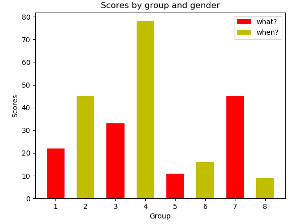
//Todo ylim, xlim 알아보기
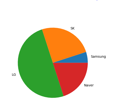
Pie
import matplotlib.pyplot as plot

mpl.rcParams['font.size'] = 20.0 ## 폰트 사이즈 변경

data = [5, 25, 50, 20]
labels = ['Samsung', 'SK', 'LG', 'Naver']

plot.pie(data, labels=labels)
plot.show()
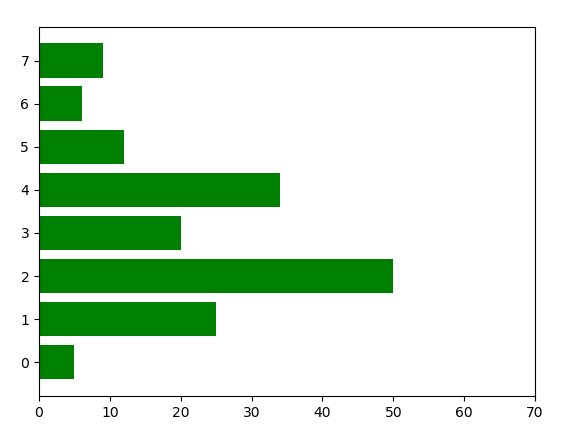
horizontal bar
ex) 그래픽 카드 속도를 나타낼 때
import matplotlib.pyplot as plot

data = [5., 25., 50., 20., 34., 12., 6., 9.]

plot.xlim(0,70)
plot.barh( list(range(len(data))), data, color='green' )
plot.show()

어려운 문제를 함께 풀어가는 것을 좋아합니다.