Histogram을 통한 Visualization
library(ggplot2)
library(ggplot)
library(reader)
library(grid)
library(gridExtra)
library(plyr)

iris[sample(nrow(iris), 10), ]

HisS1 <- ggplot(data = iris, aes(x = Sepal.Length))+
  geom_histogram(binwidth = 0.2, color = "black", aes(fill=Species)) +
  xlab("Sepal Lengh (cm)") +
  ylab("Frequency") +
  theme(legend.position = "none") +
  ggtitle("Histogram of Sepal Length") +
  geom_vline(data = iris, aes(xintercept = mean(Sepal.Length)), linetype = "dashed", color = "grey")
HisSw <- ggplot(data = iris, aes(x = Sepal.Width)) +
  geom_histogram(binwidth = 0.2, color = "black", aes(fill = Species)) +
  xlab("Sepal Width (cm)") +
  ylab("Frequency") +
  theme(legend.position = "none") +
  ggtitle("Histogram of sepal Width") +
  geom_vline(data = iris, aes(xintercept = mean(Sepal.Width)), linetype = "dashed", color = "grey")
  )
HisPw <- ggplot(data = iris, aes(x=Petal.Length)) +
  geom_histogram(binwidth = 0.2, color = "black", aes(fill = Species)) +
  xlab("Petal Width (cm)") +
  ylab("Frequency") +
  theme(legend.position = "none") +
  ggtitle("Histogram of Petal Width") +
  geom_vline(data = iris, aes(xintercept = mean(Petal.Width)), linetype = "dashed", color = "grey")
HisPl <- ggplot(data = iris, aes(x = Petal.Length)) +
  geom_histogram(binwidth = 0.2, color = "black", aes(fill = Species)) +
  theme(legend.position = "none") +
  xlab("Petal Length (cm)") +
  ylab("Frequency") +
  ggtitle("Histogram of Petal Length") +
  geom_vline(data = iris, aes(xintercept = mean(Petal.Length)), linetype = "dashed", color = "grey")
grid.arrange(HisS1 + ggtitle(""),
             HisSw + ggtitle(""),
             HisPl + ggtitle(""),
             HisPw + ggtitle(""))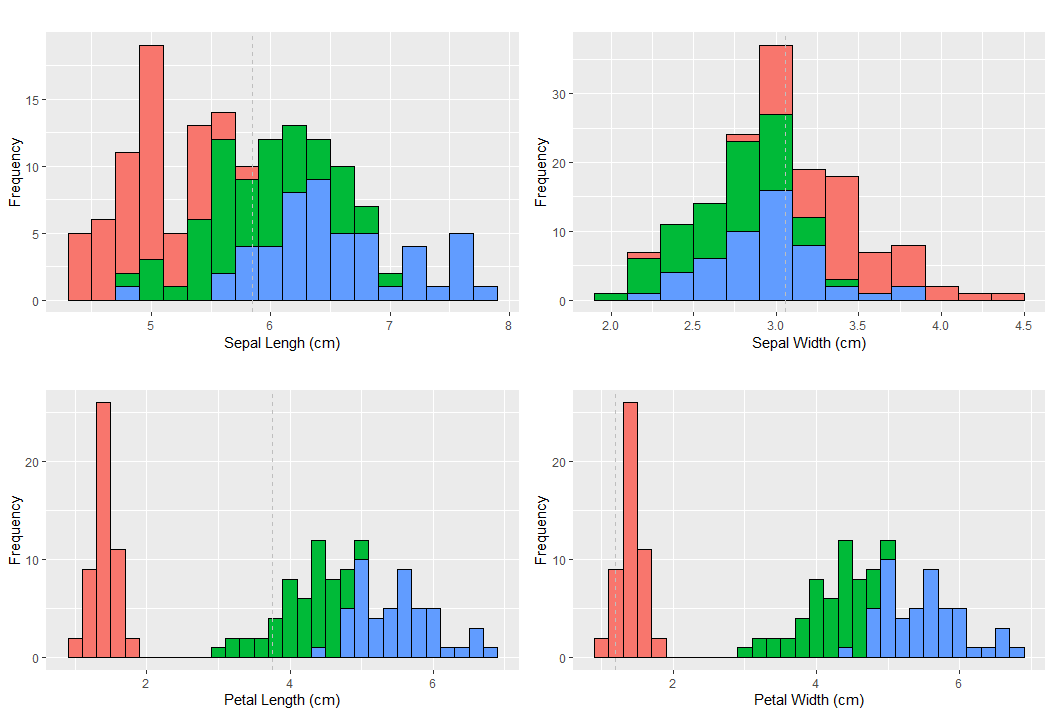
- 랜덤 샘플링
iris[sample(nrow(iris), 10), ]iris 데이터에서 전체 행 개수 중에 10개를 샘플로 하여 전체 열로 출력
    Sepal.Length Sepal.Width Petal.Length Petal.Width    Species
13           4.8         3.0          1.4         0.1     setosa
49           5.3         3.7          1.5         0.2     setosa
142          6.9         3.1          5.1         2.3  virginica
14           4.3         3.0          1.1         0.1     setosa
129          6.4         2.8          5.6         2.1  virginica
82           5.5         2.4          3.7         1.0 versicolor
6            5.4         3.9          1.7         0.4     setosa
141          6.7         3.1          5.6         2.4  virginica
84           6.0         2.7          5.1         1.6 versicolor
104          6.3         2.9          5.6         1.8  virginica
ggplot
HisS1 <- ggplot(data = iris, aes(x = Sepal.Length))+  #1
  geom_histogram(binwidth = 0.2, color = "black", aes(fill=Species)) +  #2
  xlab("Sepal Lengh (cm)") +
  ylab("Frequency") + # 3
  theme(legend.position = "none") + # 4
  ggtitle("Histogram of Sepal Length") + # 5
  geom_vline(data = iris, aes(xintercept = mean(Sepal.Length)), linetype = "dashed", color = "grey") # 6
#1 : data iris를 이용, x축은 iris 변수들 중 Sepal.Length를 이용
2#
binwidth: bin 개수가 많으면 (width가 작으면) 히스토그램의 막대 너비가 너무 작아져 빽빽해지기 때문에 분석하기에 부적합, 반대로 너무 개수가 없으면 (width가 너무 크면) 너무 많은 도수가 막대 하나로 통합해지기 때문에 이 또한 부적합aes(fill=Species): 히스토그램의 각 도수에서 Species마다 구분을 해준다.
fill vs color(colour)
ggplot(data = iris, aes(x = Sepal.Length)) +
geom_histogram(binwidth = 0.2, color = "black", aes(fill=Species))
2번째 명령문에서
color: 선 색깔fill: 채우기 색깔
1. default 값 : 흑백
HisS1 <- ggplot(data = iris, aes(x = Sepal.Length))+
  geom_histogram(binwidth = 0.2) +
  xlab("Sepal Lengh (cm)") +
  ylab("Frequency") +
  theme(legend.position = "none") +
  ggtitle("Histogram of Sepal Length") +
  geom_vline(data = iris, aes(xintercept = mean(Sepal.Length)), linetype = "dashed", color = "grey")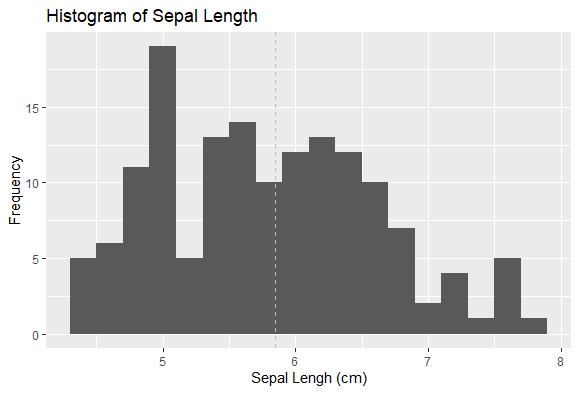
2. Color
HisS1 <- ggplot(data = iris, aes(x = Sepal.Length, color = Species))+
  geom_histogram(binwidth = 0.2) +
  xlab("Sepal Lengh (cm)") +
  ylab("Frequency") +
  theme(legend.position = "none") +
  ggtitle("Histogram of Sepal Length") +
  geom_vline(data = iris, aes(xintercept = mean(Sepal.Length)), linetype = "dashed", color = "grey")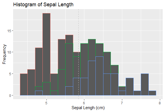
ggplot 명령문에 넣어줘도 되고, geom_histogram 안에 넣어줘도 된다.
- aes(aesthetic) : color, fill, x, y, alpha 등을 맵핑하는 함수
맵핑?: 개별 원소를 특정 함수에 일대일 시키는 과정
3. fill
HisS1 <- ggplot(data = iris, aes(x = Sepal.Length, fill = Species))+
  geom_histogram(binwidth = 0.2) +
  xlab("Sepal Lengh (cm)") +
  ylab("Frequency") +
  theme(legend.position = "none") +
  ggtitle("Histogram of Sepal Length") +
  geom_vline(data = iris, aes(xintercept = mean(Sepal.Length)), linetype = "dashed", color = "grey")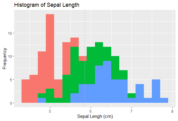
선은 흑백으로 남을 줄 알았는데 선까지 Species따라 바뀌었다. 그래서 aes로 color까지 맵핑을 해보니
ggplot(data = iris, aes(x = Sepal.Length, fill = Species, color = "black"))
Setosa 색깔로 바뀌었다..
맨 위 코딩처럼 맵핑 밖으로 빼주니(geom_histogram 안에 넣어줬다)

선색깔이 흑백으로 변경
출처 : https://www.kaggle.com/antoniolopez/iris-data-visualization-with-r

늦게 출발했지만 꾸준히 달려서 도착지점에 무사히 도달하자