Sass란?
Sass(Syntacically Awesome Style Sheets)의 약어로, CSS pre-processor로서, 복잡한 작업을 쉽게 할수 있게 해주고, 코드의 재활용성을 높여줄 뿐만 아니라, 코드의 가독성을 높여주며 유지보수를 쉽게 해주는 것이다.
Sass에서는 두 가지의 확장자 (.scss/.sass)를 지원한다.
Sass가 처음 나왔을 땐 .sass만 지원하였지만 현재는 .scss도 지원한다.
보통 scss 문법이 더 많이 사용되므로, 필자는 .scss 확장자로 스타일을 작성하였다.
시작하기
본격적으로 Sass를 사용해보자. 먼저 새로운 리액트 프로젝트를 생성하자.
$ npx create-react-app styling-with-sass해당 프로젝트 디렉터리에 node-sass라는 라이브러리를 설치하자.
$ cd styling-with-sass
$ yarn add node-sass
위의 라이브러리는 Sass를 CSS로 변환해주는 역할을 한다.
Button 컴포넌트 만들기
Button 컴포넌트를 만들고, Sass를 사용해서 스타일링을 해보자.
src 디렉터리에 components 디렉터리를 생성 후 Button.js 파일을 생성하자.
components/Button.js :
import React from 'react';
import './Button.scss';

function Button({ children }) {
  return <button className="Button">{children}</button>;
}

export default Button;
그리고, components 디렉터리에 Button.scss 파일도 생성하자.
components/Button.scss :
$blue: #228be6; // 주석 선언

.Button {
  display: inline-flex;
  color: white;
  font-weight: bold;
  outline: none;
  border-radius: 4px;
  border: none;
  cursor: pointer;

  height: 2.25rem;
  padding-left: 1rem;
  padding-right: 1rem;
  font-size: 1rem;

  background: $blue; // 주석 사용
  &:hover {
    background: lighten($blue, 10%); // 색상 10% 밝게
  }

  &:active {
    background: darken($blue, 10%); // 색상 10% 어둡게
  }
}
기존 css 에서는 사용하지 못하던 문법들을 사용했다. $blue: #228be6; 이런식의 스타일 파일에서 사용할 수 있는 변수를 선언할 수도 있고, lighten() 또는 darken()과 같이 색상을 더 밝게 하거나 어둡게 해주는 함수도 사용할 수 있다.
이 버튼을 App 컴포넌트에서 사용해보자.
App.js :
import React from 'react';
import './App.scss';
import Button from './components/Button';

function App() {
  return (
    <div className="App">
      <div className="buttons">
        <Button>BUTTON</Button>
      </div>
    </div>
  );
}

export default App;
그리고 기존의 App.css 파일을 App.scss로 변경한 뒤, 다음과 같이 적어보자.
App.scss :
.App {
  width: 512px;
  margin: 0 auto;
  margin-top: 4rem;
  border: 1px solid black;
  padding: 1rem;
}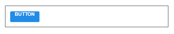
위와 같이 생긴다면 성공입니다.
버튼 사이즈 조정하기
우선 버튼 크기에 large, medium, small 를 설정해줄 수 있도록 구현해보자.
Button.js에서 다음과 같이 defaultProps를 통하여 size의 기본값을 medium으로 설정하고, 이 값은 button의 className에 넣어보자.
Button.js :
import React from 'react';
import './Button.scss';

function Button({ children, size }) {
  return <button className={['Button', size].join(' ')}>{children}</button>;
}

Button.defaultProps = {
  size: 'medium'
};

export default Button;
className에 CSS 클래스 이름을 동적으로 넣어주고 싶으면 이렇게 설정을 해주어야한다.
className={['Button', size].join(' ')}또는 이렇게 처리할 수도 있다.
className={`Button ${size}`}하지만, 조건부로 CSS 클래스를 넣어주고 싶을 땐 이렇게 문자열을 직접 조합해준느 것보다 classnames라는 라이브러리를 사용하는 것이 훨씬 편하다.
classNames를 사용하면 다음과 같이 조건부 스타일링을 할 때 함수의 인자에 문자열, 배열, 객체 등을 전달하여 손쉽게 문자열을 조합할 수 있다.
classNames('foo', 'bar'); // => 'foo bar'
classNames('foo', { bar: true }); // => 'foo bar'
classNames({ 'foo-bar': true }); // => 'foo-bar'
classNames({ 'foo-bar': false }); // => ''
classNames({ foo: true }, { bar: true }); // => 'foo bar'
classNames({ foo: true, bar: true }); // => 'foo bar'
classNames(['foo', 'bar']); // => 'foo bar'

// 동시에 여러개의 타입으로 받아올 수 도 있습니다.
classNames('foo', { bar: true, duck: false }, 'baz', { quux: true }); // => 'foo bar baz quux'

// false, null, 0, undefined 는 무시됩니다.
classNames(null, false, 'bar', undefined, 0, 1, { baz: null }, ''); // => 'bar 1'
우리 프로젝트에 설치를 해보자.
$ npm add classnames그리고 Button.js에 사용해보자.
Button.js :
import React from 'react';
import classNames from 'classnames';
import './Button.scss';

function Button({ children, size }) {
  return <button className={classNames('Button', size)}>{children}</button>;
}

Button.defaultProps = {
  size: 'medium'
};

export default Button;
이제 props로 받은 props 값이 button 태그의 className 으로 전달이 될 것이다. 이제 이에 따라 Button.scss에서 다른 크기를 지정해보자.
Button.scss :
$blue: #228be6;

.Button {
  display: inline-flex;
  color: white;
  font-weight: bold;
  outline: none;
  border-radius: 4px;
  border: none;
  cursor: pointer;

  // 사이즈 관리
  &.large {
    height: 3rem;
    padding-left: 1rem;
    padding-right: 1rem;
    font-size: 1.25rem;
  }

  &.medium {
    height: 2.25rem;
    padding-left: 1rem;
    padding-right: 1rem;
    font-size: 1rem;
  }

  &.small {
    height: 1.75rem;
    font-size: 0.875rem;
    padding-left: 1rem;
    padding-right: 1rem;
  }

  background: $blue;
  &:hover {
    background: lighten($blue, 10%);
  }

  &:active {
    background: darken($blue, 10%);
  }
}
위 코드에서
.Button {
  &.large {

  }
}
가 의미하는 것은
.Button.large {

}
이다. 결국, Button과 large CSS 클래스가 함께 적용되어 있으면 우리가 원하는 스타일을 적용하겠다는 것을 의미한다.
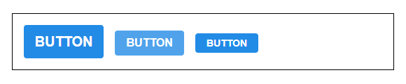
App.js에서 버튼을 2개 더 렌더링하고, size 값도 설정해주자.
App.js
import React from 'react';
import './App.scss';
import Button from './components/Button';

function App() {
  return (
    <div className="App">
      <div className="buttons">
        <Button size="large">BUTTON</Button>
        <Button>BUTTON</Button>
        <Button size="small">BUTTON</Button>
      </div>
    </div>
  );
}

export default App;
버튼들의 사이에 여백을 위해 Button.scss를 다음과 같이 수정하자.
Button.scss :
$blue: #228be6;

.Button {
  display: inline-flex;
  color: white;
  font-weight: bold;
  outline: none;
  border-radius: 4px;
  border: none;
  cursor: pointer;

  // 사이즈 관리
  &.large {
    height: 3rem;
    padding-left: 1rem;
    padding-right: 1rem;
    font-size: 1.25rem;
  }

  &.medium {
    height: 2.25rem;
    padding-left: 1rem;
    padding-right: 1rem;
    font-size: 1rem;
  }

  &.small {
    height: 1.75rem;
    padding-left: 1rem;
    padding-right: 1rem;
    font-size: 0.875rem;
  }

  background: $blue;
  &:hover {
    background: lighten($blue, 10%);
  }

  &:active {
    background: darken($blue, 10%);
  }

  & + & {
    margin-left: 1rem;
  }
}
맨 아래 & + &가 의미 하는 것은 .Button + .Button이다. 만약 함께 있다면 우측에 있는 버튼에 여백을 설정하는 것이다.
버튼 색상 설정하기
이번에는 버튼에 파란색 외의 다른 색상을 설정하는 작업에 대해서 알아보자.
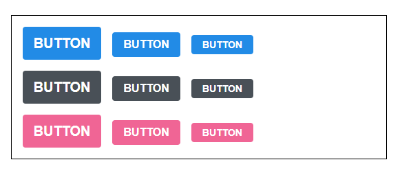
우리는 버튼의 색상에 blue, gray, pink 색을 설정할 수 있도록 구현할 것이다.
개발을 할 때 색상에 대해 고민이 될 땐 open-color를 참조하자.
우선, Button에서 color라는 props를 받아올 수 있도록 해주고, 기본 값을 blue로 설정하자. 그리고 size와 마찬가지로 color값을 className에 포함시켜주자.
components/Button.js :
import React from 'react';
import classNames from 'classnames';
import './Button.scss';

function Button({ children, size, color }) {
  return (
    <button className={classNames('Button', size, color)}>{children}</button>
  );
}

Button.defaultProps = {
  size: 'medium',
  color: 'blue'
};

export default Button;
버튼의 scss 파일도 수정해보자.
components/Button.scss :
$blue: #228be6;
$gray: #495057;
$pink: #f06595;

.Button {
  display: inline-flex;
  color: white;
  font-weight: bold;
  outline: none;
  border-radius: 4px;
  border: none;
  cursor: pointer;

  // 사이즈 관리
  &.large {
    height: 3rem;
    padding-left: 1rem;
    padding-right: 1rem;
    font-size: 1.25rem;
  }

  &.medium {
    height: 2.25rem;
    padding-left: 1rem;
    padding-right: 1rem;
    font-size: 1rem;
  }

  &.small {
    height: 1.75rem;
    font-size: 0.875rem;
    padding-left: 1rem;
    padding-right: 1rem;
  }

  // 색상 관리
  &.blue {
    background: $blue;
    &:hover {
      background: lighten($blue, 10%);
    }

    &:active {
      background: darken($blue, 10%);
    }
  }

  &.gray {
    background: $gray;
    &:hover {
      background: lighten($gray, 10%);
    }

    &:active {
      background: darken($gray, 10%);
    }
  }

  &.pink {
    background: $pink;
    &:hover {
      background: lighten($pink, 10%);
    }

    &:active {
      background: darken($pink, 10%);
    }
  }

  & + & {
    margin-left: 1rem;
  }
}
코드의 상단에서 색상 변수를 선언해주었고, 하단에서 CSS 클래스에 따라 다른 색상이 적용되도록 코드를 작성해주었다. 위 코드를 보면 반복되는 코드들이 보일 것이다.
&.blue {
    background: $blue;
    &:hover {
      background: lighten($blue, 10%);
    }

    &:active {
      background: darken($blue, 10%);
    }
  }

  &.gray {
    background: $gray;
    &:hover {
      background: lighten($gray, 10%);
    }

    &:active {
      background: darken($gray, 10%);
    }
  }

  &.pink {
    background: $pink;
    &:hover {
      background: lighten($pink, 10%);
    }

    &:active {
      background: darken($pink, 10%);
    }
  }
이렇게 반복이 되는 코드는 Sass의 mixin이라는 기능을 사용하여 쉽게 재사용할 수 있다.
button-color라는 mixin을 만들어서 사용해보자.
components/Button.scss :
$blue: #228be6;
$gray: #495057;
$pink: #f06595;

@mixin button-color($color) {
  background: $color;
  &:hover {
    background: lighten($color, 10%);
  }
  &:active {
    background: darken($color, 10%);
  }
}

.Button {
  display: inline-flex;
  color: white;
  font-weight: bold;
  outline: none;
  border-radius: 4px;
  border: none;
  cursor: pointer;

  // 사이즈 관리
  &.large {
    height: 3rem;
    padding-left: 1rem;
    padding-right: 1rem;
    font-size: 1.25rem;
  }

  &.medium {
    height: 2.25rem;
    padding-left: 1rem;
    padding-right: 1rem;
    font-size: 1rem;
  }

  &.small {
    height: 1.75rem;
    font-size: 0.875rem;
    padding-left: 1rem;
    padding-right: 1rem;
  }

  // 색상 관리
  &.blue {
    @include button-color($blue);
  }

  &.gray {
    @include button-color($gray);
  }

  &.pink {
    @include button-color($pink);
  }

  & + & {
    margin-left: 1rem;
  }
}
이로써 색상 관리쪽 코드가 훨씬 깔끔해졌다.
이제 이 색상 관리가 잘 이루어지고 있는지 확인해보자. App 컴포넌트에서 다음과 같이 다른 색상을 가진 버튼들도 렌더링해보자.
App.js :
import React from 'react';
import './App.scss';
import Button from './components/Button';

function App() {
  return (
    <div className="App">
      <div className="buttons">
        <Button size="large">BUTTON</Button>
        <Button>BUTTON</Button>
        <Button size="small">BUTTON</Button>
      </div>
      <div className="buttons">
        <Button size="large" color="gray">
          BUTTON
        </Button>
        <Button color="gray">BUTTON</Button>
        <Button size="small" color="gray">
          BUTTON
        </Button>
      </div>
      <div className="buttons">
        <Button size="large" color="pink">
          BUTTON
        </Button>
        <Button color="pink">BUTTON</Button>
        <Button size="small" color="pink">
          BUTTON
        </Button>
      </div>
    </div>
  );
}

export default App;
App.scss :
.App {
  width: 512px;
  margin: 0 auto;
  margin-top: 4rem;
  border: 1px solid black;
  padding: 1rem;
  .buttons + .buttons {
    margin-top: 1rem;
  }
}
위의 코드를 작성하여 버튼들의 사이에 여백을 주자.
옵션 만들기
이번엔 outline이라는 옵션을 주면 버튼이 테두리만 보여지도록 설정을 해보자.
components/Button.js :
import React from 'react';
import classNames from 'classnames';
import './Button.scss';

function Button({ children, size, color, outline }) {
  return (
    <button className={classNames('Button', size, color, { outline })}>
      {children}
    </button>
  );
}

Button.defaultProps = {
  size: 'medium',
  color: 'blue'
};

export default Button;
여기서는 outline 값을 props로 받아와서 객체 안에 집어 넣은 다음에 classNames()에 포함시켜줬는데 이러면 outline 값이 true일 때만 button에 outline CSS 클래스가 적용된다.
만약 outline CSS 클래스가 있다면, 테두리만 보여지도록 스타일쪽 코드도 수정해보자.
components/Button.scss :
$blue: #228be6;
$gray: #495057;
$pink: #f06595;

@mixin button-color($color) {
  background: $color;
  &:hover {
    background: lighten($color, 10%);
  }
  &:active {
    background: darken($color, 10%);
  }
  &.outline {
    color: $color;
    background: none;
    border: 1px solid $color;
    &:hover {
      background: $color;
      color: white;
    }
  }
}

.Button {
  display: inline-flex;
  color: white;
  font-weight: bold;
  outline: none;
  border-radius: 4px;
  border: none;
  cursor: pointer;

  // 사이즈 관리
  &.large {
    height: 3rem;
    padding-left: 1rem;
    padding-right: 1rem;
    font-size: 1.25rem;
  }

  &.medium {
    height: 2.25rem;
    padding-left: 1rem;
    padding-right: 1rem;
    font-size: 1rem;
  }

  &.small {
    height: 1.75rem;
    font-size: 0.875rem;
    padding-left: 1rem;
    padding-right: 1rem;
  }

  // 색상 관리
  &.blue {
    @include button-color($blue);
  }

  &.gray {
    @include button-color($gray);
  }

  &.pink {
    @include button-color($pink);
  }

  & + & {
    margin-left: 1rem;
  }
}
button-color mixin을 만들었었기 때문에 작업이 굉장히 간단해졌다!
App.js :
import React from 'react';
import './App.scss';
import Button from './components/Button';

function App() {
  return (
    <div className="App">
      <div className="buttons">
        <Button size="large">BUTTON</Button>
        <Button>BUTTON</Button>
        <Button size="small">BUTTON</Button>
      </div>
      <div className="buttons">
        <Button size="large" color="gray">
          BUTTON
        </Button>
        <Button color="gray">BUTTON</Button>
        <Button size="small" color="gray">
          BUTTON
        </Button>
      </div>
      <div className="buttons">
        <Button size="large" color="pink">
          BUTTON
        </Button>
        <Button color="pink">BUTTON</Button>
        <Button size="small" color="pink">
          BUTTON
        </Button>
      </div>
      <div className="buttons">
        <Button size="large" color="blue" outline>
          BUTTON
        </Button>
        <Button color="gray" outline>
          BUTTON
        </Button>
        <Button size="small" color="pink" outline>
          BUTTON
        </Button>
      </div>
    </div>
  );
}

export default App;
전체 너비 차지하는 옵션
이번엔 fullWidth라는 옵션이 있으면 버튼이 전체 너비를 차지하도록 구현해보자.
구현 방식은 방금 했었던 outline과 굉장히 유사하다.
components/Button.js :
import React from 'react';
import classNames from 'classnames';
import './Button.scss';

function Button({ children, size, color, outline, fullWidth }) {
  return (
    <button
      className={classNames('Button', size, color, { outline, fullWidth })}
    >
      {children}
    </button>
  );
}

Button.defaultProps = {
  size: 'medium',
  color: 'blue'
};

export default Button;
스타일 수정
components/Button.scss :
$blue: #228be6;
$gray: #495057;
$pink: #f06595;

@mixin button-color($color) {
  background: $color;
  &:hover {
    background: lighten($color, 10%);
  }
  &:active {
    background: darken($color, 10%);
  }
  &.outline {
    color: $color;
    background: none;
    border: 1px solid $color;
    &:hover {
      background: $color;
      color: white;
    }
  }
}

.Button {
  display: inline-flex;
  color: white;
  font-weight: bold;
  outline: none;
  border-radius: 4px;
  border: none;
  cursor: pointer;

  // 사이즈 관리
  &.large {
    height: 3rem;
    padding-left: 1rem;
    padding-right: 1rem;
    font-size: 1.25rem;
  }

  &.medium {
    height: 2.25rem;
    padding-left: 1rem;
    padding-right: 1rem;
    font-size: 1rem;
  }

  &.small {
    height: 1.75rem;
    font-size: 0.875rem;
    padding-left: 1rem;
    padding-right: 1rem;
  }

  // 색상 관리
  &.blue {
    @include button-color($blue);
  }

  &.gray {
    @include button-color($gray);
  }

  &.pink {
    @include button-color($pink);
  }

  & + & {
    margin-left: 1rem;
  }

  &.fullWidth {
    width: 100%;
    justify-content: center;
    & + & {
      margin-left: 0;
      margin-top: 1rem;
    }
  }
}
App 도..!
App.js :
import React from 'react';
import './App.scss';
import Button from './components/Button';

function App() {
  return (
    <div className="App">
      <div className="buttons">
        <Button size="large">BUTTON</Button>
        <Button>BUTTON</Button>
        <Button size="small">BUTTON</Button>
      </div>
      <div className="buttons">
        <Button size="large" color="gray">
          BUTTON
        </Button>
        <Button color="gray">BUTTON</Button>
        <Button size="small" color="gray">
          BUTTON
        </Button>
      </div>
      <div className="buttons">
        <Button size="large" color="pink">
          BUTTON
        </Button>
        <Button color="pink">BUTTON</Button>
        <Button size="small" color="pink">
          BUTTON
        </Button>
      </div>
      <div className="buttons">
        <Button size="large" color="blue" outline>
          BUTTON
        </Button>
        <Button color="gray" outline>
          BUTTON
        </Button>
        <Button size="small" color="pink" outline>
          BUTTON
        </Button>
      </div>
      <div className="buttons">
        <Button size="large" fullWidth>
          BUTTON
        </Button>
        <Button size="large" fullWidth color="gray">
          BUTTON
        </Button>
        <Button size="large" fullWidth color="pink">
          BUTTON
        </Button>
      </div>
    </div>
  );
}

export default App;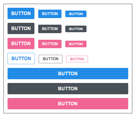
...rest props 전달하기
이제 이 컴포넌트에 onClick을 설정해주고 싶다면 어떻게 해야할까?
components/Button.js :
function Button({ children, size, color, outline, fullWidth, onClick }) {
  ...
만약 onMouseMove 이벤트를 관리하고 싶다면..?
function Button({ children, size, color, outline, fullWidth, onClick, onMouseMove }) {
  ...
필요한 이벤트가 있을 때마다 매번 이렇게 넣어주는 것은 매우 귀찮은 일이다. 이러한 문제를 해결하기 위한 문법이 있는데 그건 바로 spread와 rest이다. 이 문법은 주로 배열과 객체, 함수의 파라미터, 인자를 다룰 때 사용하는데, 컴포넌트에서돌 사용할 수 있다.
Button 컴포넌트를 수정해보자.
components/Button.js :
import React from 'react';
import classNames from 'classnames';
import './Button.scss';

function Button({ children, size, color, outline, fullWidth, ...rest }) {
  return (
    <button
      className={classNames('Button', size, color, { outline, fullWidth })}
      {...rest}
    >
      {children}
    </button>
  );
}

Button.defaultProps = {
  size: 'medium',
  color: 'blue'
};

export default Button;
이렇게 ...rest를 사용해서 우리가 지정한 props를 제외한 값들은 rest라는 객체에 모아주고, < button > 태그에 설정을 해준다.
그래서 만약 App.js에서 사용한 가장 첫번째 버튼에 onClick을 설정해준다면.
App.js :
import React from 'react';
import './App.scss';
import Button from './components/Button';

function App() {
  return (
    <div className="App">
      <div className="buttons">
        <Button size="large" onClick={() => console.log('클릭됐다!')}>
          BUTTON
        </Button>
        <Button>BUTTON</Button>
        <Button size="small">BUTTON</Button>
      </div>
      <div className="buttons">
        <Button size="large" color="gray">
          BUTTON
        </Button>
        <Button color="gray">BUTTON</Button>
        <Button size="small" color="gray">
          BUTTON
        </Button>
      </div>
      <div className="buttons">
        <Button size="large" color="pink">
          BUTTON
        </Button>
        <Button color="pink">BUTTON</Button>
        <Button size="small" color="pink">
          BUTTON
        </Button>
      </div>
      <div className="buttons">
        <Button size="large" color="blue" outline>
          BUTTON
        </Button>
        <Button color="gray" outline>
          BUTTON
        </Button>
        <Button size="small" color="pink" outline>
          BUTTON
        </Button>
      </div>
      <div className="buttons">
        <Button size="large" fullWidth>
          BUTTON
        </Button>
        <Button size="large" color="gray" fullWidth>
          BUTTON
        </Button>
        <Button size="large" color="pink" fullWidth>
          BUTTON
        </Button>
      </div>
    </div>
  );
}

export default App;
다음과 같이 버튼을 클릭 했을 때 onClick이 잘 호출된다.
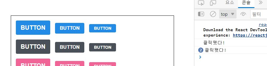
그래서 이렇게 컴포넌트가 어떤 props를 받을 지 확실치는 않지만 그대로 다른 컴포넌트 또는 HTML 태그에 전달을 해주어야 하는 상황에는 이렇게 ...rest 문법을 활용하면 된다!