10/10 6세션
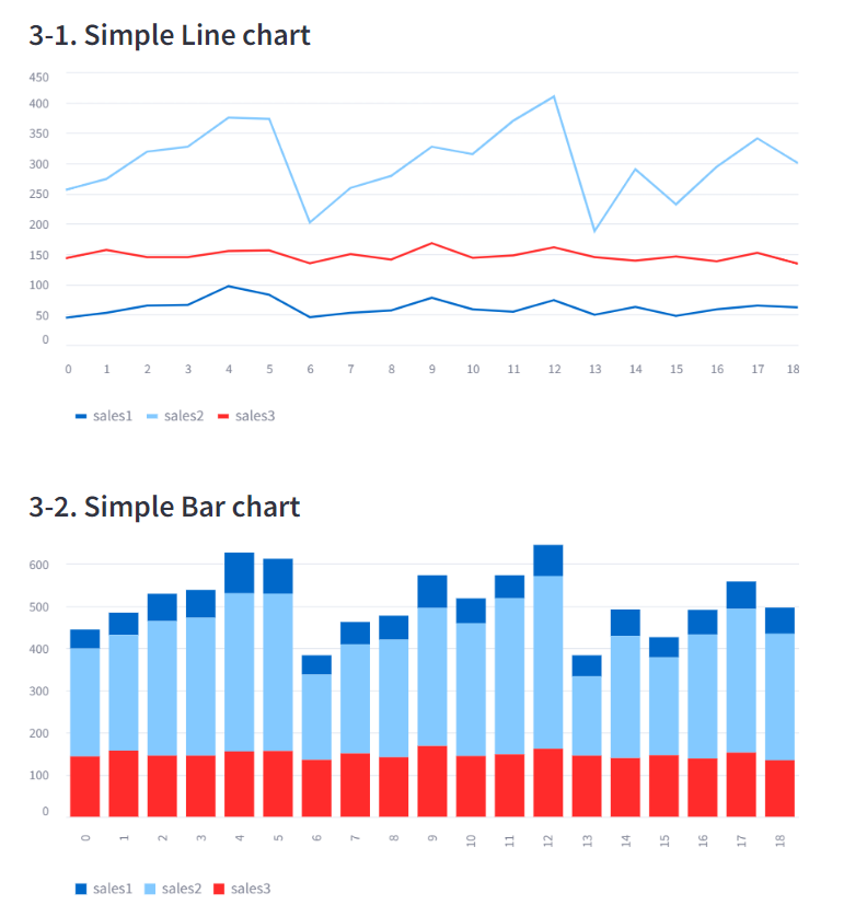
A. Simple Chart
- 데이터프레임을 간단하게 차트로 그려줌
- 너무 간결해서 다양한 표현이 불가능
선 차트 : line_chart(df)
막대 차트 : bar_chart(df)
영역 차트 : area_chart(df)
use_container_width=True: 화면 꽉차게 그리는 옵션
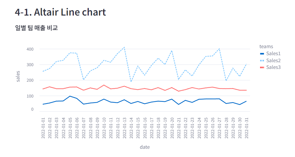
B. Altair chart
- 차트에 값 표시 가능, 데이터 설명 표시
import altair as alt사용
B-1. 선 차트 (mark_line)
import altair as alt

chart = alt.Chart(df_melted, title='일별 팀 매출 비교')
.mark_line()
.encode(x='date', y='sales', color='teams', strokeDash='teams')
.properties(width=650, height=350)

st.altair_chart(chart, use_container_width=True)mark_line(): 선 차트- encode() 에 들어가는 내용이 꾸미기
color=: teams 별로 색 다르게strokeDash=: teams 별로 선 모양 다르게
B-2. 막대 차트 (mark_bar)
- 차트 안에 텍스트를 표시하려면 chart+text 를 한다
- 텍스트는 mark_text()로 미리 선언한다
st.subheader('4-2. Altair Bar chart')

# 막대 차트 선언
chart = alt.Chart(df_melted, title='일별 매출')
.mark_bar()
.encode(x='date', y='sales', color='teams')

# 텍스트 선언
text = alt.Chart(df_melted)
.mark_text(dx=0, dy=0, color='black')
.encode(x='date', y='sales', detail='teams', text=alt.Text('sales:Q'))

# 합쳐 그리기
st.altair_chart(chart+text, use_container_width=True)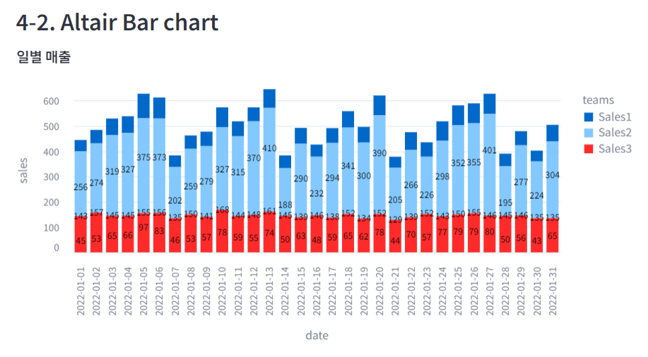
B-3. 산점도 (mark_circle)
chart = alt.Chart(iris, title='붓꽃 길이와 넓이').mark_circle()
.encode(x='petal_length', y='petal_width', color='species')

st.altair_chart(chart, use_container_width=True)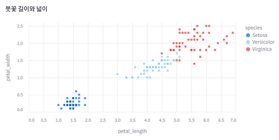
C. Plotly Chart
import plotly.express as px사용
C-1. 원형 그래프 (pie)
px.pie(df, x축, y축, 제목, 구멍 크기)update_traces: 텍스트 표시 설정update_layout: 폰트 크기 설정- 범례 중 하나 클릭하면 해당 부분을 빼고 보여줌. 범례 표시를 제거하면 해당 기능 사용 불가
# 데이터 가져오기
medal = pd.read_csv('https://raw.githubusercontent.com/huhshin/streamlit/master/data_medal.csv')
st.write(medal)
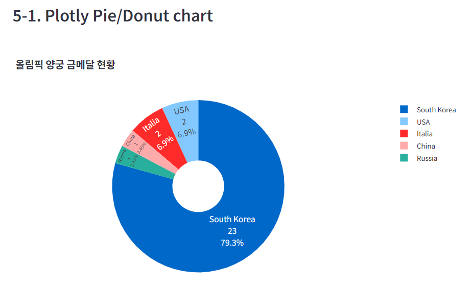
st.subheader('5-1. Plotly Pie/Donut chart')
# 파이 차트 선언
fig = px.pie(medal, names = 'nation', values= 'gold', title='올림픽 양궁 금메달 현황', hole=.3)
# 차트 모양 변경
fig.update_traces(textposition='inside', textinfo = 'percent+label+value')
fig.update_layout(font = dict(size=14))
# fig.update(layout_showlegend=False) # 범례 표시 제거
# 차트 표시
st.plotly_chart(fig)