Single Page Web
HTML
    <meta name="author" content="Sehwan">
    <meta name="description" content="이 페이지는 startBootstrap.com에서 제공하는 무료 템플릿을 커스터마이징하는 예제입니다.">
head에 추가한다.
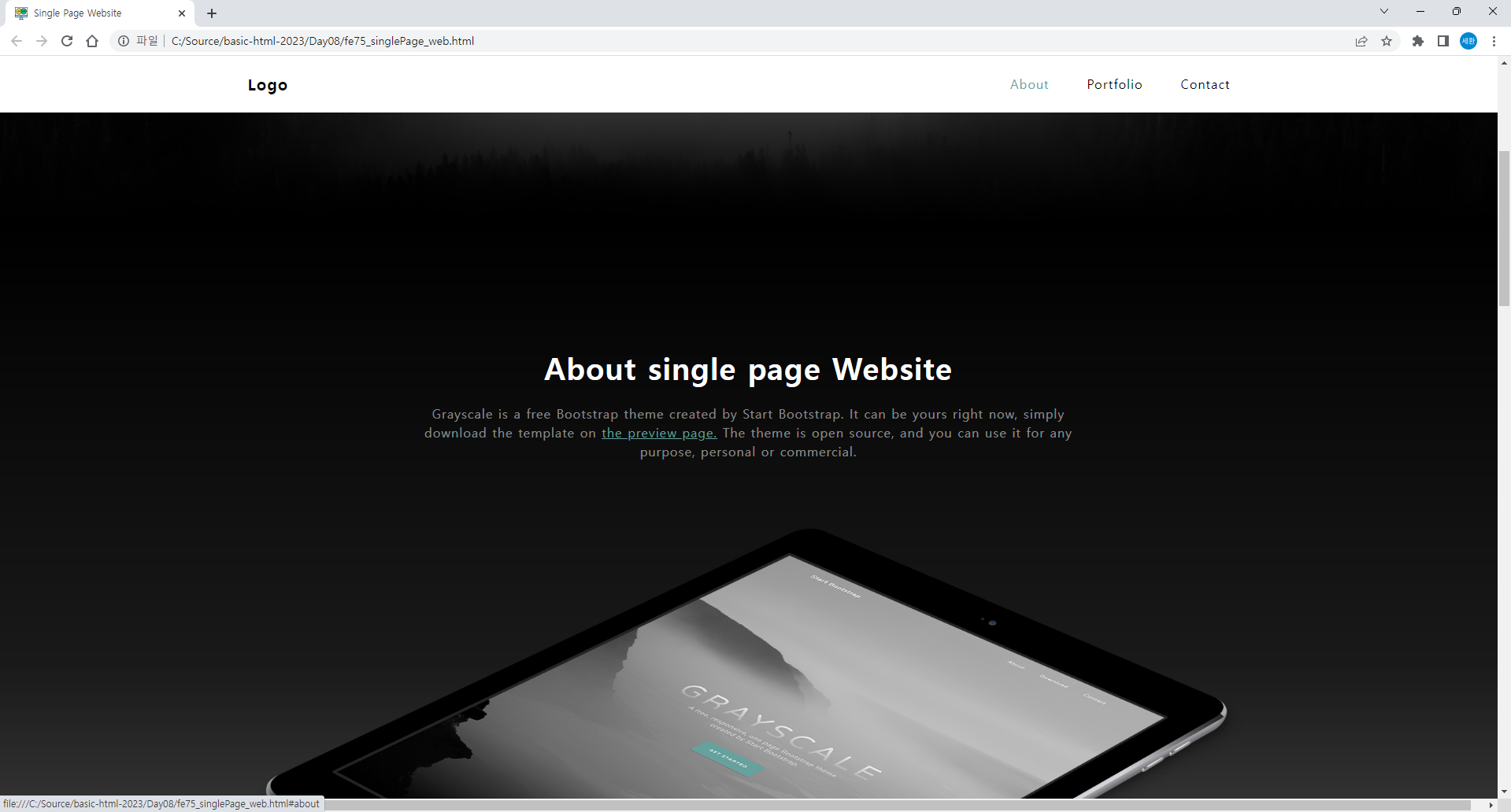
Navigation
<!-- 내비게이션 영역 -->
<nav id="mainNav" class="navbar navbar-light navbar-expand fixed-top"> <!-- 스크롤 내려도 상단에 고정 -->
<div class="container px-4">
<a href="#page-top" class="navbar-brand">Single Page Website</a>
<button type="button" class="navbar-toggler navbar-toggler-right"
data-bs-toggle="collapse" data-bs-target="#navbarResponsive"
aria-controls="navbarResponsive"aria-expanded="false" aria-label="Toggle navigation">
Menu
<i class="fas fa-bars"></i>
</button> <!-- collapse = 지우기 -->
<div id="navbarResponsive" class="navbar-collapse">
<ul class="navbar-nav ms-auto">
<li class="nav-item"><a href="#about" class="nav-link">About</a></li>
<li class="nav-item"><a href="#portfolio" class="nav-link">Portfolio</a></li>
<li class="nav-item"><a href="#signup" class="nav-link">Contact</a></li>
</ul>
</div>
</div>
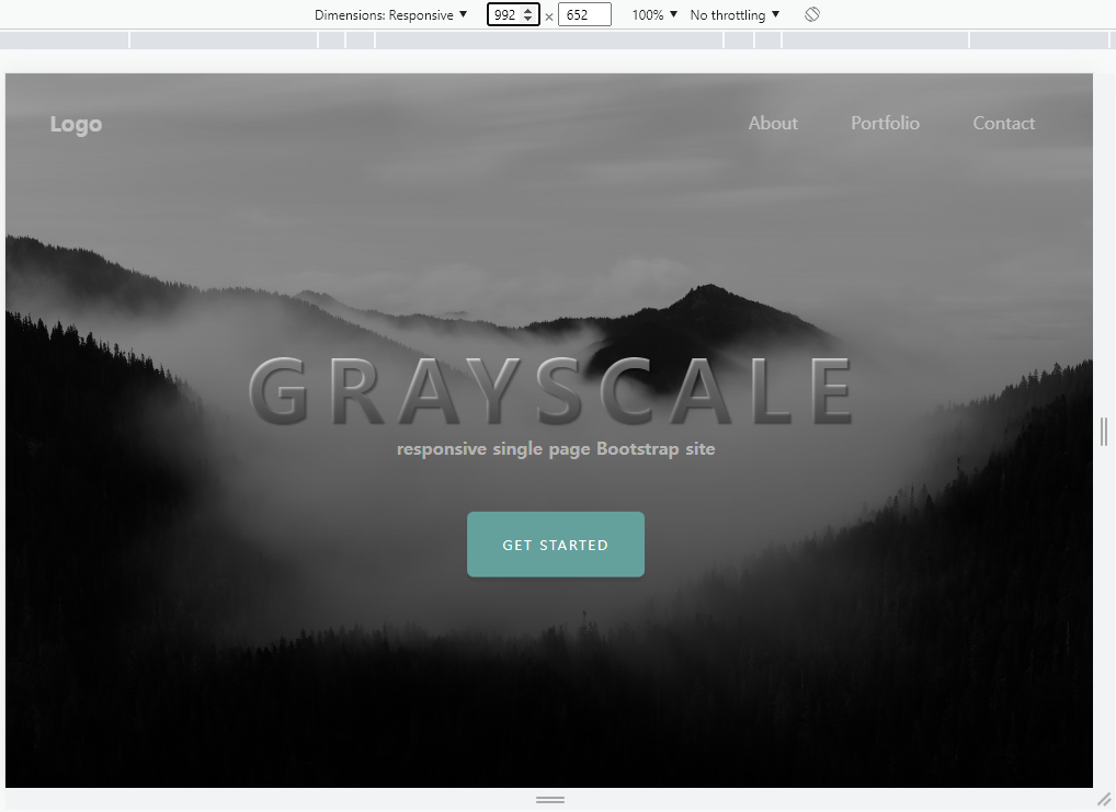
</nav>내비게이션 영역을 위처럼 수정한다.
스크롤을 내려도 상단바는 고정이 되고,
About, Portfolio, Contact를 누르면 해당 위치로 스크롤되어 이동한다.
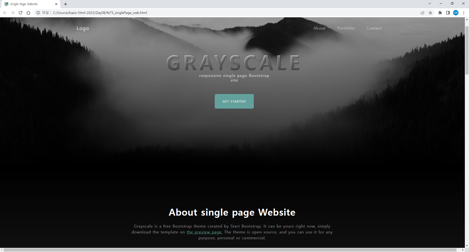
Masterhead
<!-- 마스터헤드 -->
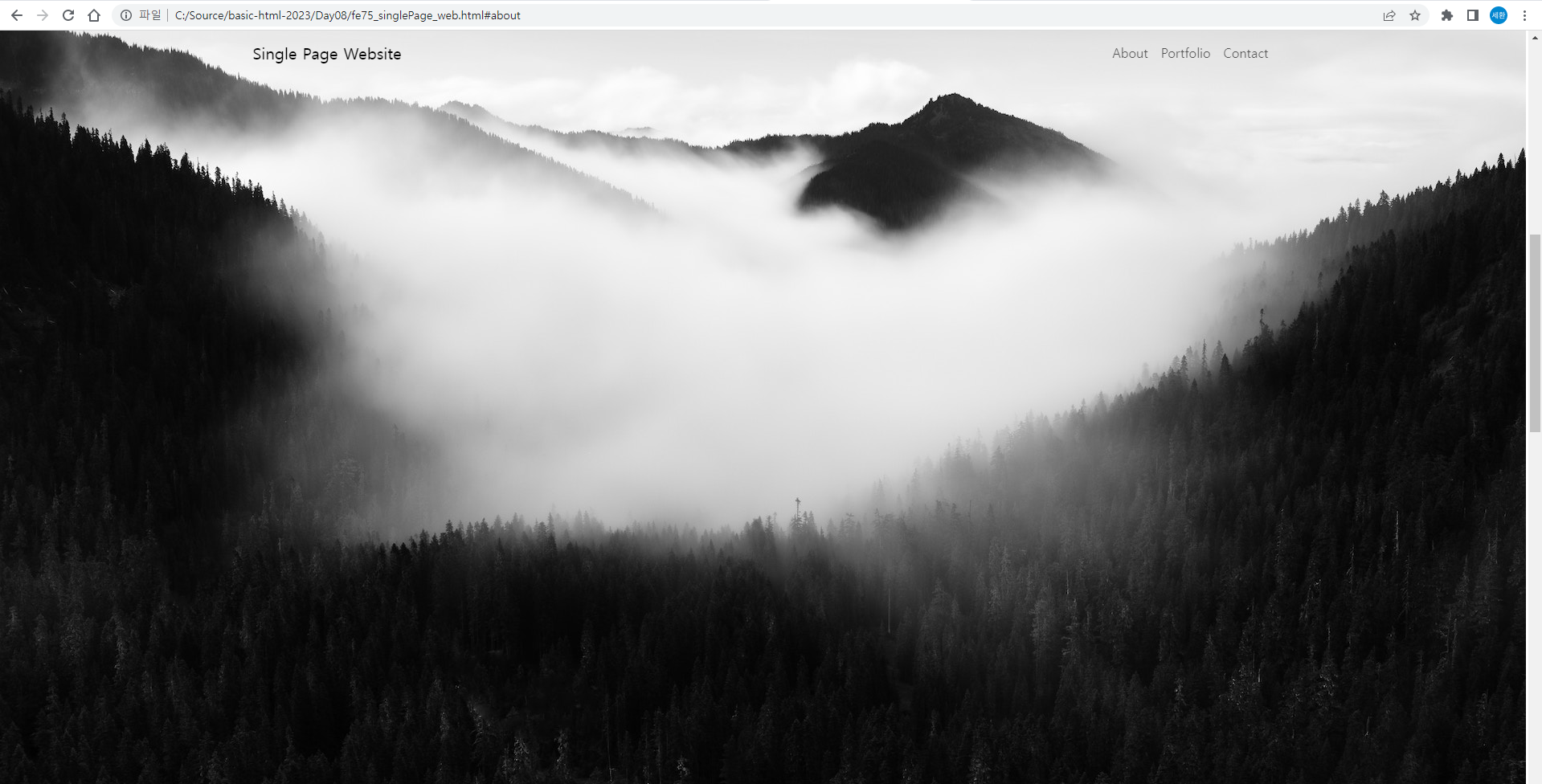
<header class="masterHead">
<div class="container px-4 d-flex h-100 justify-content-center align-items-center">
<div class="d-flex justify-content-center">
<div class="text-center">
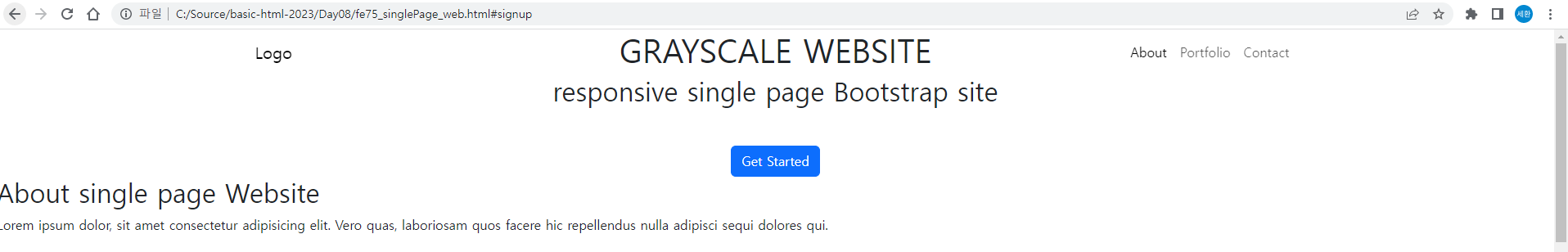
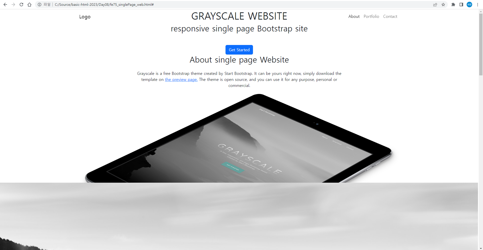
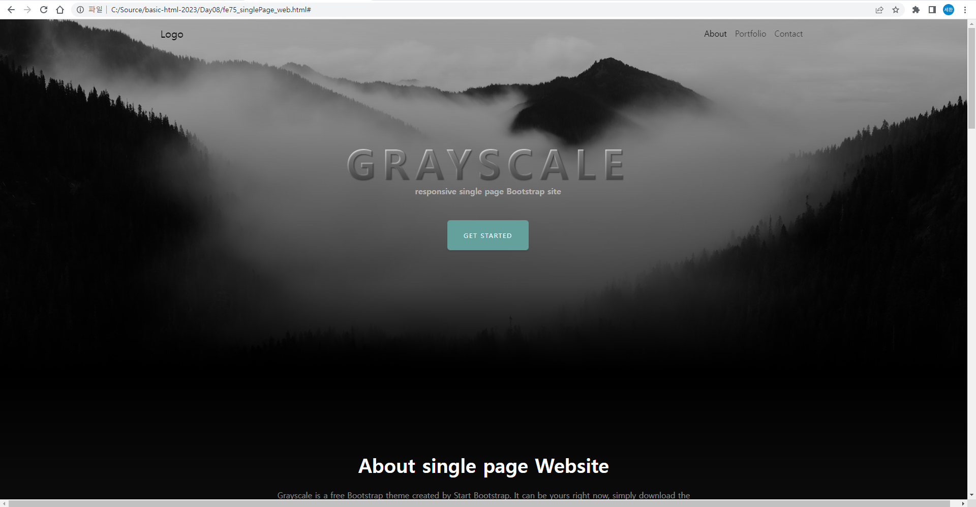
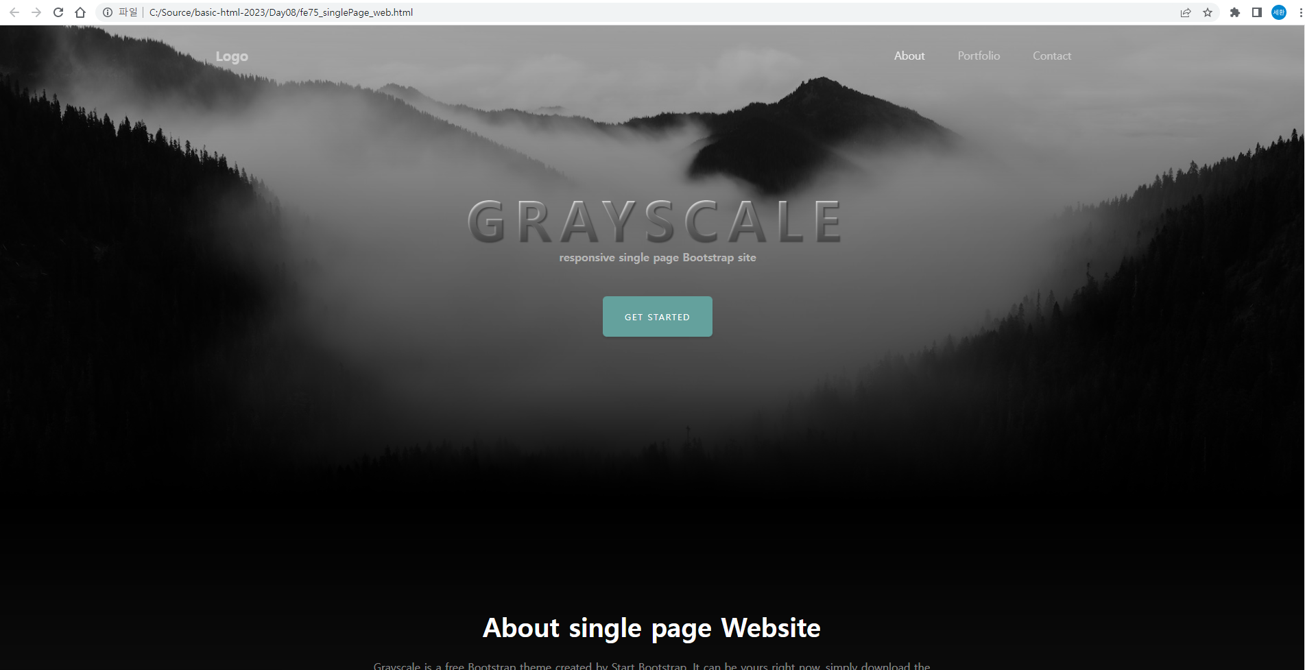
<h1 class="mx-auto my-0 text-uppercase">Grayscale Website</h1>
<h2 class="text-gray-50 mx-auto mt-2 mb-5">responsive single page Bootstrap site</h2>
<a href="#" class="btn btn-primary">Get Started</a>
</div>
</div>
</div>
</header>마스터헤드에 위 코드를 수정
결과
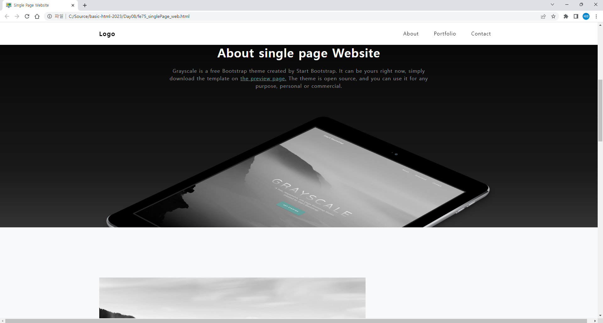
about
<a href="#" class="btn btn-primary shadow-sm">Get Started</a>마스터헤드에 쉐도우를 추가
<!-- about -->
<section id="about" class="about-section text-center">
<div class="container px-4">
<div class="row gx-4 justify-content-center">
<div class="col-8">
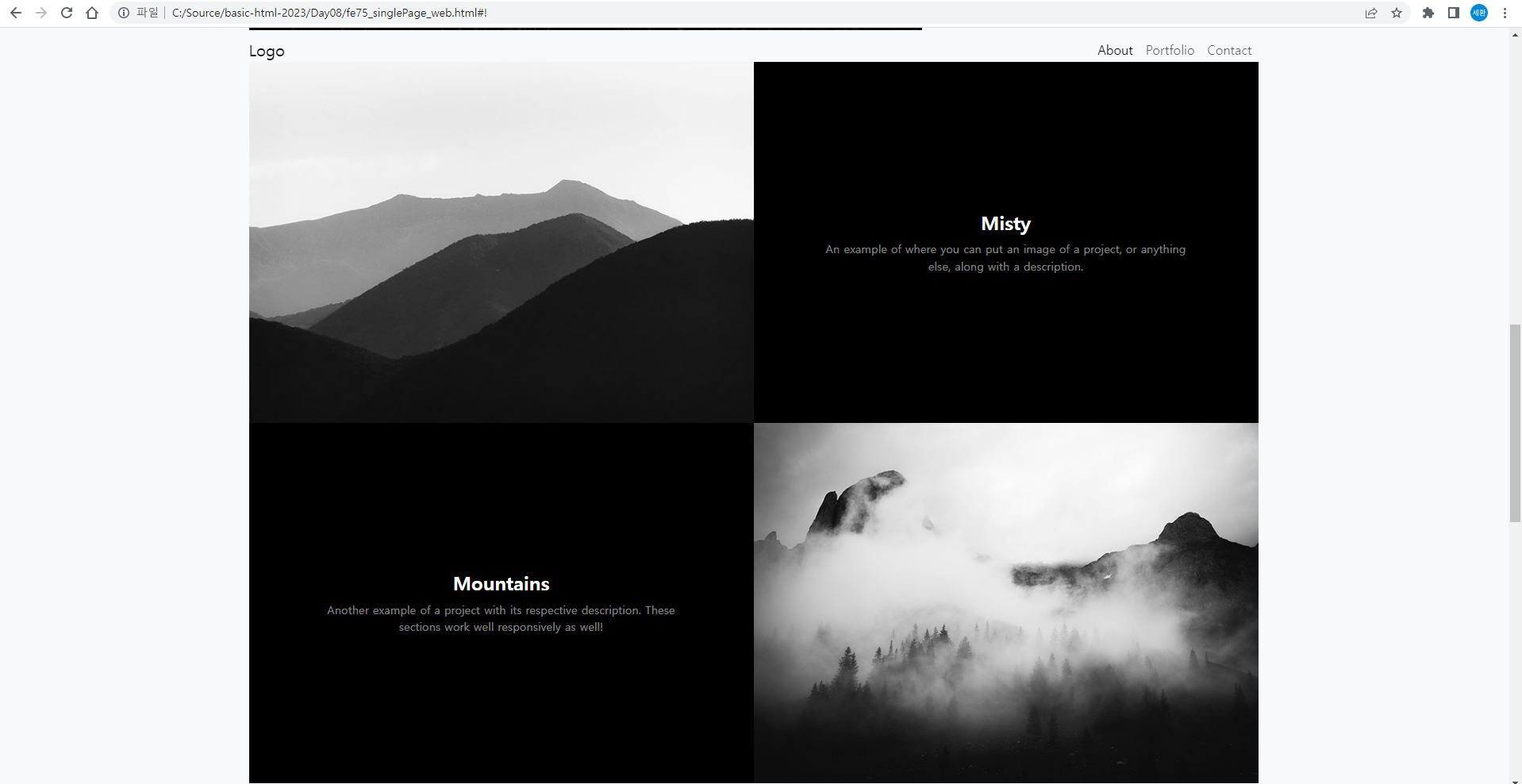
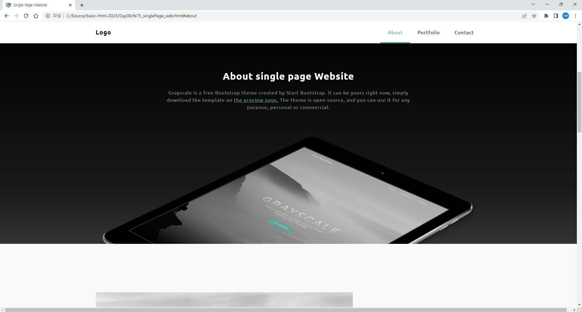
<h2 class="text-gray mb-4">About single page Website</h2>
<p class="text-gray-50">Grayscale is a free Bootstrap theme created by Start Bootstrap. It can be yours right now, simply download the template on
<a href="https://startbootstrap.com/theme/grayscale/">the preview page.</a>
The theme is open source, and you can use it for any purpose, personal or commercial.</p>
</div>
</div>
<img src="images/ipad.png" alt="..." class="img-fluid">
</div>
</section>about를 수정
결과
Portfolio
<!-- Portfolio 영역 -->
<section id="portfolio" class="portfolios-section bg-light">
<div class="container px-4">
<!-- 1st row 영역 -->
<div class="row align-items-center">
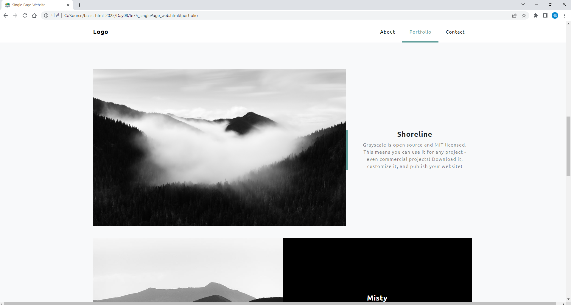
<div class="col-8">
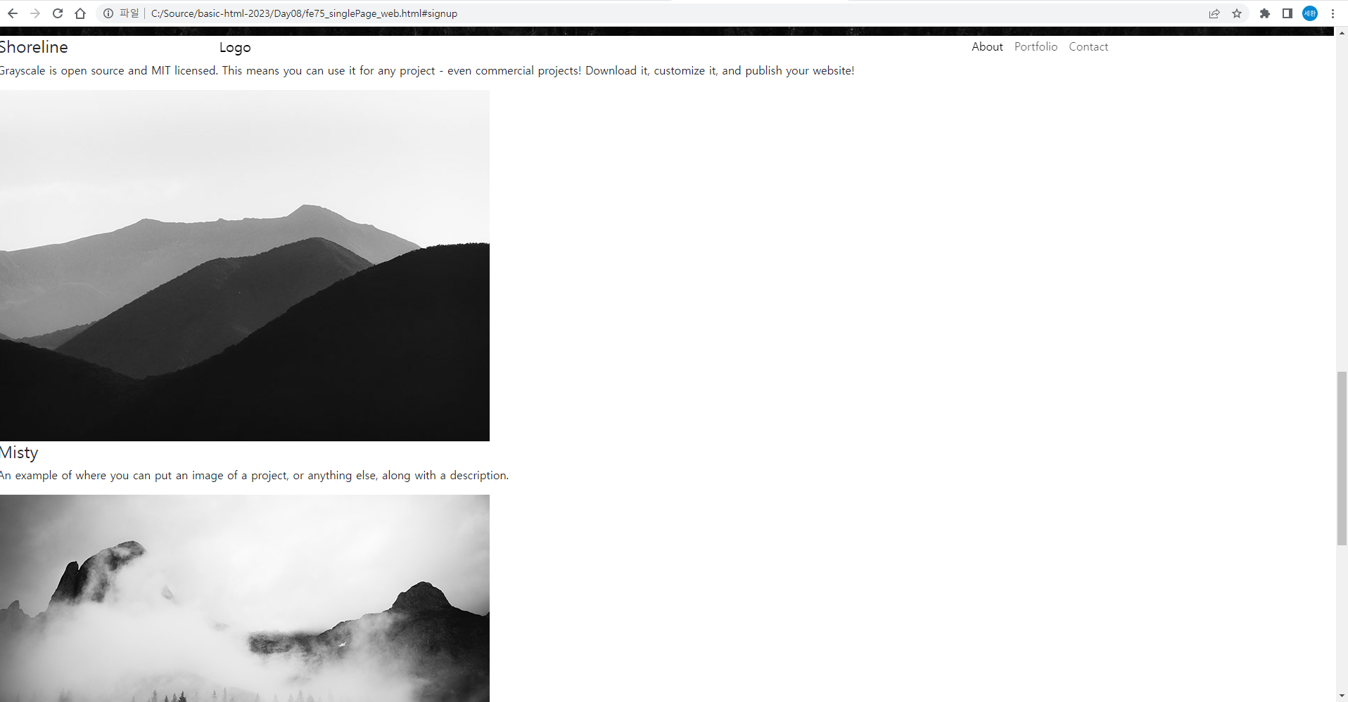
<img src="images/bg-masthead.jpg" class="img-fluid mb-3">
</div>
<div class="col-4">
<div class="featured-text text-center">
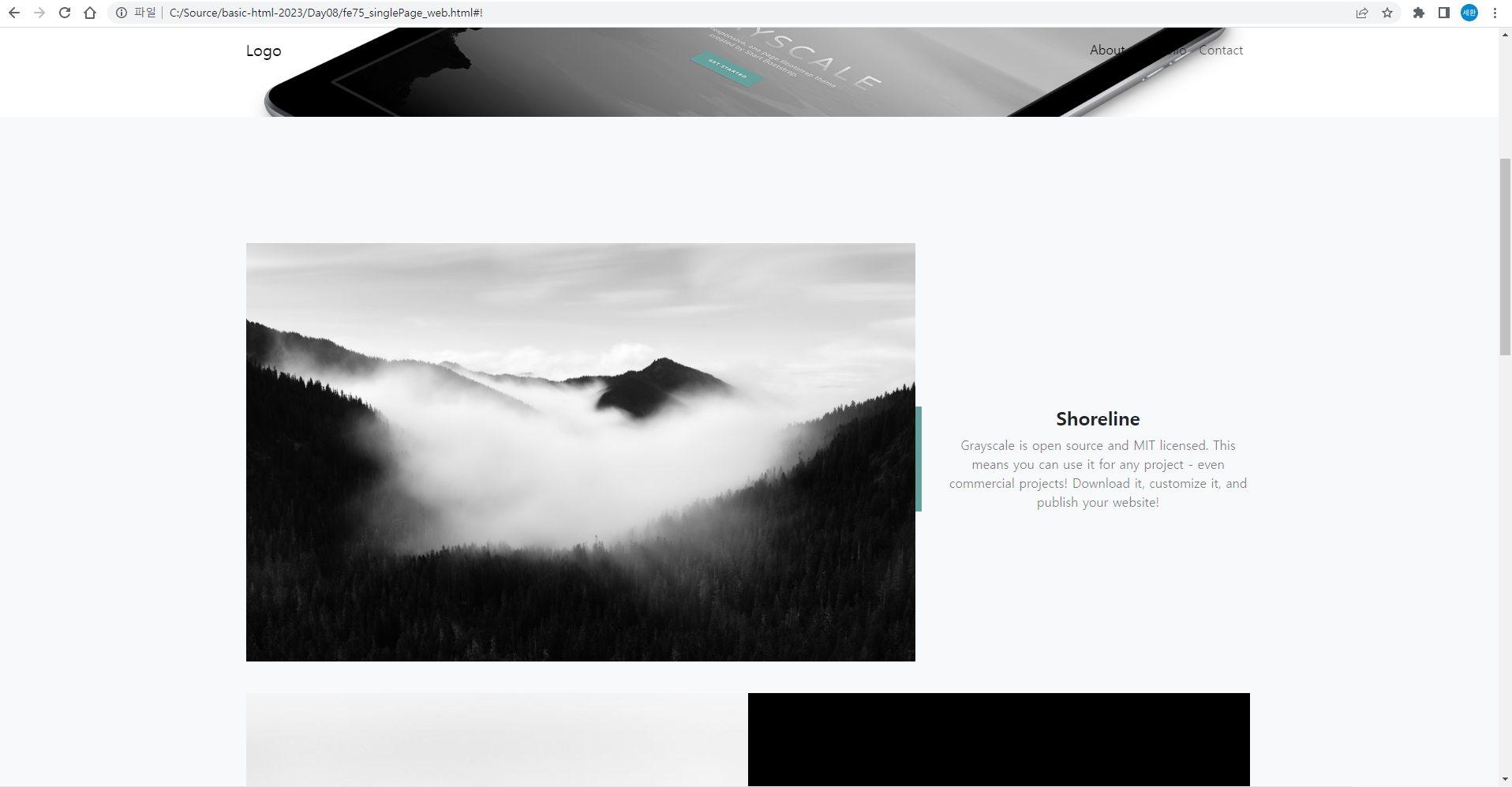
<h4>Shoreline</h4>
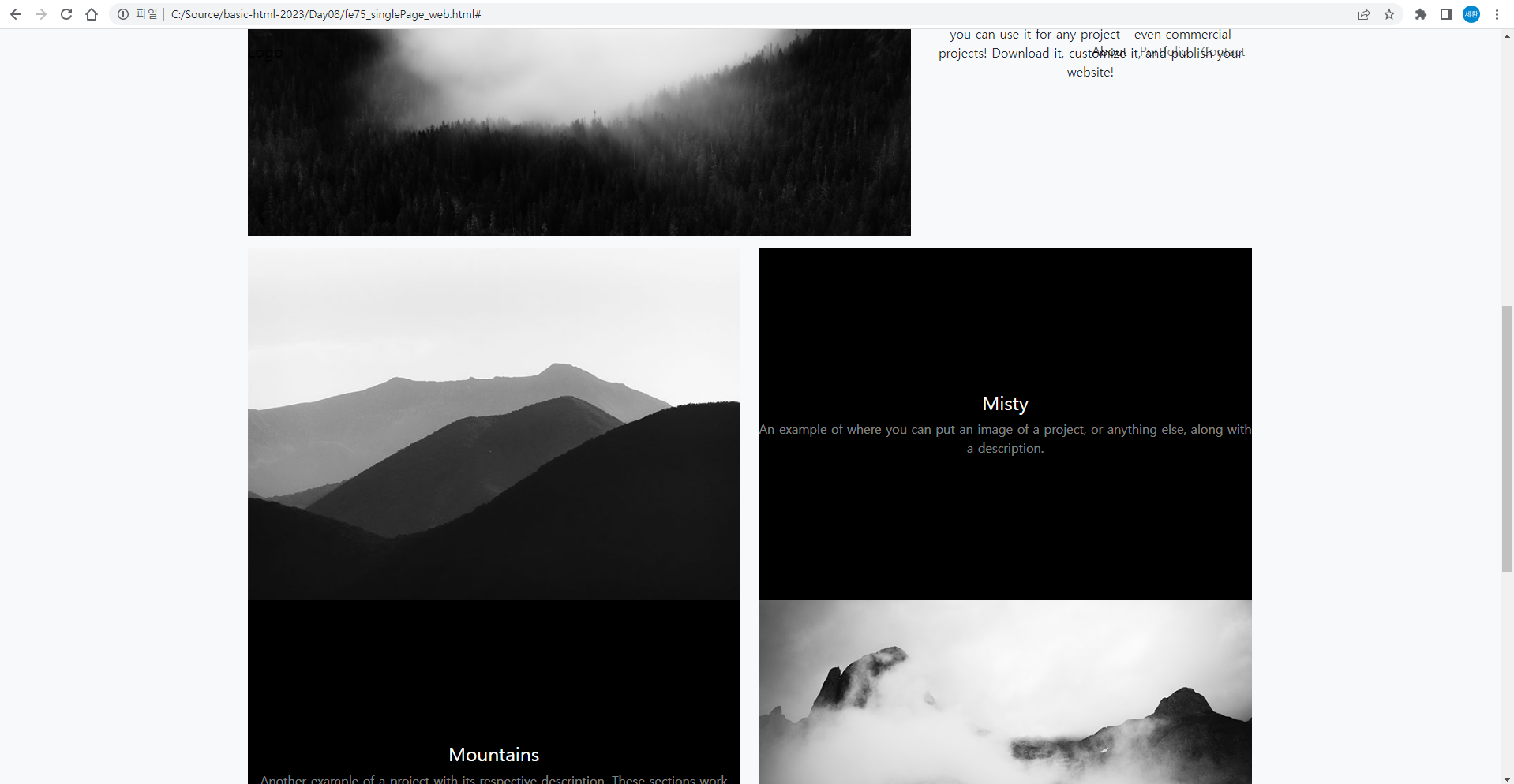
<p>Grayscale is open source and MIT licensed. This means you can use it for any project - even commercial projects! Download it, customize it, and publish your website!</p>
</div>
</div>
</div>
<!-- 2nd row -->
<div class="row justify-content-center">
<div class="col-6">
<img src="images/demo-image-01.jpg" class="img-fluid">
</div>
<div class="col-6">
<div class="bg-black text-center h-100 portfolio">
<div class="d-flex h-100">
<div class="portfolio-text w-100 my-auto text-center">
<h4 class="text-white">Misty</h4>
<p class="mb-0 text-white-50">An example of where you can put an image of a project, or anything else, along with a description.</p>
</div>
</div>
</div>
</div>
</div>
<!-- 3rd row -->
<div class="row justify-content-center">
<div class="col-6">
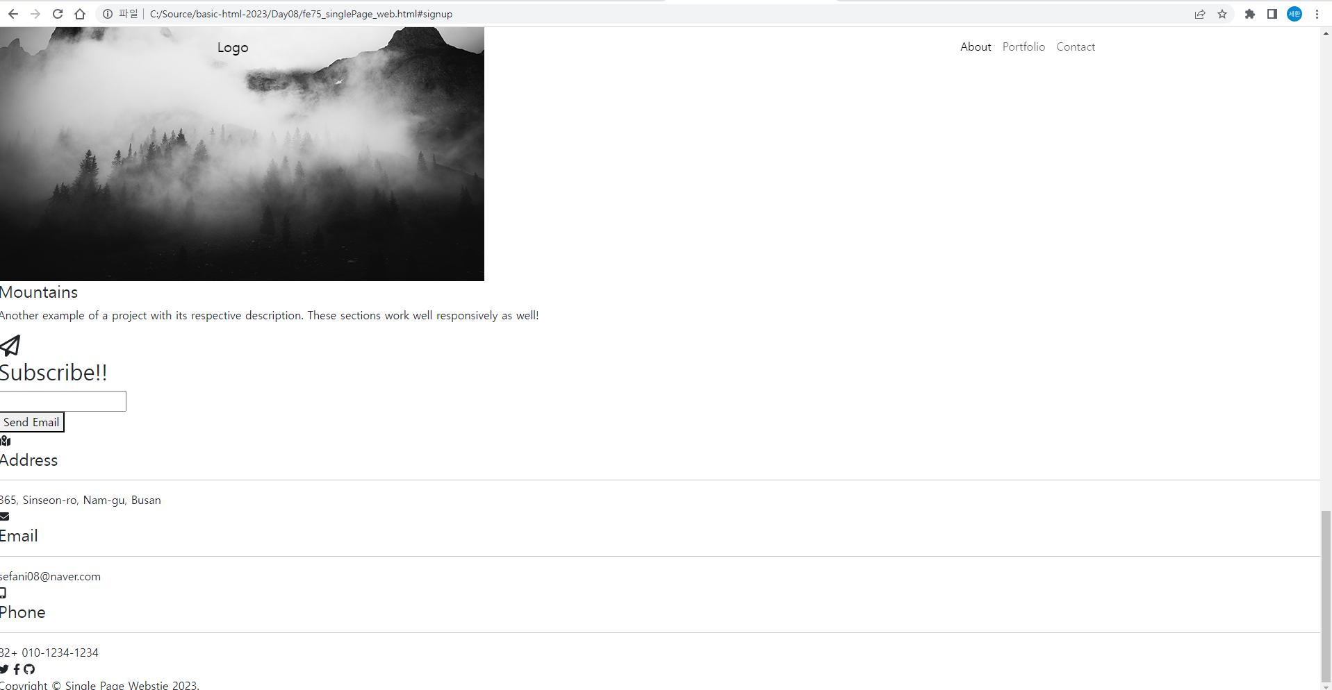
<img src="images/demo-image-02.jpg" class="img-fluid">
</div>
<!-- col 영역 위치 바꾸기 order-first -->
<div class="col-6 order-first">
<div class="bg-black text-center h-100 portfolio">
<div class="d-flex h-100">
<div class="portfolio-text w-100 my-auto text-center">
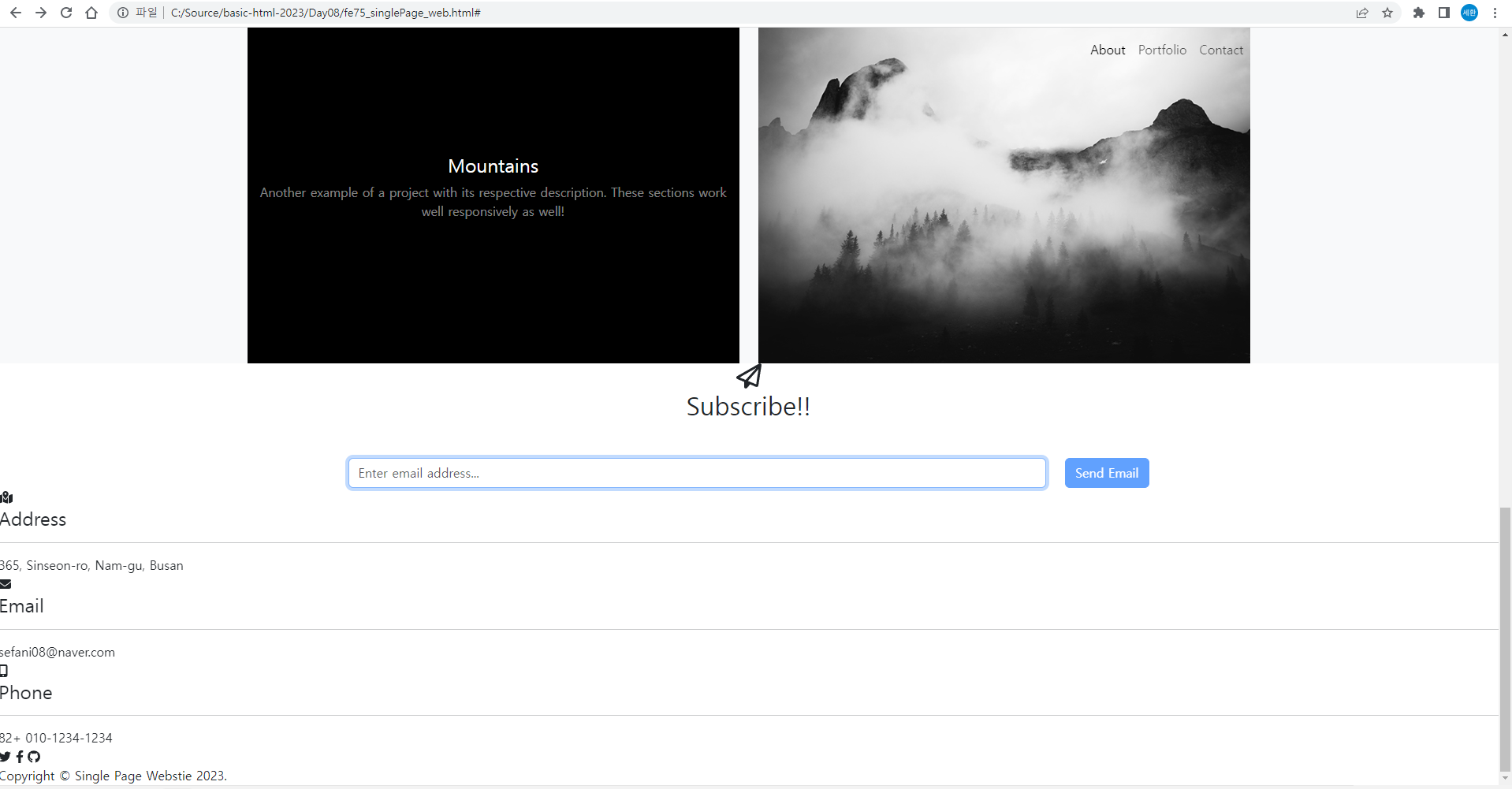
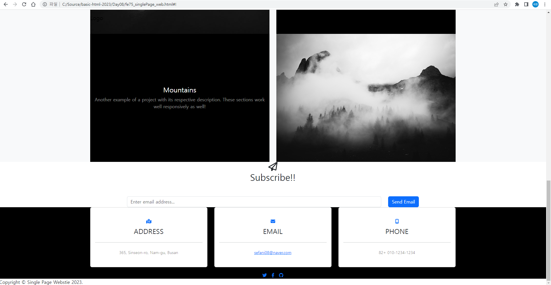
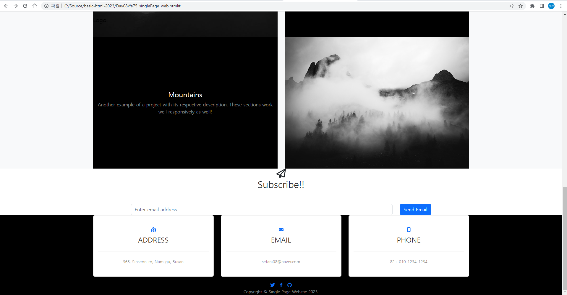
<h4 class="text-white">Mountains</h4>
<p class="mb-0 text-white-50">Another example of a project with its respective description. These sections work well responsively as well!</p>
</div>
</div>
</div>
</div>
</div>
</div>
</section>portfolio 영역을 수정
결과
Contact / signup 영역
<!-- Contact / signup 영역 -->
<section id="signup" class="signup-section">
<div class="container px-4">
<div class="row px-4">
<div class="col-10 mx-auto text-center">
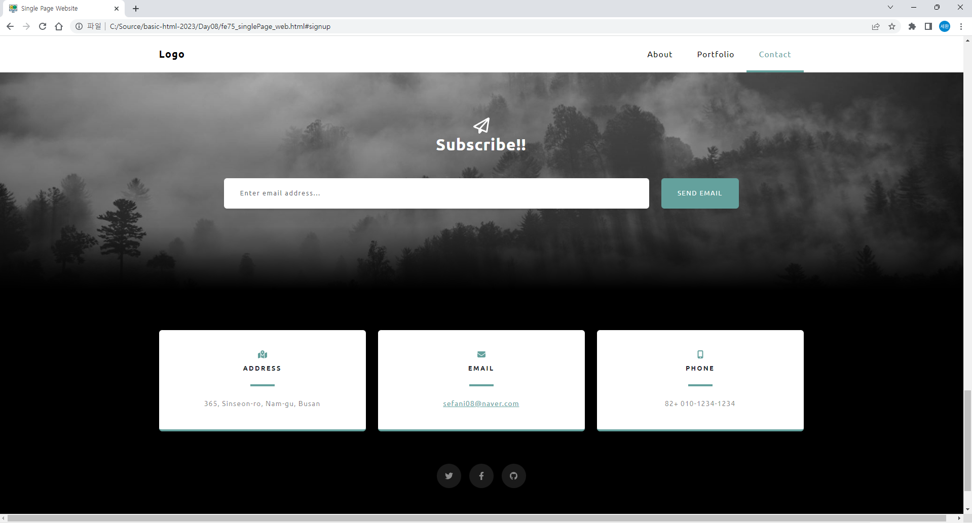
<i class="far fa-paper-plane fa-2x"></i>
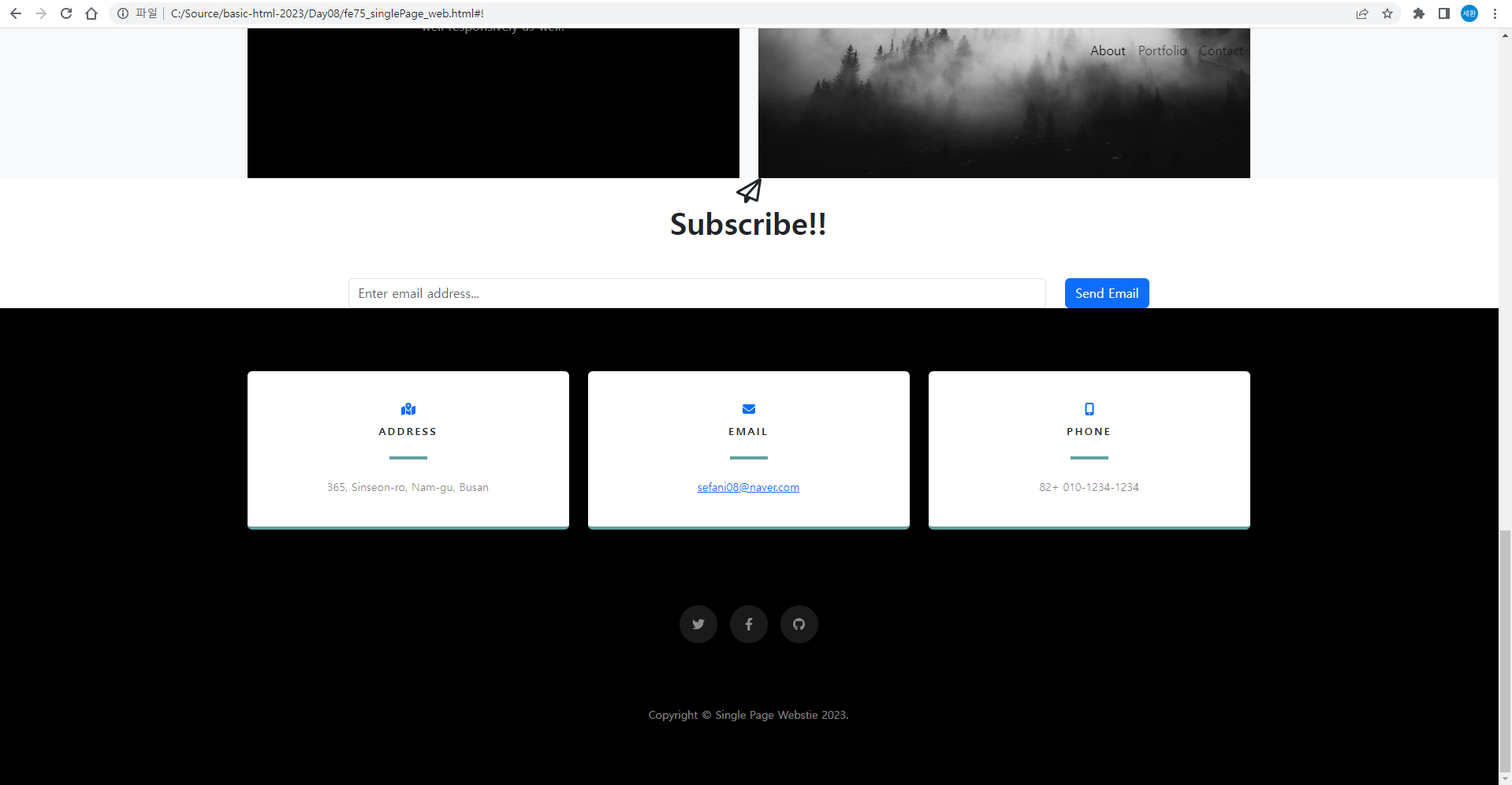
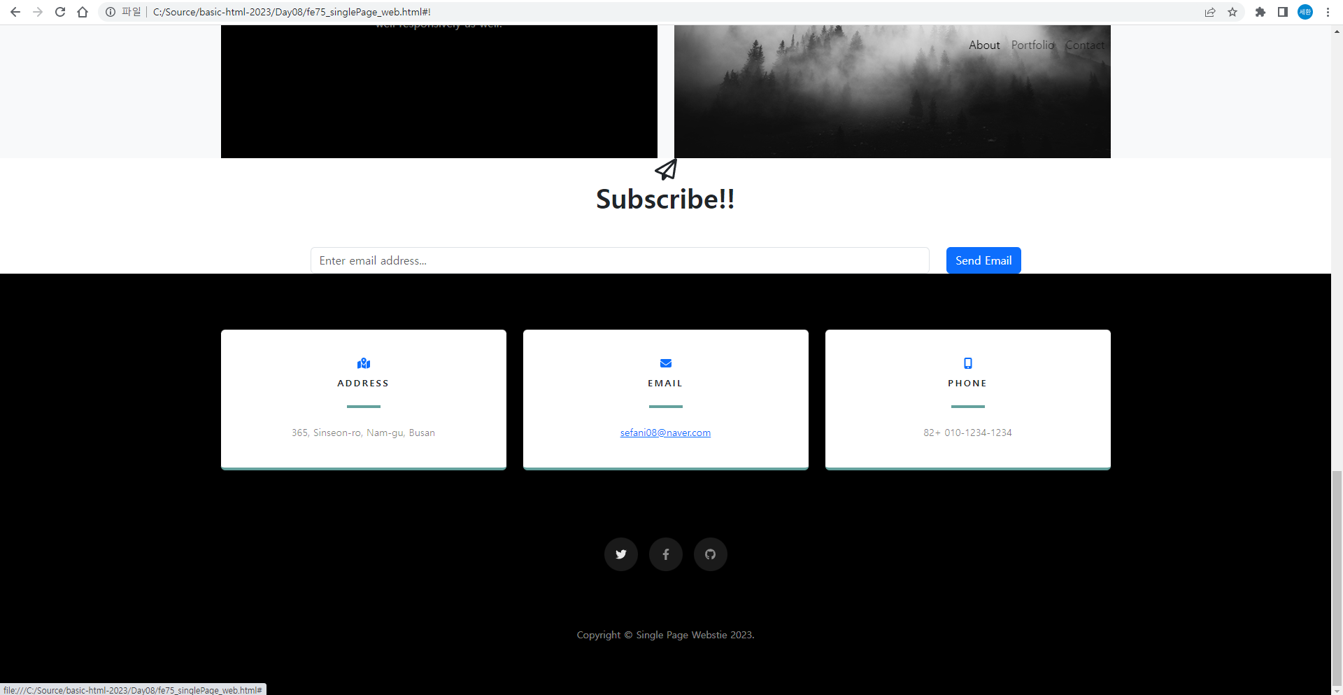
<h2 class="text-gray mb-5">Subscribe!!</h2>
<form id="contactForm" class="form-signup">
<div class="row input-group-newletter">
<div class="col"><input id="email" type="email" class="form-control" placeholder="Enter email address..." aria-label="Enter email address..." data-sb-validations="required,email"></div>
<div class="col-auto"><button id="save" type="submit" class="btn btn-primary">Send Email</button></div>
</div>
</form>
</div>
</div>
</div>
</section>Contact/signup 영역을 수정
결과
Contact 영역
    <!-- Contact 영역 -->
    <section class="contact-section bg-black">
        <div class="container px-4">
            <div class="row gx-4">
                <!-- 1st col -->
                <div class="col-4 mb-3">
                    <div class="card py-4 h-100">
                        <div class="card-body text-center">
                            <i class="fas fa-map-marked-alt text-primary mb-2"></i>
                            <h4 class="text-uppercase m-0">Address</h4>
                            <hr class="my-4 mx-auto">
                            <div class="small text-black-50">365, Sinseon-ro, Nam-gu, Busan</div>
                        </div>
                    </div>
                </div>
                <!-- 2nd col -->
                <div class="col-4 mb-3">
                    <div class="card py-4 h-100">
                        <div class="card-body text-center">
                            <i class="fas fa-envelope text-primary mb-2"></i>
                            <h4 class="text-uppercase m-0">Email</h4>
                            <hr class="my-4 mx-auto">
                            <div class="small text-black-50"><a href="#!">sefani08@naver.com</a></div>
                    </div>
                </div>
                <!-- 3rd col -->
                <div class="col-4 mb-3">
                    <div class="card py-4 h-100">
                        <div class="card-body text-center">
                            <i class="fas fa-mobile-alt text-primary mb-2"></i>
                            <h4 class="text-uppercase m-0">Phone</h4>
                            <hr class="my-4 mx-auto">
                            <div class="small text-black-50">82+ 010-1234-1234</div>
                        </div>
                    </div>
                </div>
            </div>
            <div class="social d-flex justify-content-center">
                <a class="mx-2" href="#"><i class="fab fa-twitter"></i></a>
                <a class="mx-2" href="#"><i class="fab fa-facebook-f"></i></a>
                <a class="mx-2" href="#"><i class="fab fa-github"></i></a>
            </div>
        </div>
    </section>
위 코드처럼 수정
결과
footer
<!-- footer -->
<footer class="footer bg-black small text-center text-white-50">
<div class="container px-4">Copyright © Single Page Webstie 2023.</div>
</footer>마지막으로 footer 수정
결과
singlepage.css
@charset "UTF-8";
/* 구글폰트로 웹사이트 글자체 변경 */
@import url('https://fonts.googleapis.com/css2?family=Poppins:wght@200;300;400;500;600;700;900&display=swap');

* {
    box-sizing: border-box;
    font-family: 'Ubuntu', sans-serif;
}

hr {
    margin: 1rem 0;
    color: inherit;
    border: 0;
    border-top: 1px solid;
    opacity: 0.25; /* 투명도 */
}

h1, h2, h3, h4, h5, h6 {
    margin-top: 0;
    margin-bottom: 0.5rem;
    font-weight: 600;
    line-height: 1.2;
}

h1 {
    font-size: calc(1.5rem + 1.5vw); /* 계산으로 넓이를 변경 */
}
@media screen and (min-width: 1200px) {
    h1 {
        font-size: 2.5rem;
    }
}

h2 {
    font-size: calc(1.3rem + 0.9vw); /* 계산으로 넓이를 변경 */
}
@media screen and (min-width: 1200px) {
    h1 {
        font-size: 2.0rem;
    }
}

p {
    margin-top: 0;
    margin-bottom: 1rem;
}

ol, ul {
    padding-left: 2rem;
    margin-top: 0;
    margin-bottom: 1rem;
}

img {
    vertical-align: middle;
}

.footer {
    padding: 5rem 0;
}
초기값을 설정한다.
contact-section
.contact-section {
    padding-top: 5rem;
}

.contact-section .card {
    border: 0;
    border-bottom: 0.25rem solid #64a19d;
}

.contact-section .card h4{
    font-size: 0.8rem;
    letter-spacing: 0.15rem;
}

.contact-section .card hr{
    opacity: 1;
    border-color: #64a19d;
    border-width: 0.25rem;
    width: 3rem;
}

.contact-section .social {
    margin-top: 5rem;
}

.contact-section .social a {
    text-align: center;
    width: 3rem; height: 3rem;
    background-color: rgba(255, 255, 255, 0.1);
    border-radius: 100%;
    line-height: 3rem; /* 16px x 3 */
    color: rgba(255, 255, 255, 0.5);
}

.contact-section .social a:hover {
    color: rgba(255, 255, 255, 0.9);
}

.contact-section .social a:active {
    color: white;
}
여기까지 수정하면
결과값이 이렇게 된다.
트위터, 페이스북, 깃허브 아이콘에 마우스를 갖다대면 색깔이 바뀐다.
signtup-section
.signup-section {
    padding: 10rem 0;
    background: linear-gradient(to bottom, rgba(0, 0, 0, 0.1) 0%, rgba(0, 0, 0, 0.5) 75%, #000000 100%),
                                url('../images/bg-signup.jpg');
    background-position: center;
    background-repeat: no-repeat;
    background-attachment: scroll;
    background-size: cover;
}

.signup-section .form-signup input {
    box-shadow: 0 0.19rem 0.19rem 0 rgba(0, 0, 0, 0.1) !important; /* !important = 무조건 적용되어야 하는 스타일 */
    padding: 1.25rem, 2rem;
    height: auto;
    font-size: 80%;
    letter-spacing: 0.1rem;
    border: 0;
}

.btn {
    --bs-btn-bg: #64a19d;
    background-color: #64a19d;
    box-shadow: 0 0.19rem 0.19rem 0 rgba(0, 0, 0, 0.1) !important; /* !important = 무조건 적용되어야 하는 스타일 */
    padding: 1.25rem 2rem;
    font-size: 80%;
    text-transform: uppercase;
    letter-spacing: 0.1rem;
    border: 0;
}

.btn:hover,
.btn:active {
    background-color: #558985;
}
css의 signup-section을 위처럼 생성하고
<i class="far fa-paper-plane fa-2x text-white"></i>
<h2 class="text-white mb-5">Subscribe!!</h2>
html에서 Contact / signup 영역에서 text를 흰색으로 바꿔준다.
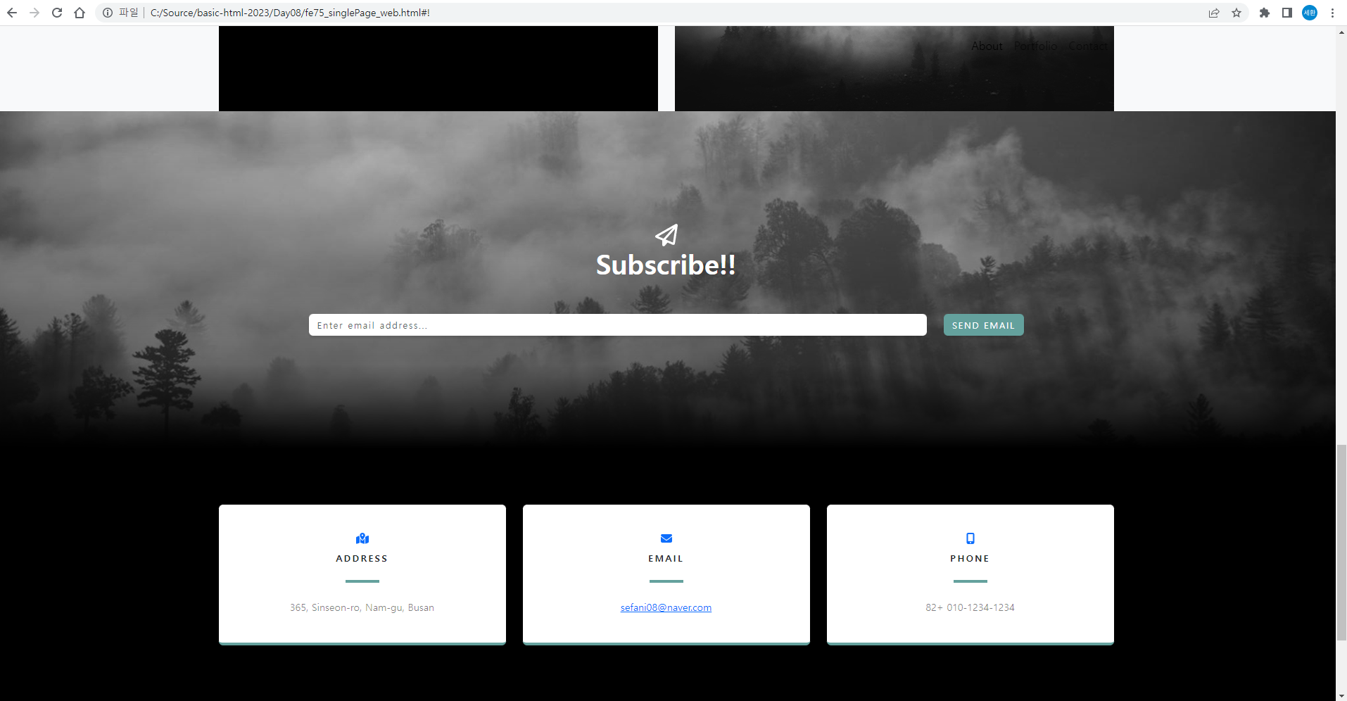
결과

SEND EMAIL에 마우스커서를 올리지 않았을 때
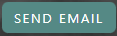
SEND EMAIL에 마우스커서를 올렸을 때
<i class="fas fa-map-marked-alt custom-color mb-2"></i>html의 Contact 영역에 주소, 이메일, 연락처 부분을 모두 이렇게 바꿔주고
.custom-color {
    color:#64a19d;
}
css에 color를 설정하면

아이콘 색깔이 바뀐다.
Portfolio
<!-- 1st row 영역 -->
            <div class="row align-items-center gx-0 mb-4">

<!-- 2nd row -->
            <div class="row justify-content-center gx-0">

<!-- 3rd row -->
            <div class="row justify-content-center gx-0">
html에서 Portfolio 영역을 위처럼 바꾸고
.portfolios-section {
    padding: 10rem 0;
}

.portfolios-section .featured-text {
    padding: 2rem;
}

.portfolios-section .portfolio-text {
    padding: 3rem;
    font-size: 90%;
}

@media screen and (min-width: 992px) {
    .portfolios-section .featured-text {
        padding: 0 0 0 2rem;
        border-left: 0.5rem solid #64a19d;
    }
    .portfolios-section .portfolio-text {
        padding: 5rem;
    }
}
css에 추가한다.
결과.
about
 <h2 class="text-white mb-4">About single page Website</h2>
                    <p class="text-white-50">Grayscale is a free Bootstrap theme created by Start Bootstrap. It can be yours right now, simply download the template on
html에서 글자 색을 바꾸고
.about-section {
    padding-top: 10rem;
    background: linear-gradient(to bottom, #000000 0%, rgba(0, 0, 0, 0.9) 75%, rgba(0, 0, 0, 0.8) 100%);
}

.about-section p{
    margin-bottom: 5rem;
}
cs에 이렇게 작성한다.
결과
MasterHead
<h1 class="mx-auto my-0 text-uppercase">Grayscale</h1>
<h2 class="text-white-50 mx-auto mt-2 mb-5">responsive single page Bootstrap site</h2>
html에서 글자를 바꿔주고
.masterHead {
    position: relative;
    width: 100vw;
    height: auto;
    min-height: 35rem;
    padding: 15rem 0;
    background: linear-gradient(to bottom, rgba(0, 0, 0, 0.3) 0%, rgba(0, 0, 0, 0.7) 75%, #000000 100% ),
                url('../images/bg-masthead.jpg');
    background-position: center;
    background-repeat: no-repeat;
    background-attachment: scroll;
    background-size: cover;
}

.masterHead h1{
    font-size: 5rem;
    line-height: 5rem;
    letter-spacing: 0.8rem;
    background: linear-gradient(rgba(255, 255, 255, 0.9), rgba(255, 255, 255, 0));
    -webkit-text-fill-color: transparent;
    -webkit-background-clip: text;
    background-clip: text;
    text-shadow: 2px 2px 2px rgba(0, 0, 0, 0.4);
}

.masterHead h2 {
    max-width: 20rem;
    font-size: 1rem;
}
css에 작성한다.
++
.btn {
    --bs-btn-bg: #64a19d;
    background-color: #64a19d;
    box-shadow: 0 0.19rem 0.19rem 0 rgba(0, 0, 0, 0.1) !important; /* !important = 무조건 적용되어야 하는 스타일 */
    /* padding: 1.25rem, 2rem; */
    padding: 1.25rem 2rem;
    font-size: 80%;
    text-transform: uppercase;
    letter-spacing: 0.1rem;
    border: 0;
}

.btn:hover,
.btn:active {
    background-color: #558985;
}
오타가 있어 수정함
결과
mainNav
#mainNav {
    min-height: 3.5rem;
    background-color: #ffffff;
}

#mainNav .navbar-toggle {
    font-size: 80%;
    padding: 0.75rem;
    color: #64a19d;
    border: 1px solid #64a19d;
}

#mainNav .navbar-toggler:focus {
    outline: none;
}

#mainNav .navbar-brand {
    color: #000000;
    font-weight: 900;
    padding: 0.9rem 0;
}

#mainNav .navbar-nav .nav-item:hover {
    color: fade(#ffffff, 80%);
    outline: none;
    background-color: transparent;
}

#mainNav .navbar-nav .nav-item:active,
#mainNav .navbar-nav .nav-item:focus {
    outline: none;
    background-color: transparent;
}

@media screen and (min-width: 992px) {
    #mainNav {
        padding-top: 0;
        padding-bottom: 0;
        border-bottom: none;
        background-color: transparent;
        transition: background-color 0.3s ease-in-out;
    }

    #mainNav .navbar-brand {
        padding: 0.5rem 0;
        color: rgba(255, 255, 255, 0.5);
    }

    #mainNav .nav-link {
        transition: none;
        padding: 2rem 1.5rem;
        color: rgba(255, 255, 255, 0.5);
    }

    #mainNav .nav-link:hover{
        color: rgba(255, 255, 255, 0.8);
    }

    #mainNav .nav-link:active{
        color: white;
    }

    /* js에서 처리하는 메뉴부분 시작 */
    #mainNav.navbar-shrink {
        background-color: white;
    }

    #mainNav.navbar-shrink .navbar-brand {
        color: #000000;
    }

    #mainNav.navbar-shrink .nav-link {
        color: #000000;
        padding: 1.5rem 1.5rem 1.25rem;
        border-bottom: 0.25rem solid transparent;
    }

    #mainNav.navbar-shrink .nav-link:hover {
        color: #64a19d;
    }

    #mainNav.navbar-shrink .nav-link:active {
        color: #467370;
    }

    #mainNav.navbar-shrink .nav-link:active {
        color: #64a19d;
        outline: none;
        border-bottom: 0.25rem solid #64a19d;
    }
    /* js에서 처리하는 메뉴부분 끝 */
}
css에 작성한다.
길이가 992 이상일 때
길이가 992보다 작을 때
상단바 색깔이 바뀐다.
Abort에 마우스커서를 올렸을 때

Abort를 클릭할 때 색깔이 바뀐다.
etc.
html {
    scroll-padding-top: calc(4.5rem - 1px);
}

body {
    letter-spacing: 0.063em;
}

a {
    color: #64a19d;
}
css에 추가
글자와 링크의 색이 변경됨.
js에서 처리하는 메뉴부분
<script>
        $(document).ready(function () {
            var navbarShrink = () => {
                const mainNav = $('#mainNav');
                if (!mainNav) {
                    return;
                }

                if(window.scrollY === 0)
                    mainNav.removeClass('navbar-shrink');
                else
                    mainNav.addClass('navbar-shrink');

            }

            navbarShrink();
            $(document).scroll(function () {
                navbarShrink();
            });
        });
    </script>
html의 head에 위 코드를 입력한다
스크롤을 내리면 상단바가 흰색으로 바뀌고 글자의 색도 바뀌는 것을 볼 수 있다.
About에 마우스를 올리면 글자 색이 바뀌고
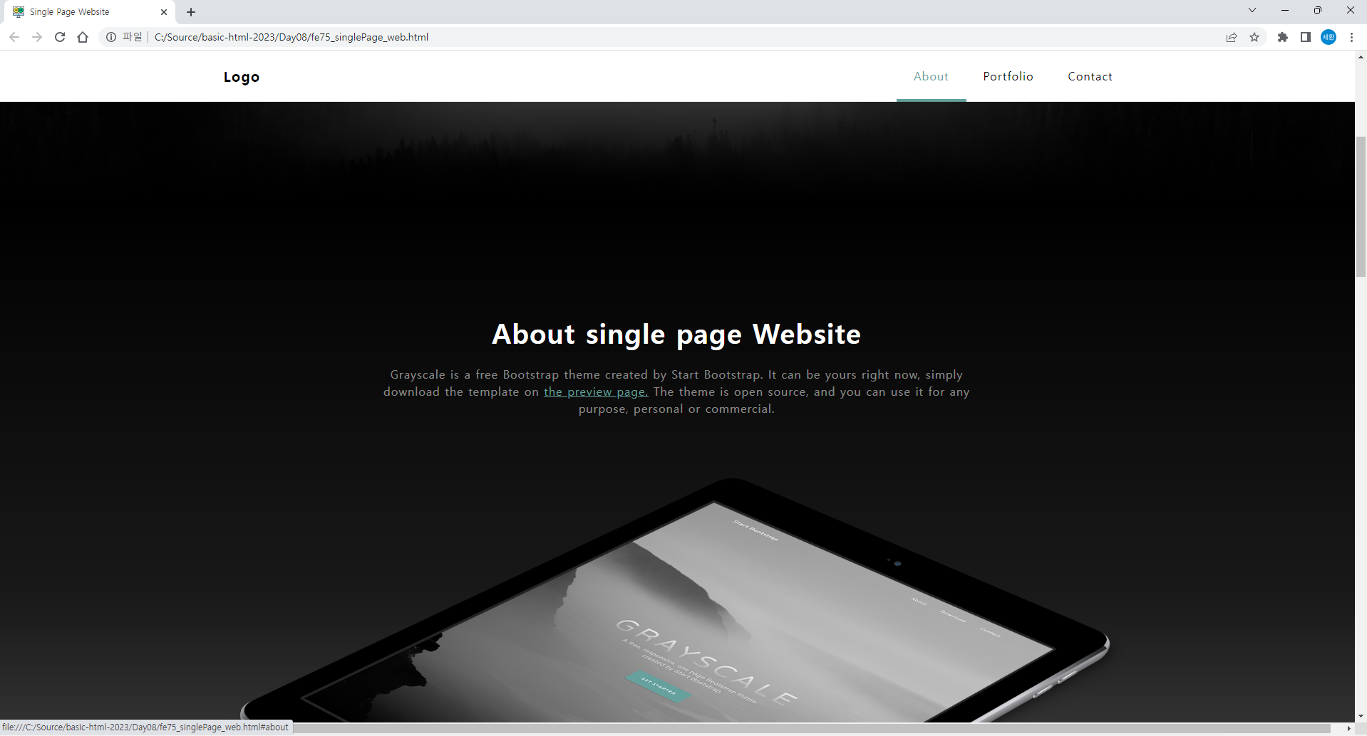
클릭할 때 글자 아래에 색깔이 생기는 것을 볼 수 있다.
$(document).ready(function () {
            // 화면을 스크롤 다운하면
            // 메뉴바 색상이 흰색으로 변경
            var navbarShrink = () => {
                const mainNav = $('#mainNav');
                if (!mainNav) {
                    return;
                }

                if(window.scrollY === 0)
                    mainNav.removeClass('navbar-shrink');
                else
                    mainNav.addClass('navbar-shrink');

            }

            navbarShrink();
            $(document).scroll(function () {
                navbarShrink();
            });

            $('#menu_about').click(function(){
                $(this).addClass('active');
                $('#menu_portfolio').removeClass('active');
                $('#menu_signup').removeClass('active');
            });
            $('#menu_portfolio').click(function(){
                $(this).addClass('active');
                $('#menu_about').removeClass('active');
                $('#menu_signup').removeClass('active');
            });
            $('#menu_signup').click(function(){
                $(this).addClass('active');
                $('#menu_portfolio').removeClass('active');
                $('#menu_about').removeClass('active');
            });
        });
이렇게 수정하고
<li class="nav-item"><a id="menu_about" href="#about" class="nav-link active">About</a></li>
<li class="nav-item"><a id="menu_portfolio"href="#portfolio" class="nav-link">Portfolio</a></li>
<li class="nav-item"><a id="menu_signup" href="#signup" class="nav-link">Contact</a></li>
body의 li에 id를 넣어주면
스크롤을 내리면 About, Portfolio, Contact 중 해당하는 칸에 파란색 줄이 생긴다.