styled-components?
- 리액트에서 컴포넌트에 css 스타일링을 적용하기 위한 플러그인
- css 요소를 자바스크립트 파일에서 한번에 관리 가능
Features
- 컴포넌트가 렌더링되는 요소에만 스타일 주입 -> 로딩시 필요한 코드 양 감소
- 클래스 네임 중복 문제를 원천적으로 피하게 해줌
- CSS 요소의 관리와 삭제를 편하게 할 수 있게 해줌
- 동적 스타일링에 있어서 CSS만을 사용하는 것에 비해 편리함
- 브라우저별로 다른 CSS 구문을 자동으로 설정해줌
Installation & Start
- npm을 통한 설치
npm install --save styled-components- styled-components import
import styled from 'styled-components'

// 렌더링 될 요소의 바깥에서 적어야하며, 아닐시 렌더링시마다 스타일링이 다시 진행됨
const Title = styled.h1`
  font-size: 1.5em;
  text-align: center;
  color: palevioletred;
`;

const Wrapper = styled.section`
  padding: 4em;
  background: papayawhip;
`;

return(
  <Wrapper>
    <Title>
      Hello World!
    </Title>
  </Wrapper>
);
결과:

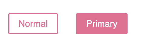
Use Props
- 스타일링을 할 컴포넌트에 함수를 작성할 수 있음, 이 때 함수에는 prop을 전달하게 됨
- 예시는 버튼의 Primary 속성 여부에 따라 버튼의 배경과 글자색이 서로 바뀌게 됨
const Button = styled.button`
  background: ${props => props.primary ? "palevioletred" : "white"};
  color: ${props => props.primary ? "white" : "palevioletred"};

  font-size: 1em;
  margin: 1em;
  padding: 0.25em 1em;
  border: 2px solid palevioletred;
  border-radius: 3px;
`;

return(
  <div>
    <Button>Normal</Button>
    <Button primary>Primary</Button>
  </div>
);
결과:
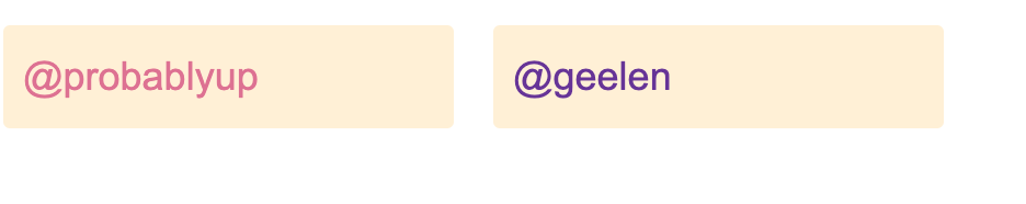
- 컴포넌트에 스타일링 속성을 추가시, 스타일링에 관련된 속성은 DOM으로 전달되지 않고 알아서 스타일링에서만 사용됨
- 예제에서는 inputColor는 DOM으로 전달되지 않고 type과 defaultValue만 전달됨
const Input = styled.input`
  padding: 0.5em;
  margin: 0.5em;
  color: ${props => props.inputColor || "palevioletred"};
  background: papayawhip;
  border: none;
  border-radius: 3px;
`;

return(
  <div>
    <Input defaultValue="@probablyup" type="text" />
    <Input defaultValue="@geelen" type="text" inputColor="rebeccapurple" />
  </div>
);
결과:
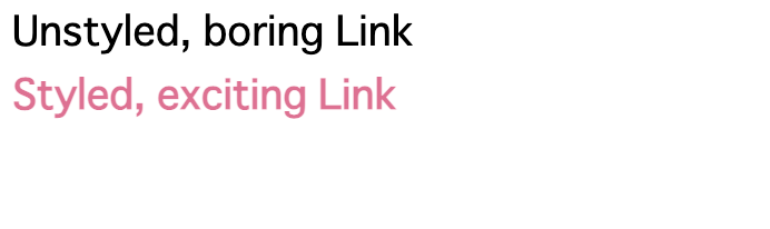
Extending Styles
- styled.tag 형식의 문법은 html 태그에만 사용 가능하고, 이미 존재하는 React Component에는 사용 불가능
- React Component에 style을 적용하기 위해 styled(component) 형식의 문법 사용
const Link = ({ className, children }) => (
  <a className={className}>
    {children}
  </a>
);

const StyledLink = styled(Link)`
  color: palevioletred;
  font-weight: bold;
`;

return(
  <div>
    <Link>Unstyled, boring Link</Link>
    <br />
    <StyledLink>Styled, exciting Link</StyledLink>
  </div>
);
결과:
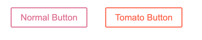
- 스타일링을 이미 한 컴포넌트에도 사용 가능하며, 예제는 이를 사용해 형태만 잡힌 버튼에 색상을 입혀주는 요소를 추가하게 됨
const Button = styled.button`
  color: palevioletred;
  font-size: 1em;
  margin: 1em;
  padding: 0.25em 1em;
  border: 2px solid palevioletred;
  border-radius: 3px;
`;

const TomatoButton = styled(Button)`
  color: tomato;
  border-color: tomato;
`;

return(
  <div>
    <Button>Normal Button</Button>
    <TomatoButton>Tomato Button</TomatoButton>
  </div>
);
결과:
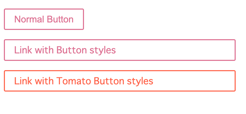
- 외관상으로는 비슷하게 보이지만 다른 태그로 사용해야 하는 경우 as를 사용해 동적으로 수정할 수 있음
- 예제는 버튼의 모양을 가진 a태그를 보여주게 됨
필요한 경우 리액트 컴포넌트도 사용 가능
// Button, TomatoButton은 바로 위의 소스코드와 동일
return(
  <div>
    <Button>Normal Button</Button>
    <Button as="a" href="#">Link with Button styles</Button>
    <TomatoButton as="a" href="#">Link with Tomato Button styles</TomatoButton>
  </div>
);
결과:
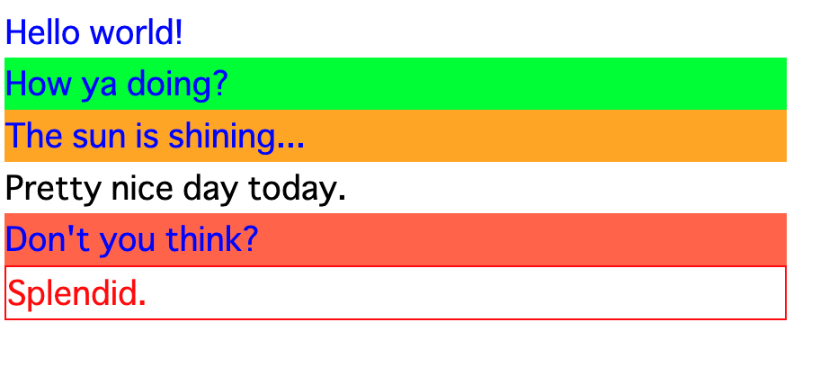
Use of &
- &을 사용해 가상 요소를, 가상 클래스를 선택하거나, 스타일 간의 결합을 할 수 있음
- &을 하나 사용시 기본적으로 컴포넌트 내부의 모든 인스턴스, 즉 본인과 컴포넌트 밑에 들어가는 태그, 컴포넌트 전체를 가리킴
// attrs -> 태그, 컴포넌트에 특정한 속성을 부여해줌
const Thing = styled.div.attrs((/* props */) => ({ tabIndex: 0 }))`
  color: blue;

  &:hover {
    color: red; //마우스를 갖다댈 시 글자가 빨개짐
  }

  & ~ & {
    background: tomato; // 주변에 &(Thing)이 없는 요소에 배경색 설정
  }

  & + & {
    background: lime; // 인접한 위치에 &가 있는 요소의 배경색 설정
  }

  &.something {
    background: orange; // & 중에서 something 클래스를 가지는 요소들의 배경색 변경
  }

  .something-else & {
    border: 1px solid; // something-else 클래스 를 가진 요소의 자식으로 &가 존재하는 요소의 boarder 설정
  } //&을 빼먹을 경우 Thing 내부에 something-else 클래스를 가진 요소를 선택한느 의미로 바뀜
`

return(
  <React.Fragment>
    <Thing>Hello world!</Thing>
    <Thing>How ya doing?</Thing>
    <Thing className="something">The sun is shining...</Thing>
    <div>Pretty nice day today.</div>
    <Thing>Don't you think?</Thing>
    <div className="something-else">
      <Thing>Splendid.</Thing>
    </div>
  </React.Fragment>
)
결과:
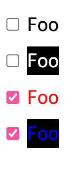
- &이 2개있는 경우 단일 인스턴스를 가리킴
const Input = styled.input.attrs({ type: "checkbox" })``;

const Label = styled.label`
  align-items: center;
  display: flex;
  gap: 8px;
  margin-bottom: 8px;
`

const LabelText = styled.span`
  ${(props) => {
    switch (props.$mode) {
      case "dark":
        return css`
          background-color: black;
          color: white;
          ${Input}:checked + && {
            color: blue; //${} 표기를 통해 내부에 다른 컴포넌트를 불러올 수 있음
          }
        `;
      default:
        return css`
          background-color: white;
          color: black;
          ${Input}:checked + && {
            color: red;
          }
        `;
    }
  }}
`;

return(
  <>
    <Label>
      <Input defaultChecked />
      <LabelText>Foo</LabelText>
    </Label>
    <Label>
      <Input />
      <LabelText $mode="dark">Foo</LabelText>
    </Label>
    <Label>
      <Input defaultChecked />
      <LabelText>Foo</LabelText>
    </Label>
    <Label>
      <Input defaultChecked />
      <LabelText $mode="dark">Foo</LabelText>
    </Label>
  <>
)
결과:
- 단독으로 사용시 css 적용의 최우선순위가 됨을 의미함
- 따라서 예시에서 Globalstyle을 무시하고 글자색은 파란색으로 출력됨
const Thing = styled.div`
   && {
     color: blue;
   }
 `

 const GlobalStyle = createGlobalStyle`
   div${Thing} {
     color: red;
   }
 `

 return(
   <>
     <GlobalStyle />
     <Thing>
       I'm blue, da ba dee da ba daa
     </Thing>
   </>
 )
결과:

Attaching additional props
- attrs 속성을 통해 태그에 속성 부여 가능
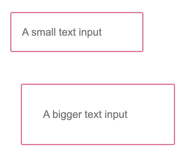
- 예제는 prop 값을 통해 text input의 크기를 변형하고 있음
const Input = styled.input.attrs(props => ({
  type: "text",
  size: props.size || "1em",
}))`
  color: palevioletred;
  font-size: 1em;
  border: 2px solid palevioletred;
  border-radius: 3px;

  margin: ${props => props.size};
  padding: ${props => props.size};
`;

return(
  <div>
    <Input placeholder="A small text input" />
    <br />
    <Input placeholder="A bigger text input" size="2em" />
  </div>
);
결과:
- attrs로 정의된 속성은 상속등을 통해 중첩될 수 있음
- 예시에서는 Input 스타일이 먼저 적용되고 PasswordInput 속성이 나중에 적용됨을 활용해 Password 색상과 input의 border 색상을 변경하고 있음
const Input = styled.input.attrs(props => ({
  type: "text",
  size: props.size || "1em",
}))`
  border: 2px solid palevioletred;
  margin: ${props => props.size};
  padding: ${props => props.size};
`;

const PasswordInput = styled(Input).attrs({
  type: "password",
})`
  // similarly, border will override Input's border
  border: 2px solid aqua;
`;

return(
  <div>
    <Input placeholder="A bigger text input" size="2em" />
    <br />
    {/* size 속성은 여전히 사용가능함 */}
    <PasswordInput placeholder="A bigger password input" size="2em" />
  </div>
);
Animations
- 애니메이션 제작에 사용되는 @keyframe에도 적용 가능
const rotate = keyframes`
from {
transform: rotate(0deg);
}
to {
transform: rotate(360deg);
}
`;
const Rotate = styled.div`
display: inline-block;
animation: ${rotate} 2s linear infinite;
padding: 2rem 1rem;
font-size: 1.2rem;
`;
return(
<Rotate>< 💅🏾 ></Rotate>출처:
https://styled-components.com/docs/basics#getting-started

냐아아아아아아아아앙