transform으로 할 수 있는 것들
- translate, translate3d
위치를 이동시킴. css3에서는 3d도 지원
translate도 종류가 다양합니다.
translate(x,y)
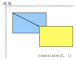
출처 : translate() - MDN
translateX(200px), y, z도 있습니다. 물론 음수로 보낼때는 왼쪽으로 이동합니다. (X축 이동한다는 가정하에)
이미지를 우측으로 200px 이동하게하는 예제
<!DOCTYPE html>
<html lang="en">
  <head>
    <meta charset="UTF-8" />
    <meta name="viewport" content="width=device-width, initial-scale=1.0" />
    <meta http-equiv="X-UA-Compatible" content="ie=edge" />
    <title>transform</title>
    <style>
      #wrap {
        width: 900px;
        margin: 0 auto;
      }

      #wrap .pic {
        width: 300px;
      }

      #wrap .pic img {
        width: 100%;
        transition: all 1s;
      }

      #wrap .pic:hover img {
        transform: translateX(200px);
      }
    </style>
  </head>
  <body>
    <div id="wrap">
      <div class="pic">
        <img src="https://placeimg.com/300/100/any" alt="" />
      </div>
    </div>
  </body>
</html>
- rotate, rotate3d
회전시킴
이미지를 회전시키는 예제
rotate()에 음수를 넣으면 반시계방향으로 돕니다.
<!DOCTYPE html>
<html lang="en">
  <head>
    <meta charset="UTF-8" />
    <meta name="viewport" content="width=device-width, initial-scale=1.0" />
    <meta http-equiv="X-UA-Compatible" content="ie=edge" />
    <title>transform</title>
    <style>
      #wrap {
        width: 900px;
        margin: 0 auto;
      }

      #wrap .pic {
        width: 300px;
      }

      #wrap .pic img {
        width: 100%;
        transition: all 1s;
      }

      #wrap .pic:hover img {
        transform: rotate(-180deg);
      }
    </style>
  </head>
  <body>
    <div id="wrap">
      <div class="pic">
        <img src="https://placeimg.com/300/100/any" alt="" />
      </div>
    </div>
  </body>
</html>
transform-origin 이란 속성은 이미지의 중간을 origin으로 두고 있습니다.
      #wrap .pic img {
        width: 100%;
        transition: all 1s;
        transform-origin: 0 0; <-
      }
다음과 같이 한다면 현재 태그의 좌측상단의 위치를 기준으로 회전합니다. 이는 다른 transform에도 똑같이 적용됩니다.
- scale, scale3d
크기를 변경합니다.
<!DOCTYPE html>
<html lang="en">
  <head>
    <meta charset="UTF-8" />
    <meta name="viewport" content="width=device-width, initial-scale=1.0" />
    <meta http-equiv="X-UA-Compatible" content="ie=edge" />
    <title>transform</title>
    <style>
      #wrap {
        width: 900px;
        margin: 0 auto;
      }

      #wrap .pic {
        width: 300px;
      }

      #wrap .pic img {
        width: 100%;
        transition: all 1s;
        transform-origin: 0 0;
      }

      #wrap .pic:hover img {
        transform: scale(2, 2);
      }
    </style>
  </head>
  <body>
    <div id="wrap">
      <div class="pic">
        <img src="https://placeimg.com/300/100/any" alt="" />
      </div>
    </div>
  </body>
</html>
transform도 같이 사용할 수 있습니다.
      #wrap .pic:hover img {
        transform: scale(2, 2) rotate(180deg);
}-
skew
-
matrix, matrix3d
-
perspective
-
perspective-origin
-
transform-origin
-
transform-style

서로 아는 것들을 공유해요~