HTML / CSS
SVG
4. svg button 만들기

HTML 구성
<a href="#">
        <svg><rect></rect></svg>
        button
</a>
CSS 구성
body{margin: 0; padding: 0;}
        a{
            position: absolute;
            left: 50%;
            top: 50%;
            width: 180px;
            height: 60px;
            text-align: center;
            transform: translate(-50%, -50%);
            line-height: 60px;
            text-transform: uppercase;
            text-decoration: none;
            color: #333;
            letter-spacing: 2px;
            transition: .5s;
        }
        a svg, a svg rect{
            position: absolute;
            top: 0;
            left: 0;
            width: 100%;
            height: 100%;
            fill: transparent;
        }
        a svg rect{
            stroke: rgb(5, 160, 227);
            stroke-width: 4;
            stroke-dasharray: 480;
            stroke-dashoffset: 480;
            transition: .5s;
            animation: ;
        }
        a:hover svg rect{
            stroke-dashoffset: 0;
        }
        a:hover{
            background: rgb(6, 164, 164);
            transition-delay: .5s;
            color: aliceblue;
        }
5. svg box 꾸미기
HTML 구성
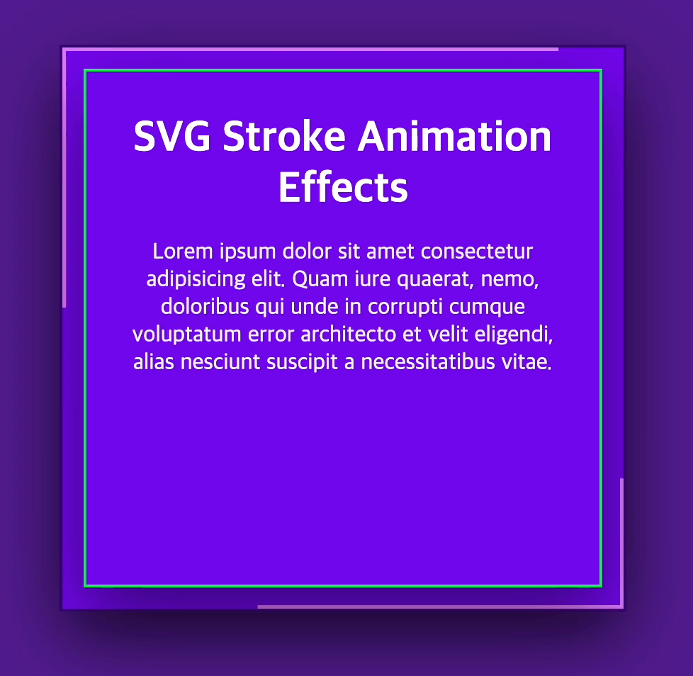
<div class="box">
        <svg><rect></rect></svg>
        <div class="content">
            <h1>SVG Stroke Animation Effects</h1>
            <p>Lorem ipsum dolor sit amet consectetur adipisicing elit. Quam iure quaerat, nemo, doloribus qui unde in corrupti cumque voluptatum error architecto et velit eligendi, alias nesciunt suscipit a necessitatibus vitae.</p>
        </div>
    </div>
CSS 구성
body{background: rgb(81, 28, 142); margin: 0; padding: 0;}
        .box{position: absolute; top: 50%; left: 50%; width: 400px; height: 400px; transform: translate(-50%,-50%); background: rgb(113, 7, 235); border: 2px solid rgba(0, 0, 0, .5); box-shadow: 0 20px 50px rgba(0, 0, 0, .5); box-sizing: border-box;}
        .box svg, .box svg rect{position: absolute; width: 100%; height: 100%; top: 0; left: 0; fill: transparent;}
        .box svg rect{stroke: rgb(224, 123, 255); stroke-width: 5; stroke-dasharray: 500;animation: ani 3s linear infinite;}
        .box .content{position: absolute; top: 15px; left: 15px; right: 15px; bottom: 15px; border: 2px solid #1add51; padding: 30px; text-align: center; box-shadow: 0 20px 50px rgba(0, 0, 0, .5);}
        .box .content h1{color: #fff; font-size: 30px; margin: 0 0 10px; padding: 0;}
        .box .content p{color: #efefef; }
        @keyframes ani{
            0%{stroke-dasharray: 500;}
            50%{stroke-dasharray: 0;}
            100%{stroke-dasharray: 500;}
        }
5. svg 자유롭게 만들어 보기
HTML 구성
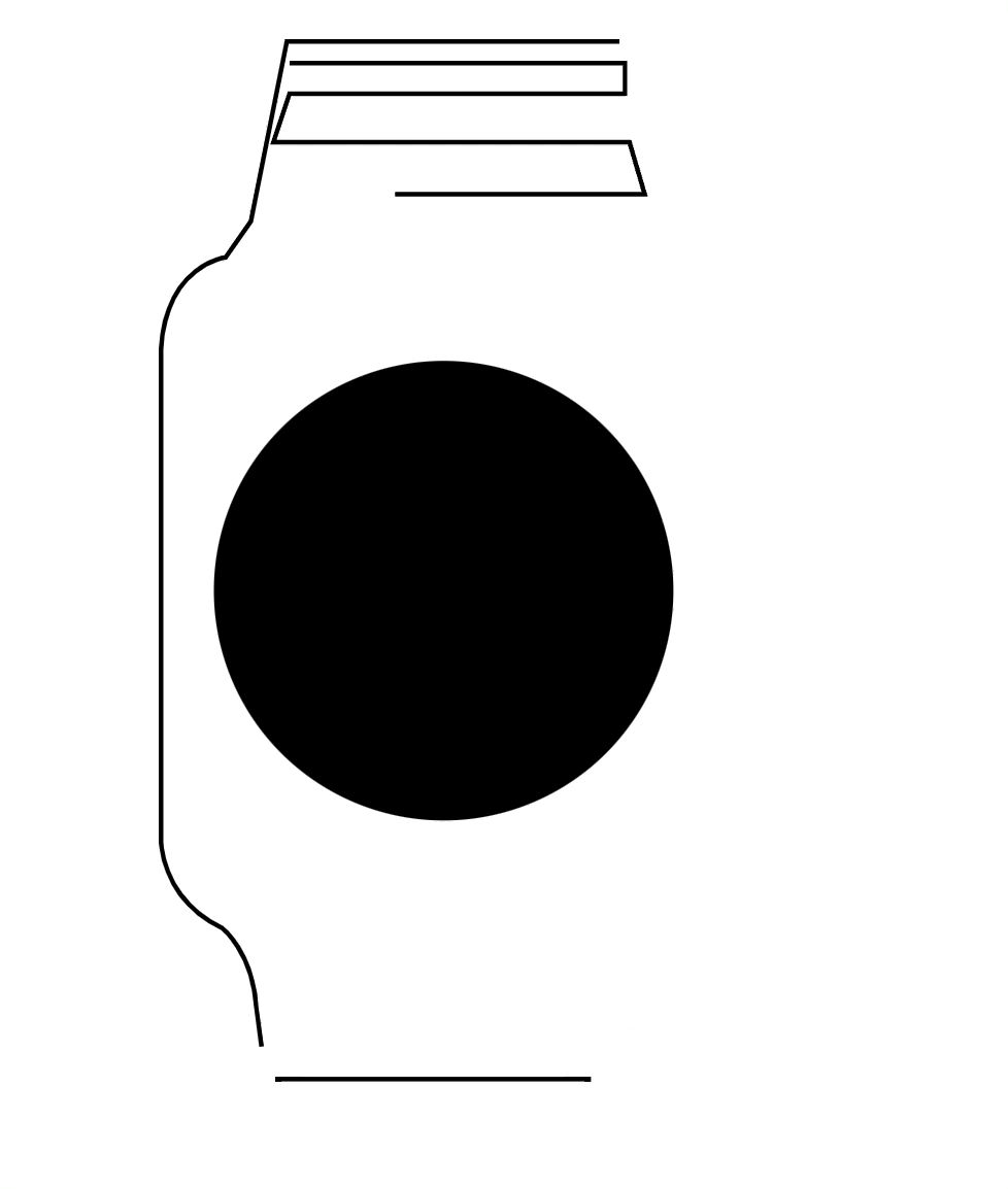
<?xml version="1.0" encoding="utf-8"?>
    <div class="wrap">
    <?xml version="1.0" encoding="utf-8"?>
        <svg version="1.1" id="Layer_1" xmlns="http://www.w3.org/2000/svg" xmlns:xlink="http://www.w3.org/1999/xlink" x="0px" y="0px"
        viewBox="0 0 134.57 236.96" style="enable-background:new 0 0 134.57 236.96;" xml:space="preserve">
        <style type="text/css">
        .st0{fill:none;stroke:#000000;stroke-miterlimit:10; stroke-dasharray: 1190; stroke-dashoffset: 1190; animation: ani1 2s linear forwards;}
        .st1{fill:none;stroke:#020202;stroke-miterlimit:10;stroke-dasharray: 266; stroke-dashoffset: 266; animation: ani2 2s linear forwards;}
        .st2{fill:transparent;stroke:#020202;stroke-miterlimit:10;stroke-dasharray: 473; stroke-dashoffset: 473; animation: ani3 2s 2s linear forwards;}
        @keyframes ani1{
            0%{stroke-dashoffset: 1190;}
            100%{stroke-dashoffset: 0;}
        }
        @keyframes ani2{
            0%{stroke-dashoffset: 266;}
            100%{stroke-dashoffset: 0;}
        }
        @keyframes ani3{
            0%{fill:transparent;}
            100%{fill:#000000;}
        }
    </style>
        <path class="st0" d="M100.28,0.5H27.89l-7.83,39.13l-5.48,7.83c0,0-12.91,1.57-14.09,19.96v106.43c0,0-0.39,12.91,13.3,19.57
        c0,0,6.65,5.09,7.43,17.22l3.52,25.83h77.87l5.87-33.26l6.65-12.13l-95.87,0.91c0,0-15.91-5.35-15.91-21.13V64.54
        c0,0-0.13-11.35,11.74-14.09h95.48c0,0,14.87,7.83,12.26,21.13v104.09c0,0-2.48,7.7-9.52,12.39l4.83,2.09c0,0,8.09-4.7,9.26-13.96
        v-71.61c0,0,6.65,1.57,6.65-0.91V80.72c0,0-7.96-4.96-9.13,6.13l0.91-7.17l2.74-0.65V62.98c0,0-8.09-15.78-15.91-17.35
        c0,0-4.57-7.57-6.13-20.74l-3.91-23.22L100.28,0.5z"/>
        <polyline class="st0" points="28.48,5.2 101.46,5.2 101.46,11.85 28.48,11.85 24.96,22.41 102.44,22.41 105.76,33.76 23.2,33.76 "/>
        <polyline class="st1" points="25.35,226.28 101.26,226.28 104.78,214.93 23.39,214.93 21.63,204.76 106.15,204.76 "/>
        <path class="st2" d="M108.5,186.37H18.89c0,0-14.48,0-13.7-29.35L5.17,66.04c0,0,2.57-14.09,14.51-13.11l90.2-0.05c0,0,10.57,3.77,10.17,16.87
        l0.01,106.04C120.06,175.8,118.87,182.85,108.5,186.37z"/>
        <circle class="c1" cx="62" cy="120" r="50"/>
        <text class="t1" x="20" y="120">갖고싶ㄷr..★</text>
        </svg>
    </div>
CSS 구성
 body{}
        .wrap{width: 300px; height: 300px; margin: 100px 100px 100px 500px;}

        .c1{stroke: red; stroke-width: 10; stroke-dasharray: 315; stroke-dashoffset: 315; animation-delay: .4s; animation: loader1 2s 2s linear infinite;}
        @keyframes loader1{
            0%{stroke-dashoffset: 315;}
            100%{stroke-dashoffset: 0;}
        }
        .t1{font-size: 15px;   fill: rgba(0, 0, 0, .1); stroke-width: 1px; stroke: rgb(201, 219, 207);
          stroke-dasharray: 208; stroke-dashoffset: 208; animation:ani 3s 4s linear forwards;}
        @keyframes ani{
            0%{stroke-dashoffset: 208; fill: rgb(255, 255, 255);}
            100%{stroke-dashoffset: 0; fill: #fff;}}
애플워치 표현이 멋있읍니다! 엄청난 발전으로 결과가 좋을 것 입니다!