
그동안 프로젝트를 진행함에 있어서 css 파일로만 스타일링을 해왔는데
팀과제를 해야하는 상황에서 styled-components를 채택해서 사용해보기로 하여
기록을 남깁니다.
styled components란?
자바스크립트 태그가 지정된 템플릿 리터럴과 css의 기능을 사용하여 리액트의
구성 요소를 스타일링 할 수 있는 CSS-in-JS 스타일링 프레임워크입니다.
설치 방법
npm install styled-components기본 문법
import "./App.css";
import styled from "styled-components";
const Wrapper = styled.div`
display: flex;
height: 100vh;
justify-content: center;
align-items: center;
`;
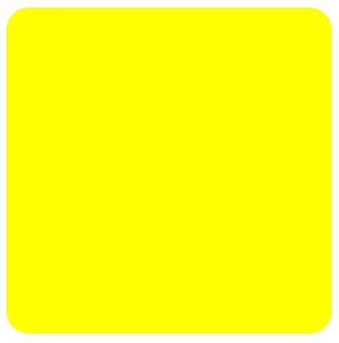
const RadiusRect = styled.div`
display: flex;
justify-content: center;
align-items: center;
width: 300px;
height: 300px;
border-radius: 20px;
background-color: skyblue;
`;
function App() {
return (
<Wrapper>
<RadiusRect />
</Wrapper>
);
}
export default App;
위에 코드는 기본적인 문법작성 방법입니다.
div 태그를 스타일링 하고 싶은 경우에는 위와같이 styled.div
button의 경우 styled.button 과 같은 방법으로 스타일링을 할 수 있습니다.
이렇게 스타일링된 태그를 컴포넌트를 사용하듯이 사용하면 되는거죠!
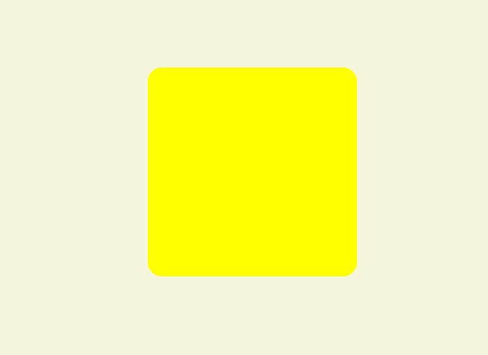
props
import styled, { css } from "styled-components";

const RadiusRect = styled.div`
  display: flex;
  justify-content: center;
  align-items: center;
  width: 100px;
  height: 100px;
  border-radius: 20px;
  background-color: ${(props) => props.bgColor || "skyblue"};
  ${(props) =>
    props.bigger &&
    css`
      width: 300px;
      height: 300px;
    `}
`;

function App() {
  return (
    <Wrapper>
      <RadiusRect bgColor="yellow" bigger />
    </Wrapper>
  );
}
위의 코드의 경우 props로 color와 bigger를 넘겨주었습니다.
RadiusRect 컴포넌트에서 color props 값을 설정해주었다면 background-color를 yellow 색상으로 그렇지 않다면 skyblue 색상을 사용하도록 조건을 걸어두었습니다.
백그라운드의 경우는 한 줄의 css 코드를 조건부로 보여주었다면 bigger의 경우는 어떻게 해야 할까요?
이 경우에는
import styled, { css } from "styled-components";styled-components에서 css를 사용해야 합니다.
사용방법은 간단합니다.
여러 줄의 css 코드를 템플릿 리터럴로 묶어준 이후 그 앞에 css를 붙이면 됩니다.
위의 코드의 경우 bigger props가 있을 경우에 width와 hieght의 값을 변경할 수 있도록 && 를 통해 조건을 걸어두었습니다.
전역 스타일링
styled-components는 애플리케이션 레벨의 스타일링을 지원하기 위해
createGlobalStyle()라는 함수를 제공하고 있습니다.
이런 전역 스타일링에서는 font-size라던지 일괄적인 스타일을 적용하기 위해 css초기화등을 하는 경우가 많은데 이러한 경우에 쓰면 좋을 것 같습니다.
// GlobalStyle.js

import { createGlobalStyle } from "styled-components";

const GlobalStyle = createGlobalStyle`
    *,
    *::before,
    *::after {
        box-sizing: border-box;
    }

    body {
        background : #F5F5DC
    }
`;

export default GlobalStyle;
이런식으로 createGlobalStyle를 통해 js 파일을 만들고 난 이후에
import GlobalStyle from "./GlobalStyle";

function App() {
  return (
    <>
      <GlobalStyle />
      <Wrapper>
        <RadiusRect color="yellow" bigger />
      </Wrapper>
    </>
  );
}
import 해온 GlobalStyle 컴포넌트를 최상위 컴포넌트로 추가를 해주게 되면
모든 하위 컴포넌트에 해당 스타일이 일괄 적용됩니다.
body 의 background를 베이지계열 색상으로 변경했기 때문에 body 색상이 변한 것을 확인할 수 있습니다.
사용 후기
이번에 처음 styled-components를 써보면서 느낀 것은 선택자를 가지고 css 파일을 통해 스타일링을 할때보다 코드가 더 깔끔해지고 관리가 잘된다는 것입니다.
특히 저는 props를 통해 조건부로 보여줄 수 있다는 점이 굉장히 편리하게 다가왔습니다. 아직은 styled-components에 대해 잘 알지 못하기 때문에 공식문서를 통해 더욱 공부를 해서 알아가는 시간을 가져야 할 듯 합니다. 공식문서에는 정말 많은 API가 있기 때문에 하나하나 알아간다면 많은 도움이 될 것 같네요!