Material Library
구글이 만들어서 그런지 플러터는 머티리얼을 많이 사용하는것 같다. 오늘은 플러터의 큰 축인 머티리얼을 위해 사용하는 위젯들에 대해 알아보고자 한다.
MaterialApp
머티리얼 디자인을 따르는 앱을 만들기 쉽도록 플러터에서 지원하는 라이브러리로, 머티리얼 디자인을 사용하기 위해 별도의 디자인 없이 머티리얼 디자인을 쉽게 이용할 수 있다.
지금까지 우리는 다음과 같이 MaterialApp 위젯을 사용하고 있었다. title, home 등을 지정하면 해당 내용이 머티리얼 디자인에 맞게 적용되어 보이게 된다.
void main() {
  runApp(
    const MaterialApp(  // Material 디자인을 사용하기 위한
      title: 'Sucream', // 앱에 대한 설명
      home: MyHome(),  // 어플리케이션이 시작될 때 실행될 위젯
    ),
  );
}
Scaffold
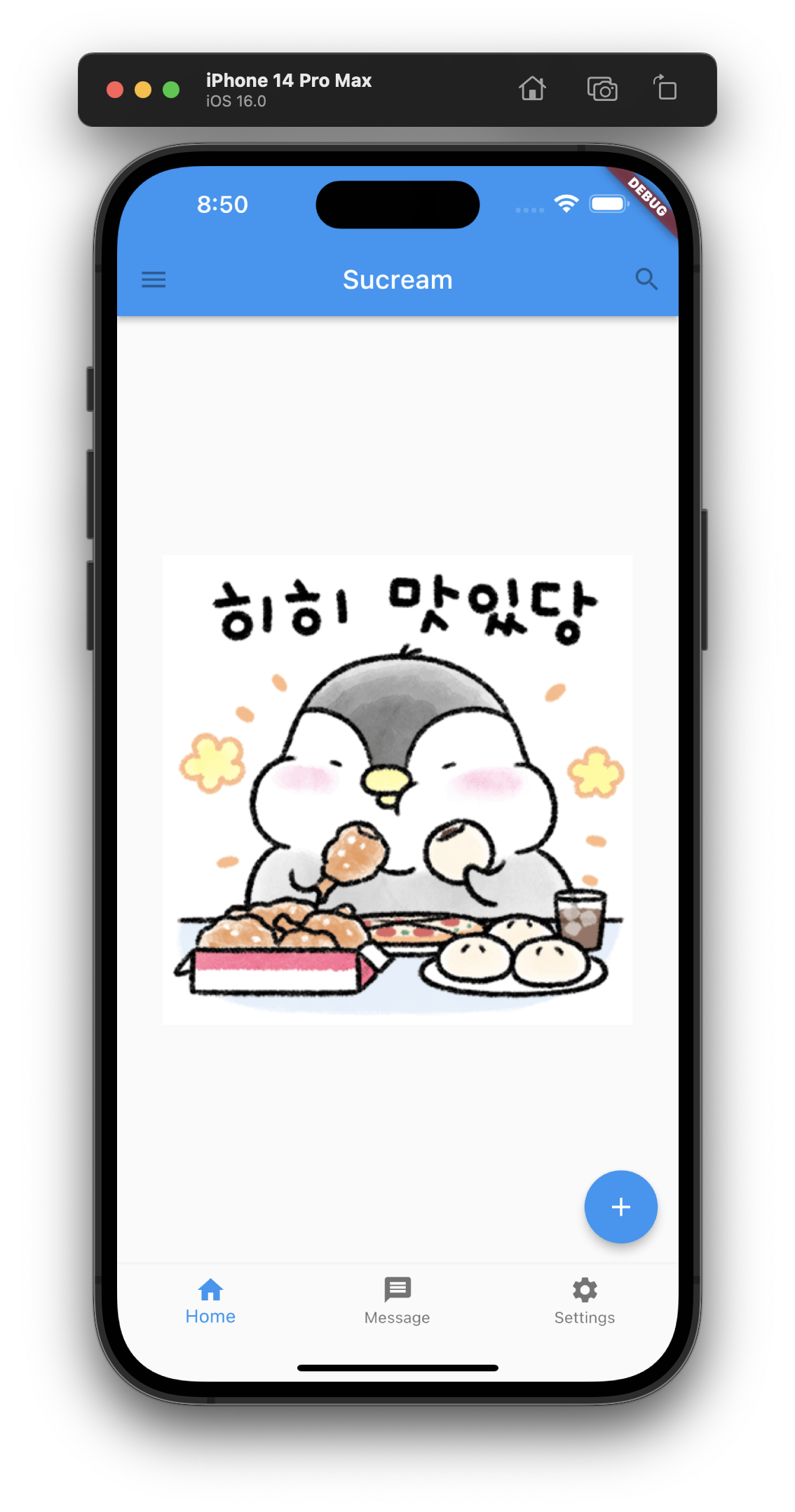
MaterialApp은 일반적으로 Scaffold와 함꼐 사용되는데, Scaffold는 머티리얼 디자인의 시각적인 레이아웃 구조를 위해 사용한다. 머티리얼 디자인에서 자주 사용되는 상단 appBar, 하단의 bottomNavigationBar, floatingActionButton 등의 레이아웃을 구성하기 쉽게 해준다. MaterialApp은 어플리케이션 당 하나, Scaffold는 화면당 하나라고 생각하면 쉬울 것 같다. 그래서 MaterialApp에 다수의 routes와 다수의 Scaffold를 제공할 수 있다.
Scaffold도 MaterialApp과 마찬가지로 계속 사용하고 있었다.
class MyHome extends StatelessWidget { // 커스텀 위젯 클래스
const MyHome({super.key});
Widget build(BuildContext context) {
return Scaffold( // Scaffold 내에 필요한 정보를 작성할 수 있다.
appBar: AppBar( // 상단의 앱바에 대한 내용으로 이곳도 다양하게 꾸밀 수 있다.
leading: const IconButton(
icon: Icon(Icons.menu),
tooltip: 'AppBar Menu',
onPressed: null,
),
title: const Text('Sucream'),
actions: const [
IconButton(
icon: Icon(Icons.search),
tooltip: 'Search',
onPressed: null,
),
],
),
body: Center( // 화면의 메인 영역에 표시될 위젯을 구성하는 부분
child: Image.asset(
'images/gif14.gif',
),
),
bottomNavigationBar: BottomNavigationBar( // 하단의 네비게이션바를 구성하는 부분
items: const [
BottomNavigationBarItem(
icon: Icon(Icons.home),
label: 'Home',
),
BottomNavigationBarItem(
icon: Icon(Icons.message),
label: 'Message',
),
BottomNavigationBarItem(
icon: Icon(Icons.settings),
label: 'Settings',
),
],
),
floatingActionButton: const FloatingActionButton( // 우측 하단에 떠있는 플로팅 액션 버튼 부분
tooltip: 'Add',
onPressed: null,
child: Icon(Icons.add),
),
);
}
}
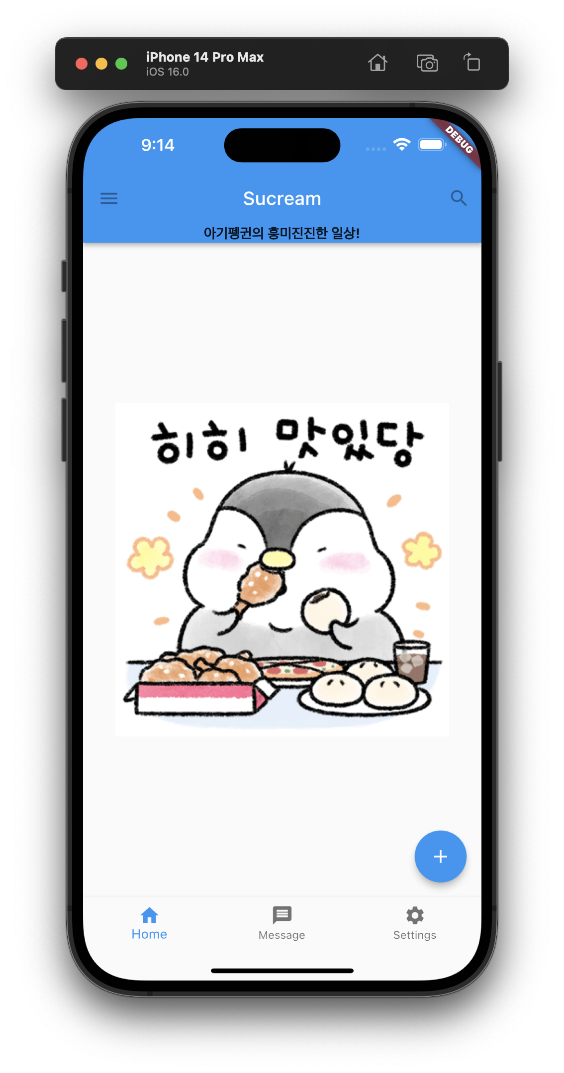
AppBar
AppBar는 일반적으로 디스플레이 상다에 위치하며, 비교적 덜 일반적인 작업을 처리하기 위해 사용되며, 상단에 고정 형태로 배치되어 있는 부분을 의미한다.
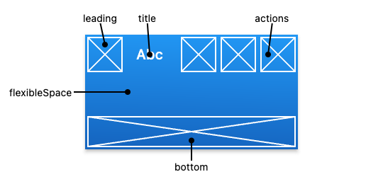
AppBar는 leading, title, actions, flexibleSpace, bottom으로 구성되어 있다. 일반적으로 leading에 메뉴바, title에 제목 혹은 메인 내용, actions에 알림 및 기타, flexibleSpace와 bottom을 필요시 사용하는 것 같다.
class MyHome extends StatelessWidget {
const MyHome({super.key});
Widget build(BuildContext context) {
return Scaffold(
appBar: AppBar(
leading: const IconButton( // 좌측 상단 영역에 표시할 위젯
icon: Icon(Icons.menu),
tooltip: 'AppBar Menu',
onPressed: null,
),
title: const Text('Sucream'), // 타이틀 영역에 표시할 위젯
actions: const [ // 액션 영역에 표시할 위젯
IconButton(
icon: Icon(Icons.search),
tooltip: 'Search',
onPressed: null,
),
],
bottom: const PreferredSize( // 바텀 영역에 표시할 위젯
preferredSize: Size.fromHeight(20.0),
child: Text(
'아기펭귄의 흥미진진한 일상!',
style: TextStyle(
fontSize: 15.0,
fontWeight: FontWeight.bold,
),
),
),
),
body: Center(
child: Image.asset(
'images/gif14.gif',
),
),
bottomNavigationBar: BottomNavigationBar(
items: const [
BottomNavigationBarItem(
icon: Icon(Icons.home),
label: 'Home',
),
BottomNavigationBarItem(
icon: Icon(Icons.message),
label: 'Message',
),
BottomNavigationBarItem(
icon: Icon(Icons.settings),
label: 'Settings',
),
],
),
floatingActionButton: const FloatingActionButton(
tooltip: 'Add',
onPressed: null,
child: Icon(Icons.add),
),
);
}
}
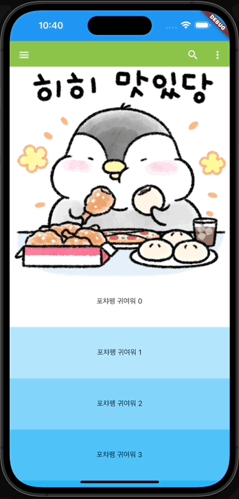
SliverAppBar
종종 화면을 슬라이드할 때 AppBar가 자연스럽게 올라가며 숨겨지는 것을 본 적이 있을 것이다. SliverAppBar는 이때 사용된다. 일반 AppBar와 달리 SliverAppBar는 Scaffold의 appBar 영역이 아닌, body를 CustomScrollView로 가지는 위젯 아래의 slivers 영역에 작성한다.
이때 slivers는 복수의 자식을 가질 수 있기 때문에 여러개의 SliverAppBar를 넣을 수 있다. 이후 아래에 SliverList를 작성하여 표시하고자 하는 항목을 작성할 수 있다. SliverList는 기존의 builder 형태로 작성하는 것 같다.
class SliverAppBarHome extends StatelessWidget {
const SliverAppBarHome({super.key});
Widget build(BuildContext context) {
return Scaffold(
body: CustomScrollView(
// body에 CustomScrollView를 추가하여 사용함
slivers: [
// slivers에 SliverAppBar와 SliverList를 추가하여 사용함
SliverAppBar(
pinned: true, // 스크롤 했을 때 앱바가 고정되어 있음
floating: false, // 스크롤을 올리자마자 앱바가 보임
expandedHeight: 460,
leading: IconButton(
focusColor: Colors.black12,
icon: const Icon(Icons.menu),
tooltip: 'AppBar Menu',
onPressed: () {},
),
flexibleSpace: FlexibleSpaceBar(
background: Padding(
padding: const EdgeInsets.only(top: 60),
child: Column(
children: [
Container(
width: double.infinity,
height: 50,
color: Colors.lightGreen,
),
Expanded(
child: Image.asset(
'images/gif14.gif',
width: double.infinity,
fit: BoxFit.cover,
),
),
],
),
),
),
actions: [
IconButton(
icon: const Icon(Icons.search),
tooltip: 'AppBar Search',
onPressed: () {},
),
IconButton(
icon: const Icon(Icons.more_vert),
tooltip: 'AppBar More',
onPressed: () {},
),
],
),
SliverList(
// SliverList는 SliverAppBar 아래에 같은 수준의 자식으로 들어가는 것임
delegate: SliverChildBuilderDelegate(
(BuildContext context, int index) {
return Container(
alignment: Alignment.center,
color: Colors.lightBlue[100 * (index % 9)],
height: 100.0,
child: Text('포챠펭 귀여워 $index'),
);
},
childCount: 20,
),
),
],
),
);
}
}
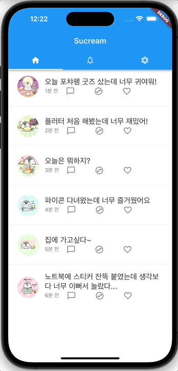
TabBar
AppBar 부분에 탭으로 구분하여 여러 페이지를 볼 수 있게 하는 방법으로, 일반적으로 AppBar의 bottom 부분에 DefaultTabController 또는 TabBar를 이용하고 body 영역에 TabBarView를 사용한다.
DefaultTabController를 이용하면 탭바를 쉽게 구현할 수 있다. 아래 예제는 3개의 화면을 각 별도의 클래스(위젯)으로 작성하였고, 이를 홈 화면에서 TabBar를 이용한 것이다.
void main() {
runApp(const MaterialApp(
title: 'Flutter Tutorial',
home: TabBarHome(),
// themeMode: ThemeMode.dark,
));
}
// 첫번째 화면에 대한 위젯
// ListView 위젯을 사용하여 화면을 구성하였다.
class FirstTab extends StatelessWidget {
FirstTab({Key? key}) : super(key: key);
final List<String> timeLines = <String>[
'오늘 포챠펭 굿즈 샀는데 너무 귀여워!',
'플러터 처음 해봤는데 너무 재밌어!',
'오늘은 뭐하지?',
'파이콘 다녀왔는데 너무 즐거웠어요',
'집에 가고싶다~',
'노트북에 스티커 잔뜩 붙였는데 생각보다 너무 이뻐서 놀랐다...'
];
Widget build(BuildContext context) {
return Center(
child: ListView.separated(
itemBuilder: ((context, index) => Padding(
padding: const EdgeInsets.all(8.0),
child: ListTile(
leading: ClipRRect(
borderRadius: BorderRadius.circular(50),
child: Image.asset('images/pic${index + 1}.jpeg'),
),
title: Text(
timeLines[index],
style: const TextStyle(fontSize: 20),
),
subtitle: Row(
children: [
Text('${index + 1}분 전'),
const Padding(
padding: EdgeInsets.only(left: 20),
child: Icon(Icons.chat_bubble_outline_outlined),
),
const Padding(
padding: EdgeInsets.only(left: 50),
child: Icon(Icons.swap_horizontal_circle_outlined),
),
const Padding(
padding: EdgeInsets.only(left: 50),
child: Icon(Icons.favorite_border_sharp),
),
],
),
),
)),
separatorBuilder: (BuildContext context, int index) =>
const Divider(),
itemCount: timeLines.length));
}
}
// 두번째 화면에 대한 위젯
// ListView 위젯을 사용하여 화면을 구성하였다.
class SecondTab extends StatelessWidget {
SecondTab({Key? key}) : super(key: key);
final List<String> notifications = <String>[
'호두새님이 회원님의 게시물을 마음에 들어 합니다.',
'호두새님이 회원님의 게시물을 마음에 들어 합니다.',
'파이콘님이 회원님의 게시물을 리트윗했습니다.',
];
Widget build(BuildContext context) {
return Center(
child: ListView.separated(
itemBuilder: ((context, index) => Padding(
padding: const EdgeInsets.all(8.0),
child: ListTile(
title: Text(
notifications[index],
style: const TextStyle(fontSize: 20),
),
),
)),
separatorBuilder: (BuildContext context, int index) =>
const Divider(),
itemCount: notifications.length));
}
}
// 세번째 화면에 대한 위젯
// ListView 위젯을 사용하여 화면을 구성하였다.
class ThirdTab extends StatelessWidget {
const ThirdTab({Key? key}) : super(key: key);
Widget build(BuildContext context) {
return Center(
child: Padding(
padding: const EdgeInsets.all(8.0),
child: ListView(
children: const [
ListTile(
leading: Icon(Icons.notification_important_sharp),
title: Text(
'알림',
style: TextStyle(fontSize: 20),
),
subtitle: Text('상태표시줄, 방해금지'),
),
Divider(),
ListTile(
leading: Icon(Icons.volume_up_sharp),
title: Text(
'소리 및 진동',
style: TextStyle(fontSize: 20),
),
subtitle: Text('소리 모드, 벨소리'),
),
Divider(),
ListTile(
leading: Icon(Icons.construction_sharp),
title: Text(
'일반',
style: TextStyle(fontSize: 20),
),
subtitle: Text('언어 및 키보드, 날짜 및 시간'),
),
],
),
),
);
}
}
// 실제 메인 부분
class TabBarHome extends StatelessWidget {
const TabBarHome({Key? key}) : super(key: key);
Widget build(BuildContext context) {
return DefaultTabController(
// DefaultTabController 위젯을 사용하여 탭바를 구현하였다.
length:
3, // 탭바에 들어갈 아이템의 개수로, 이 숫자와 아래의 TabBarView 위젯의 children의 개수가 같아야 한다.
child: Scaffold(
appBar: AppBar(
title: const Text('Sucream'),
bottom: const TabBar(
// bottom 부분에 TabBar 위젯을 사용하여 탭바를 구현하였다.
tabs: [
Tab(icon: Icon(Icons.home)),
Tab(icon: Icon(Icons.notifications_none)),
Tab(icon: Icon(Icons.settings)),
],
),
),
body: TabBarView(
// 실제 화면에 보여질 내용을 구현한 부분이다.
children: [
FirstTab(),
SecondTab(),
const ThirdTab(),
],
),
),
);
}
}
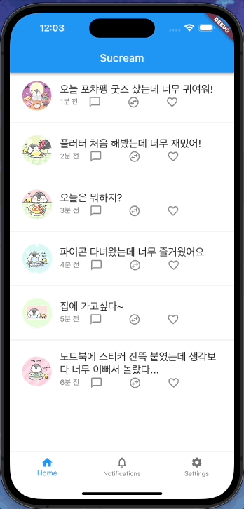
BottomNavigationBar
Scaffold 위젯의 bottomNavigationBar에 사용 가능하며, TabBar와 반대로 화면 하단에 탭을 만들 수 있다. 아래 예시는 위와 동일한 3개의 페이지 위젯을 bottomNavigationBar 형태로 바꾼 것이다.
// BottomNavigationBar 위젯홈
class BottomNavigationBarHome extends StatefulWidget {
const BottomNavigationBarHome({super.key});
State<BottomNavigationBarHome> createState() =>
_BottomNavigationBarHomeState();
}
class _BottomNavigationBarHomeState extends State<BottomNavigationBarHome> {
int _selectedIndex = 0;
final List<Widget> _widgetOptions = [
FirstTab(),
SecondTab(),
const ThirdTab(),
];
void _onItemTapped(int index) {
setState(() {
_selectedIndex = index;
});
}
Widget build(BuildContext context) {
return Scaffold(
appBar: AppBar(
title: const Text('Sucream'),
),
body: Center(
child: _widgetOptions.elementAt(_selectedIndex),
),
bottomNavigationBar: BottomNavigationBar(
items: const [
BottomNavigationBarItem(
icon: Icon(Icons.home),
label: 'Home',
),
BottomNavigationBarItem(
icon: Icon(Icons.notifications_none),
label: 'Notifications',
),
BottomNavigationBarItem(
icon: Icon(Icons.settings),
label: 'Settings',
),
],
currentIndex: _selectedIndex,
// selectedItemColor: Colors.amber[800],
onTap: _onItemTapped,
),
);
}
}
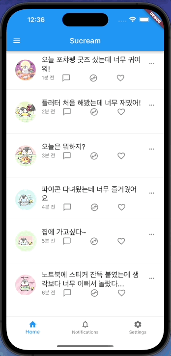
Drawer
화면 좌측 측면에서 슬라이드 하여 꺼내는 메뉴를 얘기하며, Scaffold위젯의 drawer 부분에 사용 가능하다.
class DrawerHome extends StatefulWidget {
const DrawerHome({super.key});
State<DrawerHome> createState() => _DrawerHomeState();
}
class _DrawerHomeState extends State<DrawerHome> {
int _selectedIndex = 0;
final List<Widget> _widgetOptions = [
FirstTab(),
SecondTab(),
const ThirdTab(),
];
void _onItemTapped(int index) {
setState(() {
_selectedIndex = index;
});
}
Widget build(BuildContext context) {
return Scaffold(
appBar: AppBar(
title: const Text('Sucream'),
),
drawer: Drawer(
child: ListView(
padding: EdgeInsets.zero,
children: [
DrawerHeader(
decoration: const BoxDecoration(
color: Colors.blue,
),
child: ListTile(
leading: ClipRRect(
borderRadius: BorderRadius.circular(50),
child: Image.asset('images/sucream.png'),
),
title: const Text(
'Sucream',
style: TextStyle(
color: Colors.white,
fontSize: 24,
),
),
)),
const ListTile(
leading: Icon(Icons.person_outline_sharp),
title: Text('프로필',
style: TextStyle(fontSize: 17, fontWeight: FontWeight.bold)),
),
const ListTile(
leading: Icon(Icons.message_sharp),
title: Text('토픽',
style: TextStyle(fontSize: 17, fontWeight: FontWeight.bold)),
),
const ListTile(
leading: Icon(Icons.bookmark_border_sharp),
title: Text('북마크',
style: TextStyle(fontSize: 17, fontWeight: FontWeight.bold)),
),
],
),
),
body: Center(
child: _widgetOptions.elementAt(_selectedIndex),
),
bottomNavigationBar: BottomNavigationBar(
items: const [
BottomNavigationBarItem(
icon: Icon(Icons.home),
label: 'Home',
),
BottomNavigationBarItem(
icon: Icon(Icons.notifications_none),
label: 'Notifications',
),
BottomNavigationBarItem(
icon: Icon(Icons.settings),
label: 'Settings',
),
],
currentIndex: _selectedIndex,
// selectedItemColor: Colors.amber[800],
enableFeedback: true,
onTap: _onItemTapped,
),
);
}
}
Refference
- Material Components widgets - flutter.dev