These High Quality Spinner/Loader Components as a Dev You Should Never Miss
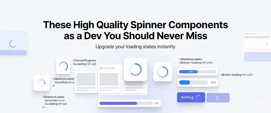
You’ve seen it. A page loads, nothing shows, and users think the app is broken.
That small gap between action and response matters. A clean spinner component solves this problem and keeps users engaged while data loads.
This guide focuses on Shadcn Spinner Components that are simple, open source, and built for real-world apps. No filler. Only what actually works in production.
What is Spinner Components?
A spinner component is a small UI element that shows loading state.
It tells users that something is happening in the background. For example, API calls, page transitions, or form submissions.
Without it, users assume your app is stuck. With it, the experience feels smooth and responsive.
Good spinner components are lightweight, customizable, and easy to integrate. The ones listed here follow that approach and fit directly into modern stacks.
Developer Checklist Before Using a Spinner
Use this before adding any loader into your project:
- Is the loading state longer than 300ms
- Is the spinner blocking or non blocking
- Does it match the UI density and layout
- Can it be reused across components
- Is animation smooth on low end devices
- Does it avoid layout shifts
- Is fallback UI defined if loading fails
- Is it accessible with proper aria labels
How These Spinner Components Work
All components listed below are:
- Open source
- Built with React and Next.js
- Styled using Tailwind CSS
- Animated via Framer Motion
- Compatible with Radix UI and Base UI
- Installable using pnpm, npm, yarn, or bun
Sample Installation (pnpm)
pnpm dlx shadcn@latest add @shadcn-space/spinner-01After install, it follows a direct copy paste usage pattern. No complex setup.
Why You Can Trust This List
Each spinner was reviewed based on:
- Render performance under API load
- Animation smoothness at 60fps
- Code simplicity and readability
- Ease of integration into existing UI systems
- Real usage in SaaS dashboards and admin panels
These are used in apps with 10+ dashboard screens and 50+ UI components, where loading states appear frequently.
Best Shadcn Spinner Components
These are minimal, production ready, and designed for real use cases like API loading, dashboards, and route transitions.
Default
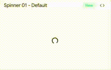
A clean circular loader with consistent rotation speed. Ideal for most generic loading states without drawing too much attention.
It uses simple motion rotation, making it lightweight and stable even in frequent re-renders. Works well in dashboards and forms.
Key Features:
- Smooth infinite rotation using Framer Motion
- Minimal DOM structure
- Easy color control via Tailwind
- Works well inside buttons and cards
- Low CPU usage
Best for: General API loading states
Throbber
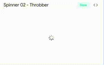
This spinner uses pulsing animation instead of rotation. It gives a softer visual feedback which feels less aggressive than standard loaders.
Useful when you want subtle loading indication without distracting users from surrounding UI.
Key Features:
- Pulse based animation
- Adjustable timing and scale
- Clean integration with Tailwind utilities
- Works well in background loading
- No layout shift
Best for: Background data fetching
Pinwheel
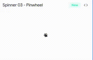
A more dynamic spinner with multi-arm rotation. Adds a bit more visual engagement compared to standard loaders.
Good fit for landing dashboards or slightly interactive UIs where motion adds personality.
Key Features:
- Multi element rotation
- Controlled animation speed
- Built with reusable motion variants
- Easy to extend design
- Smooth GPU based animation
Best for: SaaS dashboards with visual engagement
Circle Filled
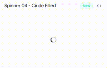
A bold loader with filled circular motion. It is more visible and works well when you need stronger feedback for longer loading times.
Helps reduce perceived wait time by clearly showing progress activity.
Key Features:
- High visibility animation
- Filled shape for better contrast
- Custom size support
- Tailwind driven styling
- Works in dark and light UI
Best for: Long API requests or heavy data loads
Ellipsis
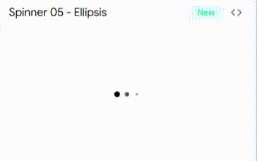
Three dot loading animation that cycles horizontally. Common pattern but implemented cleanly with motion control.
This is familiar to users, so it improves usability without needing explanation.
Key Features:
- Sequential dot animation
- Compact layout
- Adjustable spacing and speed
- Works inline with text
- Minimal code footprint
Best for: Chat apps and inline loading states
Bars
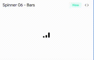
Vertical bar animation that grows and shrinks in sequence. Looks more like data activity rather than waiting state.
Adds a technical feel which fits well in analytics or dev tools.
Key Features:
- Height based animation
- Sequential timing control
- Works well in narrow spaces
- Easy theming
- Strong visual rhythm
Best for: Analytics dashboards and data tools
FAQs
1. Which Shadcn spinner component is best for Next.js loading states with server actions?
Default and Circle Filled work best. They are stable during frequent renders and integrate cleanly with async server actions.
2. How to reduce performance impact of spinner animations in React apps?
Use lightweight motion animations, avoid heavy SVG paths, and prefer GPU accelerated transforms. Keep component structure minimal.
3. Can these spinner components be used inside buttons and form submissions?
Yes. Default and Ellipsis are ideal for buttons. They fit inline and do not break layout during loading states.
Final Verdict
If you build apps with React or Next.js, ignoring loading states is a mistake. A small spinner improves user trust instantly.
Each shadcn component here solves a different use case. Default for general use. Ellipsis for inline feedback. Bars and Pinwheel for visual dashboards.
Pick based on context, not design preference. A good spinner does not just look nice. It makes your app feel faster and more reliable.