
자 이번에는 저번 포스팅에서 알아본 스토리(Story)를 직접 작성해 보겠습니다. 이번 포스팅에서 작성할 스토리의 기준이 되는 컴포넌트는 입력폼(Form)으로 3개의 text input 및 1개의 submit button 로 구성되는 형태입니다. 자, 그럼 시작해 보겠습니다.
스토리의 기준이 되는 컴포넌트를 작성하자
저번 포스팅에서 보셨다시피 스토리를 작성하기 위해서는 컴포넌트를 정의 해야 합니다. 먼저 컴포넌트를 작성해보도록 하겠습니다. 우선 입력폼 자체를 작성하기 전, 잠시 입력폼(Form)의 구조에 대해 생각해 보겠습니다. 서두에서 언급드렸다시피, 입력폼(Form)은 3개의 text input과 1개의 submit button으로 이루어져 있습니다. 그렇다면 input 컴포넌트와 button 컴포넌트로 입력폼(Form)을 쪼갤 수 있다는 뜻이 되겠네요. 작은 컴포넌트일수록 다른 컴포넌트에 결합되기도 관리하기도 편해지는 장점이 있기에 먼저 input 컴포넌트와 button 컴포넌트를 각각 작성해 보도록 하겠습니다.
우선 src 폴더 안에 components 폴더를 만들어 주세요. 그 후 components 폴더 안에 Input 폴더와 Button 폴더를 만들어주시고, Input 폴더 안에는 Input.jsx 를 Button 폴더 안에는 Button.jsx 를 생성해주세요.
그렇게 하시면 아래와 같은 폴더 구조가 만들어지셨을겁니다.
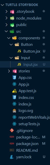
자, 위와 같은 폴더 구조가 만들어지셨다면 먼저 Input 컴포넌트 부터 구조, 스타일, 스토리를 작성해 보도록 하겠습니다. 아래의 Input 컴포넌트는 label을 props로 받는 컴포넌트입니다.
// Input.jsx
export const Input = ({ label }) => {
  return (
    <div className="input-wrap">
      <label className="input-wrap__label">{label}</label>
      <input className="input-wrap__input" />
    </div>
  );
};
그 다음으로 작성할 내용은 Input 의 style 로 /src/components/Input 폴더 안에 Input.css를 하나 만들어 주시고 아래의 스타일을 입력해 주신 후에, Input.Jsx 에서 Input.css 를 import 해 주시면 됩니다.
 /* Input.css */
.component-input {
  display: flex;
  flex-direction: column;
}

.component-input__label {
  font-size: 16px;
  margin-bottom: 8px;
}

.component-input__input {
  width: 100%;
  min-height: 32px;
  border-radius: 4px;
  outline: none;
  border: 1px solid #a1a2a3;
}

.component-input__input:focus {
  border: 1px solid #000;
}
// Input.jsx
import './Input.css';
export const Input = ({ label }) => { ...컴포넌트의 스토리를 작성하자
자, 이제 Input 컴포넌트의 구조와 스타일이 완성이 되었네요. 그럼 이제 원하는 UI가 만들어졌는지 스토리북을 통해 확인해 보도록 하죠. 물론 확인 하기 위해서는 Input 컴포넌트의 스토리 파일을 작성해야 합니다. 그럼 스토리 파일을 작성해 보겠습니다. 우선, /src/components/Input 폴더 안에 Input.stories.jsx 파일을 생성해 주시고, 아래와 같이 입력해 주시면 되겠습니다.
// Input.stories.jsx
import { Input } from './Input';

export default {
  title: 'Form/Input',
  component: Input,
};

const Template = (args) => <Input {...args} />;

export const NameInput = Template.bind({});
NameInput.args = {
  label: 'Name',
};
자 이렇게 Input 컴포넌트의 label props 가 'Name'인 경우의 스토리를 작성해 보았습니다.
위의 코드에 대한 설명은 저번 포스트에서 설명 드렸기에 기억이 잘 나지 않으신다면, 저번 포스팅을 참고하시면 좋을 것 같습니다. 자, 그럼 이제 프로젝트 폴더의 루트에서 CLI 창을 여시고, 아래의 명령어를 실행해 보도록 하겠습니다.
yarn storybook
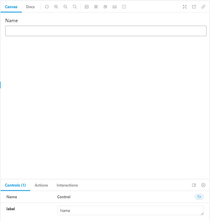
Input을 클릭하시면 오른쪽 Canvas에 아래의 이미지 처럼 컴포넌트가 렌더링 되어 있으실 겁니다.
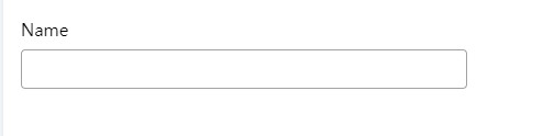
그런데 width를 100%로 설정하다 보니, input element가 왼쪽 끝에서 오른쪽 끝까지 차지하고 있네요. Input 컴포넌트를 감싸는 wrapper 컴포넌트가 있으면 좋겠네요. 이런 경우, 스토리북(storybook)의 decorators 를 활용하실 수 있습니다. 아래의 코드를 입력해 주시면 됩니다.
// Input.stories.jsx
NameInput.decorators = [
  (Story) => (
    <div style={{ width: '400px' }}>
      <Story />
    </div>
  ),
];
입력하셨다면, NameInput widht가 아래의 이미지처럼 줄어든걸 보실 수 있으실겁니다.
자, 그 다음은 label 이 Email , Message 인 스토리(Story)들을 작성해 보겠습니다. 아래의 코드를 작성해주세요.
// Input.stories.jsx
export const EmailInput = Template.bind({});
EmailInput.args = {
  label: 'Email',
};
EmailInput.decorators = [...NameInput.decorators];

export const MessageInput = Template.bind({});
MessageInput.args = {
  label: 'Mesage',
};
MessageInput.decorators = [...NameInput.decorators];
그런데 코드를 보니 각 스토리(Story)들의 decorators가 중복 된다는 것을 알 수 있습니다. 이런 경우, 한 가지 방법이 있습니다. 그건 바로, export default 하는 객체에 decorators를 정의 하는 것입니다. export default 하는 객체는 해당 컴포넌트의 모든 스토리(Story)에 적용되는 값들을 설정할 수 있습니다. 자, Inpu.stories.jsx 파일을 아래와 같이 수정해주세요.
// Input.stories.jsx
import { Input } from './Input';

export default {
  title: 'Form/Input',
  component: Input,
  decorators: [
    (Story) => (
      <div style={{ width: '400px' }}>
        <Story />
      </div>
    ),
  ],
};

const Template = (args) => <Input {...args} />;

export const NameInput = Template.bind({});
NameInput.args = {
  label: 'Name',
};

export const EmailInput = Template.bind({});
EmailInput.args = {
  label: 'Email',
};

export const MessageInput = Template.bind({});
MessageInput.args = {
  label: 'Mesage',
};
여기까지 Input 컴포넌트에 대한 스토리 작성은 마무리 하고, 이제 Button 컴포넌트를 작성해 보도록 하겠습니다.
// Button.jsx
import './Button.css';

export const Button = ({ onClickButton, label }) => {
  return (
    <button type="button" className="component-button" onClick={onClickButton}>
      {label}
    </button>
  );
};
/* Button.css */
.component-button {
width: 25%;
min-height: 2rem;
margin: auto;
background-color: rgb(78, 157, 213);
color: white;
border: none;
border-radius: 4px;
box-shadow: 2px 2px 2px rgba(0, 0, 0, 0.2);
cursor: pointer;
}
.component-button:focus,
.component-button:focus-visible {
border: none;
outline: none;
}// Button.stories.jsx
import { Button } from './Button';
export default {
title: 'Form/Button',
component: Button,
decorators: [
(Story) => (
<div style={{ width: '400px' }}>
<Story />
</div>
),
],
};
const Template = (args) => <Button {...args} />;
export const SubmitButton = Template.bind({});
SubmitButton.args = {
label: 'Submit',
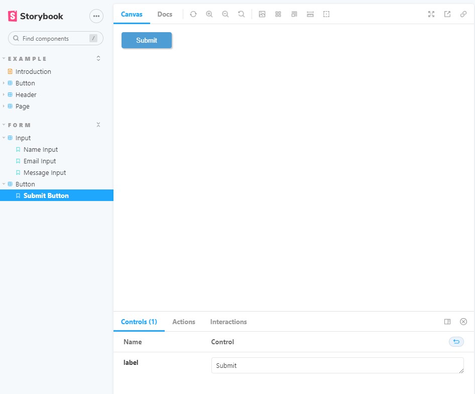
};위의 Button 코드들을 작성하신 후, 스토리북의 Form/Button 을 클릭 하시게 되면 아래와 같은 화면을 보시게 되실 것입니다.
자, 이렇게 이번 포스팅에서는 Input 과 Button 컴포넌트를 작성하고 스토리(Story)를 작성하는 방법에 대해 알아 보았습니다. 다음에는 이러한 컴포넌트를 결합해 Composite Component의 스토리(Story)를 작성하는 방법에 대해 알아 보겠습니다.
