1.학습일지
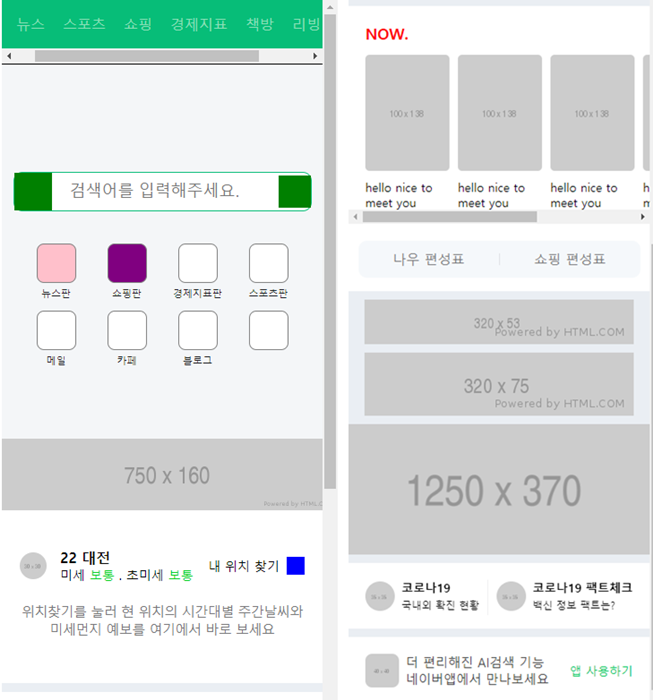
모바일 버전의 네이버 홈 화면을 카피캣 해봤다.
모바일 크기에 화면구성을 맞추기 위해서는 꼭 필요한 html코드가 있다.(helbak참고)
<meta name="viewport" content="width=device-width, initial-scale=1.0">대부분 모바일버전 화면을 보면 모든 구성이 가운데 정렬 돼 있다.
그래서 모든 구성들 배열을 맞춰주기 위해서
<div class="wrapper">로 묶어주는 과정 진행.
.wrapper {
	overflow-x: hidden;
	overflow-y: auto;

	width: 375px;
	height: 100vh;
   ~~ (**vh viewport height 기기화면 높이값 100vp: 100%full사이즈로 맞추겠다.)~~

	margin: 0 auto; ~~(**중앙정렬)~~

	background-color: #eaeef3;

}
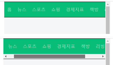
위(스크롤없애기.ver) 아래(x스크롤 생기면서 x축 정렬)
<div class="wrapper">
	<nav id="main-nav">
		<ul>
			<li><a href="#">홈</a></li>
			<li><a href="#">뉴스</a></li>
			<li><a href="#">스포츠</a></li>
			<li><a href="#">쇼핑</a></li>
			<li><a href="#">경제지표</a></li>
			<li><a href="#">책방</a></li>
			<li><a href="#">리빙</a></li>
			<li><a href="#">뭐하지</a></li>
		</ul>
	</nav>
#main-nav {
overflow: hidden;
background-color: rgb(7, 189, 120);
border-top: solid 1px #000000;
border-bottom: solid 1px #000000;
}
#main-nav ul {
overflow-x: auto;
display: flex;
align-items: center;
white-space: nowrap;
(**nav x축 스크롤 생기면서 x축 정렬)
}스크롤바에 영향미치는 css속성
#main-nav ul {
	-ms-overflow-style: none;
    익스플로어, 엣지에 영향
	scrollbar-width: none;
    파이어폭스 적용
}

#main-nav ul::-webkit-scrollbar {
	display: none;
}
#main-nav ul li {
height: 54px;
text-align: center;
}
#main-nav ul li a {
width: 100%;
line-height: 54px;
padding: 0 10px;
color: rgb(141,223,183);
}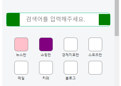
<header id="header">
	<div class="search-wrap">
		<a href="#" class="link-logo"></a>
		<input type="text" placeholder="검색어를 입력해주세요.">
		<a href="#" class="link-voice"></a>
	</div>

	<nav class="header-nav">
		<ul>
			<li>
				<a href="#">
					<i class="icon icon-1"></i>
					<span>뉴스판</span>
				</a>
			</li>
			<li>
				<a href="#">
					<i class="icon icon-2"></i>
					<span>쇼핑판</span>
				</a>
			</li>
			<li>
				<a href="#">
					<i class="icon"></i>
					<span>경제지표판</span>
				</a>
			</li>
#header {
background-color: #f4f6f8;
padding: 120px 0 80px;
}
#header .search-wrap {
display: flex;
flex-wrap: wrap;
justify-content: flex-start;
align-items: center;
align-content: stretch;
position: relative;
width: 333px;
border: solid 1px rgb(7, 189, 120);
border-radius: 10px;
margin: 0 auto 24px;
background-color: #ffffff;
}
#header .search-wrap .link-logo {
display: block;
width: 42px;
height: 42px;
background-color: green;
}
#header .search-wrap input {
width: calc(100% - 78px);
height: 22px;
font-size: 18px;
padding: 0 20px;
}
#header .search-wrap .link-voice {
display: block;
width: 36px;
height: 36px;
background-color: green;
}
#header .header-nav {
width: 316px;
margin: 0 auto;
}
#header .header-nav ul {
display: flex;
flex-direction: row;
flex-wrap: wrap;
justify-content: flex-start;
align-items: flex-start;
align-content: flex-start;
width: 100%;
}
#header .header-nav li {
width: 25%;
~~(*한개 li당 25면 4개 총 합쳐서 100% 꽉 채우게*)~~
padding-top: 12px;
}
#header .header-nav a {
display: block;
width: 100%;
~~(**li공간 안에서 크기 100%다 차게)~~
text-align: center;
}
#header .header-nav .icon {
display: inline-block;
width: 44px;
height: 44px;
border-radius: 8px;
background-color: #ffffff;
border: solid 1px grey;
}
#header .header-nav .icon-1 {
background-color: pink;
}
#header .header-nav .icon-2 {
background-color: purple;
}
#header .header-nav span {
display: block;
font-size: 11px;
color: #1e1e23;
}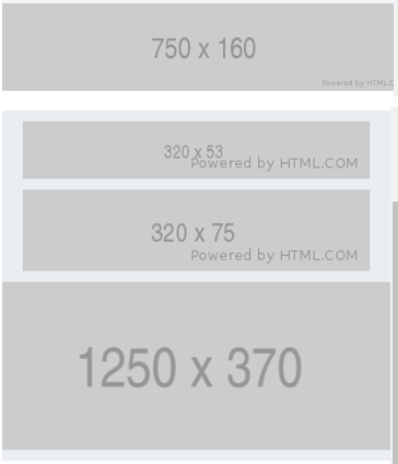
배너 1,2,3,4
<div id="banner-1">
	<div class="banner-wrap">
		<img src="https://via.placeholder.com/750x160">
	</div>
</div>
#banner-1 {
background-color: f4f4f4;
}
#banner-1 .banner-wrap {
width: 375px;
margin: 0 auto;
}
#banner-1 .banner-wrap img {
width: 100%;
}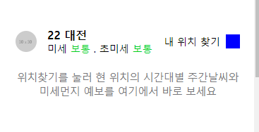
<div id="weather">
	<div class="container">

		<div class="weather-top">
			<div class="weather-left">
				<img src="https://via.placeholder.com/30x30">
				<div class="txt-wrap">
					<h3>22 대전</h3>
					<p>미세 <span>보통</span> . 초미세 <span>보통</span></p>
				</div>
				</div>
			<div class="weather-right">
				<span>내 위치 찾기 </span>
				<i class="icon"></i>
			</div>
		</div>

		<div class="weather-bottom">
			<p>위치찾기를 눌러 현 위치의 시간대별 주간날씨와 <br>
			미세먼지 예보를 여기에서 바로 보세요</p>
		</div>

	</div>
</div>
#weather {
background-color: #ffffff;
}
#weather .container {
padding: 20px;
}
#weather .weather-top{
display: flex;
flex-direction: row;
flex-wrap: wrap;
justify-content: space-between;
align-items: center;
align-content: center;
padding: 22px 0 16px;
}
#weather .weather-top .weather-left {
display: flex;
flex-direction: row;
flex-wrap: wrap;
justify-content: flex-start;
align-items: center;
align-content: center;
}
#weather .weather-top .weather-left img {
width: 30px;
height: 30px;
border-radius: 50%;
margin-right: 15px;
}
#weather .weather-top .weather-left .txt-wrap h3 {
font-size: 16px;
}
#weather .weather-top .weather-left .txt-wrap p {
font-size: 14px;
}
#weather .weather-top .weather-left .txt-wrap p span {
color: #00d01d;
}
#weather .weather-top .weather-right {
display: flex;
flex-direction: row;
flex-wrap: wrap;
justify-content: flex-end;
align-items: center;
align-content: center;
}
#weather .weather-top .weather-right span {
font-size: 14px;
margin-right: 8px;
}
#weather .weather-top .weather-right i{
display: inline-block;
width: 20px;
height: 20px;
background-color: blue;
color: #767678;
}
#weather .weather-bottom {
padding: 6px 0 30px;
}
#weather .weather-bottom p {
color: #767678;
font-weight: 400;
font-size: 15px;
line-height: 20px;
letter-spacing: -0.5px;
text-align: center;
}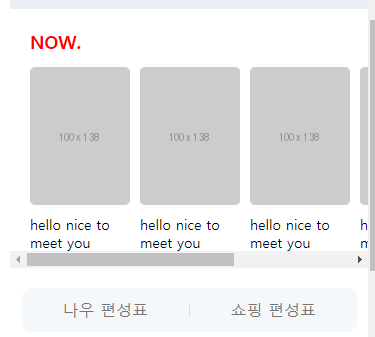
<div id="now">
	<h2>NOW.</h2>
	<ul>
		<li>
			<a href="#">
				<img src="https://via.placeholder.com/100x138">
				<p>hello nice to meet you</p>
			</a>
		</li>
    <ul>
    <div class="btn-wrap">
		<a href="#" class="btn-now">나우 편성표</a>
		<a href="#" class="btn-shopping">쇼핑 편성표</a>
	</div>
</div>
#now {
	background-color: #ffffff;
	padding: 20px 0 16px;

	margin-top: 10px;
}

#now h2 {
	font-size: 18px;
	font-weight: 700px;
	color: red;

	margin-bottom: 14px;
	margin-left: 20px;
}

#now ul {
	overflow-y: auto;

	display: flex;
	flex-direction: row;
	flex-wrap: nowrap;
	justify-content: flex-start;
	align-items: center;
	align-content: center;

	padding-left: 20px;
    ~~ (*margin 사용할 지 padding사용할 지는 디자인에 따라 선택*)~~
}

#now ul li {
	margin-right: 10px;
}

#now ul li:last-child {
	margin-right: 0;
}

#now ul li a {
	color: black;
}

#now ul li a img {
	width: 100px;
	height: 138px;

	border-radius: 5px;
}

#now ul li a p {
	font-size: 14px;
	padding-top: 10px;
}

#now .btn-wrap {
	overflow: hidden;
	width: 335px;
	border-radius: 10px;
	background-color: #f5f8fb;

	display: flex;
	flex-direction: row;
	flex-wrap: nowrap;
	justify-content: space-between;
	align-items: center;
	align-content: center;

	margin: 20px auto 0;

}

#now .btn-wrap a {
	display: block;
	width: 50%;
	height: 44px;
	text-align: center;
	line-height: 44px;

	color: #767678;
}

#now .btn-wrap .btn-shopping:before {
	content: "";
	display: block;
	width: 1px;
	height: 14px;

	margin-top: 15px;
	background-color: rgba(125,127,133,0.2);

	vertical-align: top;

	float: left;
   ~~ (*display를 inline-block으로 안바꿔도 짝대기가가 왼쪽으로 올라오면서 글씨 제대로 출력)~~
}
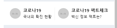
<div id="covid">
	<div class="container">
		<div class="covid-wrap">
			<a href="#" class="left-covid">
				<img src="https://via.placeholder.com/35">
				<div class="txt-wrap">
					<h3>코로나19</h3>
					<p>국내외 확진 현황</p>
				</div>
			</a>

			<a href="#" class="right-covid">
				<img src="https://via.placeholder.com/35">
				<div class="txt-wrap">
					<h3>코로나19 팩트체크</h3>
					<p>백신 정보 팩트는?</p>
				</div>
			</a>
		</div>
	</div>
</div>
#covid {
background-color: #ffffff;
margin-top: 10px;
}
#covid .container {
padding: 0 20px;
}
#covid .covid-wrap {
display: flex;
flex-direction: row;
flex-wrap: nowrap;
justify-content: space-between;
align-items: center;
align-content: center;
}
#covid .covid-wrap a {
position: relative;
display: flex;
flex-direction: row;
flex-wrap: nowrap;
justify-content: flex-start;
align-items: center;
align-content: center;
padding: 20px 0;
}
#covid .covid-wrap a.right-covid {
padding-left: 11px;
}
#covid .covid-wrap a.right-covid:before {
content: "";
display: block;
position: absolute;
width: 1px;
height: 42px;
background-color: #efeff0;
top: 20px;
left: 0;
}
#covid .covid-wrap img {
width: 35px;
margin-right: 8px;
border-radius: 50%;
}
#covid .covid-wrap .txt-wrap h3 {
font-size: 14px;
font-weight: 700;
color: #000000;
}
#covid .covid-wrap .txt-wrap p {
font-size: 12px;
font-weight: 400px;
color: #000000;
margin-top: 4px;
}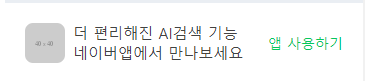
<div id="ai">
	<div class="container">
		<div class="ai-wrap">
			<div class="ai-left">
				<img src="https://via.placeholder.com/40">
				<div class="txt-wrap">
					<p>더 편리해진 AI검색 기능<br>
					네이버앱에서 만나보세요</p>
				</div>
			</div>
			<div class="ai-right">
				<span>앱 사용하기</span>
			</div>
		</div>
	</div>
</div>
#ai {
background-color: #ffffff;
margin-top: 10px;
}
#ai .container {
padding: 0 20px;
}
#ai .ai-wrap {
display: flex;
flex-direction: row;
flex-wrap: nowrap;
justify-content: space-between;
align-items: center;
align-content: center;
padding: 20px 0;
}
#ai .ai-wrap .ai-left {
display: flex;
flex-direction: row;
flex-wrap: nowrap;
justify-content: flex-start;
align-items: center;
align-content: center;
}
#ai .ai-wrap .ai-left img{
width: 40px;
height: 40px;
border-radius: 8px;
margin-right: 8px;
}
#ai .ai-wrap .ai-left .txt-wrap p {
font-size: 15px;
color: #424242;
font-weight: 400;
}
#ai .ai-wrap .ai-right {
display: flex;
flex-direction: row;
flex-wrap: nowrap;
justify-content: flex-end;
align-items: center;
align-content: center;
}
#ai .ai-wrap .ai-right span {
font-size: 14px;
font-weight: 400;
color: #03c95b;
}2.어려운내용
헤맷던 부분은 없었다.
다만 스크롤생성, 정렬, 크기 맞춤 등 아직 낮선 작성법을 더 훈련해야겠다.
3.해결방법
4.학습소감
이제 html/css과정이 다 끝나간다. 카피캣이 아닌 내가 기획하고 제작할 수 있을까 걱정된다.

예비 프론트엔드 개발자