CSS
1. Cascade Style Sheet
2. HTML 구성 요소에 스타일을 지정하는 언어이다.
3. 스타일 지정 방식
1) internal : <head> 태그 내부에 <style> 태그를 추가하고 CSS 작업하는 방식
2) external : 별도의 CSS 파일을 만들어서 <link> 태그로 등록하는 방식
3) inline : HTML 구성 요소에 직접 style 속성을 추가하고 CSS 작업하는 방식4. 스타일 우선 순위
 높음     낮음
  !important >inline > internal = external
5. 스타일 작성 방식
선택자 {
  CSS속성: 값;
  CSS속성: 값;
  ...
CSS 주석
/* 주석 */
internal
[html]
  <!DOCTYPE html>
<html lang="ko">
<head>
  <meta charset="UTF-8">
  <meta name="viewport" content="width=device-width, initial-scale=1.0">
  <title>Document</title>
  <style>
    h1 {
      color: crimson;
    }
    p {
      color: teal;
    }
  </style>
</head>
<body>
  <h1>Hello World</h1>
  <p>만나서 반갑습니다</p>
</body>
</html>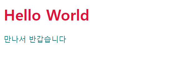
external
[html]
<!DOCTYPE html>
<html lang="ko">
<head>
  <meta charset="UTF-8">
  <meta name="viewport" content="width=device-width, initial-scale=1.0">
  <title>Document</title>
</head>
<body>
  <link rel="stylesheet" href="../../assets/css/02_external.css">
  <h1>Hello World</h1>
  <p>만나서 반갑습니다</p>
</body>
</html>
[css]
h1{
  color: crimson;
}
p{
  color: teal;
}
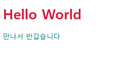
inline
[html]
<!DOCTYPE html>
<html lang="ko">
<head>
  <meta charset="UTF-8">
  <meta name="viewport" content="width=device-width, initial-scale=1.0">
  <title>Document</title>
</head>
<style>
  h1{
    color: aqua!important;/*  !important로 인해서 가장 높은 우선순위를 가진다. 단,important사용은 자제한다.*/
  }
  p{
    color: blue;
  }
</style>
<body>
  <h1 style="color:crimson;">Hello World</h1>
  <p style="color: teal;">만나서 반갑습니다</p>
</body>
</html>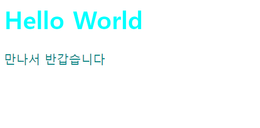
04 textstyle
[textstyle.html]
font-family
font-family: '맑은 고딕', '고딕', sans-serif;  /* '맑은 고딕' 사용, 없으면 '고딕' 사용, 없으면 고딕 계열(sans-serif) 사용 */
font-family: '궁서', '명조', serif;  /* '궁서' 사용, 없으면 '명조', 없으면 명조 계열(serif) 사용 */
font-size
font-size: 32px; /* 디폴트 16px */
font-weight
font-weight: 900; /* 디폴트 400, 100~900 */
font-style
font-style: italic; /* italic(기울임), normal(안 기울임) */color
color: crimson;
      color: rgb(0, 0, 0);  /* red(0), green(0), blue(0) - black */
      color: rgb(255, 255, 255);  /* red(255), green(255), blue(255) - white */
      color: #000000;  /* 16진수 색상코드 : red(0), greed(0), blue(0) - black */
      color: #FFFFFF;  /* 16진수 색상코드 : red(255), green(255), blue(255) - white */
      color: rgba(0, 0, 0, 1);  /* red(0), green(0), blue(0), alpha(0 ~ 1) : 투명도(0은 투명, 1은 불투명) */
letter-spacing
letter-spacing: -1px; /* 글자 사이 간격(자간) */line-height
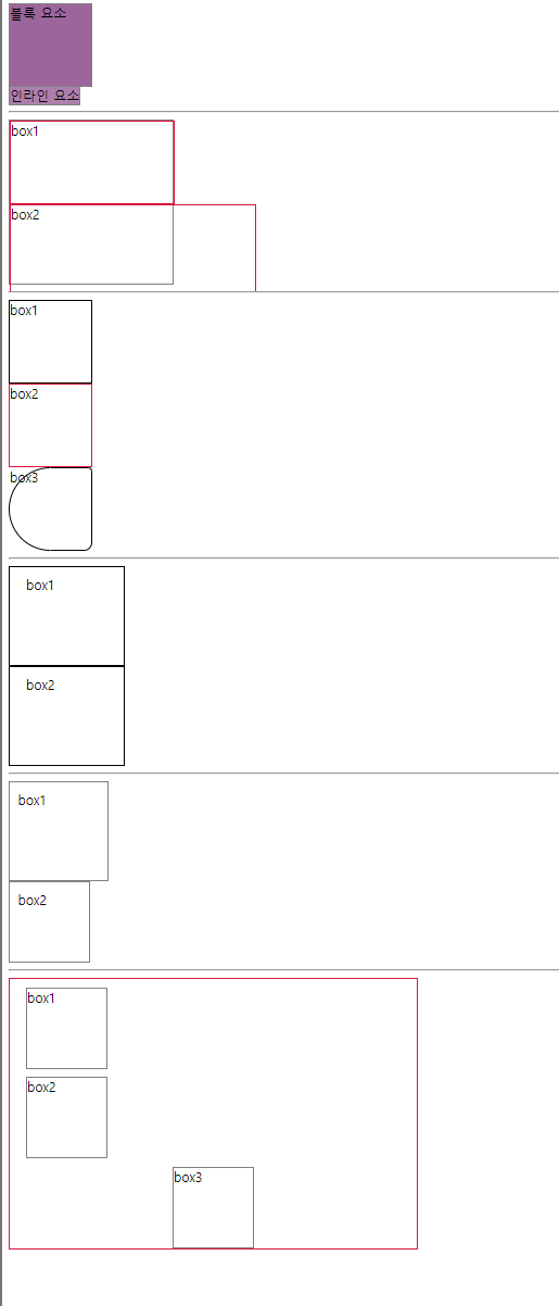
line-height: 64px; /* 행 높이(세로 가운데 정렬할 때 주로 사용) */블록요소와 인라인 요소의 차이
블록 요소
 /* 블록 요소는 정렬이 된다. */
 div, hr, h1~h6, p, pre, ul, ol, li, dl, dt, dd, audio, video, table, form

	  /* 가로 가운데 정렬 */
      text-align: center;
인라인 요소
  인라인 요소는 정렬이 되지 않는다.
      /* span, br, strong, em, ins, del, mark, img, a, input, select, textarea, button, label */
      text-align: center;  /* 가로 가운데 정렬 */
벤더 프리믹스
1. Vendor Prefix
2. CSS속성 앞에 브라우저 벤더(제공업체)를 작성 할 수 있다.
3. 종류
1) -webkit- : 크롬, 사파리
2) -moz- : 파이어폭스
3) -o- : 오페라
예시
  -webkit-text-stroke-color:crimson;
-webkit-text-stroke-width: 1px; 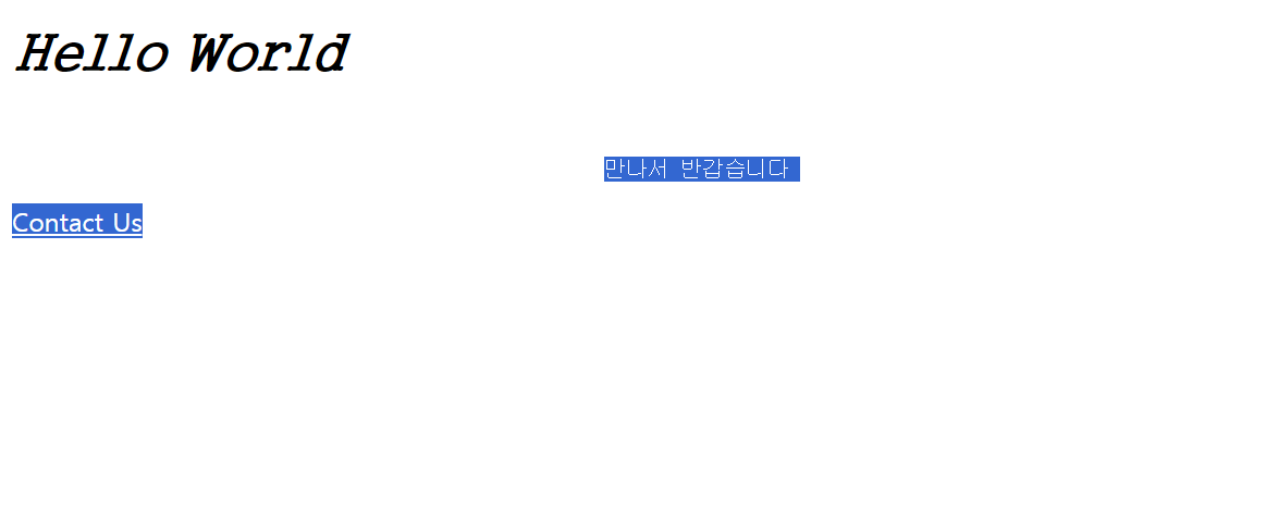
05 googlefont
구글 폰트 사용 예시
[googlefont.html]
<!DOCTYPE html>
<html lang="ko">
<head>
  <meta charset="UTF-8">
  <meta name="viewport" content="width=device-width, initial-scale=1.0">
  <title>Document</title>
  <style>
    @import url('https://fonts.googleapis.com/css2?family=Noto+Sans+KR&family=Noto+Serif+KR&display=swap');
    h1 {
      font-family: 'Noto Sans KR', sans-serif;
      font-family: 'Noto Serif KR', serif;
    }
  </style>
</head>
<body>
  <h1>Hello World</h1>
</body>
</html>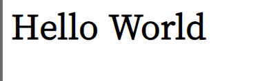
06 fontawesome
fontawesome 아이콘
1. https://cdnjs.com/ 에 접속한다.
2. "font-awesome"을 조회해서 fontawesome 아이콘을 가져올 수 있는 URL을 알아낸다.
3. 알아낸 URL을 HTML 문서로 가져온다.
  1) <link rel="stylesheet" href="알아낸 URL">
2) @import url(알아낸 URL)- https://fontawesome.com/에 접속한다.
- 원하는 아이콘의 <i class="xxx"></i> 태그를 가져온다.
예시
[fontawesome.html]
<!DOCTYPE html>
<html lang="ko">
<head>
  <meta charset="UTF-8">
  <meta name="viewport" content="width=device-width, initial-scale=1.0">
  <title>Document</title>
  <style>
    @import url(https://cdnjs.cloudflare.com/ajax/libs/font-awesome/6.4.2/css/all.min.css);
  </style>
</head>
<body>

  <p>
    홈 <i class="fa-solid fa-house"></i>
  </p>

  <p>
    휴지통 <i class="fa-regular fa-trash-can"></i>
    휴지통 <i class="fa-regular fa-trash-can fa-2x"></i>
    휴지통 <i class="fa-regular fa-trash-can fa-3x"></i>
    휴지통 <i class="fa-regular fa-trash-can fa-4x"></i>
    휴지통 <i class="fa-regular fa-trash-can fa-5x"></i>
  </p>

  <p>
    <a href="https://github.com/">
      <i class="fa-brands fa-github"></i>
    </a>
  </p>

  <p>
    <button>
      <i class="fa-solid fa-magnifying-glass"></i>
    </button>
  </p>

</body>
</html>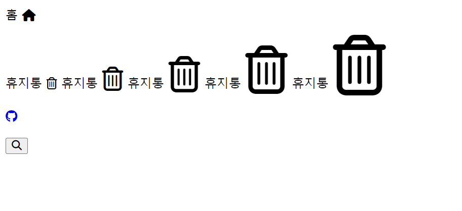
07 selector
id 속성
-
모든 태그가 가질 수 있는 전역 속성이다.
-
문서 내의 모든 요소는 중복된 id를 가질 수 없다.
id 선택자 : #id
  <style>
   #box1 {
     color: crimson;
   }
   #box2 {
     color: teal;
   }

 </style>

 <div id="box1">
   Hello World
 </div>

 <div id="box2">
   Hello World
 </div>
class 속성
- 모든 태그가 가질 수 있는 전역 속성이다.
- 문서 내의 모든 요소는 동일한 class를 가질 수 있다.
- 동일한 특성을 가지는 요소들은 동일한 class 속성을 가진다.
- 하나의 요소가 여러 개의 class를 가질 수 있다. (각 class를 공백으로 구분)
class 선택자 : .class
<style>


   .green {
     color: green;
   }
   .bold {
     font-weight: 900;
   }

 </style>

 <div class="green bold">
   안녕하세요
 </div>

 <div class="green">
   안녕하세요
 </div>
자식 선택자 : 부모 > 자식
<style>
    ul > li {
      color: orange;
    }
    ul > li > a {
      color: orangered;
    }

  </style>

  <div>
    <ul>
      <li>구글 <a href="https://www.google.com/"><i class="fa-brands fa-google"></i></a></li>
      <li>유튜브 <a href="https://www.youtube.com/"><i class="fa-brands fa-youtube"></i></a></li>
      <li>애플 <a href="https://www.apple.com/kr/store"><i class="fa-brands fa-apple"></i></a></li>
    </ul>
  </div>
후손 선택자 : 조상 후손 (조상과 후손을 공백으로 구분)
  <style>


    ol label {
      color: violet;
    }

  </style>

  <div>
    <ol>
      <li>
        <input type="radio" name="wakeup" id="six">
        <label for="six">6시</label>
      </li>
      <li>
        <input type="radio" name="wakeup" id="seven">
        <label for="seven">7시</label>
      </li>
      <li>
        <input type="radio" name="wakeup" id="eight">
        <label for="eight">8시</label>
      </li>
    </ol>
  </div>
모든 형제 선택자 : 형제 ~ 형제
<style>

    .asia > h4 ~ p {
      color: rgb(187, 187, 187);
    }

  </style>

  <div class="asia">
    <h4>아시아</h4>
    <p>한국</p>
    <p>일본</p>
    <p>중국</p>
  </div>
인접 형제 선택자 : 형제 + 형제
<style>

    .hobby > h4 + input + label {
      color: #c2c3c4;
    }

  </style>

  <div class="hobby">
    <h4>취미</h4>
    <input type="checkbox" id="fitness">
    <label for="fitness">헬스</label>
    <input type="checkbox" id="travel">
    <label for="travel">여행</label>
    <input type="checkbox" id="cook">
    <label for="cook">요리</label>
  </div>
구조 선택자
- 요소:first-of-type : 첫번째 요소
- 요소:last-of-type : 마지막 요소
- 요소:nth-of-type(n) : n번째 요소
  <style>

    .dinner li:nth-of-type(3) {
      color: rgba(255, 0, 0, 0.5);
    }

  </style>

  <div class="dinner">
    <h4>오늘 저녁 메뉴는 무엇입니까?</h4>
    <ol>
      <li>김치찌개</li>
      <li>순두부찌개</li>
      <li>된장찌개</li>
      <li>부대찌개</li>
    </ol>
  </div>
속성 선택자
  <style>

 /*
   속성 선택자
   1. 요소[속성]     속성을 가지고 있는 요소
   2. 요소[속성=값]  속성=값인 요소
   3. 요소[속성^=값] 속성이 값으로 시작하는 요소
   4. 요소[속성$=값] 속성이 값으로 끝나는 요소
   5. 요소[속성*=값] 속성이 값을 포함하는 요소
 */

 .person input[readonly] {
   color: silver;
 }
 .person input[name=age] {
   color: black;
 }

</style>

<div class="person">
 <p><input type="text" name="name" value="tom" readonly></p>
 <p><input type="text" name="age" value="20" disabled></p>
</div>
상태 선택자
- 요소:focus 포커스를 가질 때 (입력 상자를 선택한 경우)
- 요소:checked 선택했을 때 (radio, checkbox를 선택한 경우)
<style>

    .register > p:first-of-type > label {
      color: rgba(0, 0, 0, 0);
    }
    .register > p:first-of-type > input:focus + label {
      color: rgba(0, 0, 0, 1);
    }

    .register > p:last-of-type > input[type=radio]:checked + label {
      font-weight: 900;
    }

  </style>

  <div class="register">

    <p>
      <input type="text" id="name">
      <label for="name">이름</label>
    </p>
    <p>
      <input type="radio" name="gender" id="male">
      <label for="male">남자</label>
      <input type="radio" name="gender" id="female">
      <label for="female">여자</label>
    </p>

  </div>
마우스 반응 선택자
- 요소:hover 요소에 마우스를 가져다 대고 있는 동안
- 요소:active 요소를 마우스로 누르고 있는 동안
<style>

    .link > a {
      color: black;
      text-decoration: none;
    }
    .link > a:hover {
      color: orange;
    }
    .link > a:active {
      color: crimson;
    }

  </style>

  <div class="link">
    <a href="javascript:void(0)">링크</a>
  </div>
Pseudo Element(의사 요소)
- 요소::before 요소의 앞에 의사 요소를 추가
- 요소::after 요소의 뒤에 의사 요소를 추가
  <style>

    .chain > strong + strong::before {
      content: "→";
    }

  </style>

  <div class="chain">
    <strong>A</strong>
    <strong>B</strong>
    <strong>C</strong>
</div> 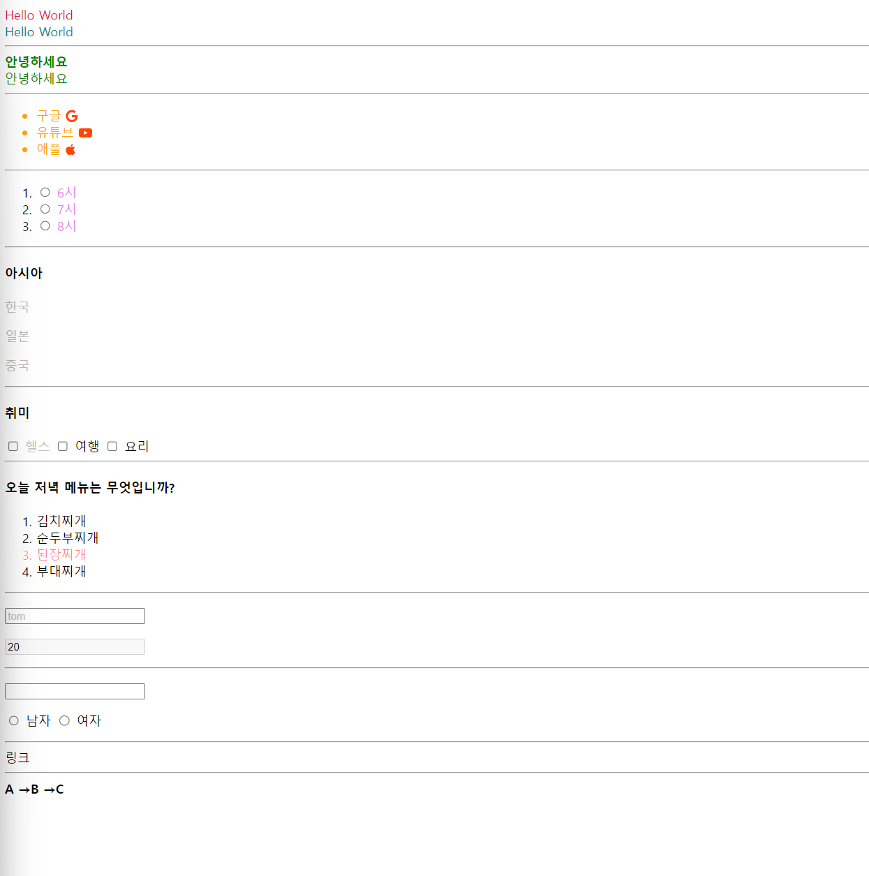
08 box_model
<style>
  /* 블록 요소는 width,height를 지정 할 수 있다. */
 .wrap1 > div {
    width: 100px;
    height: 100px;
    border: 1px solid gray;
    background-color: rgba(90, 0, 90,0.6);
  }

  /* 인라인 요소는 width,height를 지정할 수 없다. */
  .wrap1 > span {
    width: 100px;
    height: 100px;
    border: 1px solid gray;
    background-color: rgba(90, 0, 90,0.5);
  }
</style>
<div class="wrap1">
  <div>블록 요소</div>
  <span>인라인 요소</span>
</div>
<style>
/* 부모 */
.wrap2{
width: 200px;
height: 200px;
border:1px solid gray;
}
/* 자식 : 부모 기준으로 % 값을 가질 수 있다. */
.wrap2 > .box1{
width: 100%;
height: 50%;
border: 1px solid crimson;
}
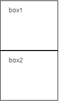
/* 자식 : 부모보다 커지면 부모 영역 밖으로 나간다. */
.wrap2 > .box2{
width: 300px;
height: 105px;
border: 1px solid crimson;
}
</style>
<div class="wrap2">
<div class="box1">box1</div>
<div class="box2">box2</div>
</div>
<style>
  .wrap3 > div{
    width:100px;
    height:100px;

  }
  /* 모든 테두리 지정하기 */
  .wrap3> .box1{
    border: 1px solid black;/*border-width border-style border-color*/
  }
  /* 원하는 테두리 지정하기 */
  .wrap3 > .box2{
    border-top:1px solid crimson;
    border-right: 1px solid crimson;
    border-bottom: 1px solid crimson;
    border-left: 1px solid crimson;
  }
  /* 모서리 둥글게 다듬기 */
  .wrap3> .box3{
    border: 2px solid black;
    border-radius: 5px;
    border-radius: 1px 20px;
    border-radius: 100px 10px 20px;
    border-radius: 100px 10px 20px 100px;

  }
</style>
<div class="wrap3">
  <div class="box1">box1</div>
  <div class="box2">box2</div>
  <div class="box3">box3</div>
</div>
<style>
  .wrap4> div{
    width: 100px;
    height: 100px;
    border: 1px solid black;
  }
  /* 내부여백(테두리와 콘텐츠 사이 여백) */
  .wrap4 > .box1{
  padding:10px ;
  padding: 10px 20px;
  padding: 10px 20px 10px;
  padding: 10px 20px 10px 20px;
  }
  /* 원하는 내부 여백 지정하기 */
  .wrap4 > .box2{
    padding-top:10px ;
    padding-right:20px ;
    padding-bottom:10px ;
    padding-left:20px ;
  }
</style>

<div class="wrap4">

  <div class="box1">
  box1
</div>

<div class="box2">
  box2
</div>

</div>
box-sizing 속성
- content-box
1) 디폴트
2) width, height는 내용(content)의 크기를 의미한다.
3) box 크기는 width/height + border + padding 으로 계산한다. - border-box
1) width, height는 테두리(border)까지의 크기를 의미한다.
2) box 크기를 width/height 이다.
<style>
  .wrap4> div{
    width: 100px;
    height: 100px;
    border: 1px solid black;
  }
  /* 내부여백(테두리와 콘텐츠 사이 여백) */
  .wrap4 > .box1{
  padding:10px ;
  padding: 10px 20px;
  padding: 10px 20px 10px;
  padding: 10px 20px 10px 20px;
  }
  /* 원하는 내부 여백 지정하기 */
  .wrap4 > .box2{
    padding-top:10px ;
    padding-right:20px ;
    padding-bottom:10px ;
    padding-left:20px ;
  }
</style>

<div class="wrap4">

  <div class="box1">
  box1
</div>

<div class="box2">
  box2
</div>

</div>
<style>

   .wrap5 > .box1{
    box-sizing: content-box;/*생략가능*/
    width:100px;
    height:100px;
    border: 1px solid gray;
    padding: 10px;
    /* box1 크기 : 내용(100px) + 테두리(1px *2 ) +내부여백(10px *2)=122px */
   }

   .wrap5> .box2{
    box-sizing: border-box;
    width: 100px;
    height: 100px;
    border: 1px solid gray;
    padding: 10px;
    /* box2 크기 계산:내용(78px)+테두리(1px * 2)+ 내부여백(10px * 2)= 100px */
   }
</style>
<div class="wrap5">

  <div class="box1">
    box1
  </div>
  <div class="box2">
    box2
  </div>


</div>
<style>
  /* margin은 동시에 지정하면 겹친다 .
  ex) box1  margin bottom 10px + box2 margin top 10px =20px?
      -> 그러나 margin이 중복되어서 10px*/
  .wrap6{
    width: 500px;
    border: 1px solid crimson;
  }

  .wrap6 >div{
    box-sizing: border-box;
    width: 100px;
    height: 100px;
    border: 1px solid gray;
  }

  /*외부여백: border 바깥쪽의 여백*/
  .wrap6 > .box1{
    margin: 10px;
    margin: 10px 20px;
    margin: 10px 20px 10px;
    margin: 10px 20px 10px 20px;
  }
  /* 원하는 외부여백 지정하기*/
  .wrap6 > .box2{
    margin-top:10px;
    margin-right:20px;
    margin-bottom:10px ;
    margin-left:20px;
  }

  /* box 가운데 배치 (좌우 margin을 auto로 설정) */
  .wrap6 > .box3{
    margin:0 auto;
  }
</style>
<div class="wrap6">
  <div class="box1">box1</div>
  <div class="box2">box2</div>
  <div class="box3">box3</div>

</div>
09 background
<style>
/* box 크기와 배경 이미지 크기를 동일하게 맞춤 */
.box1 {
box-sizing: border-box;
width: 192px;
height: 128px;
background-image: url(../../assets/images/animal10.jpg);
background-size: 192px 128px;
background: url(../../assets/images/animal10.jpg) center/192px 128px; /* 단축속성 : 위치(position)/크기(size) */
}
</style>
<div class="box1"></div>
<hr>
<style>
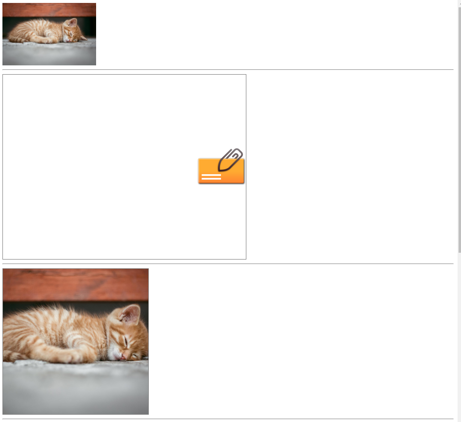
/* box보다 작은 이미지 처리 */
.box2 {
box-sizing: border-box;
width: 500px;
height: 380px;
border: 1px solid gray;
background-image: url(../../assets/images/attach1.png);
background-repeat: no-repeat; /* 반복없음 */
background-size: auto; /* 이미지 크기를 그대로 사용 */
background-position: right; /* top/bottom(세로 정렬), left/center/right(가로 정렬) */
background: url(../../assets/images/attach1.png) no-repeat right/auto;
}
</style>
<div class="box2"></div>
<hr>
<style>
/* box보다 큰 이미지 처리 */
.box3 {
box-sizing: border-box;
width: 300px;
height: 300px;
border: 1px solid gray;
background-image: url(../../assets/images/animal10.jpg);
background-repeat: no-repeat;
background-size: cover; /* contain : 이미지를 늘리거나 자르지 않고 최대한 크게 조정해서 표현 */
/* cover : 너비/높이 중 작은 부분을 최대한 여백 없이 표시하고 box 밖으로 나간 부분은 자름 */
background-position: center;
background: url(../../assets/images/animal10.jpg) no-repeat center/cover;
}
</style>
<div class="box3"></div>
<hr>
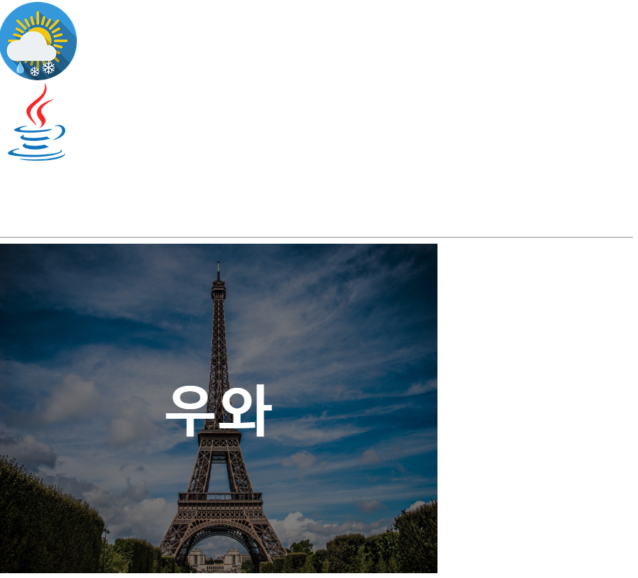
<style>
/* 이미지의 일부만 표시하기 */
.box4 {
box-sizing: border-box;
width: 115px;
height: 115px;
background-image: url(../../assets/images/weather.png);
background-position: -145px -145px; /* 가로 세로 순으로 이동, -145px: 배경이 왼쪽/아래쪽으로 145px 이동 */
background: url(../../assets/images/weather.png) -145px -145px/auto;
}
.box5 {
box-sizing: border-box;
width: 110px;
height: 220px;
background-image: url(../../assets/images/logo.png);
background-position: -1170px -175px;
background: url(../../assets/images/logo.png) -1170px -175px/auto;
}
</style>
<div class="box4"></div>
<div class="box5"></div>
<hr>
<style>
.box6 {
box-sizing: border-box;
width: 640px;
height: 480px;
background-image: url(../../assets/images/architecture2.jpg);
background-size: 640px 480px; /* background-size: 100%; */
background-color: gray;
background-blend-mode: multiply;
background: url(../../assets/images/architecture2.jpg) center/640px 480px multiple gray;
font-size: 80px;
font-weight: 900;
color: white;
text-align: center; /* 가로 가운데 정렬 */
line-height: 480px; /* box의 height와 line-height가 동일하면 세로 가운데 정렬 효과가 나타난다.(1줄만 가능) */
}
</style>
<div class="box6">우와</div>
10 visibility
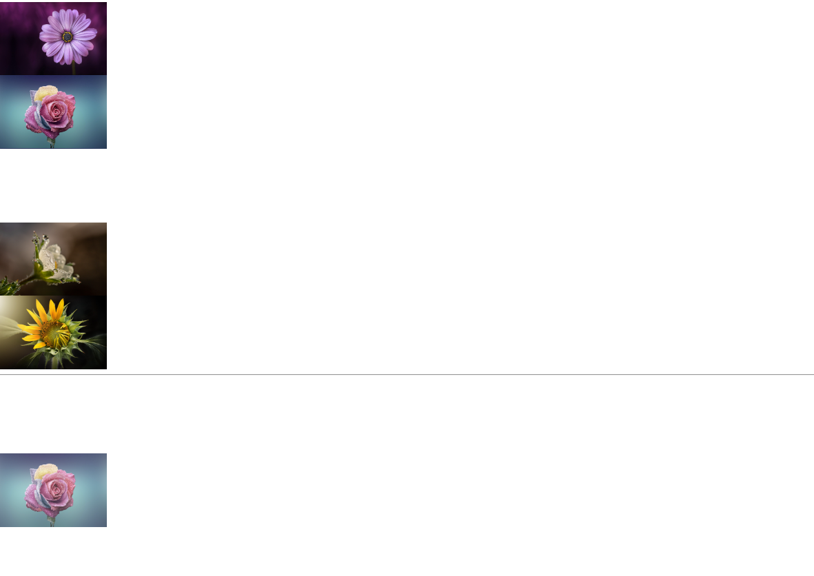
 <style>

    .wrap1 > div {
      box-sizing: border-box;
      width: 192px;
      height: 128px;
      background-size: 100%;
    }
    .wrap1 > .box1 {
      background-image: url(../../assets/images/flower1.jpg);
    }
    .wrap1 > .box2 {
      background-image: url(../../assets/images/flower2.jpg);
    }
    .wrap1 > .box3 {
      background-image: url(../../assets/images/flower3.jpg);
      visibility: hidden; /*안보임, 블록 영역은 차지하고 있음*/
    }
    .wrap1 > .box4 {
      background-image: url(../../assets/images/flower4.jpg);
    }
    .wrap1 > .box5 {
      background-image: url(../../assets/images/flower5.jpg);
    }


  </style>

  <div class="wrap1">
    <div class="box1"></div>
    <div class="box2"></div>
    <div class="box3"></div>
    <div class="box4"></div>
    <div class="box5"></div>
  </div>


  <hr>


  <style>
    .wrap2 >div{
      box-sizing: border-box;
      width: 192px;
      height: 128px;

    }
    .wrap2 img{
      visibility:hidden;
      opacity: 0;/*안보임, 투명도를 0으로 지정*/
    }
    .wrap2 .box1:hover>img
    {

      visibility:visible;
      opacity: 1;/*보임 , 투명도를 1로 지정*/
    }

    .wrap2 .box2:hover>img
    {
      visibility:visible;
      opacity: 0.8;
    }

    .wrap2 .box3:hover>img
    {
      visibility:visible;
      opacity: 0.6;
    }


    .wrap2 .box4:hover>img
    {
      visibility:visible;
      opacity: 0.4;
    }
    .wrap2 .box5:hover >img
    {
      visibility:visible;
      opacity: 0.2;
    }


  </style>
  <div class="wrap2">
    <div class="box1"><img src="../../assets/images/flower1.jpg" width="192px"height="128px"></div>
    <div class="box2"><img src="../../assets/images/flower2.jpg" width="192px"height="128px"></div>
    <div class="box3"><img src="../../assets/images/flower3.jpg" width="192px"height="128px"></div>
    <div class="box4"><img src="../../assets/images/flower4.jpg" width="192px"height="128px"></div>
    <div class="box5"><img src="../../assets/images/flower5.jpg" width="192px"height="128px"></div>
  </div>
11 table
<style>
.wrap1 > table {
/* 테이블 바깥쪽 테두리 */
border: 1px solid gray;
/* 테두리 합치기 */
border-collapse: collapse;
}
.wrap1 > table td {
/* 테이블 테두리는 <td> 태그를 대상으로 처리하는 것이 일반적이다. */
border-top: 1px solid gray;
border-bottom: 1px solid gray;
/* <td> 태그는 가로/세로 정렬이 모두 지원된다. */
text-align: center; /* 가로 방향 정렬 : left, center, right */
vertical-align: middle; /* 세로 방향 정렬 : top, middle, bottom */
}
/* nth-of-type(n) : nth-of-type(1), nth-of-type(2), nth-of-type(3), ... */
.wrap1 > table td:nth-of-type(n) {
width: 150px;
}
.wrap1 > table tr:hover {
background-color: beige;
cursor: pointer;
}
</style>
<div class="wrap1">
<table>
<thead>
<tr>
<td>회원번호</td>
<td>회원명</td>
<td>회원거주지</td>
<td>회원포인트</td>
</tr>
</thead>
<tbody>
<tr>
<td>1</td>
<td>홍길동</td>
<td>서울</td>
<td>1500</td>
</tr>
<tr>
<td>2</td>
<td>고길동</td>
<td>인천</td>
<td>1000</td>
</tr>
<tr>
<td>3</td>
<td>마길동</td>
<td>제주</td>
<td>2000</td>
</tr>
</tbody>
</table>
</div>
<hr>
<style>
.wrap2 > .title {
font-weight: 900;
text-align: center;
}
.wrap2 > .title > span {
font-size: 48px;
color: blue;
}
.wrap2 > table {
border-collapse: collapse;
margin: 10px auto;
}
.wrap2 > table td {
box-sizing: border-box;
width: 100px;
height: 100px;
border: 1px solid gray;
padding: 10px;
vertical-align: top;
}
.wrap2 > table > thead td {
height: 20px;
text-align: center;
vertical-align: middle;
}
.wrap2 > table > tbody td:hover {
background-color: salmon;
cursor: pointer;
}
.prev, .next {
color: silver;
}
.holiday {
color: crimson;
}
.sat {
color: blue;
}
</style>
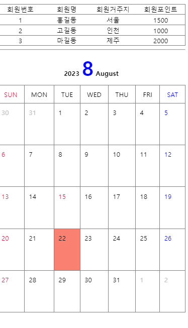
<div class="wrap2">
<div class="title">
2023 <span>8</span> August
</div>
<table>
<thead>
<tr>
<td class="holiday">SUN</td>
<td>MON</td>
<td>TUE</td>
<td>WED</td>
<td>THU</td>
<td>FRI</td>
<td class="sat">SAT</td>
</tr>
</thead>
<tbody>
<tr>
<td class="prev">30</td>
<td class="prev">31</td>
<td>1</td>
<td>2</td>
<td>3</td>
<td>4</td>
<td class="sat">5</td>
</tr>
<tr>
<td class="holiday">6</td>
<td>7</td>
<td>8</td>
<td>9</td>
<td>10</td>
<td>11</td>
<td class="sat">12</td>
</tr>
<tr>
<td class="holiday">13</td>
<td>14</td>
<td class="holiday">15</td>
<td>16</td>
<td>17</td>
<td>18</td>
<td class="sat">19</td>
</tr>
<tr>
<td class="holiday">20</td>
<td>21</td>
<td>22</td>
<td>23</td>
<td>24</td>
<td>25</td>
<td class="sat">26</td>
</tr>
<tr>
<td class="holiday">27</td>
<td>28</td>
<td>29</td>
<td>30</td>
<td>31</td>
<td class="next">1</td>
<td class="next">2</td>
</tr>
</tbody>
</table>
</div>
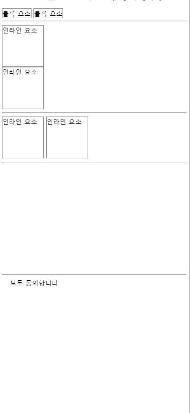
12 display
 <style>
    /* 블록 -> 인라인 */
    .wrap1 > div {
      display: inline;
      width: 100px;
      height: 100px;
      border: 1px solid gray;
    }
  </style>

  <div class="wrap1">
    <div>블록 요소</div>
    <div>블록 요소</div>
  </div>


  <hr>


  <style>
    /* 인라인 -> 블록 */
    .wrap2 > span {
      display: block;
      width: 100px;
      height: 100px;
      border: 1px solid gray;
    }
  </style>

  <div class="wrap2">
    <span>인라인 요소</span>
    <span>인라인 요소</span>
  </div>


  <hr>


  <style>
    /* inline-block : 같은 줄에 배치할 수 있는 블록 요소 */
    .wrap3 > span {
      display: inline-block;
      width: 100px;
      height: 100px;
      border: 1px solid gray;
    }
  </style>

  <div class="wrap3">
    <span>인라인 요소</span>
    <span>인라인 요소</span>
  </div>


  <hr>


  <style>

    .wrap4 > div {
      width: 128px;
      height: 128px;
      border-radius: 20px;
      background-size: cover;
      background-position: center;
    }
    .wrap4 > .box1 {
      background-image: url(../../assets/image/architecture1.jpg);
    }
    .wrap4 > .box2 {
      background-image: url(../../assets/image/architecture2.jpg);
    }
    .wrap4 > .box3 {
      background-image: url(../../assets/image/architecture3.jpg);
    }

    .wrap4 > .box2 {
      /* 화면에서 없어진다. */
      display: none;
    }

  </style>

  <div class="wrap4">
     <div class="box1"></div>
     <div class="box2"></div>
     <div class="box3"></div>
  </div>


  <hr>


  <style>
    #agree_all {
      display: none;
    }
    .wrap5 > label {
      padding-left: 20px;
      background-image: url(../../assets/image/check1.png);
      background-repeat: no-repeat;
      background-size: 16px 16px;
      background-position: 0 3px;
    }
    #agree_all:checked + label {
      background-image: url(../../assets/image/check2.png);
    }
  </style>

  <div class="wrap5">
    <input type="checkbox" id="agree_all">
    <label for="agree_all">모두 동의합니다</label>
  </div>
13 float
float 속성
- HTML 요소들은 기본 배치를 가진다.
1) 위에서 아래 방향으로 배치한다.
2) 왼쪽에서 오른쪽 방향으로 배치한다.
3) 블록 요소는 라인을 각각 차지하고, 인라인 요소는 라인에 포함된다. - HTML 기본 배치를 무시하고 새롭게 배치된다.
1) 왼쪽에 배치할 수 있다.
2) 오른쪽에 배치할 수 있다.
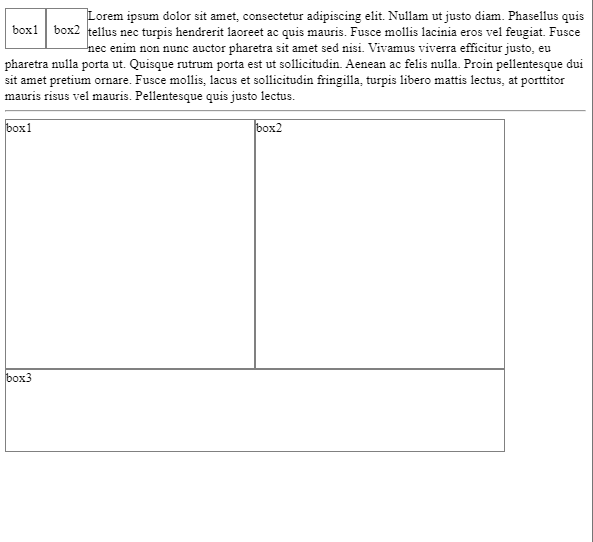
<style>
/*
float 속성
1. HTML 요소들은 기본 배치를 가진다.
1) 위에서 아래 방향으로 배치한다.
2) 왼쪽에서 오른쪽 방향으로 배치한다.
3) 블록 요소는 라인을 각각 차지하고, 인라인 요소는 라인에 포함된다.
2. HTML 기본 배치를 무시하고 새롭게 배치된다.
1) 왼쪽에 배치할 수 있다.
2) 오른쪽에 배치할 수 있다.
*/
.wrap1 > div {
box-sizing: border-box;
width: 50px;
height: 50px;
border: 1px solid gray;
text-align: center;
line-height: 50px;
}
.wrap1 > .box1 {
float: left;
}
.wrap1 > .box2 {
float: left;
}
</style>
<div class="wrap1">
<div class="box1">box1</div>
<div class="box2">box2</div>
Lorem ipsum dolor sit amet, consectetur adipiscing elit. Nullam ut justo diam. Phasellus quis tellus nec turpis hendrerit laoreet ac quis mauris. Fusce mollis lacinia eros vel feugiat. Fusce nec enim non nunc auctor pharetra sit amet sed nisi. Vivamus viverra efficitur justo, eu pharetra nulla porta ut. Quisque rutrum porta est ut sollicitudin. Aenean ac felis nulla. Proin pellentesque dui sit amet pretium ornare. Fusce mollis, lacus et sollicitudin fringilla, turpis libero mattis lectus, at porttitor mauris risus vel mauris. Pellentesque quis justo lectus.
</div>
<hr>
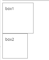
<style>
.wrap2 > div {
box-sizing: border-box;
width: 300px;
height: 300px;
border: 1px solid gray;
}
.wrap2 > .box1 {
float: left;
}
.wrap2 > .box2 {
float: left;
}
.wrap2 > .box3 {
/* float 요소의 영역에서 벗어나시오. (left, right, both) */
clear: left; /* float: left; 에서 벗어나시오. */
width: 600px;
height: 100px;
}
</style>
<div class="wrap2">
<div class="box1">box1</div>
<div class="box2">box2</div>
<div class="box3">box3</div>
</div>
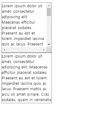
overflow
  <style>
    div{
      box-sizing: border-box;
      width: 200px;
      height: 200px;
      border: 1px solid gray;

    }

    .box1{
      overflow: scroll;/*스크롤바가 생긴다.*/
    }

    .box2{
      overflow: hidden;/*숨긴다.*/
    }
  </style>

  <div class="box1">
    Lorem ipsum dolor sit amet, consectetur adipiscing elit. Maecenas efficitur placerat sodales. Praesent eu est et lorem imperdiet lacinia quis ac lacus. Praesent mattis ac arcu sit amet ornare. Cras sodales, quam in venenatis dignissim, ipsum lacus euismod magna, ornare mollis dui urna eu massa. Duis pellentesque, sapien ut faucibus suscipit, erat elit pulvinar augue, eget ullamcorper sapien nisi in nisi. Morbi ultricies ultricies dolor eu consectetur. In ultricies ex eu neque ultricies, ac venenatis erat efficitur. Sed sit amet diam ac est dapibus finibus. Cras pharetra iaculis nunc, id luctus diam euismod at. Maecenas vehicula est at dui mollis, tincidunt efficitur lorem mollis. In feugiat finibus urna ut feugiat.
  </div>

  <div class="box2">
    Lorem ipsum dolor sit amet, consectetur adipiscing elit. Maecenas efficitur placerat sodales. Praesent eu est et lorem imperdiet lacinia quis ac lacus. Praesent mattis ac arcu sit amet ornare. Cras sodales, quam in venenatis dignissim, ipsum lacus euismod magna, ornare mollis dui urna eu massa. Duis pellentesque, sapien ut faucibus suscipit, erat elit pulvinar augue, eget ullamcorper sapien nisi in nisi. Morbi ultricies ultricies dolor eu consectetur. In ultricies ex eu neque ultricies, ac venenatis erat efficitur. Sed sit amet diam ac est dapibus finibus. Cras pharetra iaculis nunc, id luctus diam euismod at. Maecenas vehicula est at dui mollis, tincidunt efficitur lorem mollis. In feugiat finibus urna ut feugiat.
  </div>
15 layout
수평 레이아웃 설정 방법
1. float + clear 속성
2. float + overflow 속성 / float + display 속성
3. display 속성
<style>
/* CSS 초기화 */
body, div {
margin: 0;
padding: 0;
box-sizing: border-box;
}
body {
width: 90%;
margin: 0 auto;
}
div {
border: 1px solid gray;
}
</style>
<!--
수평 레이아웃 설정 방법
1. float + clear 속성
2. float + overflow 속성 / float + display 속성
3. display 속성
-->
<style>
/*
1. float + clear 속성
1) 수평 배치할 box를 float 처리한다.
2) 수평 배치된 box 아래에 배치할 box에 clear 처리한다.
*/
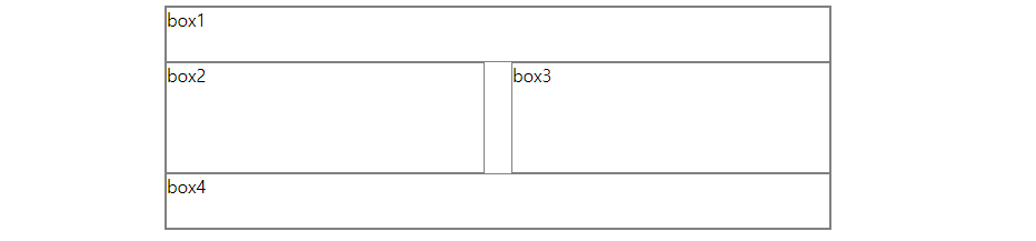
.wrap1 {
width: 100%;
max-width: 600px;
margin: 10px auto;
}
.wrap1 > .box1 {
width: 100%;
height: 50px;
}
.wrap1 > .box2 {
width: 48%;
height: 100px;
float: left;
}
.wrap1 > .box3 {
width: 48%;
height: 100px;
float: right;
}
.wrap1 > .box4 {
width: 100%;
height: 50px;
clear: both;
}
</style>
<div class="wrap1">
<div class="box1">box1</div>
<div class="box2">box2</div>
<div class="box3">box3</div>
<div class="box4">box4</div>
</div>
- float + overflow 속성
1) box를 하나 만들어 수평으로 배치할 box들을 내부에 배치한다.
2) 부모 요소에 overflow 속성을 visible이 아닌 값을 설정한다. (주로 hidden 설정)
3) 자식 요소에 float 속성을 설정한다.- float + display 속성
1) box를 하나 만들어 수평으로 배치할 box들을 내부에 배치한다.
2) 부모 요소에 display 속성을 flow-root로 설정한다.
3) 자식 요소에 float 속성을 설정한다.
- float + display 속성
16 position
1. position: static;
1) 디폴트, 생략 가능
2) HTML 기본 배치를 따른다.
3) 위치 조정(top, bottom, left, right)이 불가능하다.
2. position: relative;
1) HTML 기본 배치를 따른다.
2) 위치 조정(top, bottom, left, right)이 가능하다.
3) HTML 기본 배치를 기준으로 위치가 조정된다.
3. position: absolute;
1) HTML 기본 배치를 따르지 않는다.
2) 부모 요소를 기준으로 위치 조정(top, bottom, left, right)이 가능하다.
3) 부모 요소가 position: static;이 아닌 경우에 동작 가능하다.
4. position: fixed;
1) HTML 기본 배치를 따르지 않고 특정 위치에 고정된 상태로 배치된다.
2) 브라우저 화면을 기준으로 위치 조정(top, bottom, left, right)이 가능하다.
3) fixed된 구성 요소는 다른 요소를 가린다.
17 responseive
반응형 웹
- 화면의 크기에 따라 웹 페이지의 레이아웃이 자동으로 변하는 기능이다.
- 뷰포트 설정이 필요하다.
<meta name="viewport" content="width=device-width, initial-scale=1.0">1) width=device-width : 화면의 너비를 장치의 너비로 재지정한다.
2) initial-scale=1.0 : 페이지의 초기 확대/축소 지정을 1이다.
3. 상대 단위를 이용해서 작성한다.
%, vw, vh 등
미디어 쿼리
- 화면의 크기 변화를 감지하는 CSS 모듈이다.
- 선언 : @media
- 종류 : screen(화면), speech(낭독기), print(출력물), all(모든 미디어)
- 조건 예시
1) width: 640px 너비가 640px인 경우
2) min-width: 640px 최소 640px인 경우(640px 이상인 경우)
3) max-width: 640px 최대 640px인 경우(640px 이하인 경우)
4) orientation: portrait 화면을 세워서 볼 때
5) orientation: landscape 화면을 눕혀서 볼 때
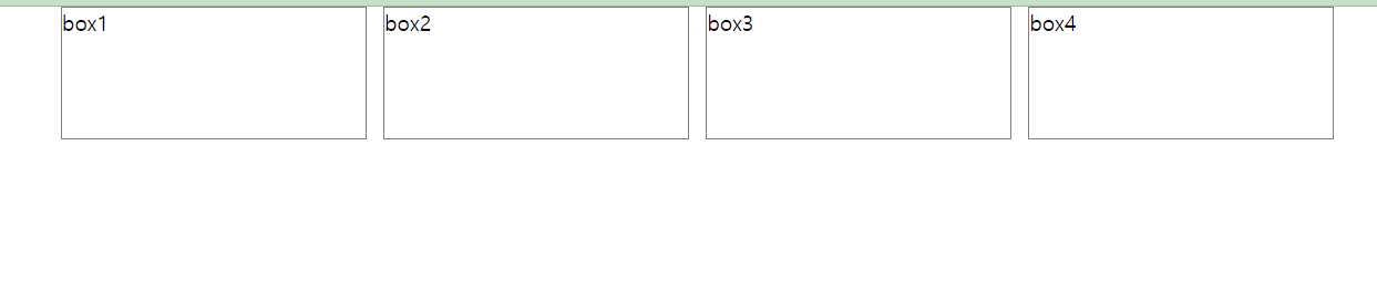
화면 크기에 따른 레이아웃 변경 실습
- 400px 이하 : 4행 1열
- 401px ~ 800px : 2행 2열
- 801px 이상 : 1행 4열
 @media screen and (max-width: 400px) {
      .wrap {
        width: 100%;
      }
      .wrap > div {
        width: 100%;
        height: 100px;
        border: 1px solid gray;
      }
    }

    @media screen and (min-width: 401px) and (max-width: 800px) {
      .wrap {
        width: 100%;
        display: flex;
        flex-wrap: wrap;
      }
      .wrap > div {
        width: 50%;
        height: 100px;
        border: 1px solid gray;
      }
    }

    @media screen and (min-width: 801px) {
      .wrap {
        width: 100%;
        max-width: 1000px;
        display: flex;
        justify-content: space-between;
      }
      .wrap > div {
        width: 24%;
        height: 100px;
        border: 1px solid gray;
      }
    }

  </style>

  <div class="wrap">
    <div>box1</div>
    <div>box2</div>
    <div>box3</div>
    <div>box4</div>
  </div>