
React Styling
eslint 란 자바스크립트 문법의 에러를 찾아서 표시해주는 도구를 말합니다. (우리가 원하는 특정한 규칙을 설정하면, 해당 규칙에 어긋나는 경우에 대해서도 표시를 해줍니다.)
prettier 란 특정한 코드 스타일로의 통일을 위해서 코드 포매팅을 도와주는 도구를 말합니다. (탭의 크기나 세미콜론의 사용 여부 등에 대해서 모든 코드를 통일시켜줄 수 있습니다.)
cra 로 생성된 프로젝트는 eslint 가 이미 설치되어있기 때문에, 굳이 eslint 를 설치해줄 필요가 없습니다만, prettier 및 eslint 와의 호환을 위한 eslint-config-prettier 총 2가지 모듈을 설치해야합니다.
yarn add --dev prettier eslint-config-prettierEslint 및 prettier 설정
$ yarn create react-app thirdapp
$ cd thirdapp
$ yarn add --dev prettier eslint-config-prettier
$ yarn start
.eslintrc
{
"extends": ["react-app", "prettier"]
}
settings.json
윈도우 : ctrl + shift + p -> Open workspace settings (JSON)
{
  "editor.formatOnSave": true,
  "editor.defaultFormatter": "esbenp.prettier-vscode",
  "editor.codeActionsOnSave": {
    "source.fixAll.eslint": true
  }
}
.prettierrc
{
  "trailingComma": "all",
  "tabWidth": 2,
  "semi": false,
  "singleQuote": true
}
리액트의 style 방법
1. 인라인 및 import css (지양)
<p style={{ backgroundColor: 'blue' }} >잘가요!</p>과 같이 인라인으로 스타일을 지정할 수도 있지만 인라인은 우선순위로 다른 css의 스타일을 덮어씌우는 등 원하는 스타일이 나올 수 없기에 지양합니다.- import해서 가지고 오는 단순 CSS style적용의 경우 컴포넌트 안에서 클래스명이 중복되는 등으로 인해 의도하지 않은 스타일의 결과를 가져올 수 있어 지양합니다.
2. SCSS
scss를 적용하기 위한 모듈 패키지
$ yarn add node-sass
아래와 같이src > components > Button.js, src > styles > Button.scss를 만들어줍니다.
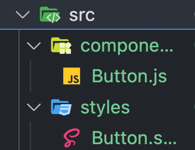
Button.js
import React from 'react'
import '../styles/Button.scss'

function Button({size}) {  //size를 변수로 받아 스타일을 지정해 사용을 할 수 있습니다.
  return (
    <button className={`Button ${size}`}>
      <p>버튼</p>
    </button>
  )
}

export default Button
Button.scss
$main-color: #3d3dff;

.Button {
  // 버튼에 먹여진 속성 제거
  outline: none;
  border: none;

  // 내부 요소 정렬
  display: flex;
  align-items: center;
  justify-content: center;

  // 색상/테두리 스타일 적용
  background-color: $main-color;
  border-radius: 10px;
  color: white;
  width: 100px;

  // 여백 적용
  margin: 10px;

  //사이즈
  &.large {
    width: 140px;
    height: 70px;
    font-size: 24px;
  }

  &.medium {
    width: 120px;
    height: 60px;
    font-size: 20px;
  }

  &.small {
    width: 100px;
    height: 50px;
    font-size: 16px;
  }
}
위와 같이 size나 color 등을 props로 받아 각각의 다른 스타일을 지정해 사용을 할 수 있습니다.
App.js
import Button from './components/Button'

function App() {
  return (
    <div>
      <Button size="large" />
      <Button size="medium" />
      <Button size="small" />
    </div>
  )
}

export default App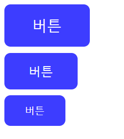
3. CSS 모듈 스타일적용
css module 을 사용하면, 어떤 컴포넌트에서 불러오는지에 따라서 다른 고유값이 class 이름에 부여됩니다.
즉, 컴포넌트 마다 고유한 스타일로서 적용이 되기 때문에 다른 컴포넌트에서 같은 클래스가 중복되는 등의 문제를 해결할 수 있습니다.
css module 의 경우, css-loader 가 필요한데, cra 로 리액트 프로젝트를 만들면 기본적으로 설정이 되어있습니다.
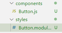
사용을 할 때는 style.클래스이름 의 형태로 className 에 지정을 해주면 됩니다!
Button.js
import React from 'react'
import style from '../styles/Button.module.css'

function Button() {
  return (
    <button className={style.Button}> //✅
      <p>버튼</p>
    </button>
  )
}

export default Button
두가지 스타일 적용
<button className={`${style.Button} ${style.large}`}>Button.module.css
.Button {
  outline: none;
  border: none;

  display: flex;
  align-items: center;
  justify-content: center;

  background-color: #3d3dff;
  border-radius: 10px;
  color: white;
  width: 100px;

  margin: 10px;
}

.large {
  width: 140px;
  height: 70px;
  font-size: 24px;
}
scss와 같이 중첩을 사용할 수는 없지만 위와 같이 각각의 스타일을 {}로 묶어 설정한 후 style.이름 으로 사용을 할 수 있습니다.
4. ⭐styled-compoents
styled-components 란 특정한 html 태그에다가 스타일을 이미 적용시킨 컴포넌트를 만들어놓는 것을 말합니다.
styled-compoents의 경우 css모듈의 장점과 scss의 모듈의 장점을 모두 사용을 할 수 있습니다.
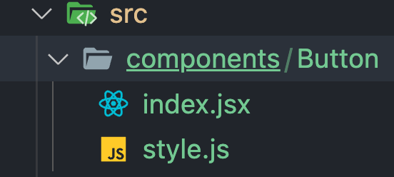
$ yarn add styled-components보통은 컴포넌트 별로 폴더를 나눠 index.jsx파일과 style파일을 만들어 사용을 합니다.
4-1 기본 예시
style.js 기본틀
import styled from 'styled-components';

export const Button = styled.button`
  outline: none;
  border: none;

  display: flex;
  align-items: center;
  justify-content: center;

  background-color: #3d3dff;
  border-radius: 10px;
  color: white;
  width: 100px;
  cursor: pointer;

  margin: 10px;
  &:hover {   ✅ scss와 같이 &를 사용할 수 있습니다.
    opacity: 0.5;
  }
`;
index.jsx
import React from 'react';
import * as S from './style'; ✅

function Button() {
  return (
    <S.Button> ✅
      <p>Button</p>
    </S.Button>
  );
}

export default Button;
import * as S from './style'를 통해 S라는 이름으로 스타일을 가져와 <S.Button></S.Button>과 같이 사용을 합니다.
4-2 Props사용 예시
style.js에서 아래와 같이 ${}를 통해 props를 적용시킬 수 있습니다.
export const Button = styled.button`
  background-color: ${(props) => props.color};
`;
만약, default값을 설정하고 싶은 경우 아래와 같이 작성해주면 됩니다.
export const Button = styled.button`
  background-color: ${(props) => props.color || 'blue'};
`;destructuring을 해서 가져오면 더 깔끔하게 코드를 작성할 수 있습니다.
export const Button = styled.button`
  background-color: ${(color) => color || 'blue'};
`;
index.jsx
return (
  <S.Button color="red">
    <p>Button</p>
  </S.Button>
);
+PLUS 클릭이 된 경우 스타일 값 변경
index.jsx
return (
  <S.Button isClicked={true}>
    <p>Button</p>
  </S.Button>
);
style.js
export const Button = styled.button`
  background-color: ${({ isClicked }) => (isClicked ? 'gray' : 'blue')};
`;
5. 스타일 컴포넌트에서 themeprovider 활용하기
themeprovider 는 앱 전체에서 공통된 스타일 값을 쓸 수 있도록 도와주는 역할을 담당합니다. 보통 프로젝트 마다 특정한 색상 팔레트를 정해놓고 해당 팔레트 안에서 요소들의 색을 지정해 통일시켜놓고, 그 색상을 사용하도록 합니다.
5-1 styles폴더 내에 theme.js이라는 파일을 만들어 줍니다.
styles > theme.js
const palette = {  //색상을 지정한 후
  orange: '#FFA500',
  black: '#000000',
};

const theme = { //지정한 색상을 theme이라는 변수에 남아
  palette,
};

export default theme; //내보냅니다.
5-2 만든 스타일을 전역화 시켜줍니다.
App.js
import React from 'react';
import { ThemeProvider } from 'styled-components';  //✅
import Button from './components/Button';
import theme from './styles/theme'; /✅

export default function App() {
  return (
    <ThemeProvider theme={theme}> //✅
      <Button />
    </ThemeProvider>
  );
}
<themeprovider></themeprovider> 로 감싸서, 앱 전체에 theme.js 에 정의한 스타일이 적용될 수 있도록 만들어줍니다.
5-3 컴포넌트에 적용하기
각 컴포넌트 내부의 style.js에서 아래와 같이 theme에 정의한 스타일을 가져와 사용할 수 있습니다.
Button > style.js
import styled from 'styled-components';

export const Button = styled.button`
 ...
 background-color: ${({ theme }) => theme.palette.orange};
 ...
`
+ PLUS 스타일 속성 집합 만들기
styles > theme.js
const palette = {
  orange: '#FFA500',
  black: '#000000',
}

const common = {
  flexCenter: `
    display: flex;
    justify-contents: center;
    align-items: center;
  `,
}

const fontSizes = {
  title: '2rem',
  subtitle: '1.5rem',
  paragraph: '1rem',
}

const theme = {
  palette,
  common,
  fontSizes,
}

export default theme
button/style.js
import styled from 'styled-components'

export const Button = styled.button`
  outline: none;
  border: none;

  ${(props) => props.theme.common.flexCenter}

  background-color: ${(props) => props.theme.palette.orange};
  border-radius: 10px;
  color: white;
  width: 100px;

  margin: 10px;
  &:hover {
    opacity: 0.5;
  }
`
이렇게 자주 쓰이는 스타일 속성들을 정의해놓고 필요할 때 가지고 와서 사용을 할 수 있습니다.
6. 스타일 컴포넌트에서 keyframes 적용하기
import styled, {keyframes} from 'styled-components'; //✅

const fadeIn = keyframes`  ✅
  from {
    opacity: 0
  }
  to {
    opacity: 1
  }
`

export const Button = styled.button`
  outline: none;
  border: none;

  display: flex;
  align-items: center;
  justify-content: center;

  background-color: ${({ theme }) => theme.palette.orange};
  border-radius: 10px;
  color: white;
  width: 100px;
  cursor: pointer;

  margin: 10px;
  &:hover {
    opacity: 0.5;
  }
  animation-name: ${fadeIn}; //✅
  animation-duration: 1s;
  animation-timing-function: ease-out;
`;
7. 폰트 설정하기
- Google Font에서 원하는 폰트 스타일을 다운받습니다.
- 다운 받은 파일을 src > assets > fonts 폴더 내에 otf파일로 넣어줍니다.
- src > styles 폴더 안에 globalStyle.js 를 만들고, 아래와 같이 작성합니다.
format()의 경우 폰트 파일의 확장자에 따라 넣어줘야합니다.otf → opentype,ttf → truetype,woff → woff
import { createGlobalStyle } from 'styled-components'
import NotoSansBold from '../assets/fonts/NotoSansKR-Bold.otf'

export default createGlobalStyle`
    @font-face {
        font-family: "NotoSansBold";
        src: url(${NotoSansBold}) format('opentype');
    }
`app.js에globalstyle을 불러와서 앱 어디서든 쓸 수 있도록 전역화해줍니다.
import { ThemeProvider } from 'styled-components'
import theme from './styles/theme'
import Button from './components/Button'
import GlobalStyle from './styles/globalStyle'

function App() {
  return (
    <ThemeProvider theme={theme}>
      <GlobalStyle />
      <Button />
    </ThemeProvider>
  )
}

export default App- 해당컴포넌트에 스타일을 적용합니다.
font-family: 'NotoSansBold';