[Vue3] 부트스트랩 Breakpoint(반응형)
부트스트랩 Breakpoint(반응형)
이번에는 부트스트랩에서 제공하는 기능을 이용해 간단하게 반응형 레이아웃 구조를 제공해보도록 하겠습니다.
먼저 헤더의 경우 어느정도 이하로 크기가 작아지게 되면 네비게이션 영역이 사라지게 됩니다.
search영역의 경우 크기가 줄어들게 되면 다음 줄로 넘어가며 표현이 되게 만들어볼 예정입니다.
마찬가지로 Movie페이지에서도 뷰포트의 크기가 줄어드는 경우 포스터와 내용이 수직으로 쌓이게금 만들어볼 예정입니다.
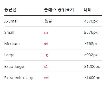
지난 번에 한번 사용을 해보았듯이 부트스트랩에서 제공하는 Breadkpoint의 경우 $grid-breadkpoints라는 변수를 통해 제어를 할 수 있습니다.
$grid-breakpoints: (
  xs: 0,
  sm: 576px,
  md: 768px,
  lg: 992px,
  xl: 1200px,
  xxl: 1400px
);
또한 @include라는 규칙을 통해 미디어쿼리를 지정할 수 있습니다.
// Source mixins

// No media query necessary for xs breakpoint as it's effectively `@media (min-width: 0) { ... }`
@include media-breakpoint-up(sm) { ... }
@include media-breakpoint-up(md) { ... }
@include media-breakpoint-up(lg) { ... }
@include media-breakpoint-up(xl) { ... }
@include media-breakpoint-up(xxl) { ... }

// Usage

// Example: Hide starting at `min-width: 0`, and then show at the `sm` breakpoint
.custom-class {
  display: none;
}
@include media-breakpoint-up(sm) {
  .custom-class {
    display: block;
  }
}
Header.vue
1. 기타 작업
먼저, 우측에 사용자 이미지가 나오는 부분의 작업을 완료하도록 하겠습니다.
<template>
...
    <div
      class="user" ✅
      @click="toAbout">
      <img
        :src="image"
        :alt="name" />
    </div>
  </header>
</template><script>
computed: {
image() {
return this.$store.state.about.image
},
name() {
return this.$store.state.about.name
}
},
</script><style lang="scss" scoped>
header {
height: 70px;
display: flex;
align-items: center;
padding: 0 40px;
position: relative;
.logo {
margin-right: 40px;
}
.user {
width: 40px;
height: 40px;
padding: 6px;
border-radius: 50%;
box-sizing: border-box;
background-color: $gray-200;
cursor: pointer;
position: absolute;
top: 0;
bottom: 0;
right: 40px;
margin: auto;
transition: .4s;
&:hover {
background-color: darken($gray-200, 10%);
}
img {
width: 100%;
}
}
}
</style>
2. 링크연결
이제 만들어진 이미지를 클릭 했을 때 원하는 페이지로 이동할 수 있도록 설정해주도록 하겠습니다.
    <RouterLink
      to="/about"
      class="user"">
      <img
        :src="image"
        :alt="name" />
    </RouterLink>
위와 같이 RouterLink와 to를 통해 특정페이지로 이동할 수 있도록 설정해줄 수 있습니다. 하지만 이번에는 다른 방법을 이용해보도록 하겠습니다.
    <div
      class="user"
      @click="toAbout">
      <img
        :src="image"
        :alt="name" />
</div> methods: {
...
toAbout() {
this.$router.push('/about')
}
}이와 같이 router에서 제공하는 push메소드를 이용해 특정페이지로 이동할 수 있도록 설정을 해줄 수 있습니다.
2. 반응형 제작
  @include media-breakpoint-down(sm) {
    .nav {
      display: none;
    }
  }
Search.vue
<style lang="scss" scoped>
@import "~/scss/main";

.container {
  display: flex;
  > * {
    margin-right: 10px;
    font-size: 15px;
    &:last-child {
      margin-right: 0;
    }
  }
  .selects {
    display: flex;
    select {
      width: 120px;
      margin-right: 10px;
      &:last-child {
        margin-right: 0;
      }
    }
  }
  .btn {
    width: 120px;
    height: 50px;
    flex-shrink: 0;
    font-weight: 700;
  }
  @include media-breakpoint-down(lg) {
    display: block;
    input {
      margin-right: 0;
      margin-bottom: 10px;
    }
    .selects {
      margin-right: 0;
      margin-bottom: 10px;
      select {
        width: 100%;
      }
    }
    .btn {
      width: 100%;
    }
  }
}
</style>
Movie.vue
<style lang="scss" scoped>
@import "~/scss/main";

.container {
  display: flex;
  > * {
    margin-right: 10px;
    font-size: 15px;
    &:last-child {
      margin-right: 0;
    }
  }
  .selects {
    display: flex;
    select {
      width: 120px;
      margin-right: 10px;
      &:last-child {
        margin-right: 0;
      }
    }
  }
  .btn {
    width: 120px;
    height: 50px;
    flex-shrink: 0;
    font-weight: 700;
  }
  @include media-breakpoint-down(lg) {
    display: block;
    input {
      margin-right: 0;
      margin-bottom: 10px;
    }
    .selects {
      margin-right: 0;
      margin-bottom: 10px;
      select {
        width: 100%;
      }
    }
    .btn {
      width: 100%;
    }
  }
}
</style>
0seo