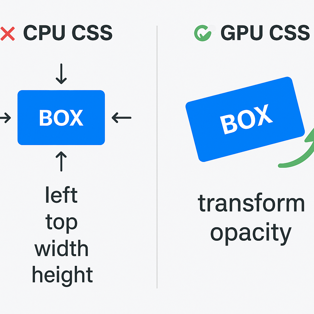
개요
웹 개발에서 애니메이션이 부드럽지 않거나 렌더링에 병목이 생긴다면, CSS가 GPU 가속을 사용하고 있는지 확인해보는 것이 중요합니다.
Chrome DevTools를 이용해 GPU 가속 여부를 확인을 해보겠습니다
(하단 영상에서의 동작 원리를 분석해보자!)
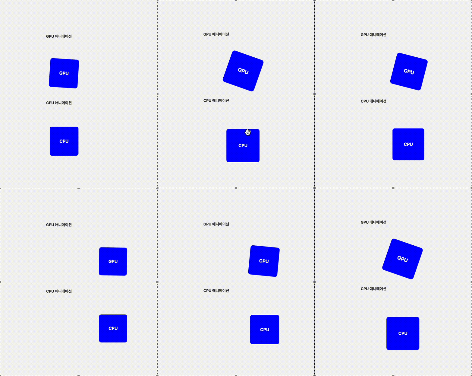
성능 차이
-> Layout + Paint 발생차이
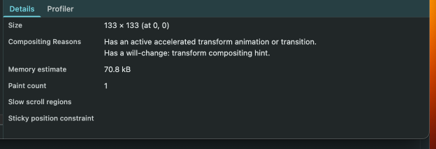
GPU
- 고정 변경(X) paint 카운트 1회
CPU
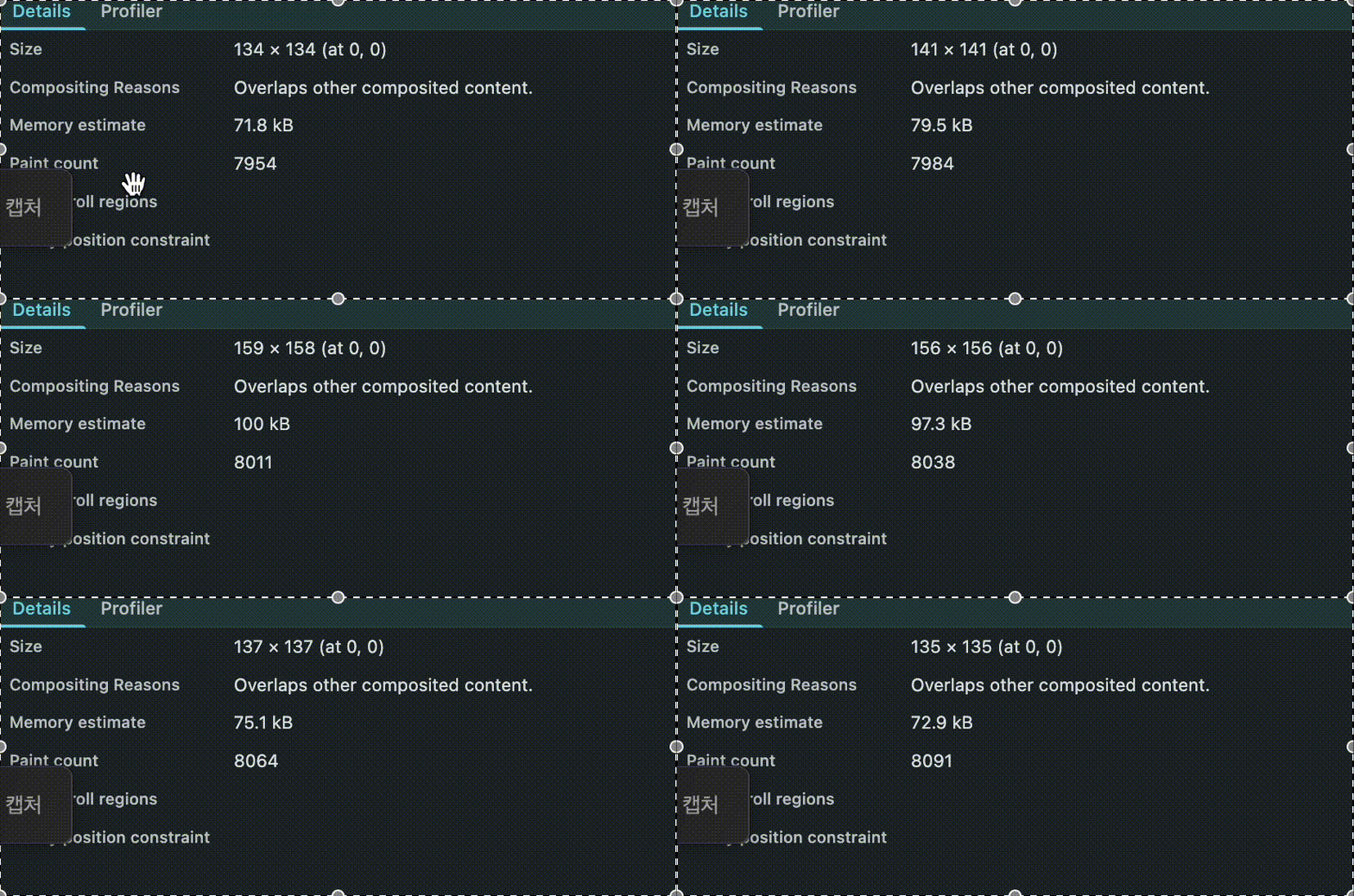
차이
GPU 기반 애니메이션
- transform, opacity 같은 속성 사용
- GPU가 처리 → 컴포지팅 단계에서 처리됨
- Layout / Paint를 건너뜀 → 빠르고 부드러움
- 주로 사용되는 속성: transform, opacity, filter
CPU 기반 애니메이션
- top, left, width, height 등 위치/크기 변경
- CPU가 처리 → Layout → Paint → Composite 전체 과정 수행
- 요소가 많거나 복잡할수록 프레임 드랍 발생
- 브라우저 성능 병목 가능성 높음
궁금증 🤷♂️
합성 레이어(Compositing Layer)
- 브라우저가 페이지 렌더링 시 요소를 GPU에서 별도로 처리하도록 분리해 만든 레이어입니다.
(GPT 설명)
보통 요소는 하나의 단일 레이어에서 처리되지만,

합성 레이어로 분리되면 해당 요소는 GPU 가속을 받아 빠르고 효율적인 렌더링이 가능해집니다.

브라우저는 레이아웃(Layout) → 페인트(Paint) → 합성(Compositing) 과정을 거쳐 화면에 그리는데, 이 중 합성 단계에서 GPU 레이어가 활용됩니다.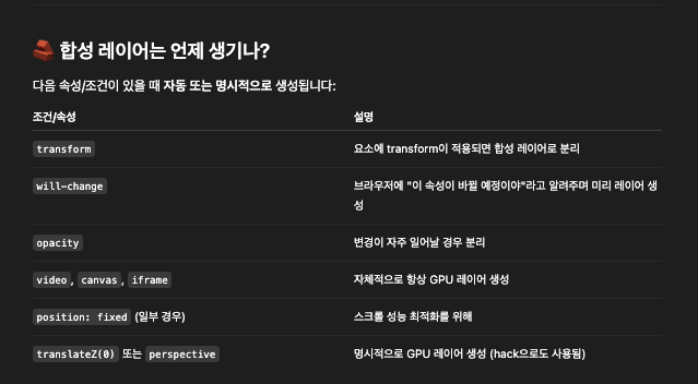
will-change
- will-change는 브라우저에게 특정 CSS 속성이 변경될 예정임을 알려주는 속성입니다. 해당 속성으로 인해 브라우저는 미리 최적화된 렌더링 경로(GPU 레이어 생성 등)를 준비해두어, 애니메이션이나 전환 시 더 부드럽고 빠른 성능을 낼 수 있게 합니다.
(⚠️ 주의 : 너무 많은 요소에 will-change를 사용하면 오히려 성능이 나빠질 수 있습니다. GPU 합성 레이어는 메모리를 더 사용함(애니메이션이 끝난 후에는 제거해주는 것이 좋다))
참고
예시코드
js
<div className="container">
  <div className="label">GPU 애니메이션</div>
  <div className="box good-animation">GPU</div>

  <div className="label">CPU 애니메이션</div>
  <div className="box bad-animation">CPU</div>
</div>
css
.container {
  display: flex;
  flex-direction: column;
  flex: 1;
  width: 100%;
  height: 100vh;
  justify-content: center;
  align-items: center;
  gap: 40px;
  background-color: #f4f4f4;
}

.label {
  margin: 8px 0 4px;
  font-size: 14px;
  font-weight: bold;
  color: #333;
}

.box {
  width: 100px;
  height: 100px;
  background-color: blue;
  color: white;
  display: flex;
  align-items: center;
  justify-content: center;
  margin-top: 30px;
  font-weight: bold;
  font-size: 16px;
  border-radius: 8px;
}

.good-animation {
  animation: move-gpu 2s infinite alternate ease-in-out;
  will-change: transform;
  transform: translateZ(0); /* 강제 GPU 합성 레이어 생성 */
}

@keyframes move-gpu {
  0% {
    transform: translateX(0) rotate(0deg) scale(1);
  }
  50% {
    transform: translateX(100px) rotate(20deg) scale(1.2);
  }
  100% {
    transform: translateX(200px) rotate(0deg) scale(1);
  }
}

.bad-animation {
  position: relative;
  animation: move-cpu 2s infinite alternate ease-in-out;
}

@keyframes move-cpu {
  0% {
    left: 0;
    top: 0;
    width: 100px;
    height: 100px;
  }
  50% {
    left: 100px;
    top: 20px;
    width: 120px;
    height: 120px;
  }
  100% {
    left: 200px;
    top: 0;
    width: 100px;
    height: 100px;
  }
}