21.07.07
css 애니메이션
transform : 이미 만들어진 태그 혹은 이미지를 늘리거나 회전시킬때 사용
.transform{
	width: 300px;
	height: 300px;
	background-color: yellow;

	transform: rotate(45deg);
	transform: scale(0.5,0.5);
	transform: skew(-10deg,20deg);
	transform: translate(100px,300px);

}
transform의 속성
-rotate : 2차원 회전 효과 (괄호)만큼 회전 각도를 나타내는 deg를 사용함
-scale : 요소의 크기를 변경하는 태그 (좌우, 상하)로 늘어남(늘이거나 줄이거나)
-skew : 요소의 왜곡 skew(x,y) 와 같이 사용 정해진 각도만큼 왜곡시킴
-translate : 요소를 각각 x,y축으로 지정한 만큼 이동시킴
transition : 정해진 시간 동안 요소의 속성값을 부드럽게 변화시킬 수 있음
.transition{
	width: 300px;
	height: 300px;
	background-color: yellow;

	transition-property: width;
	transition-duration: 2s;
	transition-timing-function: linear;
	transition-delay: 1s;

    transition: width 2s linear 1s; -> 이와같이 위에 4줄의 문장 한줄로도 사용가능
    숫자가 2개 사용될때 앞에숫자가 듀레이션 뒤에것이 딜레이
    (효율이 더 좋아짐)
}

.transition:hover {
	width: 600px;
 }

 저 위에 transition속성 적용한걸 hover 마우스를 가져다 되었을때 600만큼실행
transition 속성
-transition-property : 요소에 추가할 전환(transition) 효과를 설정함.
-transition-duration : 전환(transition) 효과가 지속될 시간을 설정함.
-transition-timing-function : 전환(transition) 효과의 시간당 속도를 설정함.
-transition-delay : 전환(transition) 효과가 나타나기 전까지의 지연 시간을 설정함.
(글로 잘 이해안가면 폴더 ex-6실습 index, css 참고)
animation
.animation{
 	width: 300px;
 	height: 300px;
 	background-color: yellow;

 	animation-name: changeWidth;
 	animation-duration: 3s;
 	animation-timing-function: linear;
 	animation-delay: 1s;

 	animation-iteration-count: 6;
 	animation-direction: normal;
 }

 @keyframes changeWidth{
 	from{
 		width: 300px;
 	}

 	to{
 		width: 600px;
 	}
 }
animation 속성
-animation-name : 애니메이션이름 @keyframes 애니메이션이름{}으로 쓰임
-animation-delay : 로드되고 나서 언제 시작할지
-animation-direction : 애니메이션이 종료되고 다시 처음부터 시작할지 역방향으로 진행할지 지정( normal,reverse,alternate,alternate-reverse,initial,inherit )
-animation-duration : 애니메이션이 진행시간 (3초 = 3s 으로 표시)
-animation-iteration-count : 몇 번 반복 (infinite : 계속반복)
-animation-play-state : 애니메이션 시작 또는 정지 상태 (running , paused )
-animation-timing-function : 애니메이션 속도(가속/감속 시간간격등 설정)
(inear,ease,ease-in,ease-out,ease-in-out,step-start,step-end,steps(int,start|end),cubic-bezier(n,n,n,n),initial,inherit )
-animation-fill-mode : 시작되기 전이나 끝나고 난 후 어떤 값이 적용될지 지정
애니메이션이 끝난후 처음상태로? 끝난 상태로? (none,forwards,backwards,both,initial,inherit)
애니메이션 발생시점은
처음과 끝을 뜻하는 from(0%), to(100%) @keyframe 을 통해 지정해주어야 함.
https://jeremyckahn.github.io/stylie/
에서 포물선등 복붙해서 사용가능
실습
index.html
<!DOCTYPE html>
<html>
<head>
	<meta charset="utf-8">
	<link rel="stylesheet" type="text/css" href="css/style.css">
</head>
<body>

	<nav class="mouse-animation">
		<ul>
			<li><a href="#">메뉴1</a></li>
			<li><a href="#">메뉴2</a></li>
			<li><a href="#">메뉴3</a></li>
			<li><a href="#">메뉴4</a></li>
		</ul>
	</nav>

</body>
</html>
style.css
html, body{
margin: 0;
padding: 0;
}
ul{
list-style: none;
}
a {
text-decoration: none;
color: #000000;
}
.mouse-animation{
}
.mouse-animation li{
width: 250px;
background-color: rgba(0, 0, 0, 1.0);
padding: 20px;
border-top: solid 5px #dfdfdf;
transition: opacity 0.5s, margin-left 0.5s;
}
.mouse-animation li:hover{
background-color: rgba(0, 0, 0, 0.5);
margin-left: 10px;
}
.mouse-animation li a {
color: white;
font-size: 20px;
}opacity은 투명화 속성
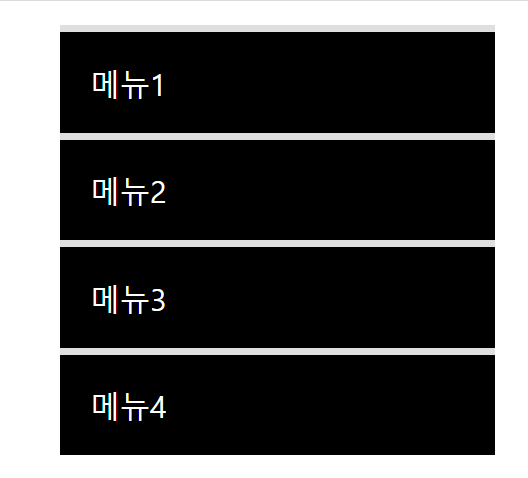
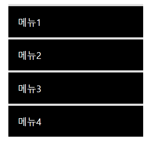
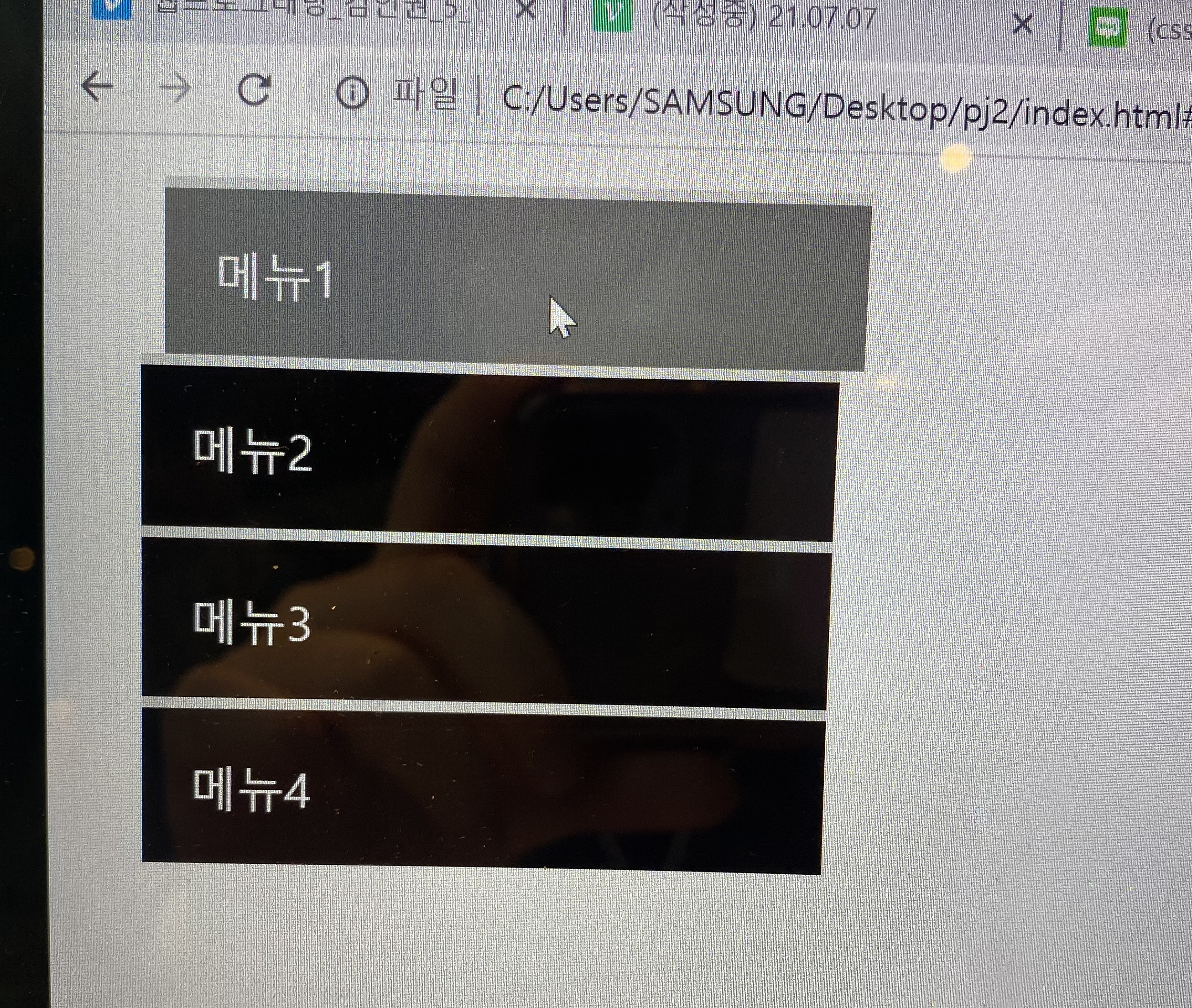
출력화면
마우스를 올리지 않았을때
마우스를 올렸을때
실습2
<div class="move-box"></div>.move-box {
position: relative;
width: 200px;
height: 200px;
background-color: red;
animation-name: moveBox;
animation-duration: 4s;
animation-timing-function: linear;
animation-delay: 1s;
animation-iteration-count: infinite;
animation-direction: alternate;
animation-play-state: paused;
animation-fill-mode: backwards;
}
@keyframes moveBox{
0%{
background-color: red;
left: 0;
top: 0;
}
25%{
background-color: yellow;
left: 500px;
top: 0px;
}
50%{
background-color: gray;
left: 500px;
top: 500px;
border-radius: 50%;
}
75%{
background-color: blue;
left: 0px;
top: 500px;
}
100%{
background-color:red;
left: 0;
top: 0px;
}
}animation-play-state: running : 브라우저 접속시 동작 바로 실행
paused : 동작실행 X
animation-fill-mode: backwards;
실습3
<div class="outer-border">
	<div  class="inner-border"></div>
</div>
.outer-border{
display: flex;
justify-content: center;
align-items: center;
width: 200px;
height: 200px;
border: solid 15px red;
border-radius: 50%;
margin: 0 auto;
margin-top: 200px;
animation: outerBorder 2s infinite;
}
@keyframes outerBorder{
0%{ border-color: red; transform: scale(1.0);}
25%{border-color : yellow; transform: scale(1.2);}
50%{border-color: blue; transform: scale(1.3);}
75%{border-color: green; transform: scale(1.2);}
100%{ border-color: pink; transform: scale(1.0);}
}
.inner-border {
width: 75px;
height: 75px;
border: 5px solid purple;
animation: innerBorder 2s infinite alternate;
}
@keyframes innerBorder{
0%{transform: rotate(0deg);}
25%{border-color : blue; }
50%{border-color: yellow; }
75%{border-color: green; }
100%{ border-color: gray; transform: rotate(360deg);}
}
실습4
<div class="mario-container">
	<div class="mario-coin"></div>
	<div class="mario-box"></div>
</div>
.mario-container {
width: 500px;
height: 500px;
border: solid 10px black;
margin: 0 auto;
margin-top: 200px;
}
.mario-container .mario-coin {
position: relative;
width: 70px;
height: 70px;
background-color: yellow;
border-radius: 50%;
margin: 0 auto;
margin-top: 100px;
animation: jumpCoin 0.5s linear infinite ;
}
@keyframes jumpCoin{
0% {
transform: translateY(0px);
opacity: 1;
}
50% {
transform: translateY(-100px) rotateY(180deg);
opacity: 0;
}
100% {
transform: translateY(-100px) rotateY(180deg);
opacity: 0;
}
}
.mario-container .mario-box {
width: 100px;
height: 100px;
background-color: blue;
margin: 0 auto;
animation: jumpBox 0.5s linear infinite alternate;
}
@keyframes jumpBox {
0%{transform: translateY(0px);}
50%{transform: translateY(-10px);}
100%{transform: translateY(0px);}
}실습5
<div class="hover-image">
			<img src="https://thumbs.dreamstime.com/b/top-view-sandy-beach-turquoise-ocean-water-small-waves-beautiful-summer-sea-background-169331189.jpg">

			<div class="image-info">
				<h2>Title</h2>
				<p>Parapragh</p>
			</div>
		</div>
.hover-image{
cursor: pointer;
overflow: hidden;
position: relative;
width: 400px;
border: solid 10px #000000;
}
.hover-image img{
width: 100%;
vertical-align: middle;
transition: transform 0.3s linear;
}
.hover-image:hover img {
transform: scale(1.3);
}
.hover-image .image-info{
box-sizing: border-box;
position: absolute;
width: 100%;
padding: 20px;
background-color: rgba(0, 0, 0, 0.5);
left: 0;
bottom: -85;
transition: bottom 0.3s linear;
}
.hover-image:hover .image-info {
bottom: 0;
}
.hover-image .image-info h2,
.hover-image .image-info p {
margin: 0;
padding: 0;
color: #ffffff;
}
.hover-image .image-info h2{
font-size: 20px;
}
.hover-image .image-info p{
font-size: 15px;
}