21.07.12
미디어쿼리 실습
index.html
<!DOCTYPE html>
<html>
<head>
	<meta charset="utf-8">

	<link rel="stylesheet" type="text/css" href="css/style.css">

</head>
<body>

	<ul class="media-menu">
		<li><a href="#">menu 1</a></li>
		<li><a href="#">menu 2</a></li>
		<li><a href="#">menu 3</a></li>
	</ul>
</body>
</html>
style.css
.media-menu {
	list-style: none;
	margin: 0;
	padding: 0;

	display: flex;
	justify-content: space-between;
	align-items: center;

	width: 700px;
	background-color: black;
}

.media-menu a {
	color: black;
	text-decoration: none;
}

.media-menu li {
	width: 150px;
	background-color: yellow;
	border: solid 5px red;
	padding: 5px 15px;
	text-align: center;
}
pc버전 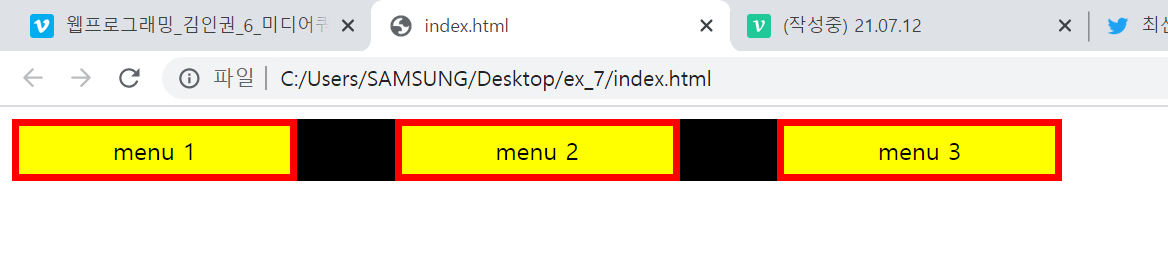
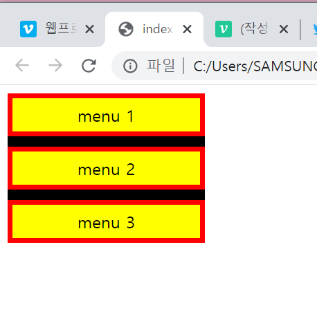
@media (min-width: 320px) and (max-width: 767px) {
	.media-menu {
		flex-direction: column;
		align-items: flex-start;
		width: 190px;
	}

	.media-menu li {
		margin-bottom: 10px;
	}

	.media-menu li:last-child{
		margin-bottom: 0;
	}
}
모바일버전
 '
'
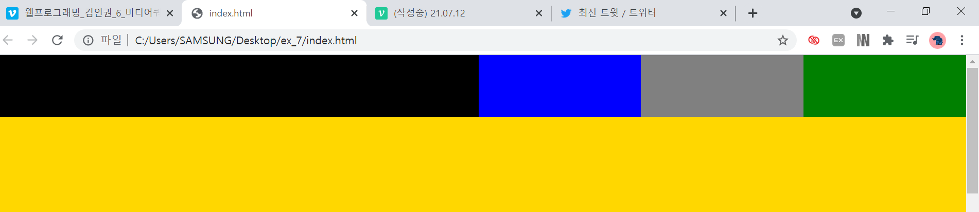
header부분 모바일이랑 피씨부분
<header class="intro">
		<h1></h1>
		<nav>
			<ul>
				<li></li>
				<li></li>
				<li></li>
			</ul>
		</nav>
	</header>

	<main role="main"></main>
.intro {
display: flex;
width: 100%;
height: 80px;
background-color: #ffffff;
}
.intro h1 {
list-style: none;
padding: 0;
margin: 0;
}
.intro h1{
width: 50%;
height: 80px;
background-color: black;
}
.intro nav {
width: 50%;
height: 80px;
background-color: yellow;
}
.intro nav ul {
list-style: none;
padding: 0;
margin: 0;
}
.intro nav ul li {
width: 33.3333%;
height: 80px;
}
.intro nav ul {
display: flex;
}
.intro ul li:nth-child(1) {
background-color: blue;
}
.intro ul li:nth-child(2) {
background-color: gray;
}
.intro ul li:nth-child(3) {
background-color: green;
}
main {
width: 100%;
height: 2000px;
background-color: gold;
padding-top: 80px;
}
@media (min-width: 320px) and (max-width: 767px) {
	.intro{
		position: static;
		flex-direction: column;
		height: 160px;
	}

	.intro h1{
		width: 100%;
	}

	.intro nav {
		width: 100%;
	}

	main{
		padding-top: 0;
	}
}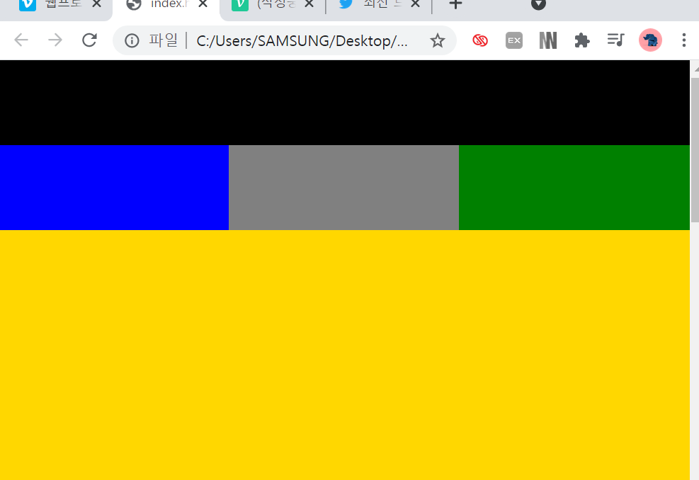
h1부분 밑으로 nav가 내려오게
<div class="column">
			<img src="https://via.placeholder.com/250x150">
			<div class="image-info">
				<h2>Title</h2>
			</div>
</div>
Title
.container {
	display: flex;
	flex-wrap: wrap;
	justify-content: space-between;

	width: 1140px;
	margin: 0 auto;
	background-color: pink;
}

.column {
	width: 355px;
	background-color: #ffffff;
	border: solid 2px red;
	margin-bottom: 10px;
}

.column:nth-child(4),
.column:nth-child(5),
.column:nth-child(6) {
	margin-bottom: 0;
}

.column img{
	width: 100%;
	vertical-align: middle;
}

.image-info{
	padding: 20px 0;
	text-align: center;
}

.image-info h2 {
	margin: 0;
}
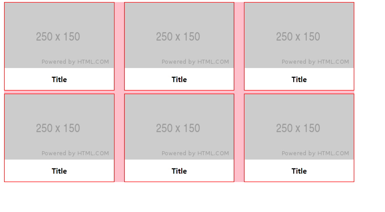
pc
@media 코드를 사용해 부라우저 폭 줄이기
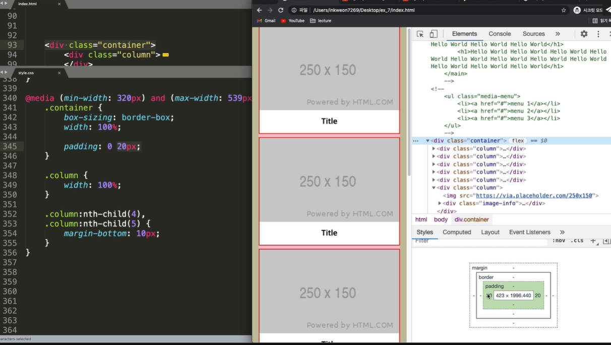
@media (min-width: 540px) and (max-width: 720px) {
	.container {
		width: 720px;
	}

	.column:nth-child(4){
		margin-bottom: 10px;
	}

}
2x3
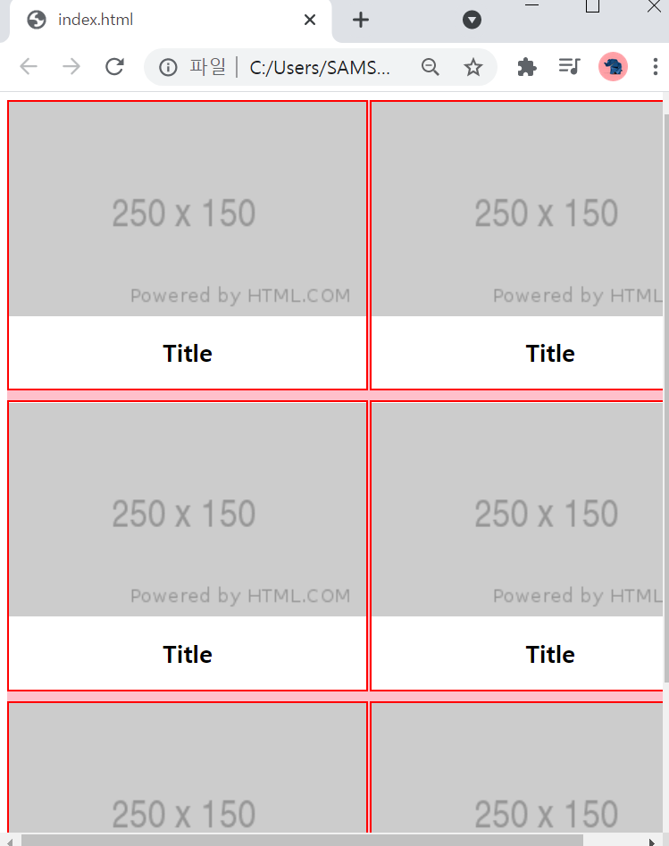
@media (min-width: 320px) and (max-width: 539px) {
	.container {
		box-sizing: border-box;
		width: 100%;

		padding: 0 20px;
	}

	.column {
		width: 100%;
	}

	.column:nth-child(4),
	.column:nth-child(5){
		margin-bottom: 10px;
	}

}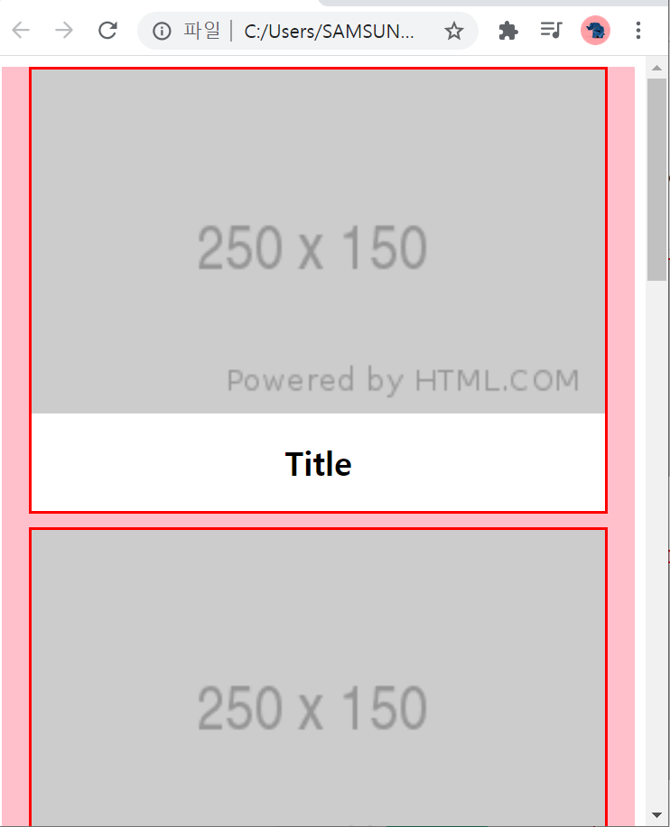
1자정렬
여담으로 노트북이 작아서 브라우저를 계속 줄이는데도 계속 3x2라서
왜 나는 안돼지??? 오타낫나??? 하고잇엇는데 화면 확대하고 브라우저 줄이니 됏다,.,.
나는 선생님이 적용한 min,max-width 보다 크게 설정하니 조금만 줄여도 휙휙 바뀌더라
또한 피씨버전이랑 모바일버전이 같이 있으면 코드가 너무 길어지면
모바일.css를 생성해서 따로 작성하는것도 좋은 방법!