개발 3일차..라고 쓰고 주말에 하루 했으니 사실 4일차ㅎ
CSS 연습이 더 필요한 나에게 생각보다 오래 걸릴 것만 같은 메인 페이지가 점점 완성되어가고 있다. 물론 여러 우여곡절이 있긴 했지만.
3일차에는 항공권 검색 컴포넌트를 제외한 모든 요소들의 작업이 완료되었고 진정한 항공권 사이트 개발의 시작은 내일부터이지 않을까 싶다!
현재까지 진행 상황
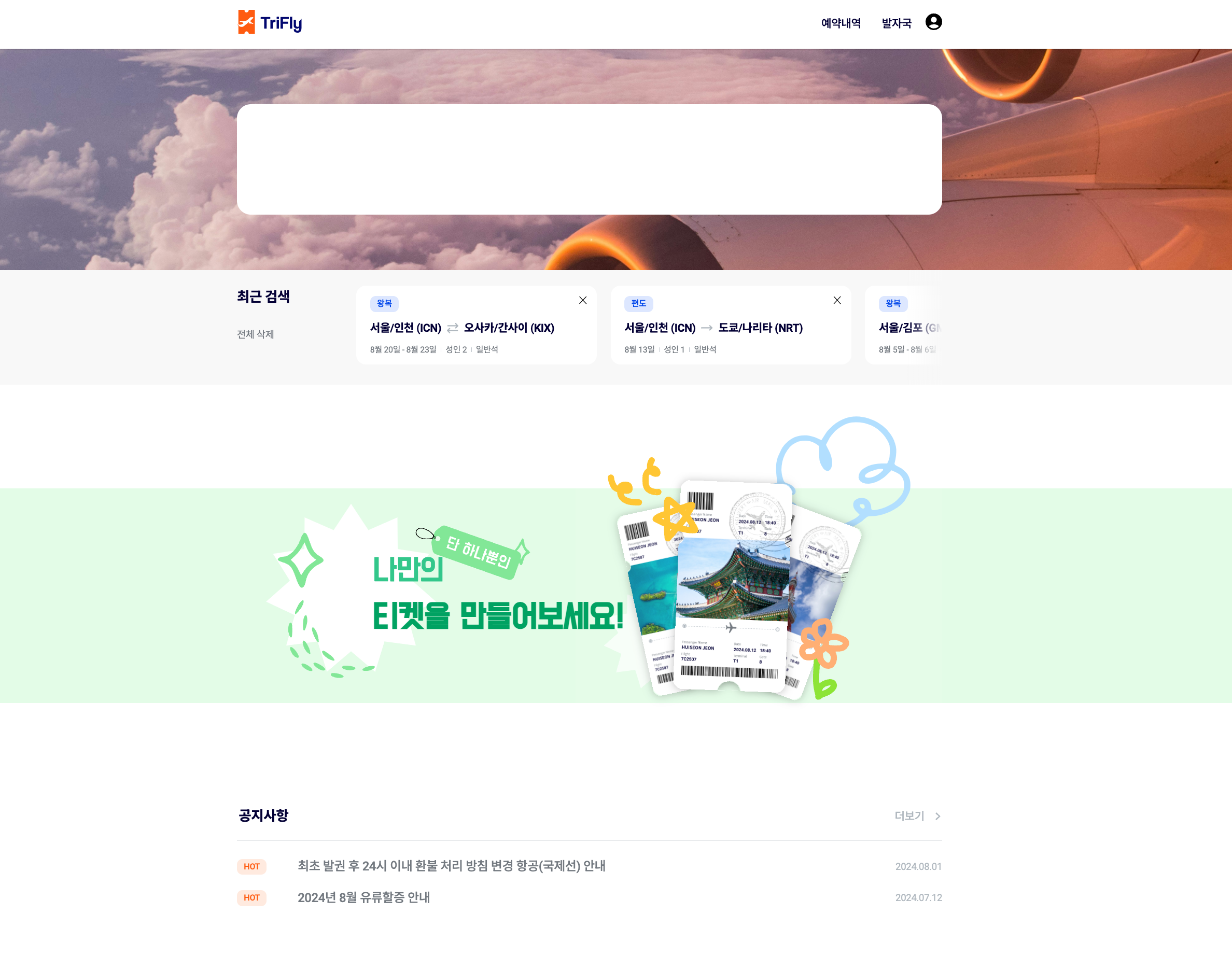
오늘까지 추가된 내용은 최근 검색 섹션, 배너, 공지사항 부분이다. 사실 대부분이 UI 작업들이라 오늘은 많은 시간이 소요된 배너 구현 과정을 소개해보려고 한다.
1️⃣ 배너
배너의 디자인은 아래와 같다.
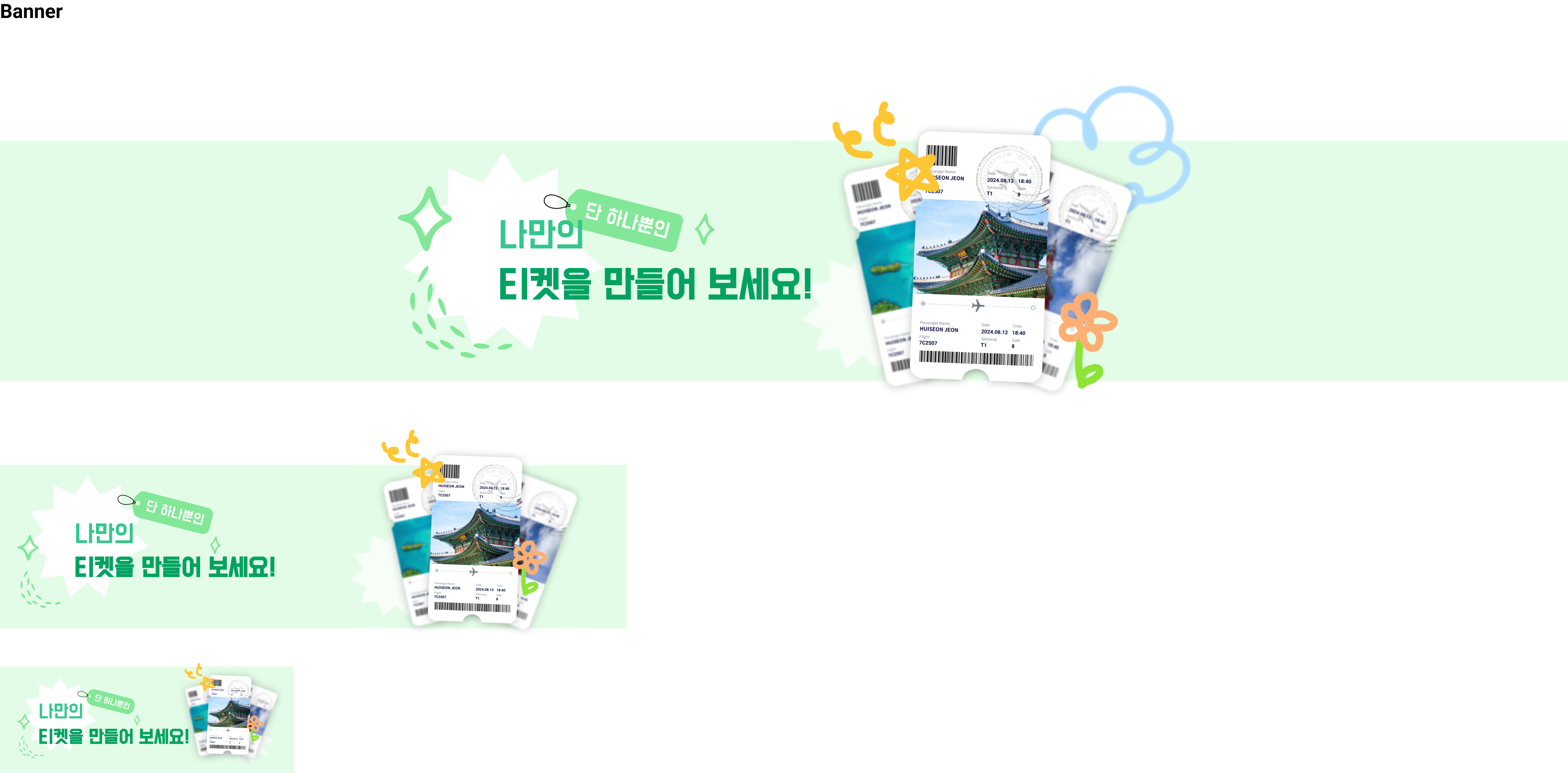
우리 배너의 핵심은 반응형! 화면이 줄어들수록 조금씩 변화하는 모양이 특징인데, 문제는 이것을 어떻게 구현하는가였다.
배너에 들어있는 요소들이 꽤 많은데, 배경에 있는 별 모양들, 우리 서비스의 핵심인 포토티켓, 배너에 작성할 텍스트, "단 하나뿐인"이라는 태그가 있다. 예쁜 디자인의 숙명은 만들기가 어렵다는 것이다. 물론 CSS 장인 소짱은 쉽게 만들었겠지만, 나는 하나하나 만지고 수정하느라 꽤 오랜 시간이 소요된 것이었다,,, 그래도 그만큼 성장한거잖아 🍀
1차전
처음에 배너를 만들었을 때는 저 모든 요소들을 모두 img 태그를 이용해 삽입하고 텍스트를 포함해 모든 요소들을 position: absolute로 띄워 위치를 조정하는 기염을 토했다!! 문제는 그렇게 위치를 맞추다보니 하나가 깨지기 시작하면 그 친구를 기준으로 위치를 잡은 모든 친구들이 이상하게 자리를 잡는 문제가 발생하는 것이었다.
또한 배너에서 중요한 것은 텍스트 뿐, 나머지 요소들은 모두 배경에 있는 이미지인데 이를 모두 img 태그를 이용해 마크업하면 불필요한 마크업이 늘어나는 단점이 존재했다.
그래서 겨우겨우 완성해 둔 배너를 모두 지우고 다시 새롭게 구조를 잡아보기로 결정했다.
문제의 그 배너..ㅎ 코드가 길쥬?
[Banner.tsx]
import { modalState } from "@/atoms/atoms";
import { useRouter } from "next/navigation";
import { useSetRecoilState } from "recoil";
import "./Banner.scss";

const Banner = ({ user }: { user: boolean }) => {
  const setModal = useSetRecoilState(modalState);
  const router = useRouter();
  const handleClick = () => {
    if (!user) {
      setModal({
        isOpen: true,
        title: "로그인 필요",
        content:
          "포토티켓을 꾸미려면 로그인이 필요합니다.\n로그인 페이지로 이동하시겠습니까?",
        buttonNum: 2,
        handleConfirm: () => {
          router.push("/login");
        },
        handleCancel: () => {},
      });
    } else {
      router.push("/footprint");
    }
  };
  return (
    <section className="banner full-width" onClick={handleClick}>
      <h3 className="hidden">포토티켓 바로가기</h3>
      <div className="banner-container">
        <div className="banner-images">
          <img
            className="pc banner-image-star1-pc"
            src="/img/banner-star1-pc.svg"
            alt=""
          />
          <img
            className="mo banner-image-star1-mo"
            src="/img/banner-star1-mobile.svg"
            alt=""
          />
          <img
            className="banner-image-star2"
            src="/img/banner-star2.svg"
            alt=""
          />
          <img
            className="pc banner-image-ticket-pc"
            src="/img/banner-ticket-pc.svg"
            alt=""
          />
          <img
            className="mo banner-image-ticket-mo"
            src="/img/banner-ticket-mobile.svg"
            alt=""
          />
          <img className="banner-image-tag" src="/img/banner-tag.svg" alt="" />
        </div>
        <div className="banner-text">
          <p className="banner-contents">나만의</p>
          <p className="banner-contents">티켓을 만들어보세요!</p>
        </div>
      </div>
    </section>
  );
};
export default Banner;
[Banner.scss]
.banner {
  height: 30rem;
  margin-top: 16rem;
  margin-bottom: 12rem;
  background-color: #e3fce7;

  .banner-container {
    width: 100%;
    height: 100%;
    max-width: var(--layout-pc);
    padding: 0 var(--layout-padding);
    box-sizing: border-box;
    margin: 0 auto;
    position: relative;

    .banner-images {
      position: relative;
      width: 100%;
      height: 100%;

      .banner-image-star1-pc {
        position: absolute;
        top: 1.4rem;
        left: 7.4rem;
        width: 38.8rem;
      }

      .banner-image-star2 {
        position: absolute;
        top: 13.3rem;
        left: 49.4rem;
        width: 15.1rem;
      }

      .banner-image-ticket-pc {
        position: absolute;
        width: 53rem;
        top: -11rem;
        right: 0;
        z-index: 2;
      }

      .banner-image-tag {
        position: absolute;
        width: 17.4rem;
        top: 5rem;
        left: 24.7rem;
        z-index: 2;
      }
    }

    .banner-text {
      position: absolute;
      padding: 0 var(--layout-padding);
      top: 8.8rem;
      left: 19rem;
      z-index: 3;

      .banner-contents {
        font-family: var(--font-dohyeon);

        &:first-child {
          font-size: 4.6rem;
          color: #33c78b;
        }

        &:last-child {
          font-size: 5rem;
          color: #00a262;
          font-weight: 700;
        }
      }
    }
  }
}

@media (max-width: 1023px) {
  .banner {
    height: 20rem;
    margin-top: 5.6rem;
    margin-bottom: 5.6rem;

    .banner-container {
      .banner-images {
        .banner-image-star1-mo {
          position: absolute;
          width: 25rem;
          top: 1.3rem;
          left: 2.1rem;
        }

        .banner-image-star2 {
          top: 7.7rem;
          left: 43rem;
          width: 11.1rem;
        }

        .banner-image-ticket-mo {
          position: absolute;
          width: 30rem;
          top: -4.3rem;
          right: 3.8rem;
        }

        .banner-image-tag {
          width: 11.9rem;
          top: 3.5rem;
          left: 12rem;
        }
      }

      .banner-text {
        top: 6.5rem;
        left: 7rem;

        .banner-contents {
          &:first-child {
            font-size: 3.2rem;
          }

          &:last-child {
            font-size: 3.2rem;
          }
        }
      }
    }
  }
}

@media (max-width: 767px) {
  .banner {
    height: 13rem;

    .banner-container {
      .banner-images {
        .banner-image-star1-mo {
          width: 15rem;
          top: 1.4rem;
          left: 2.1rem;
        }

        .banner-image-star2 {
          top: 5.3rem;
          left: unset;
          right: 0;
          width: 6.7rem;
        }

        .banner-image-ticket-mo {
          width: 14.2rem;
          top: -0.4rem;
          right: 0;
        }

        .banner-image-tag {
          width: 7.3rem;
          top: 2.3rem;
          left: 9.2rem;
        }
      }

      .banner-text {
        top: 4rem;
        left: 4.7rem;

        .banner-contents {
          &:first-child {
            font-size: 2.4rem;
          }

          &:last-child {
            font-size: 2.4rem;
          }
        }
      }
    }
  }
}
2차전
마크업이 간단해졌다.
[Banner.tsx]
"use client";

import { modalState } from "@/atoms/atoms";
import { useRouter } from "next/navigation";
import { useSetRecoilState } from "recoil";
import "./Banner.scss";

const Banner = ({ user }: { user: boolean }) => {
  const setModal = useSetRecoilState(modalState);
  const router = useRouter();

  const handleClick = () => {
    if (!user) {
      setModal({
        isOpen: true,
        title: "로그인 필요",
        content:
          "포토티켓을 꾸미려면 로그인이 필요합니다.\n로그인 페이지로 이동하시겠습니까?",
        buttonNum: 2,
        handleConfirm: () => {
          router.push("/login");
        },
        handleCancel: () => {},
      });
    } else {
      router.push("/footprint");
    }
  };

  return (
    <section className="banner full-width" onClick={handleClick}>
      <h3 className="hidden">포토티켓 바로가기</h3>
      <div className="banner-container">
        <div className="banner-contents">
          <div className="banner-text">
            <p className="banner-message">나만의</p>
            <p className="banner-message">티켓을 만들어보세요!</p>
          </div>
        </div>
      </div>
    </section>
  );
};

export default Banner;
이미지들이 싹 빠지고, 의미 있는 컨텐츠만 마크업으로 관리하였다. 다른 이미지들은 적절한 사이즈로 이미지로 저장해 만들고, background-image, 가상 요소를 이용해서 관리하였다. 확실히 CSS로 관리하기도 편해졌고, 의미있는 마크업이 구성되다보니 코드를 수정하기를 잘했다는 생각이 들었다.
[Banner.scss]
.banner {
  margin: 15rem 0;
  cursor: pointer;
  background-color: #e3fce7;

  .banner-container {
    width: 100%;
    max-width: var(--layout-pc);
    padding: 0 var(--layout-padding);
    box-sizing: border-box;
    margin: 0 auto;
    background-image: url("/img/banner-stars-pc.svg");
    background-repeat: no-repeat;
    background-size: contain;
    background-position: center left;

    .banner-contents {
      position: relative;

      .banner-text {
        box-sizing: border-box;
        padding: 8.8rem 19.6rem;

        .banner-message {
          width: fit-content;
          font-family: var(--font-dohyeon);
          z-index: 2;

          &:first-child {
            font-size: 4.6rem;
            color: #33c78b;
            position: relative;

            &::before {
              content: "";
              position: absolute;
              z-index: -1;
              top: -4rem;
              left: 5.5rem;
              width: 17.4rem;
              height: 8.2rem;
              background-image: url("/img/banner-tag.svg");
              background-repeat: no-repeat;
              background-size: contain;
              transform: rotate(5deg);
            }
          }

          &:last-child {
            font-size: 5rem;
            color: #00a262;
            font-weight: 700;
            position: relative;
          }
        }
      }

      &::after {
        content: "";
        position: absolute;
        top: -11.4rem;
        right: 0;
        width: 53rem;
        height: 43.8rem;
        background-image: url("/img/banner-ticket-pc.svg");
        background-repeat: no-repeat;
        background-size: contain;
        background-position: center;
      }
    }
  }
}

@media (max-width: 1023px) {
  .banner {
    margin: 5.6rem 0;

    .banner-container {
      .banner-contents {
        .banner-text {
          padding: 6rem 9rem;

          .banner-message {
            &:first-child {
              font-size: 3.2rem;
              position: relative;

              &::before {
                width: 11.6rem;
                height: 6.1rem;
                z-index: 0;
              }
            }

            &:last-child {
              font-size: 3.2rem;
            }
          }
        }

        &::after {
          top: -4.3rem;
          right: 0;
          width: 30rem;
          height: 25.6rem;
        }
      }
    }
  }
}

@media (max-width: 767px) {
  .banner {
    .banner-container {
      .banner-contents {
        .banner-text {
          padding: 4.1rem 4.7rem;

          .banner-message {
            &:first-child {
              font-size: 2.4rem;

              &::before {
                width: 7.3rem;
                height: 3.4rem;
                top: -2rem;
                left: 4rem;
                z-index: 0;
                transform: unset;
              }
            }

            &:last-child {
              font-size: 2.4rem;
            }
          }
        }

        &::after {
          top: 0;
          right: 0;
          width: 18rem;
          height: 14.2rem;
          background-image: url("/img/banner-ticket-mobile.svg");
        }
      }
    }
  }
}
다른 컨텐츠들도 많았지만 오늘은 배너가 메인이었기에,, 여기서 마무리하고 내일부터 본격적으로 검색창을 만들고 아마데우스 api와 연동하려고 한다!