
CSS 배울때만 해도 아무것도 몰랐고 Sass라는걸 알고나서 엄청나다고 생각했더니 Styled-components라는게 또 있었고 이제 조금 익숙해지려고 했더니 이번엔 Emotion이다. 다음엔 어떤게 기다리고 있을지 기대하며 Emotion이 뭔지 맛좀 보겠습니다..?
Emotion.js란?
Emotion.js는 CSS-in-JS의 종류 중 하나로 JavaScript 안에서 스타일을 작성할 수 있게 해준다.
emotion.js는 주로 프레임워크와 관련없이 사용하는 Framework Agnostic과 React 두 가지 방식으로 사용된다.
emotion.js 설치
# Framework Agnostic
$ npm install @emotion/css

# React
$ npm install @emotion/react
import 하기
emotion.js를 사용해야 할 컴포넌트에 먼저 import를 해야한다.
/** @jsxImportSource @emotion/react */
import { jsx, css } from '@emotion/react';
여기서 /** @jsxImportSource @emotion/react */는 babel에게 React.createElement 대신 jsx를 jsx라는 함수로 변환하라는 뜻이기 때문에 단순히 주석이라고 생각해서 쓰지 않는다면 @emotion/react가 적용되지 않는다.
기본 구조
공식 문서에 있는 예문으로 emotion의 기본 구조 styled-components와 비교해서 살펴보자.
emotion.js
/** @jsxImportSource @emotion/react */
import { css, jsx } from '@emotion/react'

const divStyle = css`
  background-color: hotpink;
  font-size: 24px;
  border-radius: 4px;
  padding: 32px;
  text-align: center;
  &:hover {
    color: white;
  }
`

export default function App() {
  return <div css={divStyle}>Hover to change color.</div>
}
styled-components
import styled from 'styled-components'

const DivStyle = styled.div`
  background-color: hotpink;
  font-size: 24px;
  border-radius: 4px;
  padding: 32px;
  text-align: center;
  &:hover {
    color: white;
  }
`

export default function App() {
  return <DivStyle>Hover to change color.</DivStyle>
}
이렇게 보면 크게 다른 점은 없지만 jsx 안에서 이게 어떤 태그인지 바로 알 수 있다는 장점이 있다.
만약 emotion.js를 styled-components처럼 사용하고 싶다면 @emotion/styled를 설치하면 된다.
$ npm install @emotion/styled @emotion/react이렇게 하면
import styled from '@emotion/styled'

const DivStyle = styled.div`
  background-color: hotpink;
  font-size: 24px;
  border-radius: 4px;
  padding: 32px;
  text-align: center;
  &:hover {
    color: white;
  }
`

export default function App() {
  return <DivStyle>Hover to change color.</DivStyle>
}
이처럼 styled-components를 사용하는 것처럼 emotion을 사용할 수 있다.
재사용
emotion 역시 styled-components와 마찬가지로 스타일을 입힌 것을 component로 만들어서 어느 곳에서든 재사용할 수 있다.
/** @jsxImportSource @emotion/react */

const P = props => (
  <p
    css={{
      margin: 0,
      fontSize: 12,
      lineHeight: '1.5',
      fontFamily: 'sans-serif',
      color: 'blue',
    }}
    {...props}
  />
)

const ArticleText = props => (
  <P
    css={{
      fontSize: 20,
      fontFamily: 'Georgia, serif',
      color: 'darkgray',
    }}
    {...props}
  />
)

export default function App() {
  return (
    <div>
      <P>Using P component</P>
      <ArticleText>Using ArticleText component</ArticleText>
    </div>
  )
}
같은 CSS 속성이 있다면 가장 최근 값으로 적용된다.
Nested
emotion.js에서도 Nested 사용이 가능하다.
/** @jsxImportSource @emotion/react */
import { jsx, css } from '@emotion/react'

const paragraph = css`
  color: turquoise;

  a {
    border-bottom: 1px solid red;
    cursor: pointer;
  }
`
render(
  <p css={paragraph}>
    Some text.
    <a>A link with a bottom border.</a>
  </p>
)
MediaQuery
반응형은 일반적으로 사용하는 미디어쿼리와 동일하게 사용할 수 있다.
/** @jsxImportSource @emotion/react */
import { jsx, css } from '@emotion/react'

render(
  <p
    css={css`
      font-size: 30px;
      @media (min-width: 420px) {
        font-size: 50px;
      }
    `}
  >
    Some text!
  </p>
)
Global Theme 설정
styled-components와 유사한 방법으로 Global Theme를 설정할 수 있다.
GlobalStyle.js
import { Global, css } from '@emotion/react'

const style = css`
  * {
    margin: 0;
    padding: 0;
  }

  body {
    box-sizing: border-box;
  }
`

const GlobalStyle = () => {
  return <Global styles={style} />
}

export default GlobalStyle
theme.js
export const size = {
  largest: '75em', // 1200px
  large: '56.25em', // 900px
  medium: '37.5em', // 600px
  small: '31.25em', // 500px
  smallest: '25em', // 400px
}

const theme = {
  mainColor: '#0000ff',
  mq: {
    laptop: `@media only screen and (min-width: ${size.largest})`,
    tablet: `@media only screen and (min-width: ${size.large})`,
    mobile: `@media only screen and (min-width: ${size.small})`,
  },
}

export default theme
index.js
import ReactDOM from 'react-dom'
import { BrowserRouter } from 'react-router-dom'

import { ThemeProvider } from '@emotion/react'
import theme from '@styles/theme' // 위치한 경로 설정
import GlobalStyle from '@styles/global' // 위치한 경로 설정

import App from './App'

ReactDOM.render(
  <BrowserRouter>
    <ThemeProvider theme={theme}>
      <GlobalStyle />
      <App />
    </ThemeProvider>
  </BrowserRouter>,
  document.getElementById('root')
)
Emotion.js의 장점
- CSS-in-JS 형식으로 스타일을 사용할 수 있다.
- className이 자동으로 부여되기 때문에 스타일이 겹칠 염려가 없다.
- 재사용이 가능하다.
- porps, 조건 등에 따라 스타일을 지정할 수 있다.
- vendor-prefixing, nested selectors, mediaqueries 등을 적용할 수 있어 작성이 간편하다.
- styled-component 사용방식과 css prop 기능을 지원하여 확장에 용이하다.
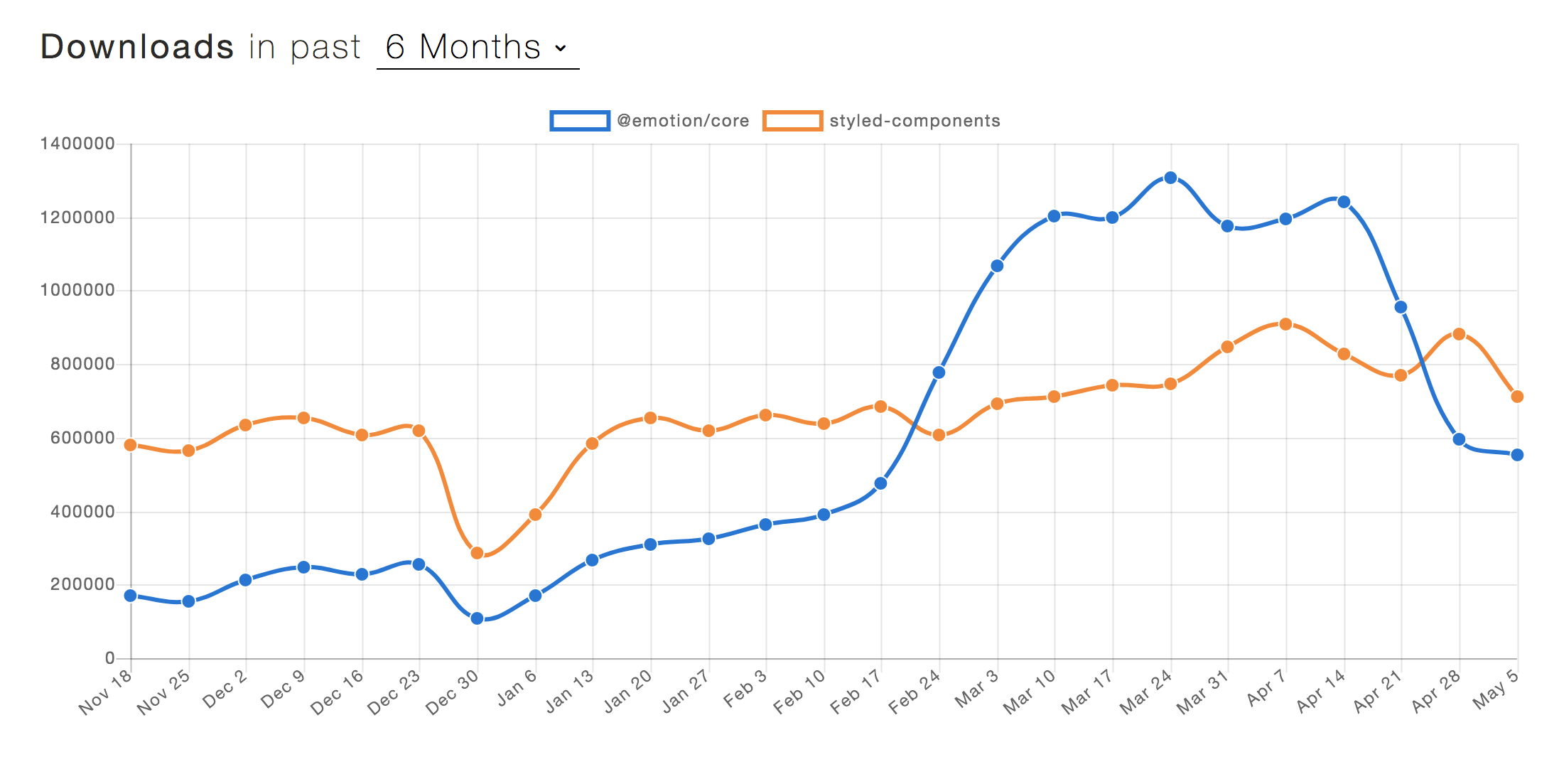
- styled-component 보다 파일 사이즈가 작고, ssr시 서버 작업이 필요없다.
결론
간단하고 효율적이며 복잡하지 않은 스타일링을 위해 크기가 작은 Emotion은 훌륭한 CSS-in-JS 라이브러리이다. 하지만 독특하고 복잡한 스타일 옵션의 경우 styled-components가 더 나은 방법이 될 수도 있다.
박빙이다...🙄