1) 학습한 내용
오늘은 네이버 블로그 페이지에 대해서 레이아웃해보았다.
먼저 이전과 같이 blog.html 파일을 index 의 블로그 부분에 연결시켜준다.
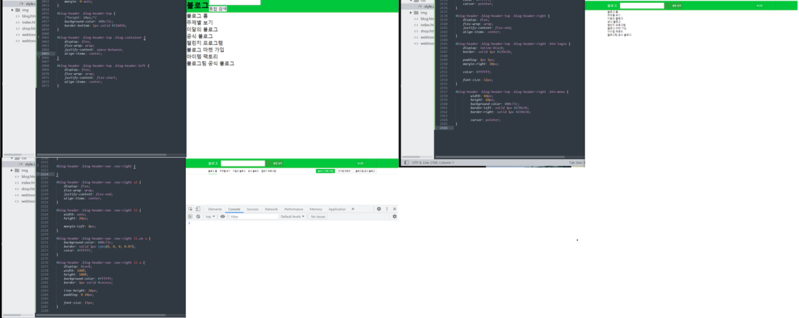
1. blog - header
- html
	<header id="blog-header">
		<div class="blog-header-top">

			<div class="blog-container">

				<div class="blog-header-left">
					<h2><a href="#">블로그</a></h2>

					<div class="blog-header-input-wrap">
						<div class="blog-search-wrap">
							<input type="text">
							<button type="button" class="btn-search"></button>
						</div>
						<button type="button" class="btn-total-search">통합 검색</button>
					</div>
				</div>


				<div class="blog-header-right">
					<a href="#" class="btn-login">로그인</a>
					<button type="button" class="btn-menu"></button>
				</div>
			</div>
		</div>

		<div class="blog-header-nav">
			<div class="blog-container">
				<nav class="nav-left">
					<ul>
						<li class="on"><a href="blog.html">블로그 홈</a></li>
						<li><a href="#">주제별 보기</a></li>
						<li><a href="#">이달의 블로그</a></li>
						<li><a href="#">공식 블로그</a></li>
						<li><a href="blog-detail.html">챌린지 프로그램</a></li>
					</ul>
				</nav>

				<nav class="nav-right">
					<ul>
						<li class="on"><a href="#">블로그 마켓 가입</a></li>
						<li><a href="#">아이템 팩토리</a></li>
						<li><a href="#">블로그팀 공식 블로그</a></li>
					</ul>
				</nav>
			</div>
		</div>
	</header>
- css
.blog-container {
	width: 1080px;
	margin: 0 auto;
}

#blog-header .blog-header-top {
	height: 60px;
	background-color: #00c73c;
	border-bottom: 1px solid #51b036;
}

#blog-header .blog-header-top .blog-container {
	display: flex;
	flex-wrap: wrap;
	justify-content: space-between;
	align-items: center;
}


#blog-header .blog-header-top .blog-header-left {
	display: flex;
	flex-wrap: wrap;
	justify-content: flex-start;
	align-items: center;
}

#blog-header .blog-header-top .blog-header-left h2 {
	font-size: 20px;
	margin-right: 20px;
}

#blog-header .blog-header-top .blog-header-left h2 a {
	color: #ffffff;
	font-weight: 700;
}

#blog-header .blog-header-top .blog-header-input-wrap {
	display: flex;
	flex-wrap: wrap;
	align-items: center;
}

#blog-header .blog-header-top .blog-search-wrap {
	display: flex;
	flex-wrap: wrap;
	align-items: center;

	width: 325px;
	height: 40px;
	background-color: #ffffff;

	margin-right: 5px;
}

#blog-header .blog-header-top .blog-search-wrap input {
	width: calc(100% - 40px);
	height: 40px;
	background-color: #ffffff;
	border: solid 1px #4da733;

	padding: 0 15px;
}

#blog-header .blog-header-top .blog-search-wrap input:focus {
	outline: none;
}

#blog-header .blog-header-top .blog-search-wrap .btn-search {
	width: 40px;
	height: 40px;
	background-color: #28a93a;
	border: solid 1px #239e36;
	cursor: pointer;
}

#blog-header .blog-header-top .btn-total-search {
	width: auto;
	height: 40px;
	background-color: #28a93a;
	border: solid 1px #239e36;

	padding: 0 5px;

	line-height: 40px;
	color: #ffffff;
	cursor: pointer;
}

#blog-header .blog-header-top .blog-header-right {
	display: flex;
	flex-wrap: wrap;
	justify-content: flex-end;
	align-items: center;
}

#blog-header .blog-header-top .blog-header-right .btn-login {
	display: inline-block;
	border: solid 1px #239e36;

	padding: 2px 5px;
	margin-right: 20px;

	color: #ffffff;

	font-size: 12px;
}

#blog-header .blog-header-top .blog-header-right .btn-menu {
		width: 60px;
		height: 60px;
		background-color: #00c73c;
		border-left: solid 1px #239e36;
		border-right: solid 1px #239e36;

		cursor: pointer;
}


#blog-header .blog-header-nav {
	height: 40px;
	background-color: #ffffff;
	border-bottom: solid 1px #e5e5e5;
}

#blog-header .blog-header-nav .blog-container {
	display: flex;
	flex-wrap: wrap;
	justify-content: space-between;
	align-items: center;
}

#blog-header .blog-header-nav .nav-left {

}

#blog-header .blog-header-nav .nav-left ul {
	display: flex;
	flex-wrap: wrap;
	align-items: center;
}

#blog-header .blog-header-nav .nav-left ul li {
	height: 40px;
	margin-right: 16px;
	border-bottom: solid 2px transparent;
	/*투명한 색*/
	/*border-bottom: solid 2px #00AB33;*/
}

#blog-header .blog-header-nav .nav-left ul li.on {
	border-bottom: solid 2px #00AB33;
}

#blog-header .blog-header-nav .nav-left li a {
	display: block;

	width: 100%;
	height: 100%;
	line-height: 40px;

	font-size: 13px;
}

#blog-header .blog-header-nav .nav-right {

}

#blog-header .blog-header-nav .nav-right ul {
	display: flex;
	/*익스플로러 하이버전은 사용하지 못하므로 float을 사용하는 경우가 일반적*/
	flex-wrap: wrap;
	justify-content: flex-end;
	align-items: center;
}

#blog-header .blog-header-nav .nav-right li {
	width: auto;
	height: 26px;

	margin-left: 8px;
}

#blog-header .blog-header-nav .nav-right li.on a {
	background-color: #00c73c;
	border: solid 1px rgba(0, 0, 0, 0.07);
	color: #ffffff;
}

#blog-header .blog-header-nav .nav-right li a {
	display: block;
	width: 100%;
	height: 100%;
	background-color: #ffffff;
	border: 1px solid #cecece;

	line-height: 26px;
	padding: 0 10px;

	font-size: 13px;
}
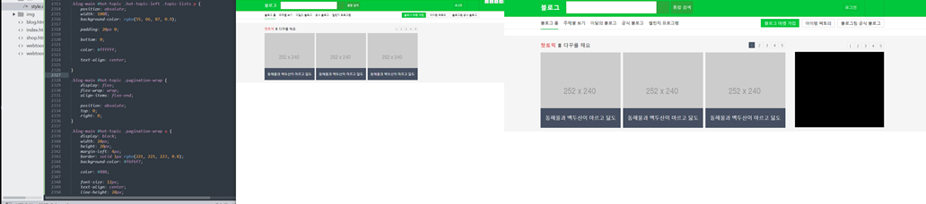
2. blog - main hot topic
- html
	<main role="main" class="blog-main">

		<div id="hot-topic">
			<div class="blog-container">
				<div class="hot-topic-left">
					<div class="topic-heading">
						<h3>핫토픽</h3>
						<i></i>
						<a href="#">다꾸를 해요</a>
					</div>

					<ul class="topic-lists">
						<li>
							<img src="https://via.placeholder.com/252x240">
							<p>동해물과 백두산이 마르고 닳도</p>
						</li>

						<li>
							<img src="https://via.placeholder.com/252x240">
							<p>동해물과 백두산이 마르고 닳도</p>
						</li>

						<li>
							<img src="https://via.placeholder.com/252x240">
							<p>동해물과 백두산이 마르고 닳도</p>
						</li>
					</ul>

					<div class="pagination-wrap">
						<a class="on" href="#">1</a>
						<a href="#">2</a>
						<a href="#">3</a>
						<a href="#">4</a>
						<a href="#">5</a>
					</div>
				</div>

				<div class="hot-topic-right">
					<div class="topic-banner"></div>

					<div class="pagination-wrap">
						<a href="#">1</a>
						<a href="#">2</a>
						<a href="#">3</a>
						<a href="#">4</a>
						<a href="#">5</a>
					</div>
				</div>
				</div>
			</div>
		</div>
- css
.blog-main #hot-topic {
	height: 305px;
	background-color: #f5f5f6;
	padding: 20px 0 15px;
}

.blog-main #hot-topic .blog-container {
	display: flex;
	flex-wrap: wrap;
	justify-content: space-between;
	align-items: center;
}

.blog-main #hot-topic .hot-topic-left {
	position: relative;
	width: 770px;
}

.blog-main #hot-topic .hot-topic-left .topic-heading {
	display: flex;
	flex-wrap: wrap;
	align-items: center;

	margin-bottom: 11px;
}

.blog-main #hot-topic .hot-topic-left .topic-heading h3 {
	font-size: 16px;
	font-weight: 600;
	color: #e55e5e;
}

.blog-main #hot-topic .hot-topic-left .topic-heading i {
	display: block;
	width: 8px;
	height: 13px;
	background-color: grey;
	margin: 0 8px;
}

.blog-main #hot-topic .hot-topic-left .topic-heading a {
	font-size: 16px;
}

.blog-main #hot-topic .hot-topic-left .topic-lists {
	display: flex;
	flex-wrap: wrap;
	justify-content: space-between;
	align-items: center;
}

.blog-main #hot-topic .hot-topic-left .topic-lists li {
	position: relative;
	width: 252px;
	height: 240px;
}

.blog-main #hot-topic .hot-topic-left .topic-lists img {
	position: absolute;
	width: 100%;
	height: 100%;
}

.blog-main #hot-topic .hot-topic-left .topic-lists p {
	position: absolute;
	width: 100%;
	background-color: rgba(55, 66, 87, 0.9);

	padding: 20px 0;

	bottom: 0;

	color: #ffffff;

	text-align: center;

}

.blog-main #hot-topic .pagination-wrap {
	display: flex;
	flex-wrap: wrap;
	align-items: flex-end;

	position: absolute;
    top: 0;
    right: 0;
}

.blog-main #hot-topic .pagination-wrap a.on {
	display: block;
	width: 20px;
	height: 20px;
	margin-left: 4px;
	border: solid 1px rgba(221, 221, 223, 0.8);
	background-color: rgba(55, 66, 87, 0.9);
	color: #ffffff;

	color: #888;

	font-size: 12px;
	text-align: center;
	line-height: 20px;
}

.blog-main #hot-topic .pagination-wrap a {
	display: block;
	width: 20px;
	height: 20px;
	margin-left: 4px;
	border: solid 1px rgba(221, 221, 223, 0.8);
	background-color: #f6f6f7;

	color: #888;

	font-size: 12px;
	text-align: center;
	line-height: 20px;
}
.blog-main #hot-topic .hot-topic-right {
	position: relative;
	width: 280px;
	padding-top: 30px;
}

.blog-main #hot-topic .hot-topic-right .topic-banner {
	width: 280px;
	height: 240px;
	background-color: black;
}
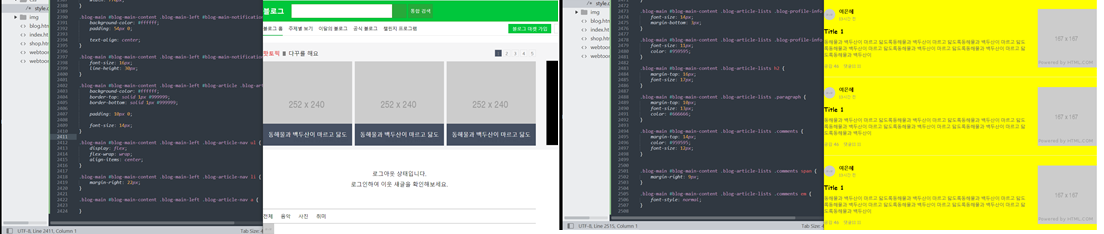
3. blog - main left
- html
<div id="blog-main-content" class="blog-container">
			<div class="blog-main-left">

				<div id="blog-main-notification">
					<p>
						로그아웃 상태입니다.<br>
						로그인하여 이웃 새글을 확인해보세요.
					</p>
				</div>


				<div id="blog-article">

					<nav class="blog-article-nav">
						<ul>
							<li><a href="#">전체</a></li>
							<li><a href="#">음악</a></li>
							<li><a href="#">사진</a></li>
							<li><a href="#">취미</a></li>
						</ul>
					</nav>

					<ul class="blog-article-lists">

						<li>
							<a href="#">
								<div class="blog-article-info">
									<div class="blog-profile-wrap">
										<img src="https://via.placeholder.com/32x32">
										<div class="blog-profile-info">
											<h3>여은혜</h3>
											<p>13시간 전</p>
										</div>
									</div>

									<h2>Title 1</h2>
									<p class="paragraph">
										동해물과 백두산이 마르고 닳도록동해물과 백두산이 마르고 닳도록동해물과 백두산이 마르고 닳도록동해물과 백두산이 마르고 닳도록동해물과 백두산이 마르고 닳도록동해물과 백두산이 마르고 닳도록동해물과 백두산이
									</p>

									<div class="comments">
										<span>공감 <em>46</em></span>
										<span>댓글11 <em>11</em></span>
									</div>
								</div>

								<img src="https://via.placeholder.com/167x167">
							</a>
						</li>
					</ul>
				</div>
			</div>

			<div class="blog-main-right">

			</div>
- css
.blog-main #blog-main-content {
display: flex;
flex-wrap: wrap;
justify-content: space-between;
}
.blog-main #blog-main-content .blog-main-left {
width: 770px;
}
.blog-main #blog-main-content .blog-main-left #blog-main-notification {
background-color: #ffffff;
padding: 54px 0;
text-align: center;
}
.blog-main #blog-main-content .blog-main-left #blog-main-notification p {
font-size: 16px;
line-height: 30px;
}
.blog-main #blog-main-content .blog-main-left #blog-article .blog-article-nav {
background-color: #ffffff;
border-top: solid 1px #999999;
border-bottom: solid 1px #999999;
padding: 10px 0;
font-size: 14px;
}
.blog-main #blog-main-content .blog-main-left .blog-article-nav ul {
display: flex;
flex-wrap: wrap;
align-items: center;
}
.blog-main #blog-main-content .blog-main-left .blog-article-nav li {
margin-right: 22px;
}
.blog-main #blog-main-content .blog-main-left .blog-article-nav a {
}
.blog-main #blog-main-content .blog-main-left .blog-article-lists {
}
.blog-main #blog-main-content .blog-article-lists li {
width: 100%;
border-bottom: solid 1px #eeeeef;
padding: 25px 0 23px;
}
.blog-main #blog-main-content .blog-article-lists li a {
display: block;
display: flex;
flex-wrap: wrap;
justify-content: space-between;
align-items: center;
width: 100%;
height: 100%;
}
.blog-main #blog-main-content .blog-article-lists .blog-article-info {
width: 573px;
}
.blog-main #blog-main-content .blog-article-lists .blog-profile-wrap {
display: flex;
flex-wrap: wrap;
align-items: center;
}
.blog-main #blog-main-content .blog-article-lists .blog-profile-wrap img {
width: 32px;
height: 32px;
border-radius: 50%;
margin-right: 10px;
}
.blog-main #blog-main-content .blog-article-lists .blog-profile-info {
}
.blog-main #blog-main-content .blog-article-lists .blog-profile-info h3 {
font-size: 14px;
margin-bottom: 3px;
}
.blog-main #blog-main-content .blog-article-lists .blog-profile-info p {
font-size: 11px;
color: #959595;
}
.blog-main #blog-main-content .blog-article-lists h2 {
margin-top: 16px;
font-size: 17px;
}
.blog-main #blog-main-content .blog-article-lists .paragraph {
margin-top: 10px;
font-size: 13px;
color: #666666;
}
.blog-main #blog-main-content .blog-article-lists .comments {
margin-top: 14px;
color: #959595;
font-size: 12px;
}
.blog-main #blog-main-content .blog-article-lists .comments span {
margin-right: 9px;
}
.blog-main #blog-main-content .blog-article-lists .comments em {
font-style: normal;
}
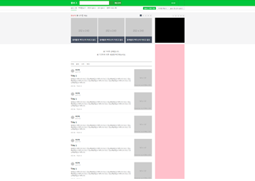
.blog-main #blog-main-content .blog-main-right {
width: 280px;
height: 2000px;
background-color: pink;
}
2) 학습내용 중 어려웠던 점 및 해결방법
지금 우리는 flex를 통해 정렬 작업을 하고 있는데, 네이버는 float을 이용해서 하고 있다. 익스플로러 하이버전들도 사용가능하도록 하기 위해서 float 을 쓴다는데 flex 와는 달리 조금 더 어려운 방법인것같다.
float에 대해 더 공부할 수 있도록 해야겠다.
3) 학습소감
네이버 페이지라는 것을 계속하다보니 나름 반복적인 부분들이 있고, 비슷하게 레이아웃을 하는 것 같아 점점 조금씩 익숙해져가는 것 같다.
다만 아직은 타이핑속도가 느려 강의를 들으며 함께 타이핑을 하는것보다 미리 해놓고 강의를 듣는 것이 더 집중도 잘되고 이해가 잘 되는 것같다. 처음에는 강의를 켜놓고 작업을 함께 해나가 따라가기에 벅찼는데 이제는 조금씩 강의를 듣는 방법도 요령이 생기나보다.
남은 페이지들도 큰문제 없이 잘 해보길 : )
아직 여백이 많은 개린이입니다.