1) 학습한 내용
오늘은 helback 이라는 덴마크 쇼핑몰 페이지를 만들어 보았다.
이미지를 제외한 메뉴 및 레이아웃을 똑같이 해보았다.
또, id는 왜 하나 밖에 존재할 수 없는지와
css 에서 클래스를 미리 만들어 html 에 적용하는 방법도 알아보았다.
1. head
-html
<!DOCTYPE html>
<html>
<head>
	<meta charset="utf-8">
	<meta name="viewport" content="width=device-width, initial-scale=1.0">
	<!-- 반응형 페이지 만들기, W3school에서 참고 -->
	<meta name="description" content="여은혜">
	<meta name="author" content="여은혜">
	<meta name="keywords" content="html, css, tutorial">

	<title>Helback</title>

	<link rel="stylesheet" type="text/css" href="css/style.css">
	<link rel="stylesheet" type="text/css" href="css.moblie.css">

</head>
-css
* {
	margin: 0;
	padding: 0;

	box-sizing: border-box;
}
/*
*는 html에서 margin 값과 padding 값을 갖고있는 모든 태그에 적용하겠다 */
html, body {
	width: 100%;
	height: 100%;
}

body {
	overflow-x: hidden;

	font-family: sans-serif;
	color: #585858;
}

h1, h2, h3, h4, h5, h6, p {
	font-weight: 400;
	/*숫자크기가 커질수록 굵어진다.*/
}

li {list-style: none;}

a { text-decoration: none; }

img { vertical-align: middle; }

span {display: block;}


/*----------- 여기까지 초기화 작업 ----------*/
2. body - header
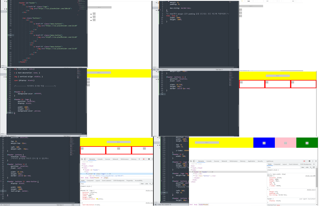
-html
<header id="header">
		<h1>
			<a href="#" class="logo">
				<img src="https://via.placeholder.com/186x18">
			</a>
		</h1>


		<nav class="buttons">
			<ul>
				<li>
					<a href="#" class="menu-button">
						<img src="https://via.placeholder.com/22x20">
					</a>
				</li>
				<li>
					<a href="#" class="menu-button">
						<img src="https://via.placeholder.com/22x20">
					</a>
				</li>
				<li>
					<a href="#" class="menu-button">
						<img src="https://via.placeholder.com/22x20">
					</a>
				</li>

			</ul>
		</nav>
	</header>
-css
/*미디어 쿼리 바깥쪽이 모바일 버전 작업*/
#header h1 {
	background-color: yellow;
}

#header h1 .logo {
	position: relative;
	display: block;

	width: 100%;
	height: 65px;
	/*background-color: yellow;*/
}


#header .logo img {
	position: absolute;

	top: 0;
	margin-top: 23px;

	left: 50%;
	margin-left: -93px;
}

#header .buttons {
	overflow: hidden;
	/*자식의 높이값을 부모가 인식 할 수 있도록*/
}

#header .buttons li {
	position: relative;
	float: left;

	width: 33.33%;
	height: 65px;
}

#header .buttons .menu-button {
	display: block;

	width: 100%;
	height: 100%;
	text-align: center;
}

#header .buttons li:nth-child(1) .menu-button {
	background-color: blue;
}

#header .buttons li:nth-child(2) .menu-button {
	background-color: pink;
}

#header .buttons li:nth-child(3) .menu-button {
	background-color: green;
}

#header .buttons li .menu-button img {
	position: relative;
	height: 20px;

	top: 50%;
	transform: translateY(-50%);
	/*y축 정렬*/
}

/* 1em = 16px; */
@media (min-width: 47em) {
	#header {
		position: fixed;
		width: 100%;
		height: 80px;

		top: 0;
		left: 0;

		z-index: 99999;
	}
	#header h1 {
		width: 50%;
	}

	#header h1 .logo {
		width: 280px;
		height: 80px;
		/*pc버전에서 여백부분에 손가락으로 변화를 주기위해 조금더 넓혀줌*/
	}

	#header .logo img {
		margin-top: 30px;
	}

	#header .buttons {
		position: absolute;
		width: 50%;
		/*absolute 사용시 공간 정할때 주의 */

		left: 50%;
		top: 0;
	}

	#header .buttons li {
		height: 80px;

	}
}
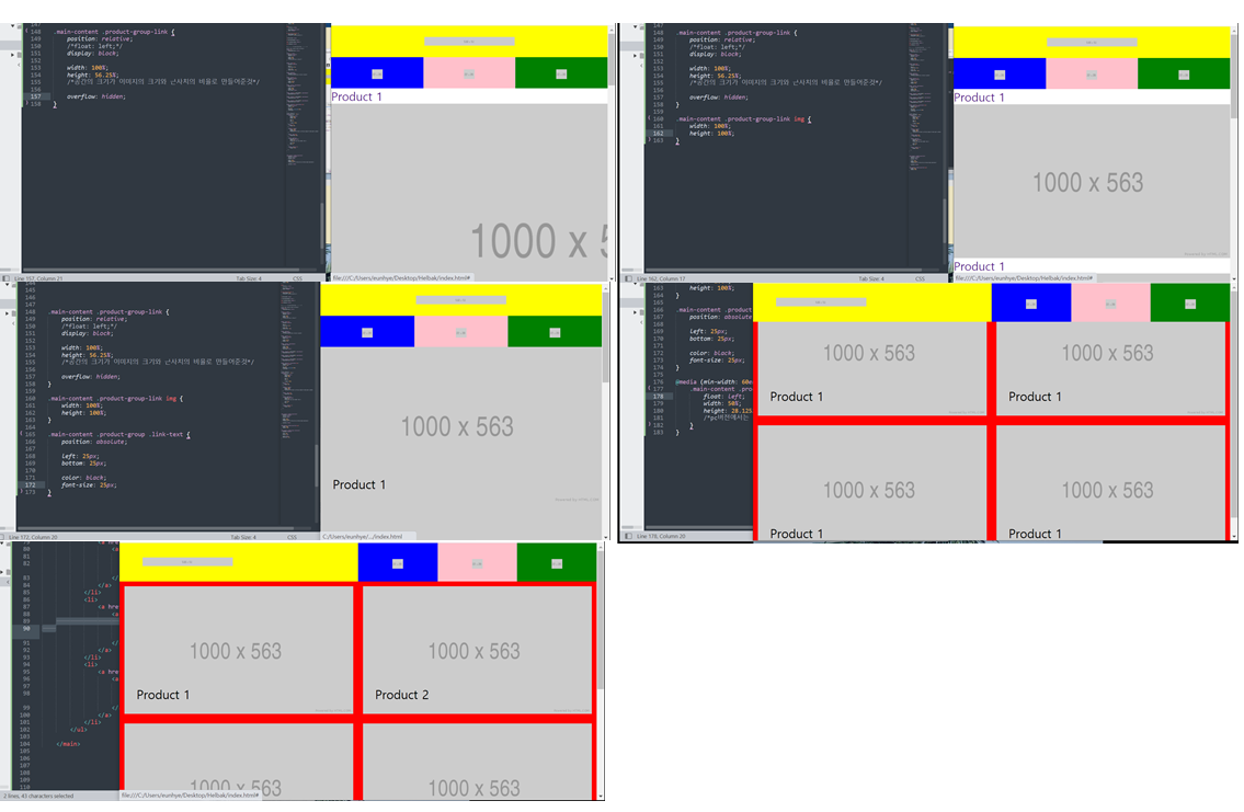
3. body - main
-html
<main role="main" class="main-content">
		<ul class="product-group">
			<li>
				<a href="#" class="product-group-link">
					<article>
						<h2 class="link-text">Product 1</h2>
						<img src="https://via.placeholder.com/1000x563">
					</article>
				</a>
			</li>
			<li>
				<a href="#" class="product-group-link">
					<article>
						<h2 class="link-text">Product 2</h2>
						<img src="https://via.placeholder.com/1000x563">
					</article>
				</a>
			</li>
			<li>
				<a href="#" class="product-group-link">
					<article>
						<h2 class="link-text">Product 3</h2>
						<img src="https://via.placeholder.com/1000x563">
					</article>
				</a>
			</li>
			<li>
				<a href="#" class="product-group-link">
					<article>
						<h2 class="link-text">Product 4</h2>
						<img src="https://via.placeholder.com/1000x563">
					</article>
				</a>
			</li>
			<li>
				<a href="#" class="product-group-link">
					<article>
						<h2 class="link-text">Product 5</h2>
						<img src="https://via.placeholder.com/1000x563">
					</article>
				</a>
			</li>
			<li>
				<a href="#" class="product-group-link">
					<article>
						<h2 class="link-text">Product 6</h2>
						<img src="https://via.placeholder.com/1000x563">
					</article>
				</a>
			</li>
		</ul>

	</main>
-css
.main-content .product-group-link {
	position: relative;
	/*float: left;*/
	display: block;

	width: 100%;
	height: 56.25%;
	/*공간의 크기가 이미지의 크기와 근사치의 비율로 만들어준것*/
	border: solid 10px red;

	overflow: hidden;
}

.main-content .product-group-link img {
	width: 100%;
	height: 100%;
}

.main-content .product-group .link-text {
	position: absolute;

	left: 25px;
	bottom: 25px;

	color: black;
	font-size: 25px;
}

@media (min-width: 47em) {
	.main-content {
		padding-top: 80px;
	}
}

@media (min-width: 60em) {
	.main-content {
		overflow: hidden;

	}
	.main-content .product-group-link {
		float: left;
		width: 50%;
		height: 28.125%;
		/*pc버전에서는 두줄로 나열하기위해 크기를 반으로 설정*/
	}
}
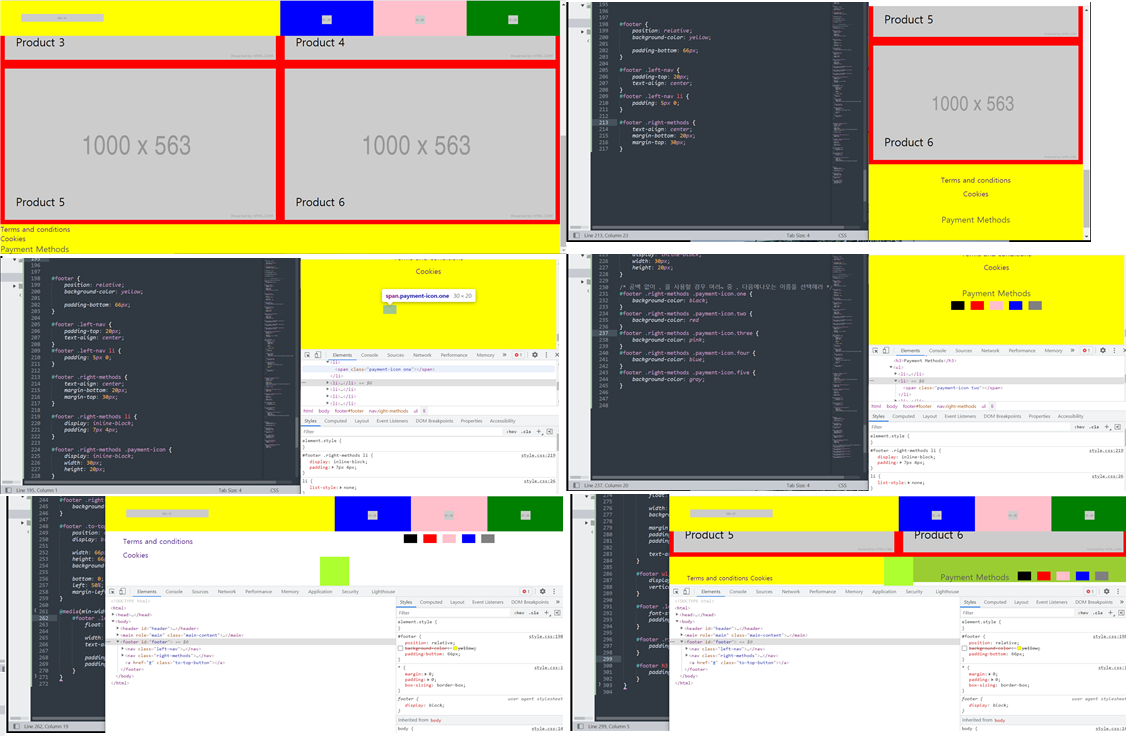
4. body - footer
-html
<footer id="footer">
		<nav class="left-nav">
			<ul>
				<li><a href="#">Terms and conditions</a></li>
				<li><a href="#">Cookies</a></li>
			</ul>
		</nav>

		<nav class="right-methods">
			<h3>Payment Methods</h3>
			<ul>
				<li><span class="payment-icon one"></span></li>
				<li><span class="payment-icon two"></span></li>
				<li><span class="payment-icon three"></span></li>
				<li><span class="payment-icon four"></span></li>
				<li><span class="payment-icon five"></span></li>
			</ul>
		</nav>

		<a href="#" class="to-top-button"></a>
	</footer>
-css
#footer {
	position: relative;
	/*background-color: yellow;*/

	padding-bottom: 66px;
	/*버튼 부분을 위한 공간을 남겨놓기 위해 만들어 놓음*/
}

#footer .left-nav {
	padding-top: 20px;
	text-align: center;
}
#footer .left-nav li {
	padding: 5px 0;
}

#footer .right-methods {
	text-align: center;
	margin-bottom: 20px;
	margin-top: 30px;
}

#footer .right-methods li {
	display: inline-block;
	padding: 7px 4px;
}

#footer .right-methods .payment-icon {
	display: inline-block;
	width: 30px;
	height: 20px;
}

/* 공백 없이 . 을 사용할 경우 여러~ 중 . 다음에나오는 이름을 선택해라 */
#footer .right-methods .payment-icon.one {
	background-color: black;
}
#footer .right-methods .payment-icon.two {
	background-color: red
}
#footer .right-methods .payment-icon.three {
	background-color: pink;
}
#footer .right-methods .payment-icon.four {
	background-color: blue;
}
#footer .right-methods .payment-icon.five {
	background-color: gray;
}

#footer .to-top-button {
	position: absolute;
	display: block;

	width: 66px;
	height: 66px;
	background-color: greenyellow;

	bottom: 0;
	left: 50%;
	margin-left: -33px;
}

@media(min-width:  60em) {
	#footer {
		height: 66px;
	}

	#footer .left-nav {
		float: left;

		width: 50%;
		/*background-color: yellow;*/
		text-align: left;

		padding-top: 32px;
		padding-left: 40px;
	}

	#footer .right-methods {
		float: right;

		width: 50%;
		/*background-color: yellowgreen;*/

		margin: 0;
		padding-top: 32px;
		padding-right: 40px;

		text-align: right;
	}

	#footer ul, #footer li, #footer h3 {
		display: inline-block;
		vertical-align: middle;
	}

	#footer .left-nav a {
		font-size: 14px;
		padding: 0;
	}

	#footer .right-methods li {
		padding: 0 4px;
	}

	#footer h3 {
		padding-right: 10px;
	}
}
5. ID와 Class
-html
<!DOCTYPE html>
<html>
<head>
	<meta charset="utf-8">
	<title></title>
	<link rel="stylesheet" type="text/css" href="css/style.css">
</head>
<body>


 	<!-- 왜 같은 아이디가 존재할 수 없을까 ? -->

 	<!-- <ul>
 		<li><a href="https://www.naver.com/">one</a></li>
 		<li><a href="contact.html">two</a></li>
 		<li><a href="#three">three</a></li> -->
 		<!-- <a href="또다른 html문서나,주소,id 속성값을 넣을수 있다.">one</a></li>

 		그러므로 아이디 값이 중복이 되어있으면 어떤 id 로 가야하는지 알수 없기 때문에, 중복되면 안된다. -->
 	<!-- </ul>

 	<div id="one"></div>
 	<div id="two"></div>
 	<div id="three"></div>
 -->


 	<p class="text-box">
 		동해물과 백두산이 마르고 닳도록 하느님이 보우하사 우리나라만세
 		동해물과 백두산이 마르고 닳도록 하느님이 보우하사 우리나라만세
 		동해물과 백두산이 마르고 닳도록 하느님이 보우하사 우리나라만세
 		동해물과 백두산이 마르고 닳도록 하느님이 보우하사 우리나라만세
 		동해물과 백두산이 마르고 닳도록 하느님이 보우하사 우리나라만세
 		동해물과 백두산이 마르고 닳도록 하느님이 보우하사 우리나라만세
 		동해물과 백두산이 마르고 닳도록 하느님이 보우하사 우리나라만세
 		동해물과 백두산이 마르고 닳도록 하느님이 보우하사 우리나라만세
 	</p>


 	<h1 class="ellipsis m-b-100">
 		동해물과 백두산이 마르고 닳도록 하느님이 보우하사 우리나라만세
 		동해물과 백두산이 마르고 닳도록 하느님이 보우하사 우리나라만세
 		동해물과 백두산이 마르고 닳도록 하느님이 보우하사 우리나라만세
 		동해물과 백두산이 마르고 닳도록 하느님이 보우하사 우리나라만세
 		동해물과 백두산이 마르고 닳도록 하느님이 보우하사 우리나라만세
 		동해물과 백두산이 마르고 닳도록 하느님이 보우하사 우리나라만세
 		동해물과 백두산이 마르고 닳도록 하느님이 보우하사 우리나라만세
 		동해물과 백두산이 마르고 닳도록 하느님이 보우하사 우리나라만세
 	</h1>

 	<h2 class="ellipsis ">
 		동해물과 백두산이 마르고 닳도록 하느님이 보우하사 우리나라만세
 		동해물과 백두산이 마르고 닳도록 하느님이 보우하사 우리나라만세
 		동해물과 백두산이 마르고 닳도록 하느님이 보우하사 우리나라만세
 		동해물과 백두산이 마르고 닳도록 하느님이 보우하사 우리나라만세
 		동해물과 백두산이 마르고 닳도록 하느님이 보우하사 우리나라만세
 		동해물과 백두산이 마르고 닳도록 하느님이 보우하사 우리나라만세
 		동해물과 백두산이 마르고 닳도록 하느님이 보우하사 우리나라만세
 		동해물과 백두산이 마르고 닳도록 하느님이 보우하사 우리나라만세
 	</h2>
-contact.html
<!DOCTYPE html>
<html>
<head>
	<meta charset="utf-8">
	<title></title>
</head>
<body>

	<h1>Contact</h1>

</body>
</html>
-css
* {
	margin: 0;
	padding: 0;

	box-sizing: border-box;
}


#one, #two, #three {
	widows: 100%;
	height: 800px;
}
#one {
	background-color: yellow;
}

#two {
	background-color: pink;
}
#three {
	background-color: gray;
}


.text-box {
	width: 200px;
	height: 200px;
	background-color: yellow;

	white-space: nowrap;
	/*x축으로 쭉나열되고, 스크롤도 생김*/
	overflow: hidden;
	text-overflow: ellipsis;
	/*말줄임 표시를 하기 위해서는 위에 세가지 코드 함께 사용*/
}


h1 {
	background-color: pink;
}

h2 {
	background-color: gray;
}

.ellipsis {
	white-space: nowrap;
	overflow: hidden;
	text-overflow: ellipsis;
}
/*미리 css 에 말줄임표시를 담당하는 클래스를 만들어놓고 html에 적용하면 말줄임이 된다.*/


.m-b-10 {
	margin-bottom: 10px;
}
.m-b-15 {
	margin-bottom: 15px;
}
.m-b-20 {
	margin-bottom: 20px;
}
.m-b-100 {
	margin-bottom: 100px;
}

/* 위와 같이 미리 css에서 클래스를 지정해놓고 html에서 사용하면 다른 분들이 보기에 이부분에서
이러한 css 를 적용했구나라는걸 빠르게 알 수 있다. */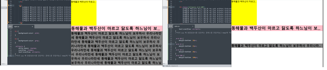
a 태그에서 href에 id의 속성값을 사용할 수 있는데, id의 값은 중복으로 사용할 경우
클릭시 어떤 id 값으로 가야할지 알 수 없으므로 html 에서 id의 값은 하나만 존재하도록한다.
css에서 미리 class 값을 입력해놓고 html 에서 태그를 작성하면서 함께 css를 지정해놓은 class 를 사용하면 바로 적용이 되어 편리하고 가독성에도 좋다.
2) 학습내용 중 어려웠던 점 및 해결방법
이전에 animation이 포함된 페이지를 만들다가 오늘은 포함이 되지 않은 페이지를 만들어보니 코드도 많이 줄어 좀 더 쉽게 따라 할 수 있었던 것 같다.
그래서 크게 어려웠던 점은 없었다.
3) 학습소감
이전에 kids gao를 만들때는 내가 지금 실력이 늘고 있는 건지 잘 몰랐는데, 확실히 오늘 halback 페이지를 만들어보니 전에 보다는 조금더 늘었다는 걸 느낄 수 있었다.
특히 강사님이 말씀하시기전에 이런 태그와 css를 쓰면 되겠다 미리 생각 할 수 있었고, 공간이 겹치는 문제 등이 발생하면 바로 바로 어떤 부분을 봐야하고 어떻게 해결을 하면되는지 대충 여러가지 해결방안들이 생각났다.
또 강사님이 계속 중간중간에 실무에서 사용되는 꿀 팁 같은 것들을 많이 알려주시는데, 그런것들이 정말 유용한것같아서 좋았다 :)
벌써 이번주도 끝이났다! 주말 충전해서 다음주도 뽜이팅 해야겠다 : )