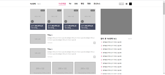
1) 학습한 내용
오늘은 엔터부분의 페이지를 마무리해보았다.
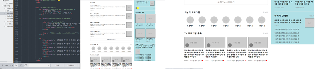
1. ent-right banner & section10
- html
<div class="ent-banner"></div>


				<div id="ent-section-10">

					<div class="title-wrap ent-flex-between">
						<h3>많이 본 TV연예 뉴스</h3>
						<a href="#" class="more">더보기</a>
					</div>

					<ol>
						<li>
							<a href="#">
								<span class="rank">1</span>
								<p>동해물과 백두산이 마르고 닳도록</p>
							</a>
						</li>
						<li>
							<a href="#">
								<span class="rank">2</span>
								<p>동해물과 백두산이 마르고 닳도록</p>
							</a>
						</li>
						<li>
							<a href="#">
								<span class="rank">3</span>
								<p>동해물과 백두산이 마르고 닳도록</p>
							</a>
						</li>
						<li>
							<a href="#">
								<span class="rank">4</span>
								<p>동해물과 백두산이 마르고 닳도록</p>
							</a>
						</li>
						<li>
							<a href="#">
								<span class="rank">5</span>
								<p>동해물과 백두산이 마르고 닳도록</p>
							</a>
						</li>
						<li>
							<a href="#">
								<span class="rank">6</span>
								<p>동해물과 백두산이 마르고 닳도록</p>
							</a>
						</li>
						<li>
							<a href="#">
								<span class="rank">7</span>
								<p>동해물과 백두산이 마르고 닳도록</p>
							</a>
						</li>
						<li>
							<a href="#">
								<span class="rank">8</span>
								<p>동해물과 백두산이 마르고 닳도록</p>
							</a>
						</li>
						<li>
							<a href="#">
								<span class="rank">9</span>
								<p>동해물과 백두산이 마르고 닳도록</p>
							</a>
						</li>
						<li>
							<a href="#">
								<span class="rank">10</span>
								<p>동해물과 백두산이 마르고 닳도록</p>
							</a>
						</li>
					</ol>
				</div>
- css
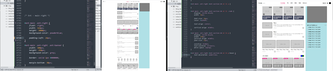
#ent-main .ent-right .ent-banner {
	width: 300px;
	height: 250px;
	background-color: grey;

	border: solid 1px #000000;

	margin-bottom: 30px;
}


#ent-main .ent-right #ent-section-10 {
	padding-bottom: 12px;
	border-bottom: solid 1px #e8e8e8;
}

#ent-main .ent-right #ent-section-10 .title-wrap {
	margin-bottom: 8px;
}

#ent-main .ent-right #ent-section-10 .title-wrap h3 {
	font-size: 16px;
}

#ent-main .ent-right #ent-section-10 .title-wrap a {

	font-size: 12px;
    color: #999;
    /*margin-right: 3;*/
}

#ent-main .ent-right #ent-section-10 ol {

}

#ent-main .ent-right #ent-section-10 ol li {
	margin-bottom: 10px;
}

#ent-main .ent-right #ent-section-10 ol li a {

}

#ent-main .ent-right #ent-section-10 ol li .rank {
	display: inline-block;
	width: 16px;

	font-size: 16px;
	color: #e2458f;

	text-align: center;

	vertical-align: middle;
}

#ent-main .ent-right #ent-section-10 ol li p {
	display: inline-block;
	width: 270px;
	vertical-align: middle;
	font-size: 12px;

	overflow: hidden;
	text-overflow: ellipsis;
	white-space: nowrap;
}

#ent-main .ent-right #ent-section-10 ol li p:hover {
	text-decoration: underline;
}
2. ent-right section11
- html
<div id="ent-section-11">

					<ul>
						<li>
							<a href="#">
								<div class="title-wrap ent-flex-between">
									<div class="title-left ent-flex-start">
										<span class="count">14</span>
										<h3>타이틀 1</h3>
									</div>
									<div class="icon-arrow"></div>
								</div>

								<div class="article-content ent-flex-between">
									<div class="content-left">
										<h4>서브 타이틀 서브 타이틀 서브 타이틀서브 타이틀 서브 타이틀</h4>
										<span class="source">스타뉴스</span>
									</div>
									<img src="https://via.placeholder.com/70">
								</div>
							</a>
						</li>
					</ul>

					<div class="bottom ent-flex-between">
						<div class="btn-wrap ent-flex-start">
							<button class="btn btn-prev"></button>
							<button class="btn btn-next"></button>
						</div>
						<a href="#" class="more">더보기</a>
					</div>

				</div>
- css
#ent-section-11 {
	border-bottom: solid 1px #f2f2f2;
	padding-bottom: 24px;
}

#ent-section-11 ul {
	margin-bottom: 12px;
}

#ent-section-11 ul li {
	padding: 14px;
	border-bottom: solid 1px #f2f2f2;
}

#ent-section-11 ul a {

}

#ent-section-11 ul .title-wrap {
	margin-bottom: 10px;
}

#ent-section-11 ul .title-wrap .title-left {

}

#ent-section-11 ul .title-wrap .title-left .count{
	width: 20px;
	height: 15px;
	padding: 2px 4px;
	border: solid 1px #e2458f;

	color: #e2458f;
	font-size: 10px;

	margin-right: 8px;
}

#ent-section-11 ul .title-wrap .title-left h3 {
	color: #e2458f;
	font-size: 12px;
}

#ent-section-11 ul .title-wrap .icon-arrow {
	width: 8px;
	height: 12px;
	background-color: #e2458f;
}
#ent-section-11 ul .title-wrap .icon-arrow p {
	text-align: center;
}
#ent-section-11 ul .article-content {

}

#ent-section-11 ul .article-content .content-left {
	width: 190px;
}

#ent-section-11 ul .article-content .content-left h4 {
	font-size: 12px;
	font-weight: 700;
	line-height: 18px;
	margin-bottom: 6px;
}

#ent-section-11 ul .article-content .content-left .source {
	font-size: 11px;
	color: #a6a6a6;
}

#ent-section-11 ul .article-content img {
	width: 70px;
	height: 70px;
	border: solid 1px #000000;
}

#ent-section-11 .bottom .btn-wrap {

}

#ent-section-11 .bottom .btn-wrap .btn {
	width: 24px;
	height: 24px;
	border: solid 1px #f2f2f2;
}

#ent-section-11 .bottom .btn-wrap .btn-prev {
	background-color: grey;
	border-right: none;
}

#ent-section-11 .bottom .btn-wrap .btn-next {
	background-color: yellow;
}

#ent-section-11 .bottom .more {
	font-size: 12px;
	color: #999;
}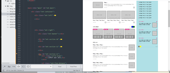
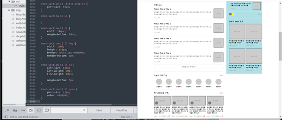
3. ent-right section12
- html
<div id="ent-section-12">
					<div class="title-wrap">
						<h3>연예가 HOT 포토</h3>
					</div>

					<ul class="ent-flex-between">
						<li>
							<img src="https://via.placeholder.com/146x138">
							<h4>타이틀 타이틀 타이틀 타이틀 타이틀 타이틀</h4>
							<span>스타들의 일상</span>
						</li>
						<li>
							<img src="https://via.placeholder.com/146x138">
							<h4>타이틀 타이틀 타이틀 타이틀 타이틀 타이틀</h4>
							<span>스타들의 일상</span>
						</li>
						<li>
							<img src="https://via.placeholder.com/146x138">
							<h4>타이틀 타이틀 타이틀 타이틀 타이틀 타이틀</h4>
							<span>스타들의 일상</span>
						</li>
						<li>
							<img src="https://via.placeholder.com/146x138">
							<h4>타이틀 타이틀 타이틀 타이틀 타이틀 타이틀</h4>
							<span>스타들의 일상</span>
						</li>
					</ul>
				</div>
- css
#ent-section-12 {
	padding: 20px 0 2px;
	border-bottom: solid 1px #e8e8e8;
}

#ent-section-12 .title-wrap {
	margin-bottom: 12px;
}

#ent-section-12 .title-wrap h3 {
	font-size: 16px;
}

#ent-section-12 ul {

}

#ent-section-12 li {
	width: 146px;
	margin-bottom: 19px;
}

#ent-section-12 li img {
	width: 100%;
	height: 138px;
	border: solid 1px #000000;
	margin-bottom: 9px;
}

#ent-section-12 li h4 {
	font-size: 12px;
	font-weight: 700;
	line-height: 18px;

	margin-bottom: 5px;
}

#ent-section-12 li span {
	font-size: 11px;
	color: #898989;
}
4. ent-right section13
- html
<div id="ent-section-13">
					<div class="title-wrap ent-flex-between">
						<h3>연예가 인터뷰</h3>
						<a href="#" class="more">더보기</a>
					</div>

					<div class="heading ent-flex-between">

						<div class="heading-info">
							<h4>타이틀 타이틀 타이틀 타이틀 타이틀 타이틀 타이틀 타이틀 타이틀 타이틀</h4>
							<span class="source">스포츠</span>
						</div>

						<img src="https://via.placeholder.com/70">
					</div>

					<ul>
						<li><a href="#">동해물과 백두산이 마르고 닳도록</a></li>
						<li><a href="#">동해물과 백두산이 마르고 닳도록</a></li>
						<li><a href="#">동해물과 백두산이 마르고 닳도록</a></li>
						<li><a href="#">동해물과 백두산이 마르고 닳도록</a></li>
						<li><a href="#">동해물과 백두산이 마르고 닳도록</a></li>
					</ul>
				</div>
- css
#ent-section-13 {
	padding-top: 22px;
}

#ent-section-13 .title-wrap {
	margin-bottom: 8px;
}

#ent-section-13 .title-wrap h3 {
	font-size: 16px;
}

#ent-section-13 .title-wrap .more {
	font-size: 12px;
    color: #999;
}

#ent-section-13 .heading {
	margin-bottom: 8px;
}

#ent-section-13 .heading .heading-info {
	width: 210px;
}

#ent-section-13 .heading h4 {
	font-size: 12px;
	font-weight: 700;
	line-height: 18px;
}

#ent-section-13 .heading .source{
	font-size: 11px;
    color: #999;
}

#ent-section-13 .heading img {
	width: 70px;
	height: 70px;
	border: solid 1px #000000;
}

#ent-section-13 ul {

}

#ent-section-13 ul li {
	margin-bottom: 8px;
}

#ent-section-13 ul a {
	display: block;
	width: 100%;
	font-size: 12px;
	color: #222;

	overflow: hidden;
	text-overflow: ellipsis;
	white-space: nowrap;
}

#ent-section-13 ul a:hover {
text-decoration: underline;
}

#ent-section-13 ul a:before {
	display: inline-block;
	content: '';
	width: 2px;
	height: 2px;

	vertical-align: top;
	background-color: silver;

	margin: 5px 5px 0 0;
}
2) 학습내용 중 어려웠던 점 및 해결방법
오늘은 엔터부분을 마무리하는데, 계속 시작부터 조금 맘에 걸렸던 부분이 헤더의 레이아웃 이었다. 레이아웃이 자꾸 메인영역을 벗어나 화면 끝까지 채우는 것이었다.
그래서 브라우저 크기가 줄어들어도 가로 스크롤이 생기지 않고 끊어지는 현상이 발생했다.
엔터부분의 첫 css를 작성을 할때 .ent-container 에 가로 와 마진값을 넣어주고 시작을 했었는데, 메인에는 이값을 넣었으나 헤더부분에는 넣지 않았는 것을 발견했다. 그래서 거기에도 값을 넣어주니 메인과 widht 값이 맞아 떨어져 딱 맞아 떨어지는 레이아웃이 완성되었다.
처음엔 작업을 할때 브라우저크기를 작게해서 코드와 함께 봐가면서 하기때문에 가로스크롤이 생기는데, 이번에는 생기지 않아 한참을 헤매었다. 그래서 이전에 작없했던 페이지들을 비교해보며 무엇이 잘못되었는지 보니 찾을 수 있었다.
비교하기이전에는 그냥 페이지에서 계속 x축 스크롤을 주기위해 이런저런 css 코드를 작성을 했지만 전체적으로 생기는 것이 아닌 부분부분 생겨서 한참 고민했던 것 같다.
또 폰트가 달라 생기는 공간의 틀어짐으로 padding 값을 강사님과 다르게 해야 중간에 배치가 되었고, 화살표를 주는 공간에 강사님은 화살표를 넣지 않았는데, 넣어보려고 시도하였을때 계속 박스안을 벗어나 flex를 적용하고 폰트사이즈와 패딩값을 설정함으로써 벗어 나지 않도록 할 수 있었다.
3) 학습소감
disflay,absolute,flex,flaot 등과 같이 서로 영향을 미치는 요소들이 너무 어려운것 같다. 특히나 코드가 길어 질수록 어디서 영향을 받아 적용이 되고 안되는지를 따지는게 아직 감이 안잡히는 것 같다........
어디서 어떻게 공부를 해야할지도 모르겠다..... 계속 반복 하는 수 밖에...
그래도 문제를 해결할때마다 뿌듯함이 느껴져 그런점은 좋은것같다!!!
아아 열심히 하쟈 !!! 뽜이팅 :)