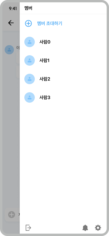
현재 진행하는 프로젝트에서 카톡과 같이 SideBar 메뉴를 만들 일이 생겼다.
Compose에서는 기본적으로 NavigationDrawer 를 사용하여 왼쪽에서 오른쪽으로 나오게 구현할 수 있지만, 이 SideBar가 하필 오른쪽에 붙어있어야 한다는 것이였다.
음.. 방법이 없나?
방법1
CompositionLocalProvider 를 통해 LocalLayoutDirection 의 방향을 변경하는 것이다.
LocalLayoutDirection는 레이아웃의 방향을 결정한다. 즉 레이아웃을 좌우 반전시키면 해당 문제를 해결할 수 있다.
Material에서 지원하는 Scaffold는 왼쪽에서 오른쪽으로 나오는 drawerContent를 가질 수 있기에 상위 부모, 하위 자식들에 대해 방향을 반전시키면 된다.
@Composable
fun ScaffoldDemo() {
val materialBlue700 = Color(0xFF1976D2)
val scaffoldState = rememberScaffoldState(rememberDrawerState(DrawerValue.Open))
CompositionLocalProvider(LocalLayoutDirection provides LayoutDirection.Rtl) {
Scaffold(scaffoldState = scaffoldState,
topBar = {
CompositionLocalProvider(LocalLayoutDirection provides LayoutDirection.Ltr) {
TopAppBar(title = { Text("TopAppBar") }, backgroundColor = materialBlue700)
}
},
drawerContent = {
CompositionLocalProvider(LocalLayoutDirection provides LayoutDirection.Ltr) {
Text(text = "drawerContent", color = Color.Black, fontSize = 55.sp)
}
},
}
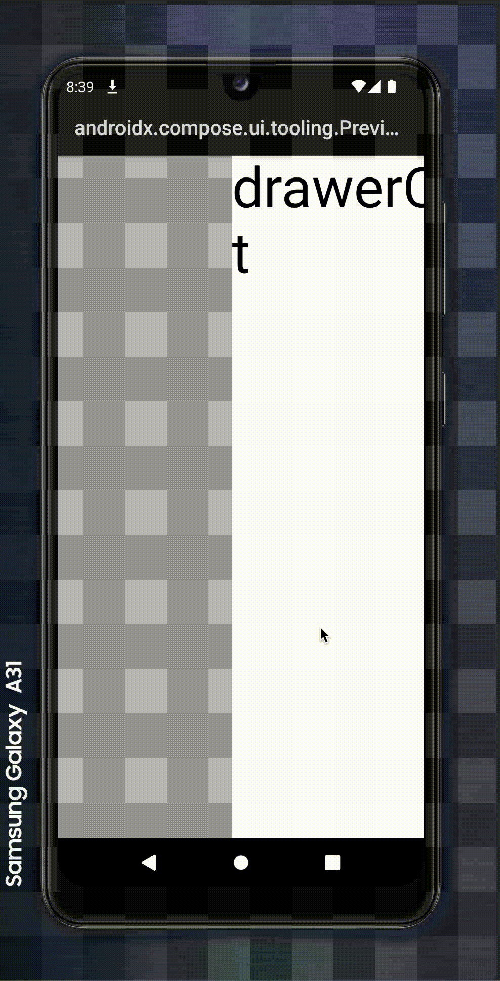
}오! 되기는 했다.
하지만 코드 가독성 면에서 뎁스가 깊어져 코드를 알아보기 힘들 뿐더러, 각 하위 뷰에도 방향을 뒤집어야한다는 큰 문제점이 존재한다.
음.. 다른건 없을까?
방법2
여러가지로 방법을 모색하던중 Jetpack Compose 1.6.0-alpha01 부터 제공된 Modifier.anchoredDraggable 를 이용해서 SideBar를 구현할 수 있었다.
anchoredDraggable은 기본적으로 콘텐츠에 적용되며, AnchoredDraggableState를 통해 드래그의 작동방식을 결정한다.
@ExperimentalFoundationApi
<T : Any?> AnchoredDraggableState(
    initialValue: T,
    anchors: DraggableAnchors<T>,
    positionalThreshold: (totalDistance: Float) -> Float,
    velocityThreshold: () -> Float,
    snapAnimationSpec: AnimationSpec<Float>,
    decayAnimationSpec: DecayAnimationSpec<Float>,
    confirmValueChange: (newValue) -> Boolean
)- initialValue 는 기본값을 의미합니다.
- anchors 는 드래그의 상태가 지정될 위치를 의미합니다.
현재 구현할 SideBar의 핵심 요소입니다. - positionalThreshold 는 앵커 사이의 거리에 따라 다음 앵커로 애니메이션을 적용할지 아니면 돌아갈지에 대한 여부를 결정합니다.
- velocityTheshold 는 positionalThreshol와 관계 없이 다음 앵커에 애니메이션을 적용해야 할지에 대한 여부를 결정합니다.
- snapAnimationSpec 는 드래그시 애니메이션을 적용할 방법에 대해 결정합니다.
- decayAnimationSpec 는 목표상태에 도달하거나 교차할 만큼 빠르게 스크롤할 때 사용되는 애니메이션에 대해 결정합니다.
- confirmValueChange 는 콘텐츠가 변경사항을 거부하는데 사용되는 선택적 람다입니다.
해당 anchoredDraggable을 사용해 스크롤 구현하고, 화면의 사이즈를 구해 그만큼 밀려나도록 만들었다.
enum class DragState {
START,
END,
}
@Preview
@OptIn(ExperimentalFoundationApi::class)
@Composable
fun Test() {
val density = LocalDensity.current
val screenSizeDp = LocalConfiguration.current.screenWidthDp.dp
val screenSizePx = with(density) { screenSizeDp.toPx() }
val anchors = remember {
DraggableAnchors {
DragState.START at 0f
DragState.END at screenSizePx
}
}
val anchoredState = remember {
AnchoredDraggableState(
initialValue = DragState.START,
animationSpec = tween(),
positionalThreshold = {
0f
},
velocityThreshold = {
0f
},
)
}
val sizeModifier = if (anchoredState.currentValue == DragState.START || anchoredState.targetValue == DragState.START) Modifier.fillMaxSize() else Modifier.size(0.dp)
SideEffect {
anchoredState.updateAnchors(anchors, DragState.START)
}
Box(
modifier = Modifier
.then(sizeModifier)
.anchoredDraggable(anchoredState, orientation = Orientation.Horizontal)
.background(Black.copy(alpha = 0.3f)),
) {
Box(
modifier = Modifier
.fillMaxHeight()
.clickable(
interactionSource = NoInteractionSource(),
indication = null,
onClick = { },
),
)
Box(
modifier = Modifier
.offset {
IntOffset(
x = anchoredState
.requireOffset()
.roundToInt(),
y = 0,
)
}
.fillMaxSize()
.background(White),
) {
Text(text = "drawerContent", color = Color.Black, fontSize = 55.sp)
}
}
}
요구사항에 적절하게 만들어졌다!
이제 재활용할 수 있게 만들어보자.
나는 Material3에는 drawerContent가 빠졌지만 다시 넣어서 깔끔하게 관리하고 싶었다.
그래서 이번에 RightSideScaffold를 정의하게 되었다.
enum class DragState {
    START,
    END,
}

@OptIn(ExperimentalFoundationApi::class)
@Composable
fun SeugiRightSideScaffold(
    modifier: Modifier = Modifier,
    topBar: @Composable () -> Unit = {},
    bottomBar: @Composable () -> Unit = {},
    snackbarHost: @Composable () -> Unit = {},
    sideBar: @Composable BoxScope.() -> Unit = {},
    state: AnchoredDraggableState<DragState>,
    startPadding: Dp = 0.dp,
    onSideBarClose: () -> Unit = {},
    floatingActionButton: @Composable () -> Unit = {},
    floatingActionButtonPosition: FabPosition = FabPosition.End,
    containerColor: Color = MaterialTheme.colorScheme.background,
    contentColor: Color = contentColorFor(containerColor),
    contentWindowInsets: WindowInsets = ScaffoldDefaults.contentWindowInsets,
    content: @Composable (PaddingValues) -> Unit,
) {
    val sizeModifier = if (state.currentValue == DragState.START || state.targetValue == DragState.START) Modifier.fillMaxSize() else Modifier.size(0.dp)

    Box(
        modifier = modifier,
    ) {
        Scaffold(
            modifier,
            topBar,
            bottomBar,
            snackbarHost,
            floatingActionButton,
            floatingActionButtonPosition,
            containerColor, contentColor,
            contentWindowInsets,
            content,
        )
        Box(
            modifier = Modifier
                .then(sizeModifier)
                .anchoredDraggable(state, orientation = Orientation.Horizontal)
                .background(Black.copy(alpha = 0.3f)),
        ) {
            Box(
                modifier = Modifier
                    .fillMaxHeight()
                    .width(startPadding)
                    .clickable(
                        interactionSource = NoInteractionSource(),
                        indication = null,
                        onClick = onSideBarClose,
                    ),
            )
            Box(
                modifier = Modifier
                    .offset {
                        IntOffset(
                            x = state
                                .requireOffset()
                                .roundToInt(),
                            y = 0,
                        )
                    }
                    .fillMaxSize()
                    .padding(
                        start = startPadding,
                    )
                    .background(White),
            ) {
                sideBar()
            }
        }
    }
}
이를 통해 실제 사용에는 적은 코드와 얕은 뎁스로 사용할 수 있게 되었다. 또 DraggableAnchors을 상위에서 넘겨주기에 더욱 효율적이다.
결론
실제 사용에는 방법2가 옳다고 본다. 좌우반전은 뎁스가 생각보다 깊고 이로 인해 무슨 문제가 생길지 모른다.