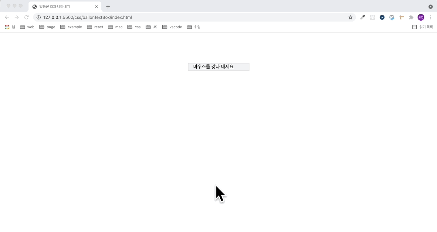
프로젝트 진행 중 말풍선 효과 나타내기가 디자인으로 나왔다.
찾아보니 css 만으로 간단하게 만드는 방법이 있길래 코드를 공유하고자 작성했습니다.
<!DOCTYPE html>
<html lang="en">
<head>
<meta charset="UTF-8" />
<meta http-equiv="X-UA-Compatible" content="IE=edge" />
<meta name="viewport" content="width=device-width, initial-scale=1.0" />
<link rel="stylesheet" href="./index.css" />
<title>말풍선 효과 나타내기</title>
</head>
<body>
<div id="menu">
<div>
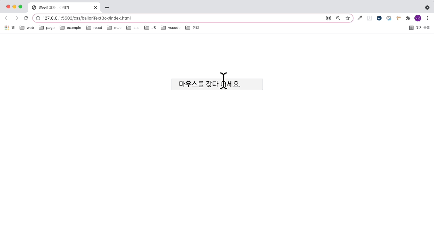
<span>마우스를 갖다 대세요.</span>
<p class="arrow_box">말풍선 등장!</p>
</div>
</div>
</body>
</html>
#menu {
  width: 200px;
  margin: 100px auto;
  background: #f3f3f3;
  border: 1px solid #d8d8d8;
  text-align: center;
}
#menu div {
  position: relative;
  display: inline-block;
}

span {
  display: flex;
  width: 200px;
  padding: 2px 16px;
  cursor: pointer;
}

/* 말풍선 적절한 top 과 margin-left 로 위치조정 */
.arrow_box {
  display: none;
  position: absolute;
  width: 100px;
  padding: 8px;
  left: 0;
  -webkit-border-radius: 8px;
  -moz-border-radius: 8px;
  border-radius: 8px;
  background: #333;
  color: #fff;
  font-size: 14px;
}

.arrow_box:after {
  position: absolute;
  bottom: 100%;
  left: 50%;
  width: 0;
  height: 0;
  margin-left: -10px;
  border: solid transparent;
  border-color: rgba(51, 51, 51, 0);
  border-bottom-color: #333;
  border-width: 10px;
  pointer-events: none;
  content: ' ';
}

span:hover + p.arrow_box {
  display: block;
}
