요소 단위를 내가 원하는 위치에 어떻게 배치할 것인지 살펴보도록 하겠습니다.
block과 inline
CSS는 컨텐츠의 내용을 꾸밀 뿐만 아니라 컨텐츠의 위치를 적절히 배치하는 역할을 수행합니다.
display
가장 처음 살펴볼 프로퍼티는 display입니다 display는 요소가 보여지는 방식을 지정하는 프로퍼티입니다.
<h1>h1 태그</h1>
<div>div 태그</div>
<span>span 태그</span>
<p>p 태그</p>
<a href="/">a 태그</a>
<article>article 태그</article>
<strong>strong 태그</strong>
<li>li 태그</li>
h1, div, p, article, li {
background-color: pink;
}
span, a, strong{
background-color: skyblue;
}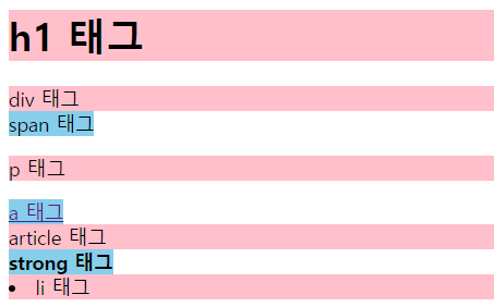
다음 결과물을 보면 배경색만 지정했음에도 출력되는 형태가 각각 다른 것을 확인할 수 있습니다.
이는 각각의 HTML 태그가 다른 display 프로퍼티 값을 기본 스타일로 가지고 있기 때문입니다. HTML 요소들은 display 속성의 기본 값으로 block 혹은 inline을 가지고 있습니다.
display : block 과 display: inline
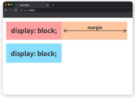
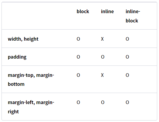
display : block을 가지고 있는 요소는 항상 새로운 줄에서 시작합니다. 또한 width : 100% 를 기본 값으로 갖습니다.
이러한 display: block을 가지고 있는 태그로는 div, h1~h6, p, footer, section 등이 이에 해당합니다.
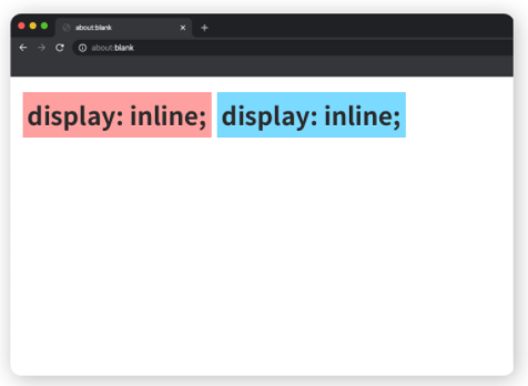
display : inline을 가지고 있는 inline 요소는 block과 달리 새로운 줄에서 시작하지 않으며 필요한 만크의 너비만 가집니다. 즉, 요소의 컨텐츠 크기 만큼만 너비를 가진다는 말과 동일합니다.
이러한 display : inline 요소는 span, a, img 등이 해당합니다.
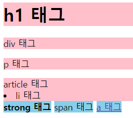
block는 덩어리 막다의 의미를 가지고 있습니다. 이는 다른 요소들이 올 수 없도록 혼자 한 줄을 차지하고 막고 있는 것입니다. 만약 크기를 지정하더라도 남은 길이를 margin으로 채워 옆으로 다른 요소가 오는 것을 막습니다.
inline은 일렬로 늘어선 이란 뜻을 가지고 있습니다. display : inline 역시 이러한 뜻으로 사용됩니다. strong, span, a 태그가 이러한 예에 해당합니다.
display-block과 inline 각각의 목적, 즉 쓰임을 정확히 알고 있어야 앞으로의 사용에도 도움이 될 것입니다.
먼저 block은 전체 문단과 같이 큰 맥락을 가질 때 사용하는 반면, inline은 그 안에 들어가는 단어, 링크 ,이미지 등에 쓰입니다. 한편 block의 경우 width, height, margin, padding을 모두 사용가능하지만 inline은 width, height, margin-top, margin-bottom 프로퍼티를 지정할 수 없습니다.
inline-block
inline-block은 block괴 inline의 요소의 특징을 모두 가집니다. 기본적인 쓰임은 inline과 동일하나 width, height, margin-left, margin-right을 지정할 수 있습니다.
display : none
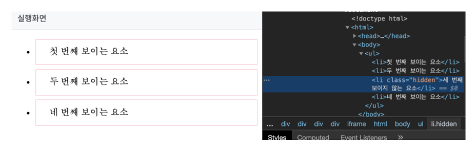
display:none은 브라우저에 해당 요소가 출력되지 않게 만들어 줍니다.
<ul>
	<li>첫 번째 보이는 요소</li>
	<li>두 번째 보이는 요소</li>
	<li class="hidden">세 번째 보이지 않는 요소</li>
	<li>네 번째 보이는 요소</li>
</ul>
li {
border: 1px solid pink;
padding: 12px 24px;
margin-bottom: 8px;
}
li.hidden {
display: none;
}display: none 이 지정된 li는 아예 출력되지는 않습니다. 하지만 개발자 도구에서는 출력이 됩니다.
position
position은 이름 그대로 요소를 배치하는 방법을 정하는 프로퍼입니다.
position-static
보통 요소의 position 값은 statoc이 기본입니다. ㄴtatic에서는 좌표 프로퍼티를 사용할 수 없습니다.
top, right, bottom, left
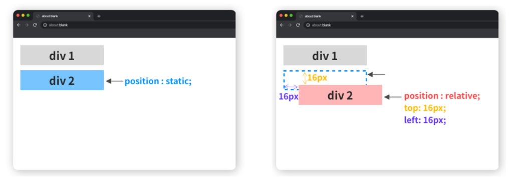
position: relative
relative는 말 그대로 상대위치를 말합니다. 기본 위치를 기준으로 좌표 프로퍼티를 사용하여 위치를 이동합니다. 좌표 프로포티를 사용하여 이동할 수 있다는 점만 제외하면 나머지는 static과 동일합니다.
예를 들어 다음과 같이 코드를 작성하게 되면
.static {
	position: static;
	background: pink;
	left: 16px;
	top: 16px;
}
.relative {
	position: relative;
	background: skyblue;
	left: 16px;
	top: 16px;
}
position을 relative로 설정한 경우에는 원래 static으로 설정한 위치에서 변경이 되는 것을 확인할 수 있습니다.
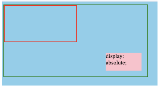
position : absolute
absolute는 절대 위치입니다. 이 부분은 부모 요소나 조상 요소 중 relative, absolute 혹은 fixed 가 선언된 곳을 기준으로 좌표 프로퍼티가 작동됩니다.
예제)
<div class="ancestor">
	<div class="parent">
		<div class="box absolute">display: absolute;</div>
	</div>
</div>
body {
background-color: skyblue;
}
.box {
width: 100px;
height: 50px;
}
.ancestor {
border : 2px solid green;
width: 400px;
height: 200px;
position: relative;
}
.parent {
border: 2px solid red;
width: 200px;
height: 100px;
}
.absolute {
background-color: pink;
position: absolute;
bottom: 16px;
right: 16px;
}이렇게 코드가 구성된 경우 ancestor에 position이 relative로 존재하므로 .ancestor를 기준으로 배치가 됨을 알 수 있습니다.
position : fixed
fixed는 간단합니다. 보이는 화면을 기준으로 좌표 프로퍼티를 이용하여 위치를 고정시킵니다. 스크롤 하더라도 따라다니는 메뉴가 바로 fixed를 활용한 것입니다.
<div class="parent">
	<div class="box fixed">position: fixed;</div>
	<div class="box absolute top">position: absolute;</div>
	<div class="box absolute bottom">position: absolute;</div>
</div>
.box {
width: 100px;
height: 50px;
}
.parent {
height: 2400px;
position: relative;
border: 2px solid blue;
}
.absolute{
position: absolute;
background-color: skyblue;
}
.top {
top: 16px;
left: 16px;
}
.bottom {
bottom: 16px;
right: 16px;
}
.fixed {
position: fixed;
right: 16px;
top: 16px;
background-color: pink;
}z-index
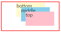
z-index를 통해 수직으로 어떻게 쌓이는지 정하는 프로퍼티로, 값은 숫자로 표현됩니다. 숫자가 클수록 전면에 출력됩니다. static을 제외한 요소에만 적용됩니다.
<div class="parent">
	<div class="box top">top</div>
	<div class="box middle">middle</div>
	<div class="box bottom">bottom</div>
</div>
.box {
width: 100px;
height: 50px;
position: absolute;
}
.parent {
position: relative;
border: 2px solid red;
width: 200px;
height: 100px;
}
.top {
background-color: pink;
right: 16px;
bottom: 16px;
z-index: 50;
}
.middle {
background-color: skyblue;
right: 32px;
bottom: 32px;
z-index: 25;
}
.bottom {
background-color: lemonchiffon;
right: 48px;
bottom: 48px;
z-index: 1;
}
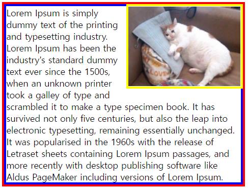
float
float 프로퍼티는 말 그대로 요소를 어떻게 띄울지 결정합니다. 이러한 float 프로퍼티는 요소를 디자인 흐름에서 벗어나게 한 뒤, 사용자가 지정한 방향에 배치하도록 하는 프로퍼티입니다.
.container {
	border: 4px solid red;
}
.text {
	margin: 0;
	border: 4px solid blue;
}
.cat-img {
	border: 4px solid yellow;
	width: 200px;
	float: right;
}
즉, 이렇게 float을 두게 되면 다음과 같이 이미지가 표현됨을 알 수 있습니다.
출처)
groom-edu
해당 내용은 k-digital credit 구름 강의 내용을 보고 정리한 내용입니다.