(노마드코더 CSS Layout 마스터클래스 필기입니다.)
variables
_variables.scss 만들어주고
styles.scss에 임포트!
_variables에서 $title, $bg 등으로 지정해주고 나서,
style.scss에서 자유롭게 사용이 가능하다.
Nesting
.box {
margin-top: 20px;
}

.box h2 {
color: blue;
}

.box button {
color: red;
}

.box: hover{
background-color:green;
}
Nesting을 사용하면 위 코드를 아래와 같이 적을 수 있다.
html구조를 파악하기 훨씬 쉽다! 가독성이 뛰어난 코드가 된다!
.box{
  marin-top: 20px;
  &:hover{
    background-color:green;
  }
  h2{
    color: blue;
  }
  button{
    color: red;
  }
}
Mixins
- scss functionality를 재사용할 수 있도록 돕는다!
- react가 나만의 태그(컴포넌트)를 만들어준다면, mixins는 scss에서 나만의 디자인템플릿을 만드는 과정이라 생각해도 좋을 것 같다.
- _mixins라는 파일을 따로 만들고나서!
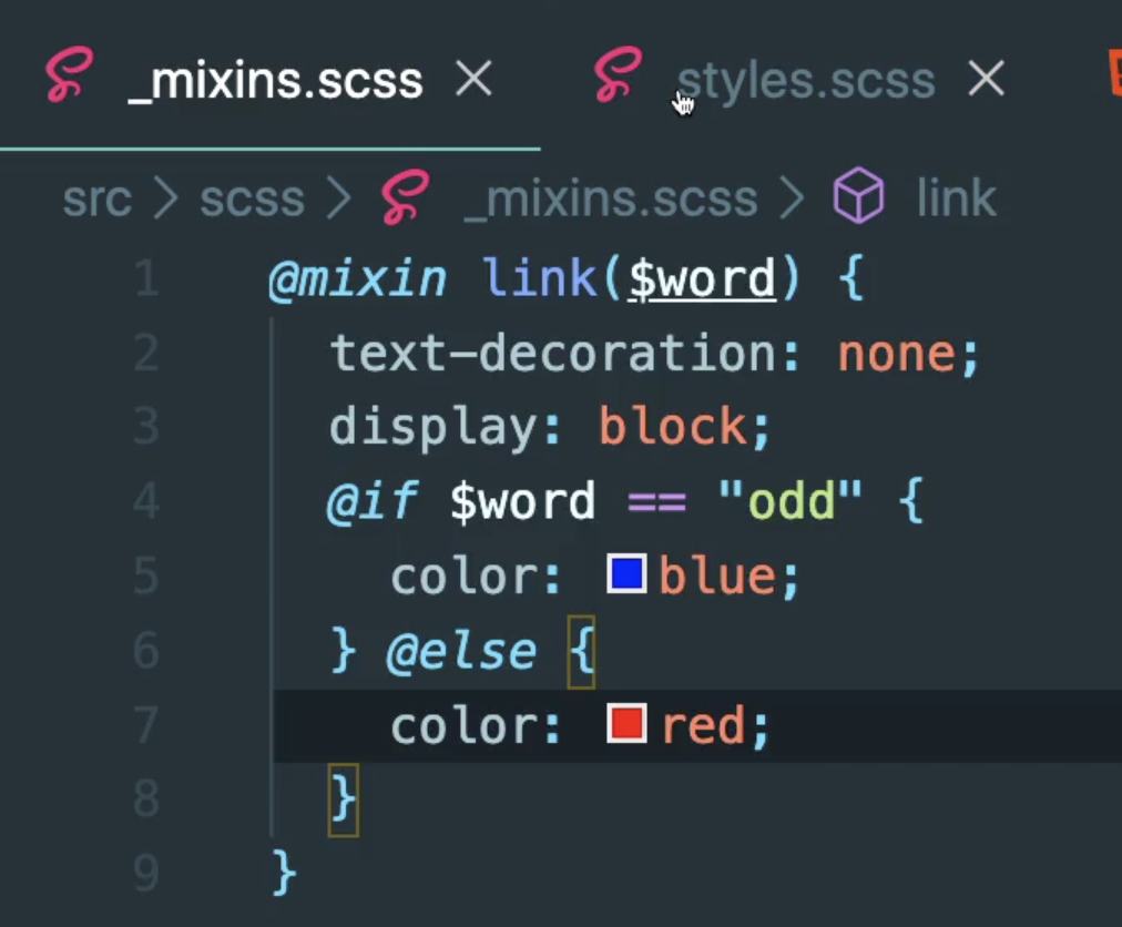
@mixin link($color){
  text-decoration: none;
  display: block;
  color: $color;
}
위와 같이 작성해주고,
아래와 같이 사용한다!
@import "_mixins"

a {
  margin-bottom: 10px;
  &:nth-child(odd){
    @include link(blue);
  }
  &:nth-child(even){
    @include link(red);
  }
}
여러 개에 같은 걸 적용해주면서도 조금씩 다른 바리에이션을 줄 때 아주 유용하다.
mixin을 이용하면 위와 같은 코드를 작성할 수도 있는데...
왜 프로그래밍 언어처럼 바꿀 수 있다고 하는지 알겠음...
extends
-
같은 코드를 반복하고 싶지 않을 때 사용한다.
-
mixin은 같은 코드를 상황에 따라 다르게 코딩을 하고 싶을 때 사용하는 것.
-
extend는 말 그대로 다른 코드를 확장하거나 코드를 재사용하고 싶을 때 사용하면 된다.
-
%를 사용한다!
%button{
  border-radius: 7px;
  font-size: 12px;
  text-transform: uppercase;
  padding: 5px 10px;
  background-color: peru;
  color: white;
  font-weight: 500;
}
@import "_buttons"
a{
@extend %button;
text-decoration: none;
}
button{
@extend %button;
border: none;
}Mixin @content
$minIphone: 500px;
$maxIphone: 690px;
$minTablet: $minIphone + 1;
$maxTablet: 1120px;

@mixin responsive($device) {
  @if $device == "iphone" {
    @media screen and (min-width: $minIphone) and (max-width: $maxIphone) {
      @content;
    }
  } @else if $device == "tablet" {
    @media screen and (min-width: $minTablet) and (max-width: $maxTablet) {
      @content;
    }
  } @else if $device == "iphone-l" {
    @media screen and (max-width: $minIphone) and (max-width: $maxIphone) and (orientation: landscape) {
      @content;
    }
  } @else if $device == "ipad-l" {
    @media screen and (min-width: $minTablet) and (max-width: $maxTablet) and (orientation: landscape) {
      @content;
    }
  }
}
@import "_mixins";
h1 {
color: red;
@include responsive("iphone") {
color: yellow;
}
@include responsive("iphone-l") {
font-size: 60px;
}
@include responsive("tablet") {
color: green;
}
}

부정확한 정보나 잘못된 정보는 댓글로 알려주시면 빠르게 수정토록 하겠습니다, 감사합니다!