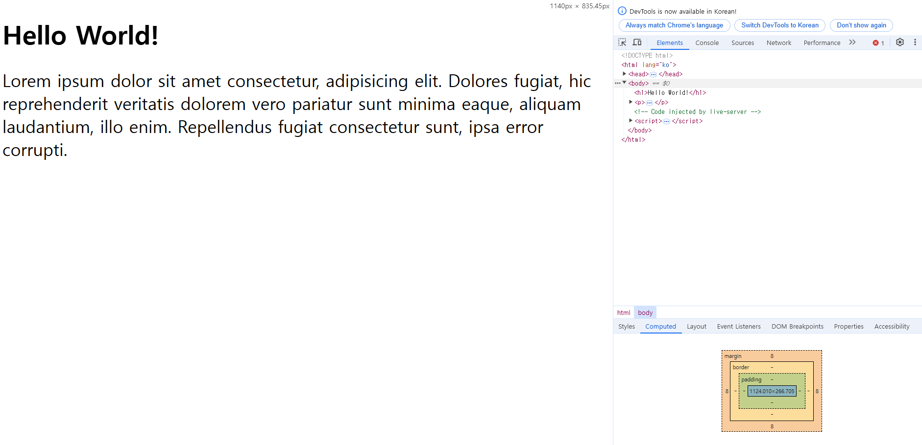
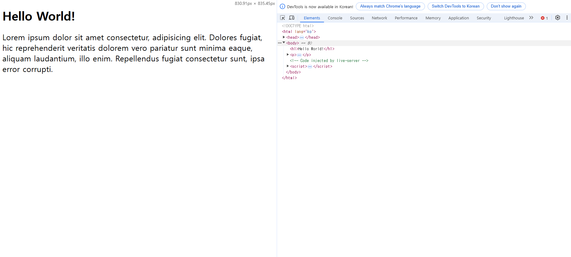
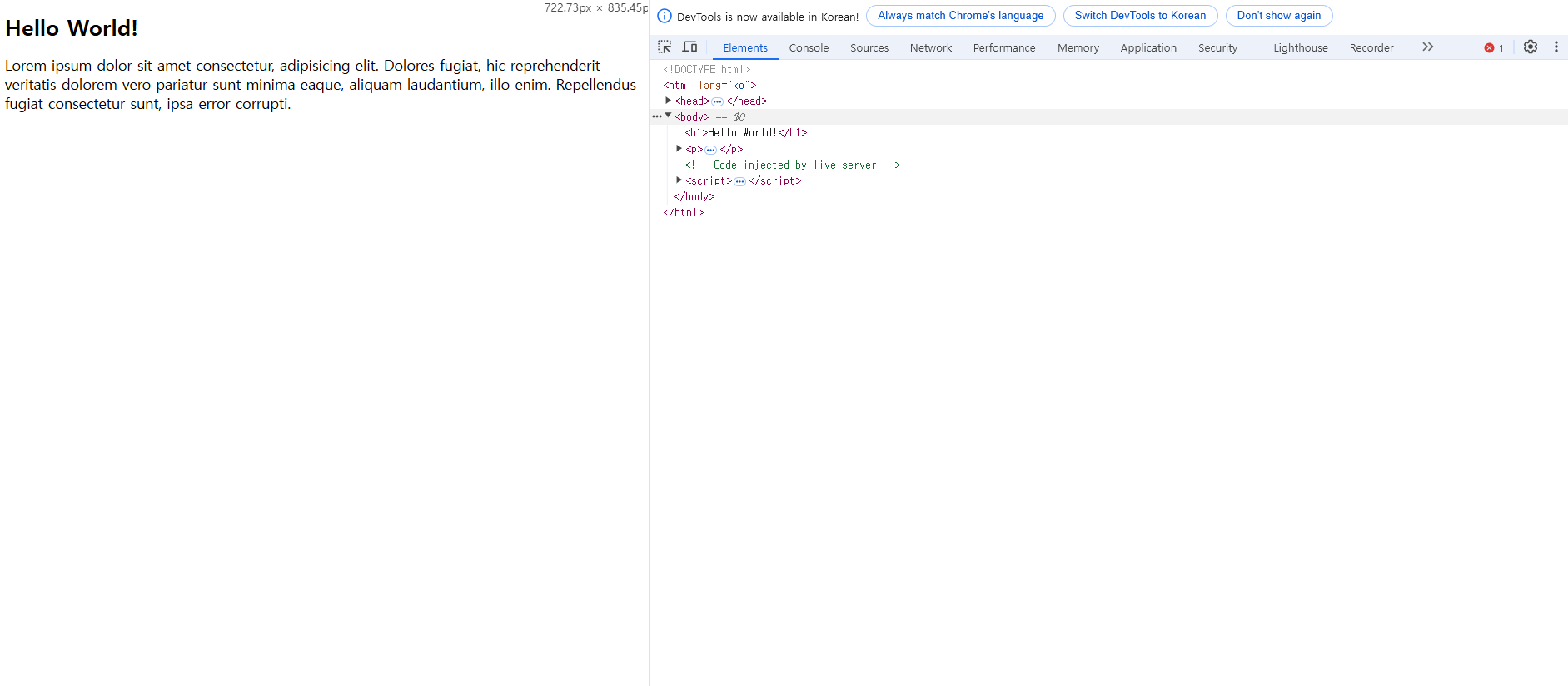
1. 반응형 웹

	- 브라우저 사이즈에 맞춰서 레이아웃이 바뀌는 것 = 반응형 웹디자인 (Responsive Web Design)
    - 반응형 웹을 통해서 브라우저 크기에 상관없이 사이트를 사용할 수 있도록 한다.
index.html
<!DOCTYPE html>
<html lang="ko">
<head>
<meta charset="UTF-8">
<meta name="viewport" content="width=device-width, initial-scale=1.0">
<link rel="stylesheet" href="style.css">
<title>responsive web</title>
</head>
<body>
<h1>Hello World!</h1>
<p>Lorem ipsum dolor sit amet consectetur, adipisicing elit. Dolores fugiat,
hic reprehenderit veritatis dolorem vero pariatur sunt minima eaque, aliquam
laudantium, illo enim. Repellendus fugiat consectetur sunt, ipsa error corrupti.</p>
</body>
</html>
style.css
h1 {
font-size: 24px;
}
p {
font-size: 16px;
}
@media (min-width: 768px) {
/* 브라우저의 가로 길이가 768px이상이 되면 아래의 css가 적용된다. */
h1 {
font-size: 36px;
}
p {
font-size: 24px;
}
}
@media (min-width: 992px) {
/* 브라우저의 가로 길이가 992px이상이 되면 아래의 css가 적용된다. */
h1 {
font-size: 48px;
}
p {
font-size: 32px;
}
}
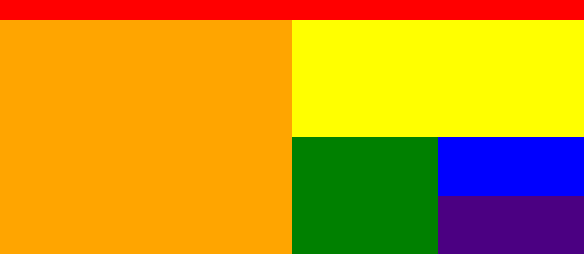
2. 반응형 그리드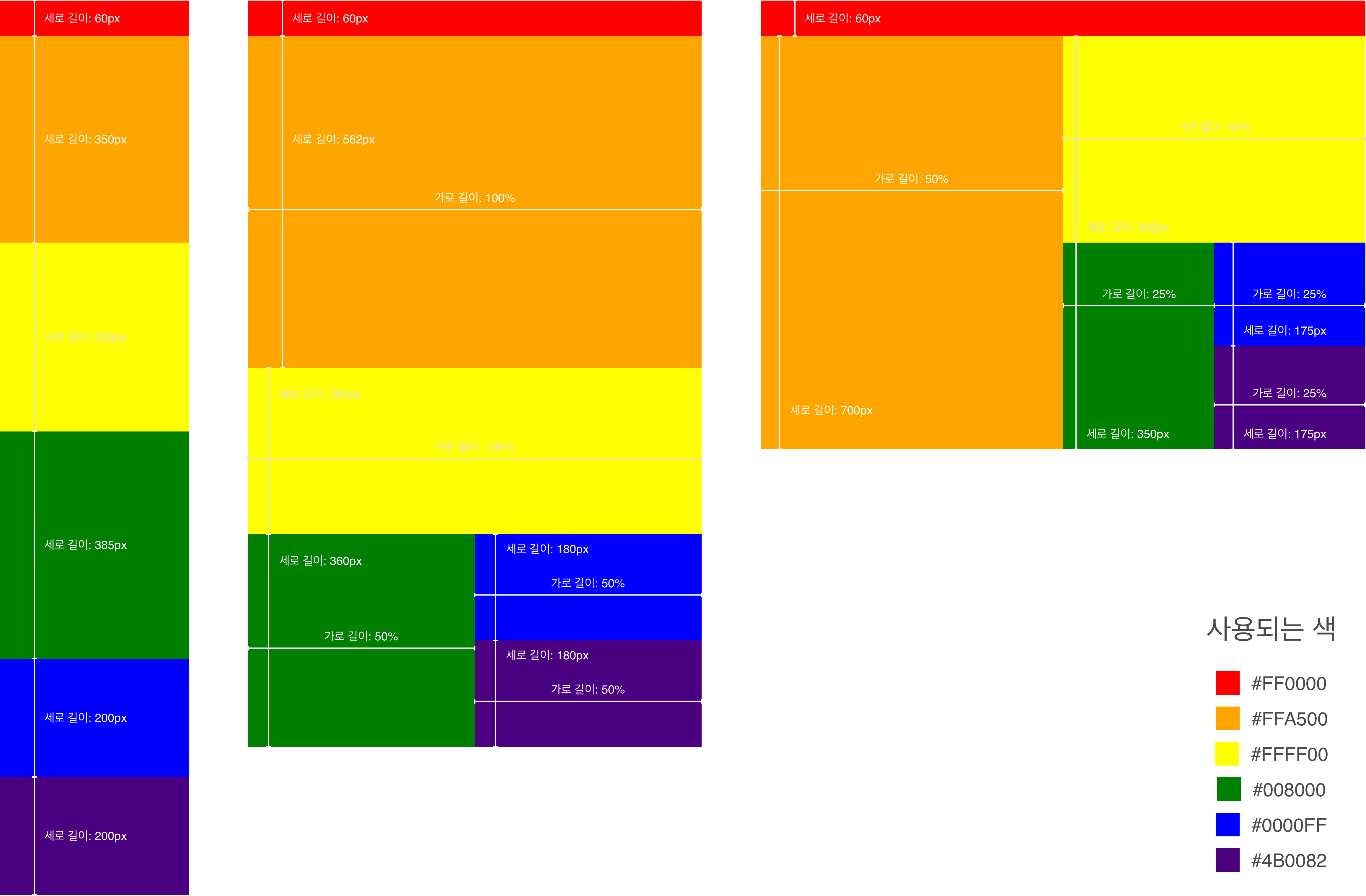
위와 같은 반응형 그리드를 만들어 보세요.
크게 세 가지로 나누어집니다.
- 왼쪽: 모바일 사이즈 (767px 이하)
- 가운데: 타블릿 사이즈 (768px 이상, 991px 이하)
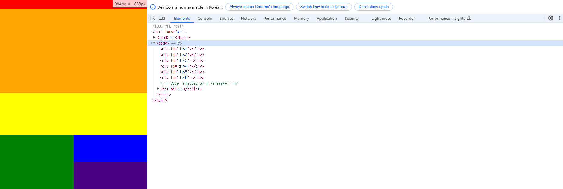
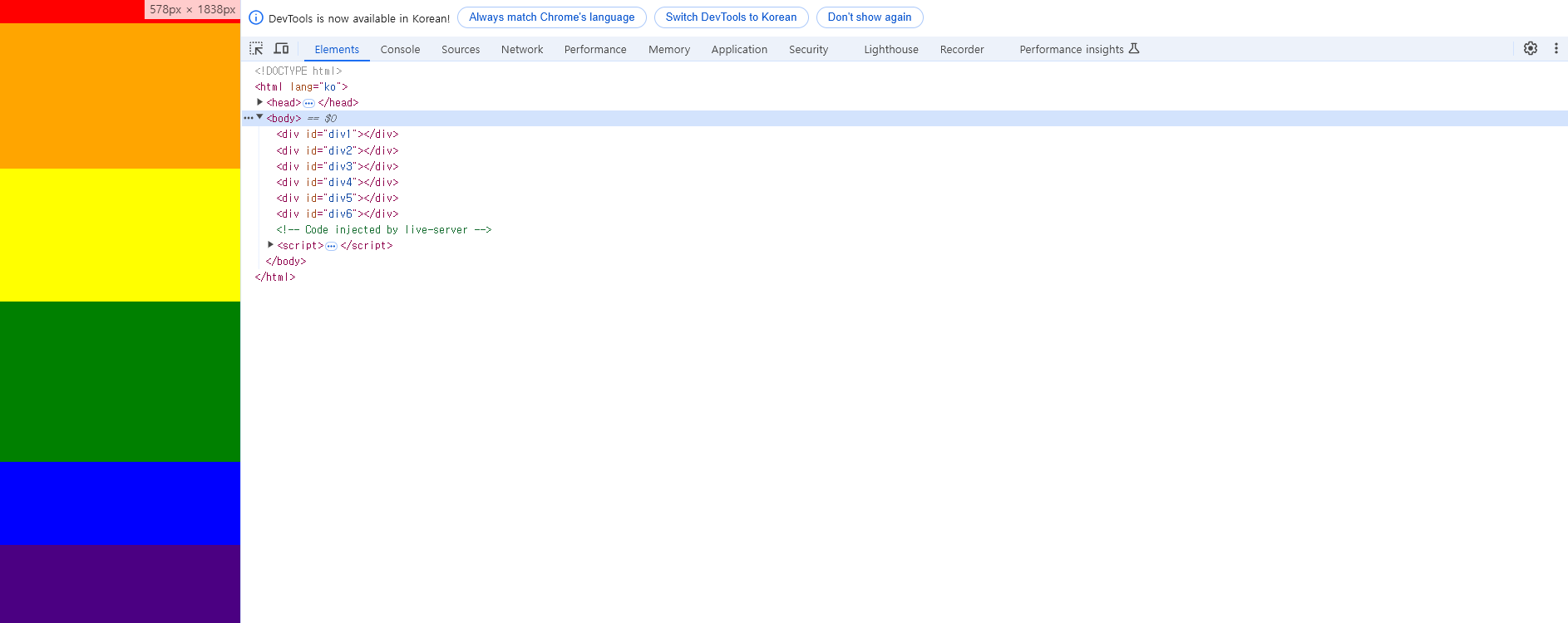
- 오른쪽: 데스크탑 사이즈 (992px 이상)index.html
<!DOCTYPE html>
<html lang="ko">
<head>
<meta charset="UTF-8">
<meta name="viewport" content="width=device-width, initial-scale=1.0">
<link rel="stylesheet" href="style.css">
<title>responsive web</title>
</head>
<body>
<div id="div1"></div>
<div id="div2"></div>
<div id="div3"></div>
<div id="div4"></div>
<div id="div5"></div>
<div id="div6"></div>
</body>
</html>
style.css
body {
margin: 0;
}
#div1 {
width: 100%;
height: 60px;
background-color: #ff0000;
}
#div2 {
width: 100%;
height: 350px;
background-color: #ffa500;
}
#div3 {
width: 100%;
height: 320px;
background-color: #ffff00;
}
#div4 {
width: 100%;
height: 385px;
background-color: #008000;
}
#div5 {
width: 100%;
height: 200px;
background-color: #0000ff;
}
#div6 {
width: 100%;
height: 200px;
background-color: #4b0082;
}
/* Tablet */
@media (min-width: 768px) {
div {
float: left;
}
#div2 {
height: 562px;
}
#div3 {
height: 282px;
}
#div4 {
width: 50%;
height: 360px;
}
#div5 {
width: 50%;
height: 180px;
}
#div6 {
width: 50%;
height: 180px;
}
}
/* Desktop */
@media (min-width: 992px) {
#div2 {
width: 50%;
height: 700px;
}
#div3 {
width: 50%;
height: 350px;
}
#div4 {
width: 25%;
height: 350px;
}
#div5 {
width: 25%;
height: 175px;
}
#div6 {
width: 25%;
height: 175px;
}
}
3. 이노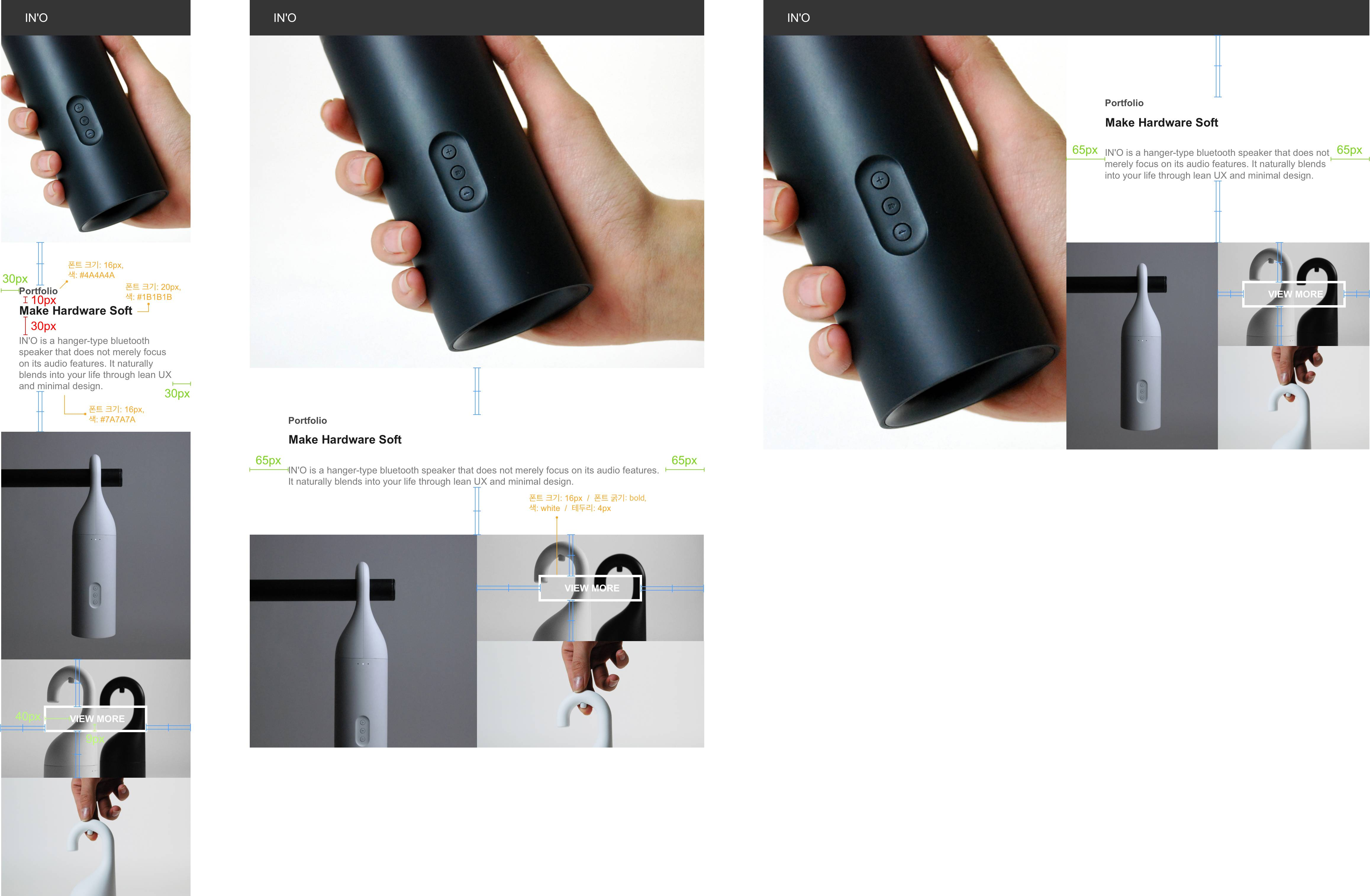
- 옷걸이처럼 걸어 놓을 수 있는 블루투스 스피커 '이노'를 홍보하는 사이트를 만들어보려고 합니다.
  위에 있는 도면을 따라 반응형 웹사이트를 만들어 주세요.

1. 그리드는 반응형 그리드 과제에서 만든 것을 그대로 사용하면 됩니다!(width, height 도 동일합니다)
2. 초록색 선은 padding, 빨간색 선은 margin, 파란색 선은 가운데 정렬(가로 혹은 세로)을 뜻합니다.
3. 모든 사진은 background-image를 통해 넣었습니다.
4. In'o 글자의 font-size는 20px 글자색은 white입니다.
5. In'o 글자가 속한 div 태그의 background-color 는 #353535입니다.
index.html
<!DOCTYPE html>
<html lang="ko">
<head>
<meta charset="UTF-8">
<meta name="viewport" content="width=device-width, initial-scale=1.0">
<link rel="stylesheet" href="/css/style.css">
<title>IN'O</title>
</head>
<body>
<div class="navbar col">
<span class="logo">IN`O</span>
</div>
<div class="banner col"></div>
<div class="info col">
<div class="helper"></div><div class="warp">
<div class="label">Portfolio</div>
<h2>Make Hardware Soft</h2>
<p>IN'O is a hanger-type bluetooth speaker that does not merely focus on its audio features. It naturally blends into your life through lean UX and minimal design.</p>
</div>
</div>
<div class="img-div1 col"></div>
<div class="img-div2 col">
<div class="helper"></div><a href="#">VIEW MORE</a>
</div>
<div class="img-div3 col"></div>
</body>
</html>
style.css
body {
margin: 0;
font-family: Arial, Helvetica, sans-serif;
}
.navbar {
width: 100%;
height: 60px;
background-color: #353535;
padding-left: 30px;
padding-right: 30px;
line-height: 60px;
}
.navbar .logo {
font-size: 20px;
color: white;
}
.banner {
width: 100%;
height: 350px;
background-image: url(../img/banner_img.jpg);
background-size: cover;
background-position: center center;
}
.info {
width: 100%;
height: 320px;
background-color: white;
}
.info .helper {
display: inline-block;
height: 100%;
vertical-align: middle;
}
.info .warp{
display: inline-block;
vertical-align: middle;
padding-left: 30px;
padding-right: 30px;
}
.info .label {
font-size: 16px;
color: #4a4a4a;
}
.info h2{
font-size: 20px;
color: #1b1b1b;
margin-top: 10px;
margin-bottom: 30px;
}
.info .helper {
display: inline-block;
height: 100%;
}
.info p{
font-size: 16px;
color: #7a7a7a;
margin: 0;
}
.img-div1 {
width: 100%;
height: 385px;
background-image: url(../img/img1.jpg);
background-size: cover;
background-position: center top;
}
.img-div2 {
width: 100%;
height: 200px;
background-image: url(../img/img2.jpg);
background-size: cover;
background-position: center top;
text-align: center;
}
.img-div2 .helper {
display: inline-block;
height: 100%;
vertical-align: middle;
}
.img-div2 a {
color: white;
font-weight: bold;
border: 4px solid white;
padding : 9px 40px;
text-decoration: none;
}
.img-div3 {
width: 100%;
height: 200px;
background-image: url(../img/img3.jpg);
background-size: cover;
background-position: center top;
}
/* Tablet */
@media (min-width: 768px) {
.col {
float: left;
}
.banner {
height: 562px;
}
.info {
height: 282px;
}
.info .warp{
padding-left: 65px;
padding-right: 65px;
}
.img-div1 {
width: 50%;
height: 360px;
}
.img-div2 {
width: 50%;
height: 180px;
}
.img-div3 {
width: 50%;
height: 180px;
}
}
/* Desktop */
@media (min-width: 992px) {
.banner {
width: 50%;
height: 700px;
}
.info {
width: 50%;
height: 350px;
}
.img-div1 {
width: 25%;
height: 350px;
}
.img-div2 {
width: 25%;
height: 175px;
}
.img-div3 {
width: 25%;
height: 175px;
}
}
Bootstrap

1. 새로운 기술을 배우는 법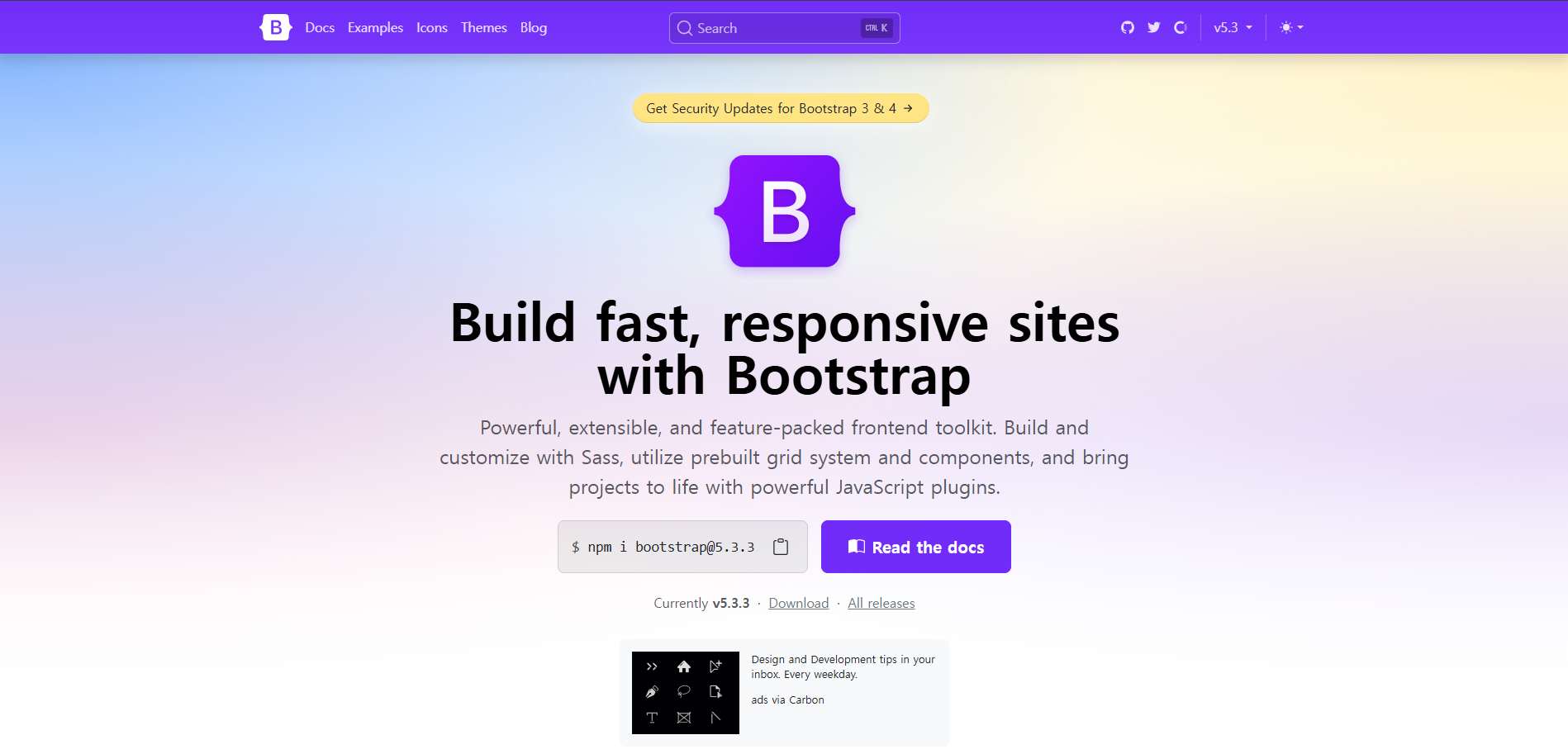
2. 부트스트랩 소개
   → 트위터의 개발자가 오픈소스로 제공해주는 HTML, CSS, JS Framework
   → 2024년 11월 기준 강의와 달리 bootstrap버전 5.3.3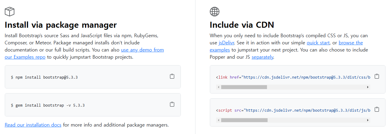
→ bootstrap을 시작하는 방법은 2가지가 있다.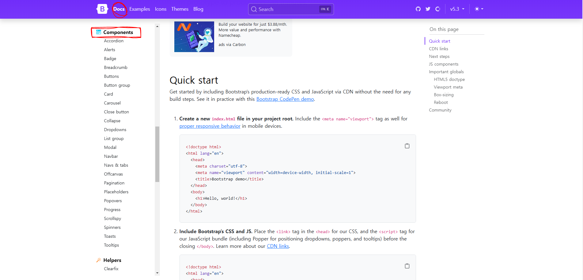
   → Framework는 미리 제공되는 코드이므로,
     bootstrap 사이트에서 docs메뉴 안의 components에서 필요한 부분을 찾아 적용하면 된다.
index.html

  <!DOCTYPE html>

  <html lang="ko">
  <head>
    <meta charset="UTF-8">
    <meta name="viewport" content="width=device-width, initial-scale=1.0">


    <link href="https://cdn.jsdelivr.net/npm/bootstrap@5.3.3/dist/css/bootstrap.min.css" rel="stylesheet" integrity="sha384-QWTKZyjpPEjISv5WaRU9OFeRpok6YctnYmDr5pNlyT2bRjXh0JMhjY6hW+ALEwIH" crossorigin="anonymous">

    <title>IN'O</title>
  </head>

  <body>
    <nav class="navbar navbar-expand-lg bg-body-tertiary">
      <div class="container-fluid">
        <a class="navbar-brand" href="#">Navbar</a>
        <button class="navbar-toggler" type="button" data-bs-toggle="collapse" data-bs-target="#navbarSupportedContent" aria-controls="navbarSupportedContent" aria-expanded="false" aria-label="Toggle navigation">
          <span class="navbar-toggler-icon"></span>
        </button>
        <div class="collapse navbar-collapse" id="navbarSupportedContent">
          <ul class="navbar-nav me-auto mb-2 mb-lg-0">
            <li class="nav-item">
              <a class="nav-link active" aria-current="page" href="#">Home</a>
            </li>
            <li class="nav-item">
              <a class="nav-link" href="#">Link</a>
            </li>
            <li class="nav-item dropdown">
              <a class="nav-link dropdown-toggle" href="#" role="button" data-bs-toggle="dropdown" aria-expanded="false">
                Dropdown
              </a>
              <ul class="dropdown-menu">
                <li><a class="dropdown-item" href="#">Action</a></li>
                <li><a class="dropdown-item" href="#">Another action</a></li>
                <li><hr class="dropdown-divider"></li>
                <li><a class="dropdown-item" href="#">Something else here</a></li>
              </ul>
            </li>
            <li class="nav-item">
              <a class="nav-link disabled" aria-disabled="true">Disabled</a>
            </li>
          </ul>
          <form class="d-flex" role="search">
            <input class="form-control me-2" type="search" placeholder="Search" aria-label="Search">
            <button class="btn btn-outline-success" type="submit">Search</button>
          </form>
        </div>
      </div>
    </nav>

    <script src="https://cdn.jsdelivr.net/npm/bootstrap@5.3.3/dist/js/bootstrap.bundle.min.js" integrity="sha384-YvpcrYf0tY3lHB60NNkmXc5s9fDVZLESaAA55NDzOxhy9GkcIdslK1eN7N6jIeHz" crossorigin="anonymous"></script>
  </body>
  </html>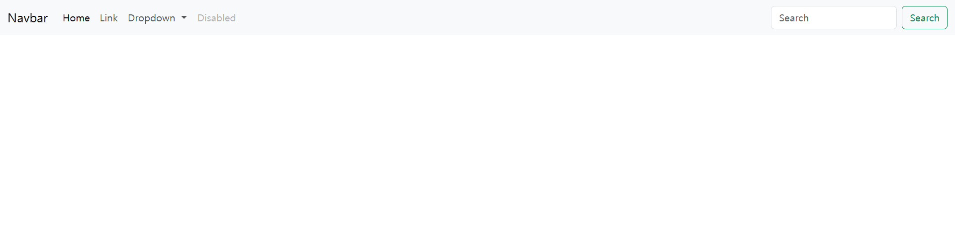
   → 제공된 코드를 copy해서 적용해보면 다양한 class들이 있는데 cdn으로 연결한 css 파일 안에
     제공된 코드를 스타일링 해주는 css 코드가 담겨 있다.
   → JS도 마찬가지로 다양한 태그들에 기능을 입혀주는 JS 코드가 연결한 cdn 파일 내부에 담겨 있다.
3. 부트스트랩 그리드
→ 부트스트랩의 그리드 시스템은 3가지로 구성된다.
(1) 컨테이너 (container)
(2) 행 (row)
(3) 열 (column)
→ 부트스트랩 사이트에 자세히 설명되어 있으나 많은 사람들이 무시하는 몇 가지 규칙은 다음과 같다.
→ 아래의 규칙만 지켜도 예상치 못한 레이아웃이 나올 확률을 거의 없다.
(1) 행(<div class="row">)은 꼭 컨테이너(<div class="container">) 안에 넣는다.
(2) 열(<div class="col">)은 꼭 행(<div class="row">)안에 넣는다.
오직 열만 행의 직속 자식이 될 수 있다.
(3) 콘텐츠(우리가 그리드에 넣고 싶은 내용)는 꼭 열(<div class="col">)안에 넣는다.
→ 부트스트랩 그리드에는 한 줄에 기본적으로 12칸의 열(column)이 있다.
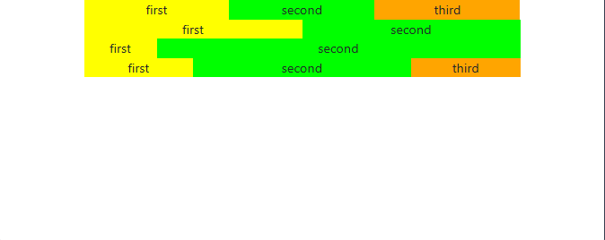
ex) 한 줄을 정확히 3등분 하고 싶다면 4칸을 차지하는 열 3개를 쓰면 된다.
4칸을 사용하는 열은 <div class="col-4">로 표현할 수 있다.
index.html

  <head>
    <link rel="stylesheet" href="https://maxcdn.bootstrapcdn.com/bootstrap/4.0.0-beta/css/bootstrap.min.css" integrity="sha384-/Y6pD6FV/Vv2HJnA6t+vslU6fwYXjCFtcEpHbNJ0lyAFsXTsjBbfaDjzALeQsN6M" crossorigin="anonymous">
  </head>

  <body>
    <div class="container">
      <div class="row">
        <!-- 정확히 3등분 -->
        <div class="col-4 first">first</div>
        <div class="col-4 second">second</div>
        <div class="col-4 third">third</div>
      </div>

      <div class="row">
        <!-- 정확히 2등분 -->
        <div class="col-6 first">first</div>
        <div class="col-6 second">second</div>
      </div>

      <div class="row">
        <!-- 1대 5 비율 -->
        <div class="col-2 first">first</div>
        <div class="col-10 second">second</div>
      </div>

      <div class="row">
        <!-- 1대 2대 1 비율 -->
        <div class="col-3 first">first</div>
        <div class="col-6 second">second</div>
        <div class="col-3 third">third</div>
      </div>
    </div>
  </body>


style.css

  .container {
    text-align: center;
  }

  .first {
    background-color: yellow;
  }

  .second {
    background-color: lime;
  }

  .third {
    background-color: orange;
  }
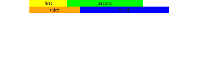
→ 만일 한 행에 12칸이 넘는 열이 들어가게 된다면 새로운 줄로 넘어간다.index.html
<head>
<link rel="stylesheet" href="https://maxcdn.bootstrapcdn.com/bootstrap/4.0.0-beta/css/bootstrap.min.css" integrity="sha384-/Y6pD6FV/Vv2HJnA6t+vslU6fwYXjCFtcEpHbNJ0lyAFsXTsjBbfaDjzALeQsN6M" crossorigin="anonymous">
</head>
<body>
<div class="container">
<div class="row">
<div class="col-3 first">first</div>
<div class="col-6 second">second</div>
<div class="col-4 third">third</div>
<div class="col-7 fourth">fourth</div>
</div>
</div>
</body>
style.css
.container {
text-align: center;
}
.first {
background-color: yellow;
}
.second {
background-color: lime;
}
.third {
background-color: orange;
}
.fourth {
background-color: blue;
}
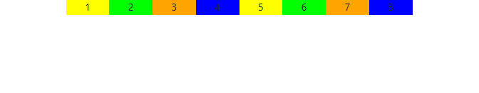
   → 왜 부트스트랩에서 한 줄을 12칸으로 나누었을까?

      ☞ 12는 상당히 많은 숫자들(1,2,3,4,6,12)로 나누어지므로 굉장히 유연한 숫자이다.

      ex) 8칸으로 나누고 싶더라도 12라는 숫자의 유연함 덕에 쉽게 나눌 수 있다.
          col-6를 두 개 쓰면 2등분이 가능하고, 그 안에서 또 col-3으로 4등분을 하면 8칸이 생긴다.

      ☞ 이런 식으로 열을 또 여러 열로 나누는 것을 중첩(nesting)이라고 부른다.
         중첩을 하기 위해서는 우선 열(<div class="col-6">)안에 새로운 행(<div class="row">)을
         써야 한다.
index.html

  <head>
    <link rel="stylesheet" href="https://maxcdn.bootstrapcdn.com/bootstrap/4.0.0-beta/css/bootstrap.min.css" integrity="sha384-/Y6pD6FV/Vv2HJnA6t+vslU6fwYXjCFtcEpHbNJ0lyAFsXTsjBbfaDjzALeQsN6M" crossorigin="anonymous">
  </head>

  <body>
    <div class="container">
      <div class="row">
        <div class="col-6">
          <div class="row"> <!-- 중첩을 위한 새로운 행 -->
            <div class="col-3 first">1</div>
            <div class="col-3 second">2</div>
            <div class="col-3 third">3</div>
            <div class="col-3 fourth">4</div>
          </div>
        </div>

        <div class="col-6">
          <div class="row"> <!-- 중첩을 위한 새로운 행 -->
            <div class="col-3 first">5</div>
            <div class="col-3 second">6</div>
            <div class="col-3 third">7</div>
            <div class="col-3 fourth">8</div>
          </div>
        </div>
      </div>
    </div>
  </body>


style.css

  .container {
    text-align: center;
  }

  .first {
    background-color: yellow;
  }

  .second {
    background-color: lime;
  }

  .third {
    background-color: orange;
  }

  .fourth {
    background-color: blue;
  }
4. 부트스트랩 반응형 그리드

   → 다음은 부트스트랩에서 정해둔 반응형 구간이다.

     모바일 Extra Small         : (<576px)
     모바일 Small               : (≥576px)
     태블릿 Medium              : (≥768px)
     데스크탑 Large             : (≥992px)
     와이드 데스크탑 Extra Large : (≥1200px)


   → 컨테이너(Container)

      ☞ 컨테이너는 기본적으로 가운데 정렬이 되어 있고, 그리드의 행들을 감싸주는 역할
         (행들은 열들을 감싸주고 있다.)
      ☞ 컨테이너의 종류는 2가지이다.

	  (1) <div class="container">: 구간별로 그리드에 고정된 width를 설정해줍니다.
      (2) <div class="container-fluid">: 그리드는 항상 width: 100%;입니다.


   → <div class="container">
      ☞ 구간별로 그리드에 고정된 가로값을 설정해주고 싶다면 container 클래스를 사용
      ☞ 구간별로 그리드가 고정되어 있으면 레이아웃을 예상하기가 더 쉽다.
      ☞ container 클래스를 사용하면 아래의 css 코드가 적용된다.
style.css
.container {
width: 100%; /* extra small */
padding-right: 15px;
padding-left: 15px;
margin-right: auto;
margin-left: auto;
}
/* small */
@media (min-width: 576px) {
.container {
max-width: 540px;
}
}
/* medium */
@media (min-width: 768px) {
.container {
max-width: 720px;
}
}
/* large */
@media (min-width: 992px) {
.container {
max-width: 960px;
}
}
/* extra large */
@media (min-width: 1200px) {
.container {
max-width: 1140px;
}
}
   → <div class="container-fluid">

      ☞ 상황에 따라 그리드가 항상 100%의 가로 길이를 갖는 것이 좋을 때에는
         container-fluid 클래스를 사용한다.
style.css
.container-fluid {
width: 100%;
padding-right: 15px;
padding-left: 15px;
margin-right: auto;
margin-left: auto;
}
→ 열 (column)
☞ 반응형 구간별로 (총 12칸 중) 열이 차지하는 칸의 갯수도 다르게 설정할 수 있다.
ex 1. 구간 별로 모두 설정되어 있는 경우
<div class="col-12 col-sm-6 col-md-4 col-lg-3 col-xl-2">
Extra Small (< 576px): 12칸을 모두 차지
Small (≥ 576px): 6칸 차지
Medium (≥ 768px): 4칸 차지
Large (≥ 992px): 3칸 차지
Extra Large (≥ 1200px): 2칸 차지
ex 2. 특정 구간만 설정되어 있는 경우
☞ 특정 구간에만 열 수가 설정되어 있는 경우도 있다.
☞ 그 구간부터 새로운 설정이 있는 상위 구간까지는 같은 칸 수를 차지
<div class="col-12 col-lg-3">
Extra Small (< 576px): 12칸을 모두 차지
Small (≥ 576px): 12칸을 모두 차지
Medium (≥ 768px): 12칸을 모두 차지
Large (≥ 992px): 3칸 차지
Extra Large (≥ 1200px): 3칸 차지
<div class="col-6">
Extra Small (< 576px): 6칸 차지
Small (≥ 576px): 6칸 차지
Medium (≥ 768px): 6칸 차지
Large (≥ 992px): 6칸 차지
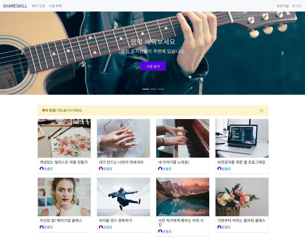
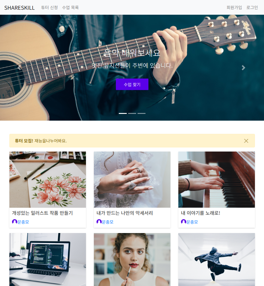
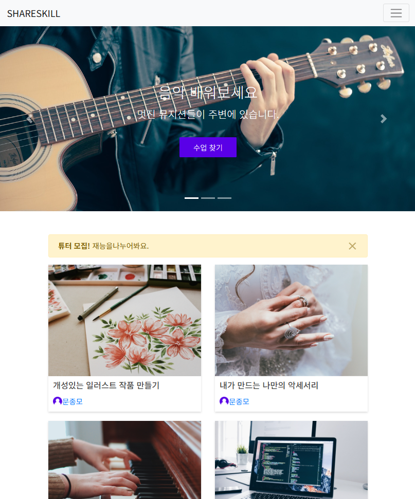
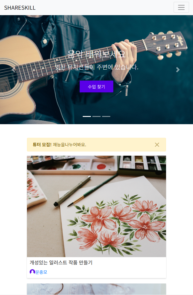
Extra Large (≥ 1200px): 6칸 차지5. 재능 공유 사이트 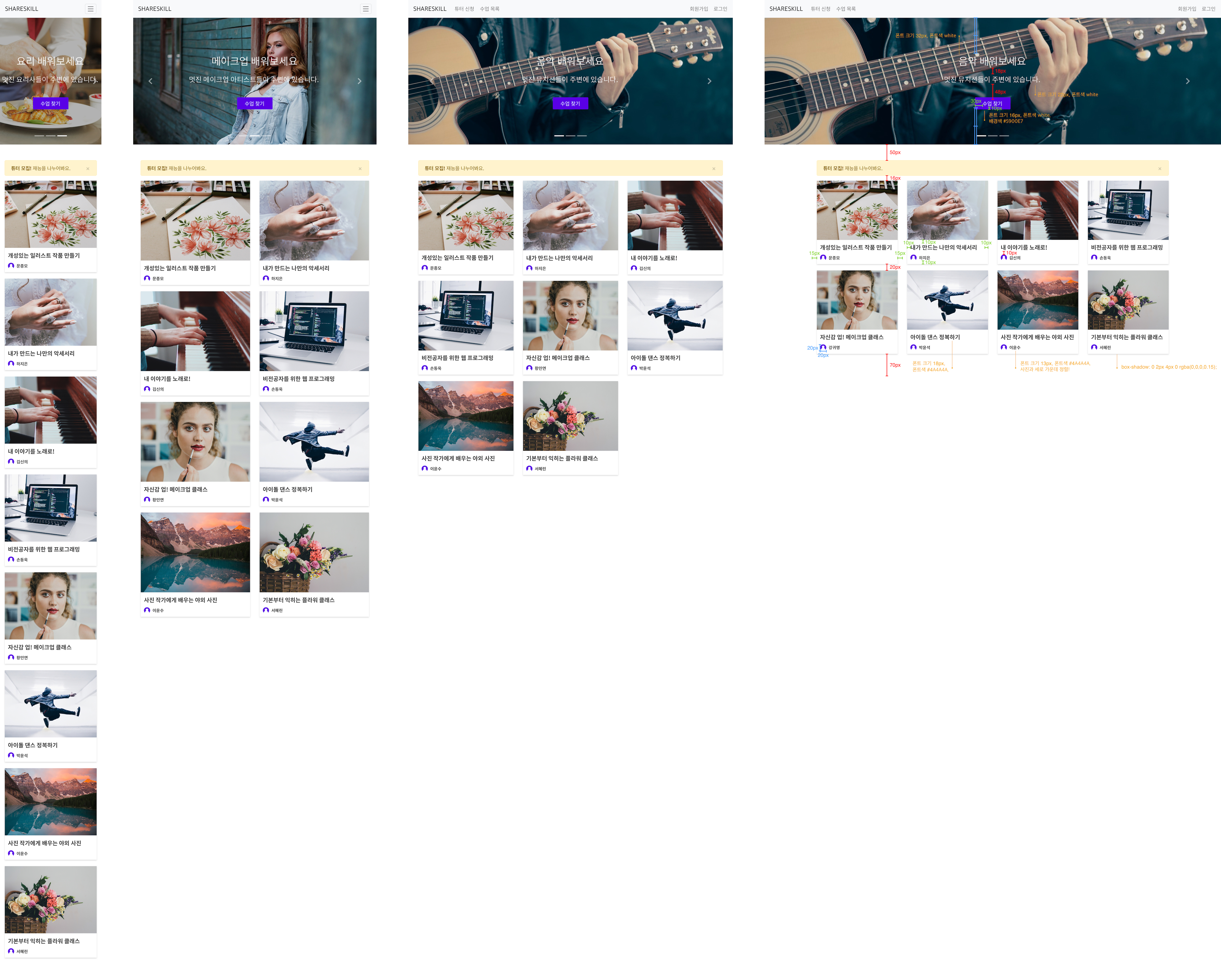
  → 재능 공유 사이트 'ShareSkill'을 제작하려고 한다.

  Hero Header
  → 네비게이션 바 밑에 있는 캐러셀의 높이는 400px
     각 슬라이드의 배경 이미지는 다르고, background-position도 각각 다르다.
  	  1. 음악 이미지는 왼쪽 가운데
 	  2. 메이크업 이미지는 가운데 위
  	  3. 요리 이미지는 가운데 가운데

→ 사용해야 하는 부트스트랩 컴포넌트는 다음과 같다.index.html
<!DOCTYPE html>
<html>
<head>
<title>ShareSkill</title>
<meta charset="utf-8">
<link href="https://cdn.jsdelivr.net/npm/bootstrap@5.3.3/dist/css/bootstrap.min.css" rel="stylesheet" integrity="sha384-QWTKZyjpPEjISv5WaRU9OFeRpok6YctnYmDr5pNlyT2bRjXh0JMhjY6hW+ALEwIH" crossorigin="anonymous">
<link rel="stylesheet" href="css/styles.css">
</head>
<body>
<nav class="navbar navbar-expand-lg navbar-light bg-light">
<a class="navbar-brand" href="#">SHARESKILL</a>
<button class="navbar-toggler" type="button" data-toggle="collapse" data-target="#navbarSupportedContent" aria-controls="navbarSupportedContent" aria-expanded="false" aria-label="Toggle navigation">
<span class="navbar-toggler-icon"></span>
</button>
<div class="collapse navbar-collapse" id="navbarSupportedContent">
<ul class="navbar-nav mr-auto">
<li class="nav-item">
<a class="nav-link" href="#">튜터 신청</a>
</li>
<li class="nav-item">
<a class="nav-link" href="#">수업 목록</a>
</li>
</ul>
<ul class="navbar-nav">
<li class="nav-item">
<a class="nav-link" href="#">회원가입</a>
</li>
<li class="nav-item">
<a class="nav-link" href="#">로그인</a>
</li>
</ul>
</div>
</nav>
<!--캐러셸-->
<div id="carouselExampleIndicators" class="carousel slide" data-ride="carousel">
<ol class="carousel-indicators">
<li data-target="#carouselExampleIndicators" data-slide-to="0" class="active"></li>
<li data-target="#carouselExampleIndicators" data-slide-to="1"></li>
<li data-target="#carouselExampleIndicators" data-slide-to="2"></li>
</ol>
<!--케러셀이미지-->
<div class="carousel-inner">
<div class="carousel-item item1 active">
<div class="helper"></div><div class="intro">
<h2>음악 배워보세요</h2>
<h3>멋진 뮤지션들이 주변에 있습니다.</h3>
<a href="#">수업 찾기</a>
</div>
</div>
<div class="carousel-item item2">
<div class="helper"></div><div class="intro">
<h2>메이크업 배워보세요</h2>
<h3>멋진 메이크업 아티스트들이 주변에 있습니다.</h3>
<a href="#">수업 찾기</a>
</div>
</div>
<div class="carousel-item item3">
<div class="helper"></div><div class="intro">
<h2>요리 배워보세요</h2>
<h3>멋진 요리사들이 주변에 있습니다.</h3>
<a href="#">수업 찾기</a>
</div>
</div>
</div>
<a class="carousel-control-prev" href="#carouselExampleIndicators" role="button" data-slide="prev">
<span class="carousel-control-prev-icon" aria-hidden="true"></span>
</a>
<a class="carousel-control-next" href="#carouselExampleIndicators" role="button" data-slide="next">
<span class="carousel-control-next-icon" aria-hidden="true"></span>
</a>
</div>
<div class="container">
<div class="row">
<div class="col-12">
<div class="alert alert-warning alert-dismissible fade show" role="alert">
<strong>튜터 모집!</strong> 재능을나누어봐요.
<button type="button" class="close" data-dismiss="alert" aria-label="Close">
<span aria-hidden="true">×</span>
</button>
</div>
</div>
</div>
<div class="row">
<div class="col-12 col-md-6 col-lg-4 col-xl-3">
<a href="#" class="course">
<img src="images/course1.jpg" width="100%" class="course-img">
<div class="info">
<h4>개성있는 일러스트 작품 만들기</h4>
<div class="lecture">
<img src="images/user.png" width="20" height="20"><span class="name">문종모</span>
</div>
</div>
</a>
</div>
<div class="col-12 col-md-6 col-lg-4 col-xl-3">
<a href="#" class="course">
<img src="images/course2.jpg" width="100%" class="course-img">
<div class="info">
<h4>내가 만드는 나만의 악세서리</h4>
<div class="lecture">
<img src="images/user.png" width="20" height="20"><span class="name">문종모</span>
</div>
</div>
</a>
</div>
<div class="col-12 col-md-6 col-lg-4 col-xl-3">
<a href="#" class="course">
<img src="images/course3.jpg" width="100%" class="course-img">
<div class="info">
<h4>내 이야기를 노래로!</h4>
<div class="lecture">
<img src="images/user.png" width="20" height="20"><span class="name">문종모</span>
</div>
</div>
</a>
</div>
<div class="col-12 col-md-6 col-lg-4 col-xl-3">
<a href="#" class="course">
<img src="images/course4.jpg" width="100%" class="course-img">
<div class="info">
<h4>비전공자를 위한 웹 프로그래밍</h4>
<div class="lecture">
<img src="images/user.png" width="20" height="20"><span class="name">문종모</span>
</div>
</div>
</a>
</div>
<div class="col-12 col-md-6 col-lg-4 col-xl-3">
<a href="#" class="course">
<img src="images/course5.jpg" width="100%" class="course-img">
<div class="info">
<h4>자신감 업! 메이크업 클래스</h4>
<div class="lecture">
<img src="images/user.png" width="20" height="20"><span class="name">문종모</span>
</div>
</div>
</a>
</div>
<div class="col-12 col-md-6 col-lg-4 col-xl-3">
<a href="#" class="course">
<img src="images/course6.jpg" width="100%" class="course-img">
<div class="info">
<h4>아이돌 댄스 정복하기</h4>
<div class="lecture">
<img src="images/user.png" width="20" height="20"><span class="name">문종모</span>
</div>
</div>
</a>
</div>
<div class="col-12 col-md-6 col-lg-4 col-xl-3">
<a href="#" class="course">
<img src="images/course7.jpg" width="100%" class="course-img">
<div class="info">
<h4>사진 작가에게 배우는 야외 사진</h4>
<div class="lecture">
<img src="images/user.png" width="20" height="20"><span class="name">문종모</span>
</div>
</div>
</a>
</div>
<div class="col-12 col-md-6 col-lg-4 col-xl-3">
<a href="#" class="course">
<img src="images/course8.jpg" width="100%" class="course-img">
<div class="info">
<h4>기본부터 익히는 플라워 클래스</h4>
<div class="lecture">
<img src="images/user.png" width="20" height="20"><span class="name">문종모</span>
</div>
</div>
</a>
</div>
</div>
</div>
</body>
</html>
style.css
body {
font-family: 'Noto Sans KR', sans-serif;
}
.carousel-item {
height: 400px;
background-size: cover;
text-align: center;
}
.carousel-item.item1 {
background-image: url("../images/guitar.jpg");
background-position: left center;
}
.carousel-item.item2 {
background-image: url("../images/makeup.jpg");
background-position: center top;
}
.carousel-item.item3 {
background-image: url("../images/cooking.jpg");
background-position: center center;
}
.helper {
display: inline-block;
height: 100%;
vertical-align: middle;
}
.intro {
display: inline-block;
vertical-align: middle;
}
.intro h2 {
font-size: 32px;
color: white;
font-weight:300;
margin-top: 0;
margin-bottom: 18px;
}
.intro h3 {
font-size: 22px;
color: white;
font-weight: 300;
margin-top: 0;
margin-bottom: 48px;
}
.intro a {
background-color: #5900e7;
border-radius: 2px;
padding: 10px 30px;
color: white;
font-weight: 300;
}
.container {
margin-top: 50px;
margin-bottom: 50px;
}
.course {
display: block;
box-shadow: 0 2px 4px 0 rgba(0, 0, 0, 0.15);
margin-bottom: 20px;
}
.course:hover {
text-decoration: none;
}
.course .course-img {
display: block;
}
.course .info {
padding: 10px;
}
.course .info h4 {
font-size: 18px;
color: #4a4a4a;
margin-top: 0;
margin-bottom: 10px;
}
.course .info .lecturer {
font-size: 13px;
color: #4a4a4a;
}
.course .info .lecture img,
.course .info .lecture .name {
vertical-align: middle;
}