DQ REVIEW
- CSS 스타일 적용 방식 중 구조와 디자인의 완전한 분리로 재사용성 및 유지보수성을 극대화 할 수 있는 방식
- 한 요소에 여러 CSS 규칙이 충돌할 때, 선택자가 더 구체적이고 좁은 범위를 타겟팅할수록 점수가 높게 산정되어 최우선 적용되는 규칙
- flexbox에서 확장 비율 나눠가지기
- flex-grow : 여백을 할당 받는 비율 설정
- 정확한 3등분 크기로 조정하기 위해서는 여백을 전체 크기로 조정하고 등분 (width: 0;)
VIEW PORT
- width
- device-width : 장비의 너비 기준
- device-height : 장비의 가로모드 기준
- user-scalable
- yes : 확대, 축소 가능
- no : 확대, 축소 불가
- minimum-scale : 축소 비율
- maximum-scale : 확대 비율
- initial-scale : 처음 화면 비율
break point
- css 적용을 다르게 할 수 있음
- 모바일 ( ~ 767px)
- 태블릿 ( 768 ~ 1023px )
- 데스크탑 ( 1024px ~ )
- @media 미디어타입(장비종류) and 미디어 특성(브레이크 포인트 주로 지정) { css .... }
미디어 타입(장비종류)
- screen : 데스크탑 모니터, 태블릿, 스마트폰
- print : 프린트에만 해당하는 css
- speech : 시각장애인용 스크린 리더 css
- all : 전체 ( 기본값 )
미디어 특성
- width : 특정 넓이, 높이에 도달했을때 css 적용
- min-width : ~ 크기 이상
- max-width : ~ 크기 이하
- orientation : 기기의 방향
- portrait : 세로 방향
- landscape : 가로 방향
<style>
body {
margin: 0;
}
* {
box-sizing: border-box;
}
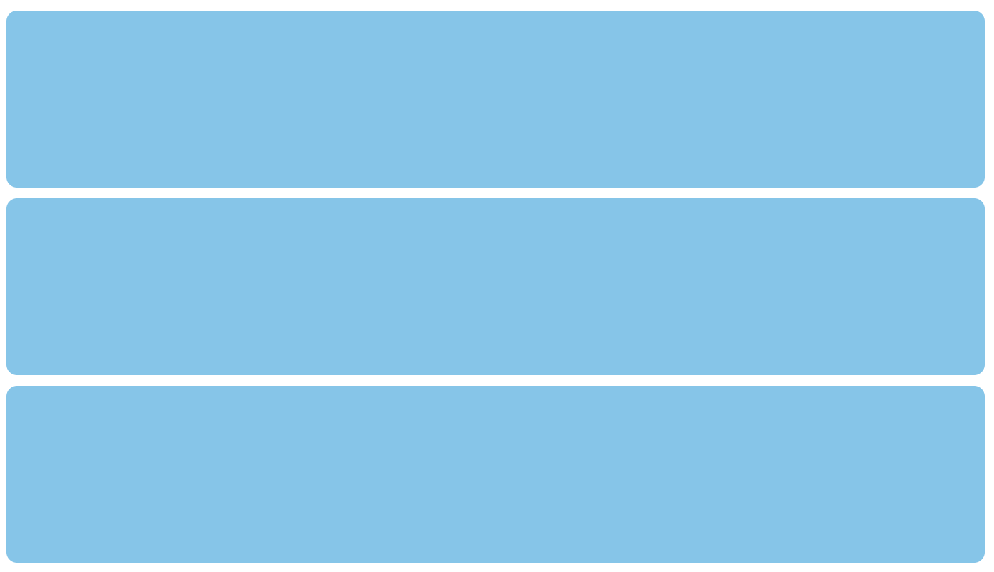
.box-group {
display: grid;
grid-template-columns: 1fr;
padding: 20px;
row-gap: 15px;
}
.box-group .box {
background: skyblue;
height: 250px;
border-radius: 15px;
}
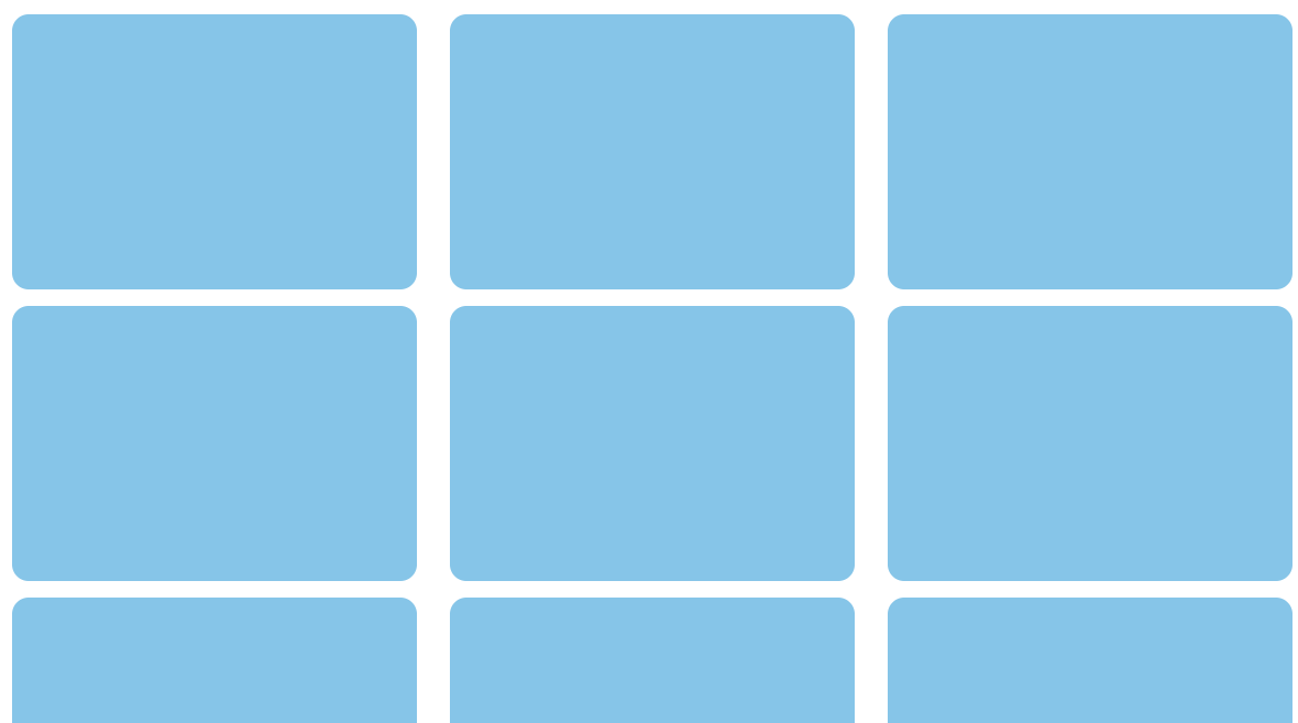
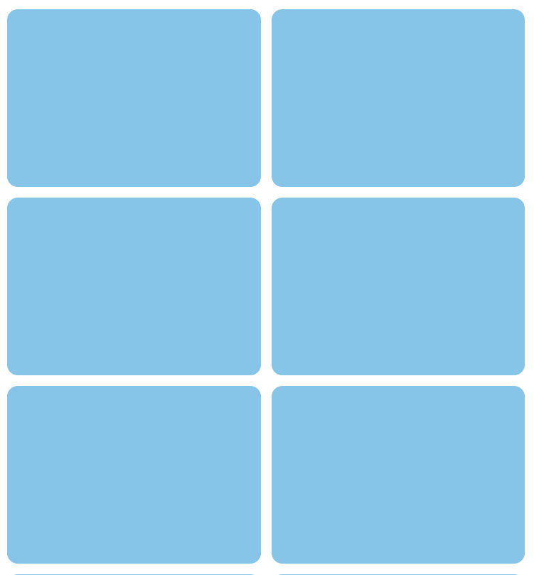
@media screen and (min-width: 768px) and (max-width: 1023px) {
.box-group {
grid-template-columns: repeat(2, 1fr);
column-gap: 15px;
}
}
@media screen and (min-width: 1024px) {
.box-group {
grid-template-columns: repeat(3, 1fr);
column-gap: 30px;
}
}
@media print {
body {
background: black;
}
}
</style>
<div class="box-group">
<div class="box"></div>
<div class="box"></div>
<div class="box"></div>
<div class="box"></div>
<div class="box"></div>
<div class="box"></div>
<div class="box"></div>
<div class="box"></div>
<div class="box"></div>
</div>
모바일 사이즈
태블릿 사이즈
데스크탑 사이즈